
An essay about bad AI app design| koomen.dev
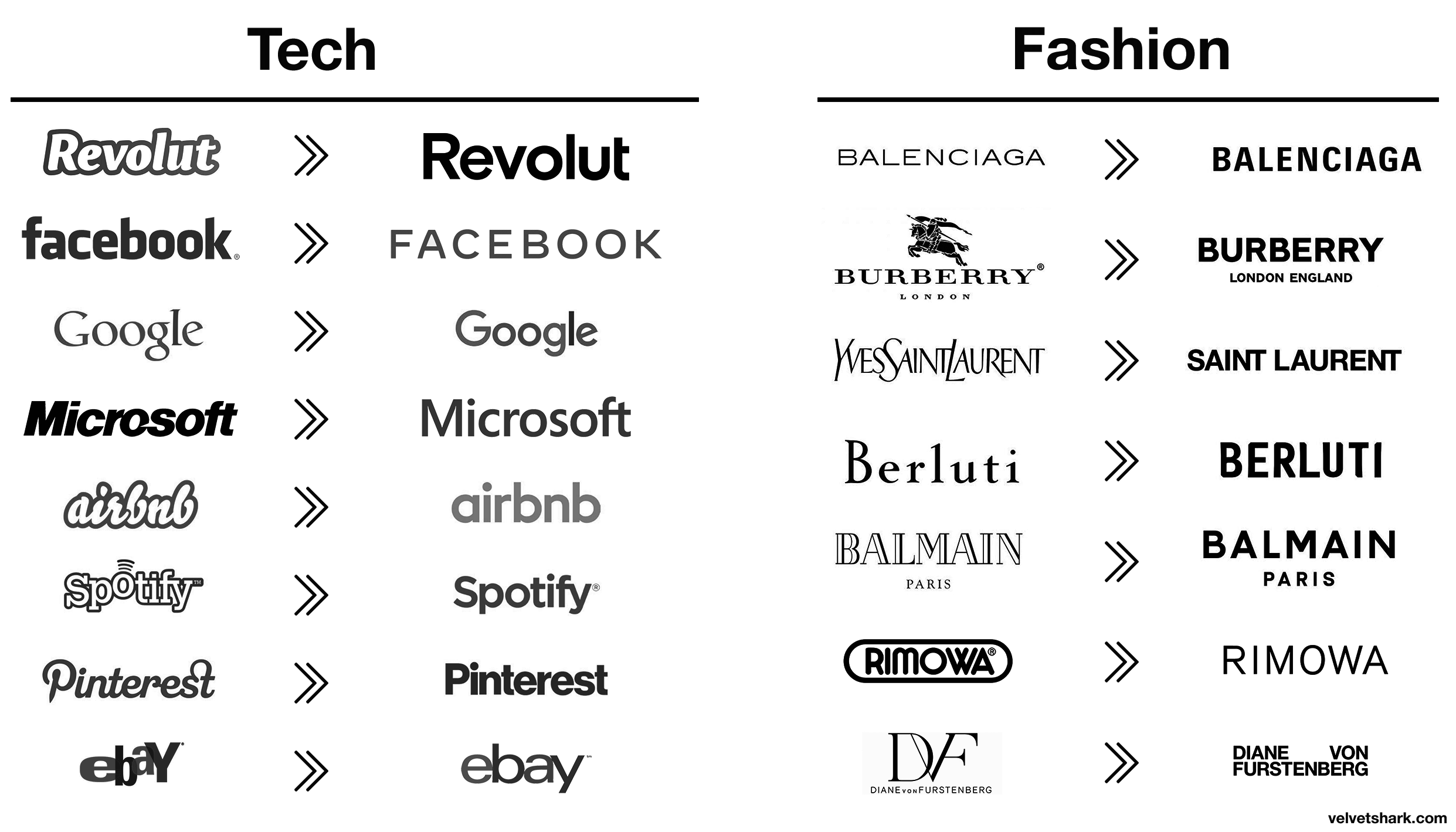
Tech and fashion logos are becoming increasingly similar, all of them using sans serif fonts. Why do they do that? And why it doesn't make sense.| velvetshark.com
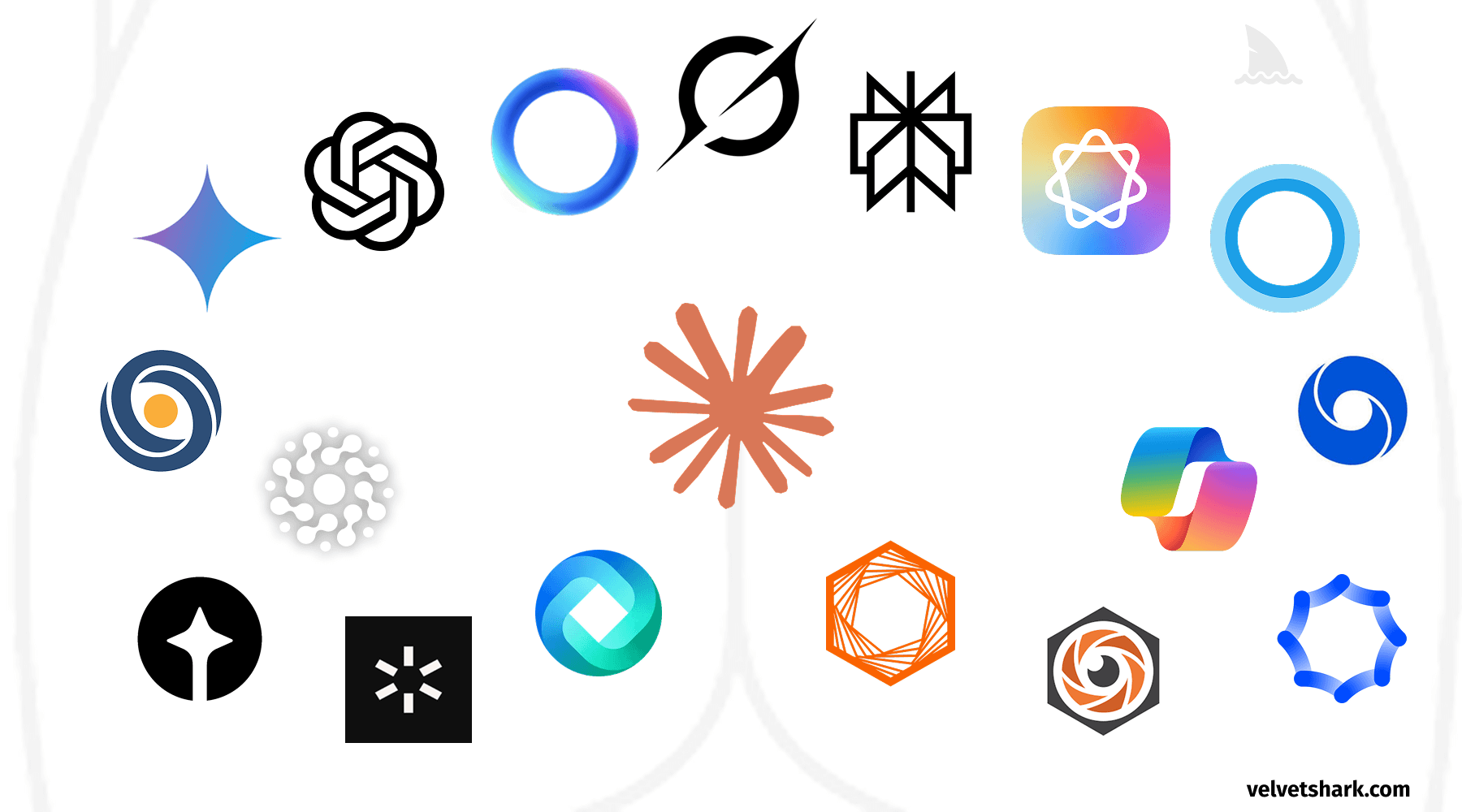
A humorous exploration of the uncanny resemblance between AI company logos and human anatomy. Discover why circular, gradient-based designs dominate the AI industry, and what this design convergence tells us about branding in tech.| velvetshark.com