
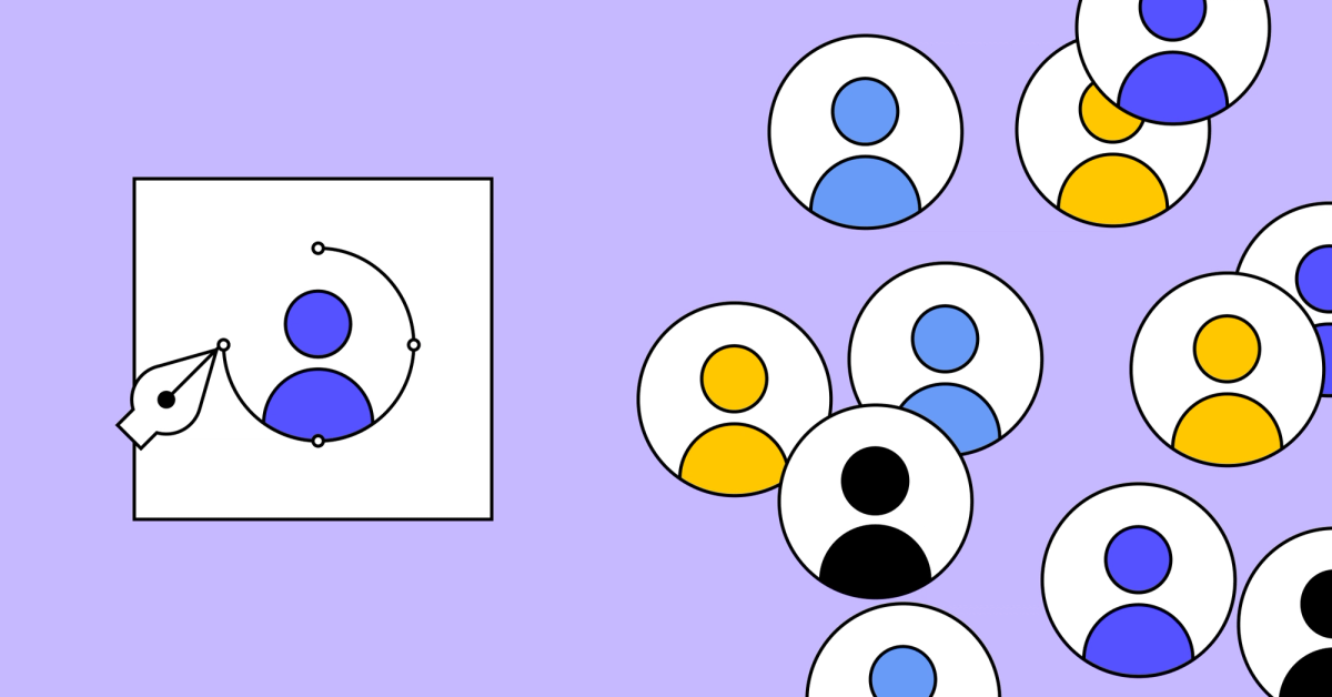
What is color theory? | Figma
Color theory helps designers make color choices that captivate users and elevate a brand. Learn to apply color theory to your color palette with Figma.| Figma
Color theory helps designers make color choices that captivate users and elevate a brand. Learn to apply color theory to your color palette with Figma.| Figma
Inclusivity is a design opportunity, and an essential part of the design process. Learn more about how to implement best practices in your work.| Figma

The color turquoise represents the hue of the blue-green gemstone. Learn more about the color turquoise in this guide.| Figma

Pastel yellow is a soft and pale shade of yellow that evokes a sense of calmness. Learn more about the color pastel yellow in this guide.| Figma

Navy blue's deep shade embodies professionalism and stability, offering a reliable backdrop for sophisticated designs. Learn more about the color navy blue in this guide.| Figma

Mint green is a light, cool-toned green that embodies springtime design elements. Learn more about the color mint green in this guide.| Figma
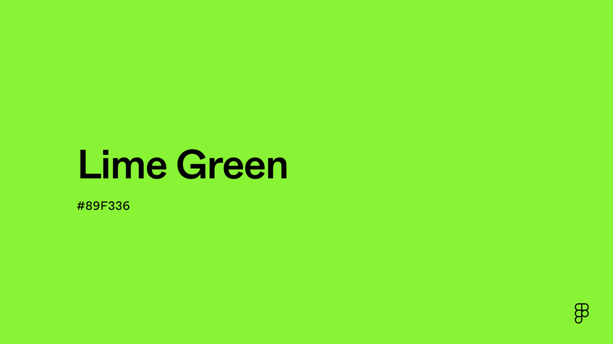
Lime green's vivid and bright hue sparks creativity and adds a dynamic flair to design projects. Learn more about the color lime green in this guide.| Figma

Beige's gentle, understated tone provides a classic foundation that pairs well with many colors. Learn more about the color beige in this guide.| Figma

RGB (red, green, blue) produces colors on digital screens through a combination of red, green, and blue light. Read on to learn how it works.| Figma

Red is one of the three primary colors and can evoke various emotions, from love to anger. Learn more about the color red in this guide.| Figma

Magenta is a vibrant purplish-red shade that evokes creativity and cheerfulness. Learn more about the color magenta in this guide.| Figma

Pewter is a is a bright and vibrant color. Learn more about cyan and how to use it in designs in this guide.| Figma
