Hidden features, reduced discoverability, cognitive overhead from dual environments, and reduced power from a single-window UI and low information density. Too bad.| Nielsen Norman Group
Paper prototyping, card sorting, and traditional usability testing were all employed to guide the design of the 1995 Sun Microsystems' Web site.| Nielsen Norman Group
Textual links should be colored and underlined to achieve the best perceived affordance of clickability, though there are a few exceptions to these guidelines.| Nielsen Norman Group
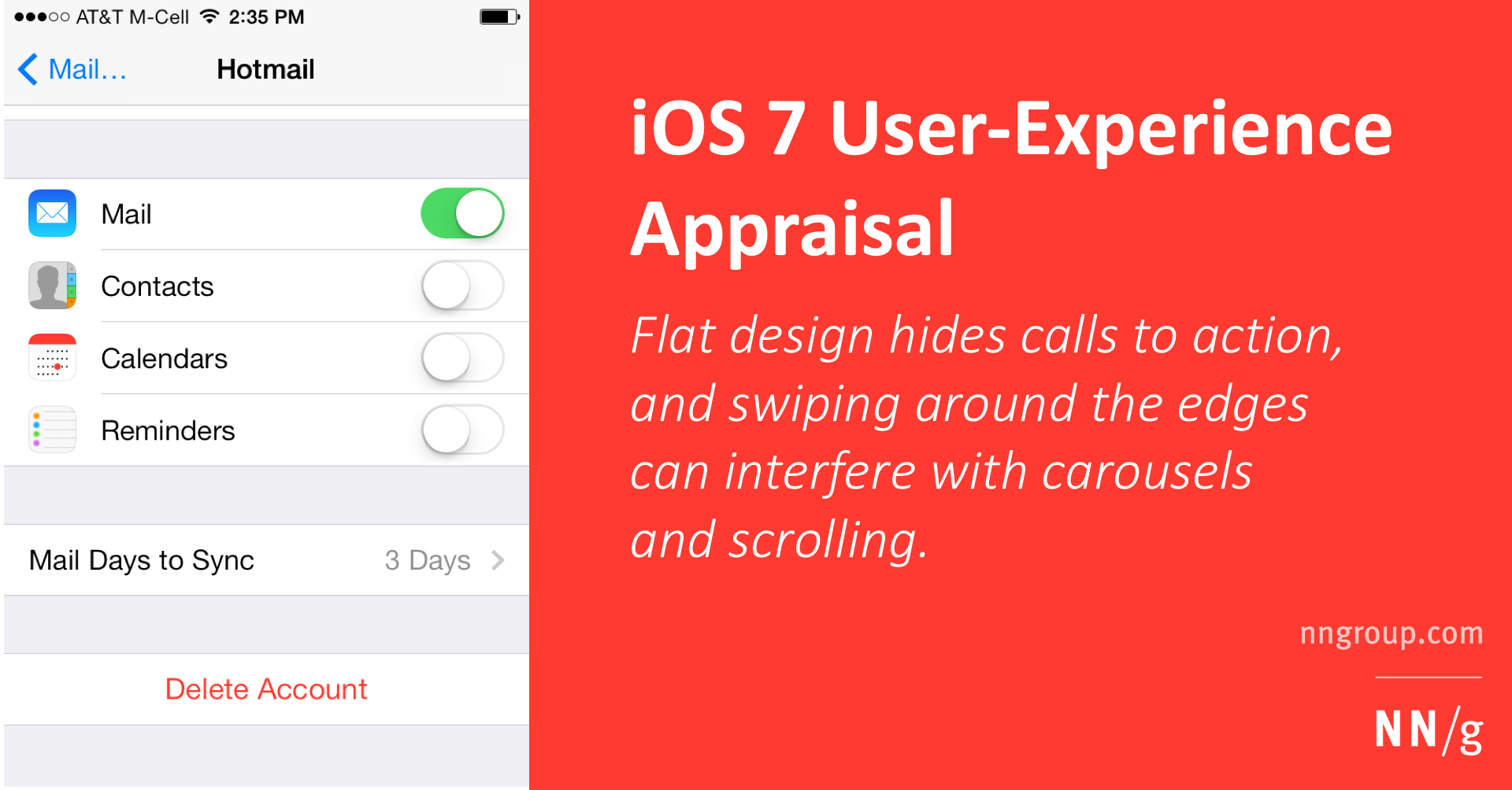
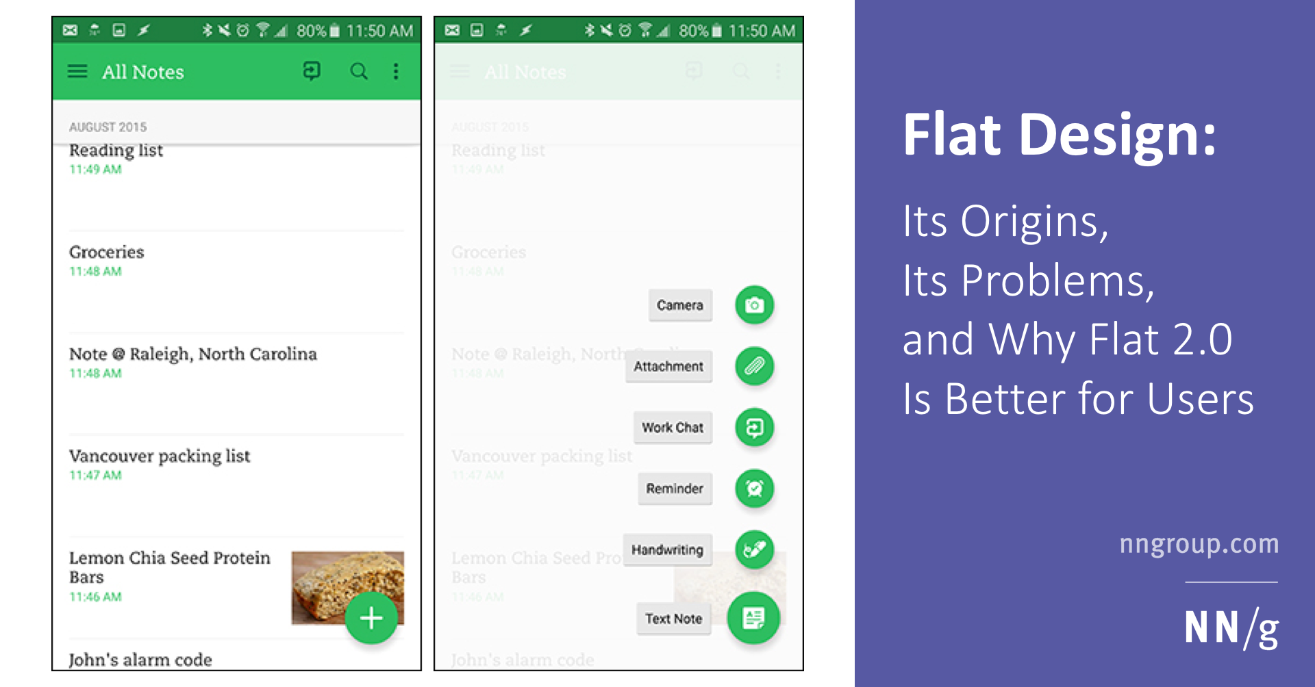
Flat design is a web-design style that became popular around 2012. It is still widely used today, and its misuse can cause serious usability problems.| Nielsen Norman Group
Clickable interface elements with absent or weak visual signifiers condition users to click and hover uncertainly across pages — reducing efficiency.| Nielsen Norman Group
The tighter the mapping between icons and the thing they represent, the easier they are to understand, but standardization can also make an icon easy.| Nielsen Norman Group
The interaction cost is the sum of efforts — mental and physical — that users must deploy in interacting with a site in order to reach their goals.| Nielsen Norman Group
To help users quickly find what they need, anchor text should stand out from the body content and accurately describe the page that it refers to.| Nielsen Norman Group
Due to the absence of a standard usage for individual icons, text labels are necessary to communicate meaning and reduce ambiguity in an icon-based design.| Nielsen Norman Group