We love useful stuff, and we love quality writing. Every Tuesday, we send out an editorial email newsletter with useful tips and techniques for designers and developers — thoroughly collected, written and edited by us exclusively for our readers. Once subscribed, you’ll receive a small token of appreciation — a free eBook just for you.| Smashing Magazine
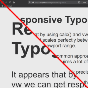
Typography that responds to viewport width (‘fluid’ or ‘responsive’ typography) can be useful when you want to ensure text does not get clipped or spill out of some design elements. Carousels, widget controls, or my Venn diagram are some examples. I say viewport width because I rarely see responsive type…| Adrian Roselli
In this article, Adrian Bece will explore fluid typography principles, use-cases, best practices, implementation with CSS clamp function and how to calculate the right parameters. He’ll also show you how to address some accessibility concerns and watch out for one important issue that you cannot fix as of yet, but have to be aware of regardless.| Smashing Magazine
Large complex projects — **from SaaS and B2C to enterprise and B2B** — aren’t easy to navigate for UX designers, even with years of experience. How do we succeed, grow and do good work in such intricate and difficult environments? Well, let’s figure it out! In this workshop by Vitaly Friedman, a UX consultant of the European Parliament and Smashing Magazine's creative lead, you’ll explore all the tactics and strategies to thrive and survive in complex environments, fight through la...| SmashingConf