Create simplified responsive grid systems using both CSS grid and flexbox. Using both, we'll create just two classes to handle from 1-4 columns of content that responsively resizes.| Modern CSS Solutions
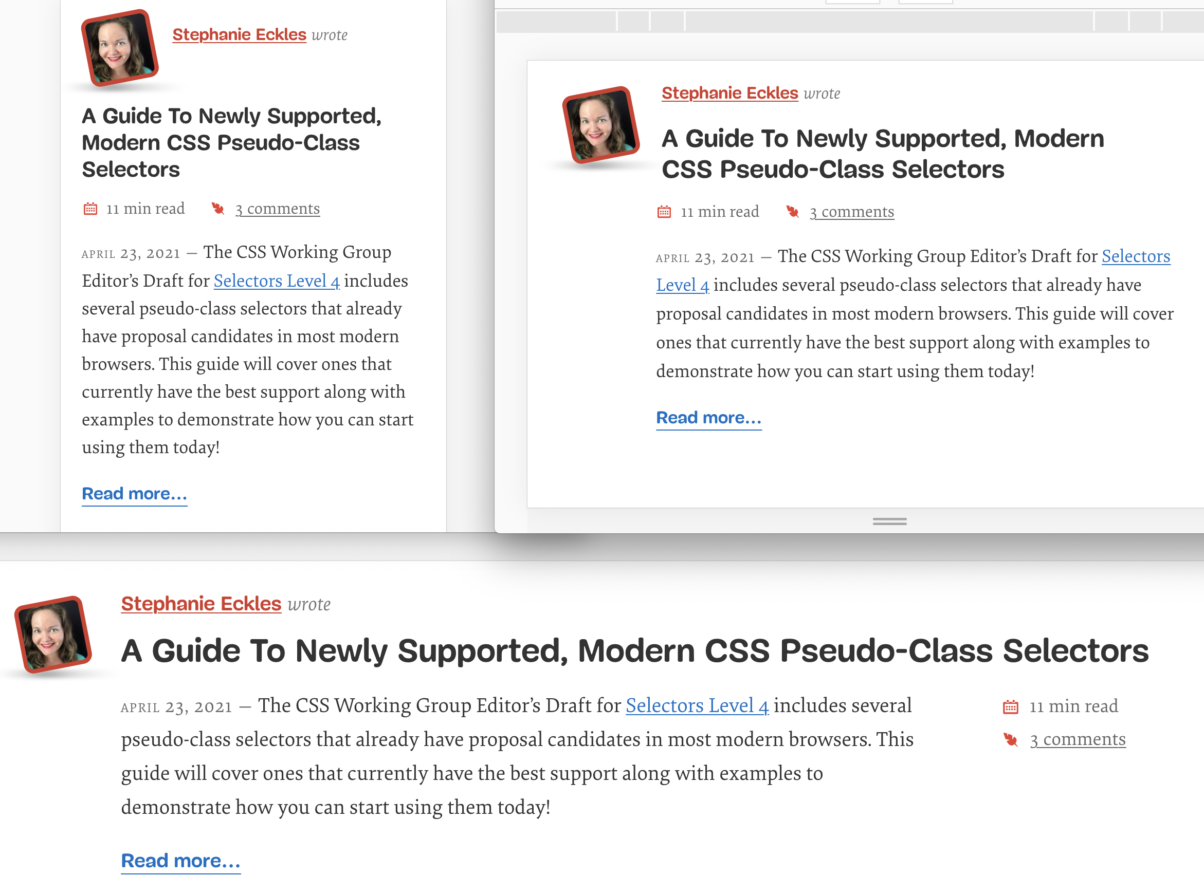
In more recent years, design systems and component libraries have gained popularity. There is also a desire to build once, deploy anywhere. Meaning a component developed in isolation is intended to work in any number of contexts to make building complex interfaces more efficient and consistent. CSS container queries have landed and are now available for experimentation. Let’s look at what problem is being solved, learn how container queries work, and see how they compare with and complement...| Smashing Magazine
1. Introduction| drafts.csswg.org
Designers have coveted print for its precision layouts, lamenting the varying user contexts on the web that compromise their designs. Ethan Marcotte advocates we shift our design thinking to approp…| A List Apart
The original “Responsive Web Design” article was published a decade ago! Here’s how it happened, and who helped make it happen.| ethanmarcotte.com