
Placeholders in Form Fields Are Harmful
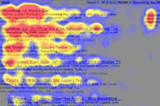
Labels or sample text inside a form field makes it difficult for people to remember what information belongs in that field once they start data entry.| Nielsen Norman Group
Labels or sample text inside a form field makes it difficult for people to remember what information belongs in that field once they start data entry.| Nielsen Norman Group
For people with impaired vision, we are required to ensure that there is a minimum amount of contrast between our foreground and background colors. formulas for determining optimum color contrast. W3C's specification on color contrast... hp color palette. style sheet text colors. style sheet text colors.| snook.ca
1. Introduction| drafts.csswg.org
While a good measure does improve the reading experience, it’s only one rule for good typography. Another rule is to maintain a comfortable font size. Designing on a desktop or laptop browser means that we are spending most of our time at an arm’s length from the text, and we don’t spend much time seeing how the text renders on small devices. A good font size (not too small) is readable. A good font size (not too big) promotes horizontal eye motion. A good font size with the proper line...| Smashing Magazine

Accessibility resources free online from the international standards organization: W3C Web Accessibility Initiative (WAI).| Web Accessibility Initiative (WAI)
Introduction | www.w3.org
Introduction | www.w3.org
