
The Modern Guide For Making CSS Shapes — Smashing Magazine
In this comprehensive guide, Temani Afif explores different techniques for creating common shapes with the smallest and most flexible code possible.| Smashing Magazine
In this comprehensive guide, Temani Afif explores different techniques for creating common shapes with the smallest and most flexible code possible.| Smashing Magazine

Personas have been in use since the mid-’90s and since then have gained widespread awareness within the design community. Once Shlomo Goltz understood why personas were valuable and how they could be put into action, he started using them in his own work, and then his process became more efficient and fun, while the fruits of his labor became more impactful and useful to others. Personas will supercharge your work and help you take your designs to the next level.| Smashing Magazine

Richard Shepherd dives into how the Nike Better World website was made. Learn how it was put together, and then use similar techniques to create our own parallax scrolling website.| Smashing Magazine

The CSS `clamp()` function is often paired with viewport units for “fluid” font sizing that scales the text up and down at different viewport sizes. As common as this technique is, several voices warn that it opens up situations where text can fail WCAG Success Criterion 1.4.4, which specifies that text should scale up to at least 200% when the user’s browser reaches its 500% maximum zoom level. Max Barvian takes a deep look at the issue and offers ideas to help address it.| Smashing Magazine

Since the introduction of CSS viewport units in 2012, many of us have been using `width: 100vw` as a way to set an element’s width to the full width of the viewport. But, as Šime Vidas explains in this deep dive, `100vw` does not always represent the full width of the viewport due to differences in how browsers handle scrollbars.| Smashing Magazine
In this article, Sacha Greif tries to anticipate future CSS trends and takes a look at some far-fetched and futuristic CSS features that might one day make their way to the browser.| Smashing Magazine

In this article, the author explains why 16 pixels should generally be the minimum size for body copy in modern Web design.| Smashing Magazine

The best error message is the one that never shows up. It is always better to prevent errors from happening in the first place by guiding users in the right direction ahead of time. But, when errors do arise, well-designed error handling helps teach users how to use the app as you intended. In this article, Nick Babich will examine how the design of apps can be optimized to prevent user errors and how to create effective error messages in cases when errors occur independently of user input.| Smashing Magazine
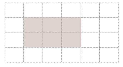
There are methods that enable the naming of lines and even grid areas. Using these methods enables easier placement of items by name rather than number, but also brings additional possibilities when creating systems for layout. In this article, Rachel Andrew will take an in-depth look at the various ways to name lines and areas in CSS Grid Layout, and some of the interesting possibilities this creates. Try not to get hung up on what is “right” or “wrong”. If you find a method confusi...| Smashing Magazine
Browsers’ visual display of headings nested inside `` elements makes it look as if they are assigning a logical hierarchy to those headings. However, this is purely visual and is not communicated to assistive technologies. In this article, Bruce Lawson explains what use we have of `` and how authors should mark up headings that are hugely important to AT users.| Smashing Magazine

Meet Gleb Bahmutov, Senior Director Of Engineering at Mercari US, who is redefining the standards of software testing. Dive into Gleb’s world of testing and learn how small changes can lead to big impacts.| BrowserStack Blog

Conducting UX research that includes participants with a variety of disabilities is vital to building inclusive technology, but most prototypes used for testing are inaccessible. Rather than continuing to leave out feedback from disabled consumers, which ultimately leads to exclusive technology, researchers must get creative in their workarounds and be relentless in their efforts.| Smashing Magazine

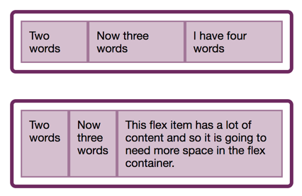
In the last two articles, we have looked at what happens when we create a flex container, and also taken a look at alignment. This time we explore the often confusing issue of sizing in Flexbox. How does Flexbox decide how big things should be? In this article, Rachel Andrew will explain some of the finer points of how Flexbox works out how big the flex items are. It can seem a little academic, however, taking some time to understand the way this works can save you huge amounts of time when u...| Smashing Magazine

For the entire history of CSS Layout, being able to properly align things on both axes seemed like it might truly be the hardest problem in web design. The alignment properties that you might think of as the flexbox alignment properties are now fully defined in the Box Alignment Specification. If you have ever been confused about when to align and when to justify, this article will make things clearer! Today, Rachel Andrew will take a look at the alignment properties in Flexbox while discov...| Smashing Magazine
In this article, the beginning of a series on Flexbox, Rachel Andrew will take a detailed look at what actually happens when you add display: flex to your stylesheet. She will take the initial values of Flexbox, in order to explain what actually happens when you say display: flex. It’s a surprising amount once you begin to unpack it, and contained within these few properties are many of the key features of flex layouts.| Smashing Magazine
In this article, Adrian Bece will explore fluid typography principles, use-cases, best practices, implementation with CSS clamp function and how to calculate the right parameters. He’ll also show you how to address some accessibility concerns and watch out for one important issue that you cannot fix as of yet, but have to be aware of regardless.| Smashing Magazine
Overcorrecting for one form of disability may unintentionally negatively impact the experience for other forms of disability. For example, partially visually hidden link names may work great for people who use screen readers, but this approach can be problematic for people who rely on voice control software. Because of this, your designs need to be flexible and adaptable, as well as accommodate the many different ways people can interact with them.| Smashing Magazine
