
5 Fundamental and Incredibly Exciting Rules for Internal Website Links - Wired Impact
Forgetting to add helpful and relevant website links is a very common content mistake. Learn 5 linking rules to use on your nonprofit’s site.| Wired Impact
Forgetting to add helpful and relevant website links is a very common content mistake. Learn 5 linking rules to use on your nonprofit’s site.| Wired Impact
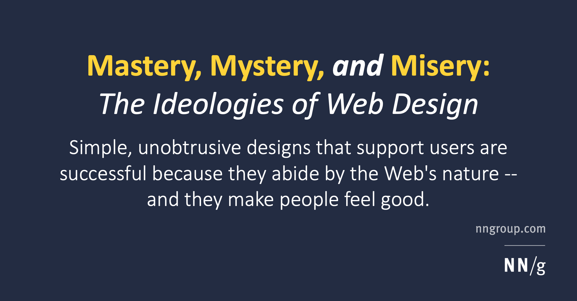
Simple, unobtrusive designs that support users are successful because they abide by the Web's nature -- and they make people feel good.| Nielsen Norman Group

People get lost and move in circles when websites use the same link color for visited and new destinations. To reduce navigational confusion, select different colors for the two types of links.| Nielsen Norman Group
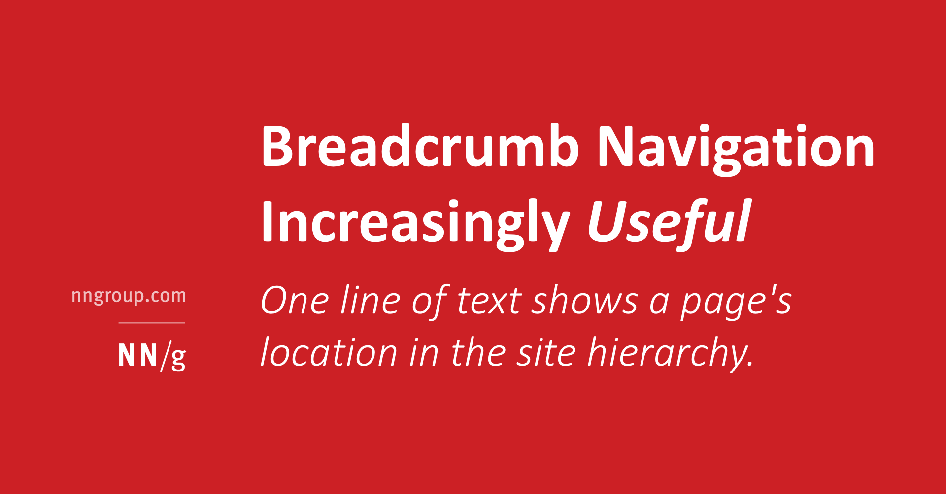
One line of text shows a page's location in the site hierarchy. User testing shows many benefits and no downsides to breadcrumbs for secondary navigation.| Nielsen Norman Group
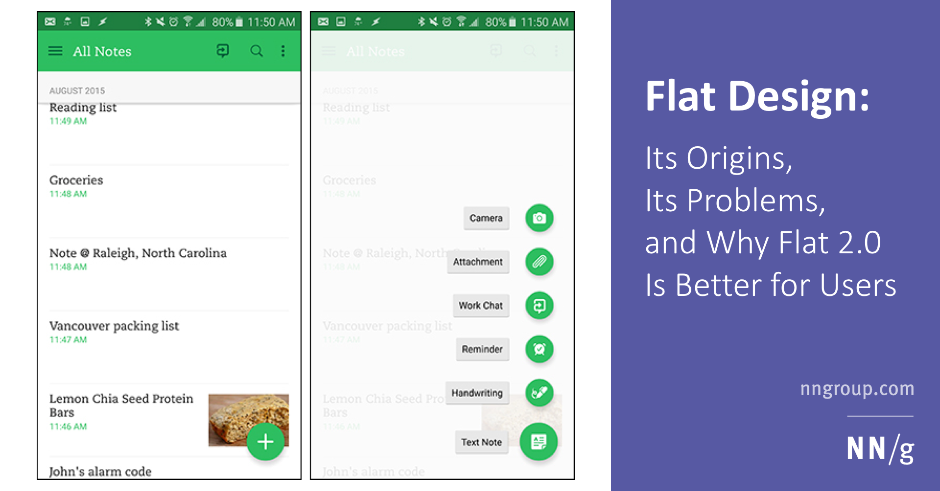
Flat design is a web-design style that became popular around 2012. It is still widely used today, and its misuse can cause serious usability problems.| Nielsen Norman Group

Clickable interface elements with absent or weak visual signifiers condition users to click and hover uncertainly across pages — reducing efficiency.| Nielsen Norman Group

Whether you adopt a flat-design style or not, interactive components must retain sufficient cues to suggest clickability.| Nielsen Norman Group
