Use our powerful mobile-first flexbox grid to build layouts of all shapes and sizes thanks to a twelve column system, six default responsive tiers, Sass variables and mixins, and dozens of predefined classes.| getbootstrap.com
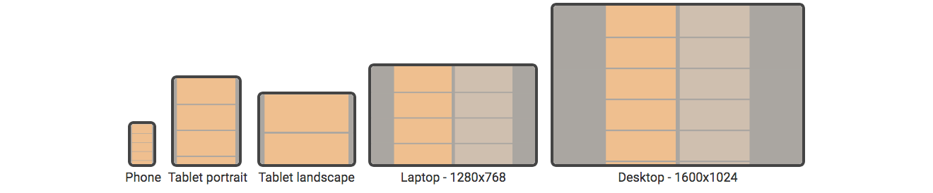
Throughout this tutorial, I encourage you to look at the page source and resize your browser window to see how the different examples react to different screen and text sizes. If you're on a phone, try switching between portrait and landscape mode to get different page widths. For clarity, all| Good Internet
In this post, I am going to demonstrate how to set up a simple Next.js web application. Next.js is a heavily opinionated JavaScript framework, in that it has a lot of conventions and recommended tools built into its design. We'll use Next.js version 14.2.2 to set up the groundwork for a simple web application. By "web application," I mean an application that is designed primarily to collect input from a user in a web browser and return some output generated from that input.| Keyhole Software
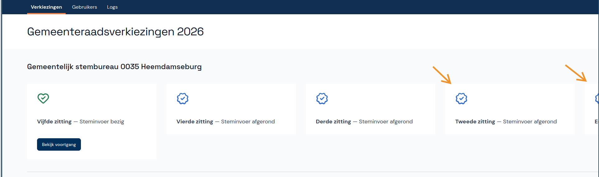
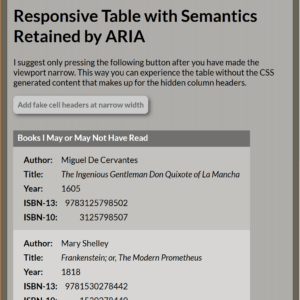
Update: 7 October 2023 Tables with display properties are now functional across Chromium, Gecko, and (finally) WebKit browsers. Barring regressions (which have happened), display: contents is the only style that may cause issues, and that is a function of a poor specification. My post It’s Mid-2022 and Browsers (Mostly Safari)…| Adrian Roselli
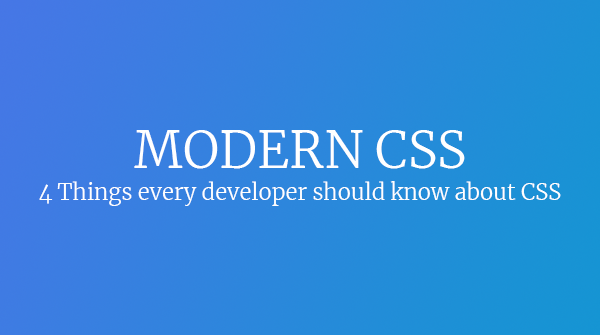
Contrary to popular belief, CSS is an absolute delight. Many developers I talk to think the phrase "Modern CSS" is an oxymoron. If you haven’t been watching the growth and maturity of CSS in the past 5 years, you’re doing yourself a disservice.| bryanlrobinson.com
Flexbox is one of the best additions to CSS. I found it very useful to code elements and making them adapt easily to different screen sizes.| ishadeed.com
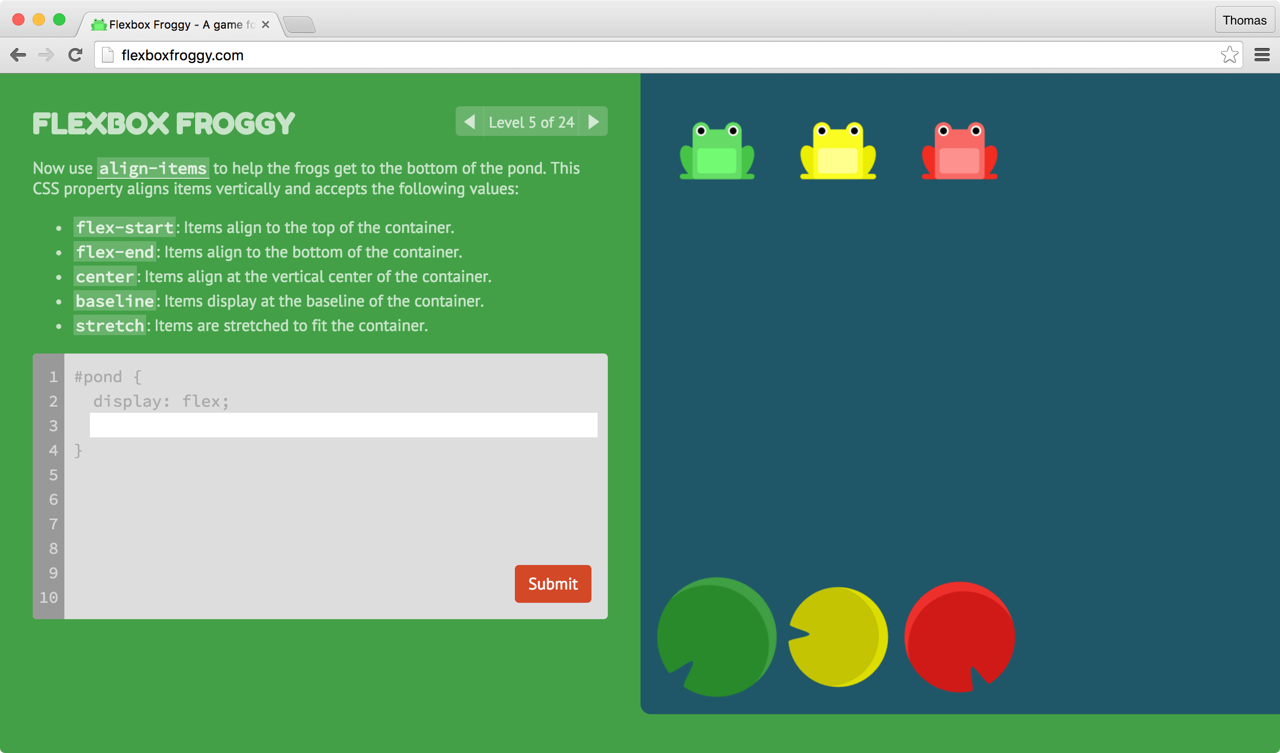
I've created a game for learning CSS flexbox called Flexbox Froggy. The goal of the game is to help the frogs get to their lilypads by writing CSS code. See if you can beat all the levels! Flexbox Froggy Flexbox Froggy takes inspiration from the classic arcade game Frogger, and web literacy games like the| Thomas Park | On web development, interface design, user research, and all th...
Do you often find yourself looking up a Flexbox cheat sheet? Wish you could just commit all those properties to memory and be done with it? Here’s how I memoriz| keithjgrant.com
Use our powerful mobile-first flexbox grid to build layouts of all shapes and sizes thanks to a twelve column system, six default responsive tiers, Sass variables and mixins, and dozens of predefined classes.| getbootstrap.com