
My journal. — Ethan Marcotte
Some things I’ve written.| ethanmarcotte.com
Frontend web developer, turned engineering manager.| nooshu.com
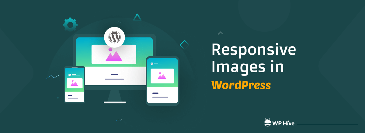
A responsive image adapts to different screen sizes and resolutions. In this post, we'll discuss in detail what are responsive images and things you need to know| WP Hive

CSS Media queries are a way to target browser by certain characteristics, features, and user preferences, then apply styles based on those things.| CSS-Tricks
この記事では、コンテナクエリ(@container)の例を挙げながら、実際にどのような使い方ができるのか、使用する際にどのような懸念点が考えられるかといった点について考えていきます。| griponminds.jp

With container queries now on the horizon - will we need media queries at all?| Max Böck
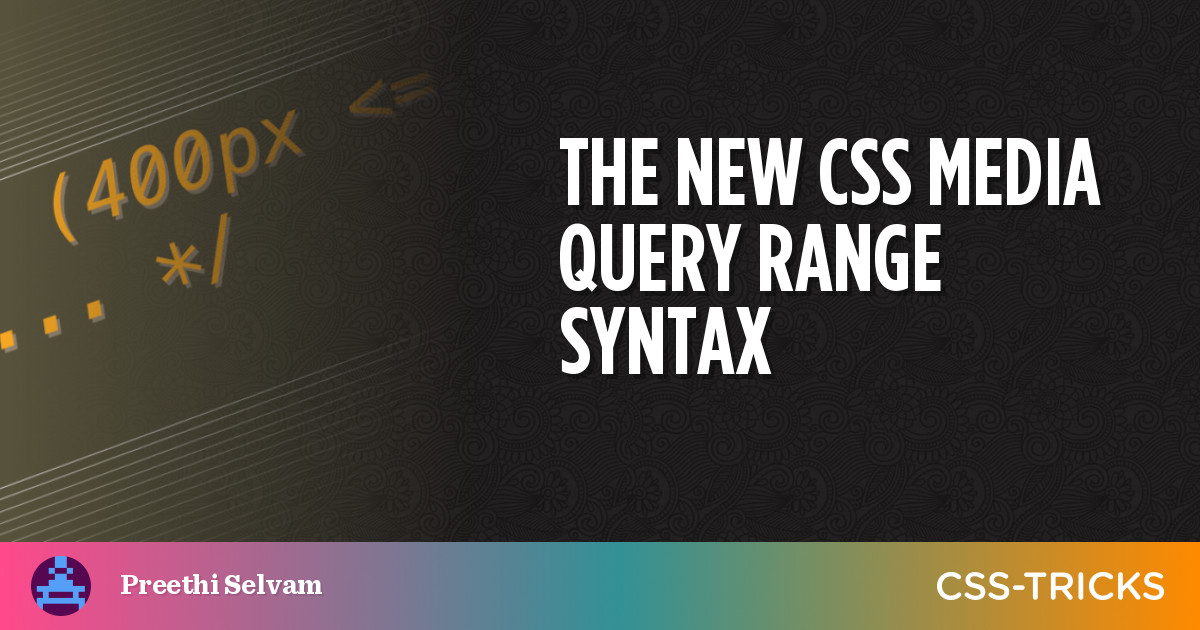
The Media Queries Level 4 specification has introduced a new syntax for targeting a range of viewport widths using common mathematical comparison operators, like , and =, that make more sense syntactically while writing less code for responsive web design.| CSS-Tricks
In more recent years, design systems and component libraries have gained popularity. There is also a desire to build once, deploy anywhere. Meaning a component developed in isolation is intended to work in any number of contexts to make building complex interfaces more efficient and consistent. CSS container queries have landed and are now available for experimentation. Let’s look at what problem is being solved, learn how container queries work, and see how they compare with and complement...| Smashing Magazine

Defining the inputs instead of trying to control the outputs.| adactio.com

Life after Twitter remains, well, weird. Maybe this is better.| ethanmarcotte.com
When did we start using “breakpoint” to talk about layout adaptation? (Honestly, I don’t know!)| ethanmarcotte.com
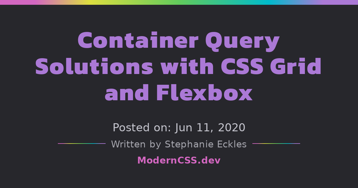
Using grid and flexbox, we can create styles that respond to container and content widths and overcome some of the pain points that container queries are proposed to resolve.| Modern CSS Solutions
The fine folks at A Book Apart asked me to participate in a little interview, as my little yellow book just turned ten years old!| ethanmarcotte.com
At long last, container queries might finally become reality! And responsive design just turned eleven! My goodness!| ethanmarcotte.com
The original “Responsive Web Design” article was published a decade ago! Here’s how it happened, and who helped make it happen.| ethanmarcotte.com
Justin Avery kindly invited me to do an interview for his wonderful Responsive Web Design newsletter. So you know I had to oblige.| ethanmarcotte.com
The more I work with CSS Grid, the more I’ve realized I’m a big fan of the fr unit. And it’s subtly changed how I think about grids.| ethanmarcotte.com
