There are methods that enable the naming of lines and even grid areas. Using these methods enables easier placement of items by name rather than number, but also brings additional possibilities when creating systems for layout. In this article, Rachel Andrew will take an in-depth look at the various ways to name lines and areas in CSS Grid Layout, and some of the interesting possibilities this creates. Try not to get hung up on what is “right” or “wrong”. If you find a method confusi...| Smashing Magazine
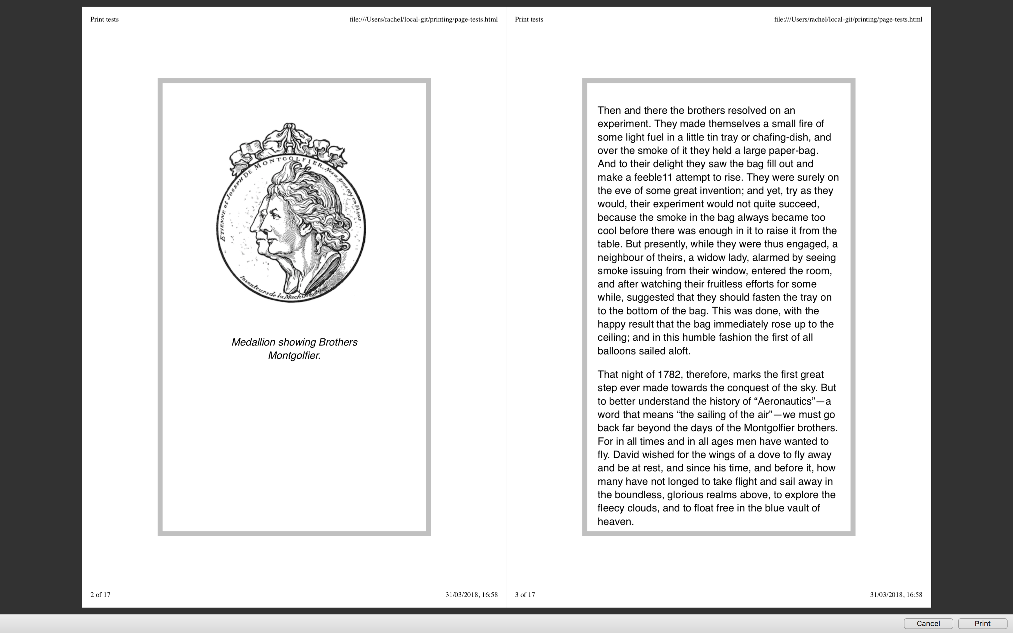
Printing pages directly from the browser is an experience that can lead to frustration with enormous images being printed out. We have covered print stylesheets in the past here on Smashing Magazine, but in this article, Rachel Andrew takes a look at the state of printing from the browser today. She will show you how you should include print styles in your web pages, and look at the specifications that really come into their own once printing.| Smashing Magazine
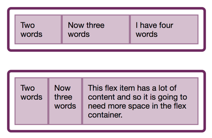
In the last two articles, we have looked at what happens when we create a flex container, and also taken a look at alignment. This time we explore the often confusing issue of sizing in Flexbox. How does Flexbox decide how big things should be? In this article, Rachel Andrew will explain some of the finer points of how Flexbox works out how big the flex items are. It can seem a little academic, however, taking some time to understand the way this works can save you huge amounts of time when u...| Smashing Magazine
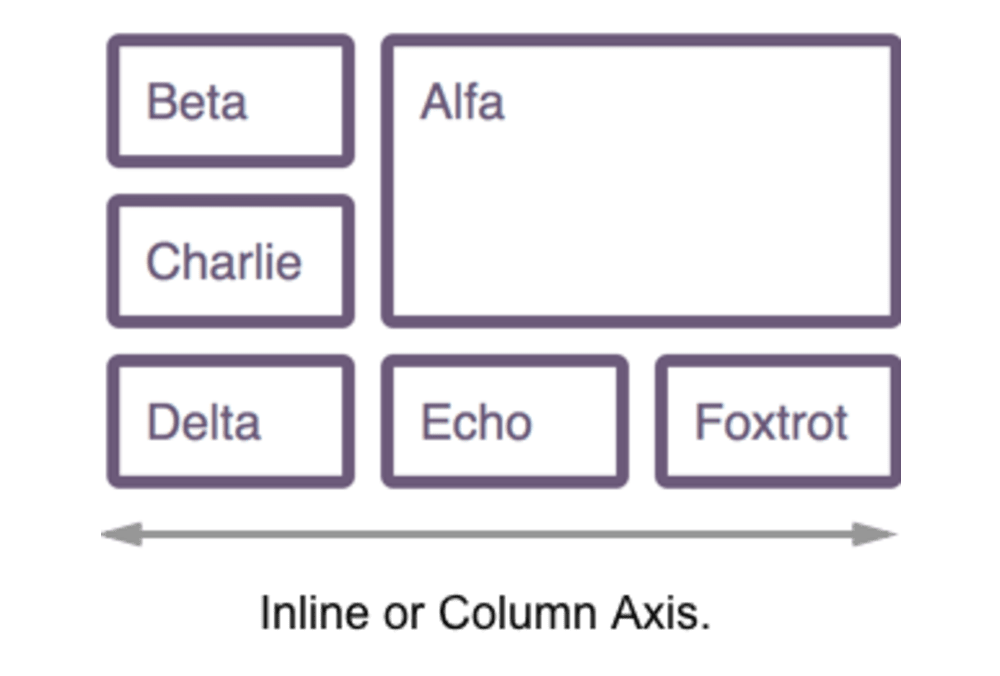
For the entire history of CSS Layout, being able to properly align things on both axes seemed like it might truly be the hardest problem in web design. The alignment properties that you might think of as the flexbox alignment properties are now fully defined in the Box Alignment Specification. If you have ever been confused about when to align and when to justify, this article will make things clearer! Today, Rachel Andrew will take a look at the alignment properties in Flexbox while discov...| Smashing Magazine
In this article, the beginning of a series on Flexbox, Rachel Andrew will take a detailed look at what actually happens when you add display: flex to your stylesheet. She will take the initial values of Flexbox, in order to explain what actually happens when you say display: flex. It’s a surprising amount once you begin to unpack it, and contained within these few properties are many of the key features of flex layouts.| Smashing Magazine
TL;DR: Design systems + CSS Zen Garden = Awesome. Is it possible to create a single design system that powers wildly different-looking brands and experiences? The answer is yes! But why would you want to? Different audiences and contexts - The team at GE recently discussed the opportunities an| Brad Frost
CSS Logical Properties and Values aren't quite ready to be used yet, however learning about them can help you to understand CSS Layout, and the interaction with Writing Modes. In this article, Rachel Andrew is going to explain how CSS is changing to support writing modes, and in doing so, she’ll clear up some of the things that might confuse you about Flexbox and Grid.| Smashing Magazine
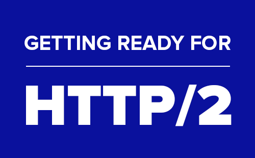
In this article, Rachel Andrew will look at the basics of HTTP2 as they apply to web designers and developers. She’ll explain some of the key features of the new protocol, look at browser and server compatibility, and detail the things you might need to think about as we see more adoption of HTTP2. You will get an overview of what to consider changing in your workflow in the short and long term. Rachel will also include plenty of resources if you want to dig further into the issues raised....| Smashing Magazine
You may not have thought much about lists, although we use them frequently in our markup. Many things can be marked up quite logically as a list. There is more to styling lists in CSS than you might think. In this article, Rachel Andrew starts by looking at lists in CSS, and moving onto some interesting features defined in the CSS Lists specification — markers and counters.| Smashing Magazine
I went over to dribbble in search of fresh webdesign ideas - how hard is it to build a non-standard layout, given the modern CSS tools we have today? An experiment on CodePen.| Max Böck