CSV to data visualization – in seconds! Flourish makes it easy to create real-time charts and maps without needing to manually republish them. Learn more in our blog post.| Flourish
Wondering how to make a box plot? Read our box-and-whisker diagram guide to discover the essential elements of a box plot and quickly make your own with Flourish.| Flourish
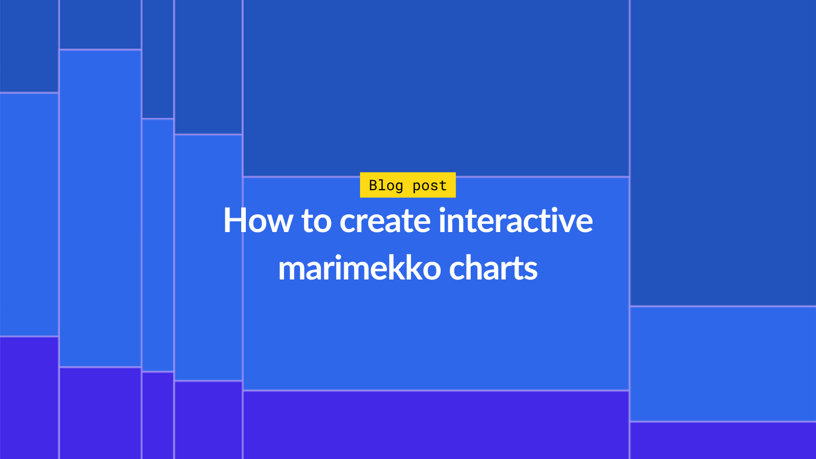
Marimekko charts are great for comparing categorical data while considering the relative proportions of each subcategory. You can now easily create a Marimekko chart with Flourish!| Flourish
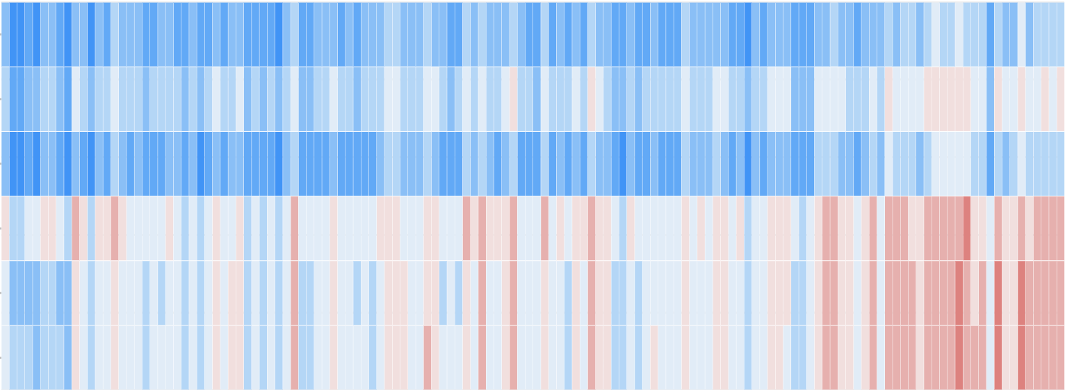
Explore heatmap examples and learn how to make interactive and mobile-friendly heatmap visualizations with Flourish. Create everything from categorical heatmaps to climate stripes.| Flourish
Show rich regional data with clear, easy comparisons. Discover how grid maps simplify trends like election results, population shifts, and more!| Flourish
Discover how to effortlessly create dynamic parliament charts. Explore how to compare election results, customize colors, adjust layouts, and more to craft stunning and interactive parliament charts.| Flourish
Explore common map types and learn how to make choropleth maps, point maps, proportional symbol maps, arc maps, hex maps and more with Flourish, a tool for data visualization and storytelling.| Flourish
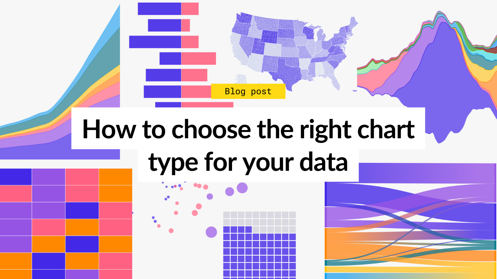
Learn how to visualize trends and patterns effectively with key chart types like line, area, and bump charts. Transform complex data into clear insights.| Flourish