CSS Media Queries Guide | CSS-Tricks
CSS Media queries are a way to target browser by certain characteristics, features, and user preferences, then apply styles based on those things.| CSS-Tricks
Breakpoints are customizable widths that determine how your responsive layout behaves across device or viewport sizes in Bootstrap.| getbootstrap.com
1. | drafts.csswg.org
1. | drafts.csswg.org
Understanding| www.w3.org
CSS Media queries are a way to target browser by certain characteristics, features, and user preferences, then apply styles based on those things.| CSS-Tricks
2023 年は主要ブラウザでの CSS のサポート状況が大幅に向上し、ウェブデザインの可能性が大きく広がりました。この記事では、新たに使用できるようになった CSS の機能を踏まえたうえで、2023 年 12 月時点での個人的な CSS の書き方や方針をまとめます。| griponminds.jp

The Media Queries Level 4 Interaction Media Features — pointer, hover, any-pointer and any-hover — are meant to allow sites to implement different styles and functionality (either CSS-specific interactivity like :hover, or JavaScript behaviors, when queried using window.matchMedia), depending on the particular characteristics of a user’s input device.| CSS-Tricks
1. Introduction| www.w3.org

With container queries now on the horizon - will we need media queries at all?| Max Böck
1. Introduction| drafts.csswg.org
1. Introduction| www.w3.org
1. Introduction| www.w3.org
1. Introduction| drafts.csswg.org
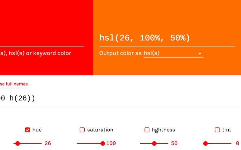
After two weeks of usage and great feedback, I made a handful of bug fixes and feature additions to the tiny color tweaker that could.| tylergaw.com