The CSS `clamp()` function is often paired with viewport units for “fluid” font sizing that scales the text up and down at different viewport sizes. As common as this technique is, several voices warn that it opens up situations where text can fail WCAG Success Criterion 1.4.4, which specifies that text should scale up to at least 200% when the user’s browser reaches its 500% maximum zoom level. Max Barvian takes a deep look at the issue and offers ideas to help address it.| Smashing Magazine
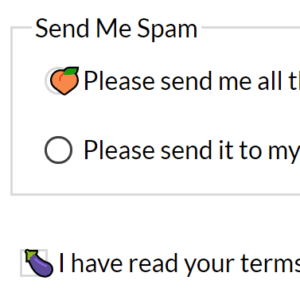
Note: September 25, 2021 If you do not need to support IE, Legacy Edge, or older versions of Firefox, then I encourage you to ignore this post and instead read Scott O’Hara’s post One last time: custom styling radio buttons and checkboxes. Updated August 17, 2019 I have updated this…| Adrian Roselli
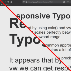
Typography that responds to viewport width (‘fluid’ or ‘responsive’ typography) can be useful when you want to ensure text does not get clipped or spill out of some design elements. Carousels, widget controls, or my Venn diagram are some examples. I say viewport width because I rarely see responsive type…| Adrian Roselli
In this article, Adrian Bece will explore fluid typography principles, use-cases, best practices, implementation with CSS clamp function and how to calculate the right parameters. He’ll also show you how to address some accessibility concerns and watch out for one important issue that you cannot fix as of yet, but have to be aware of regardless.| Smashing Magazine