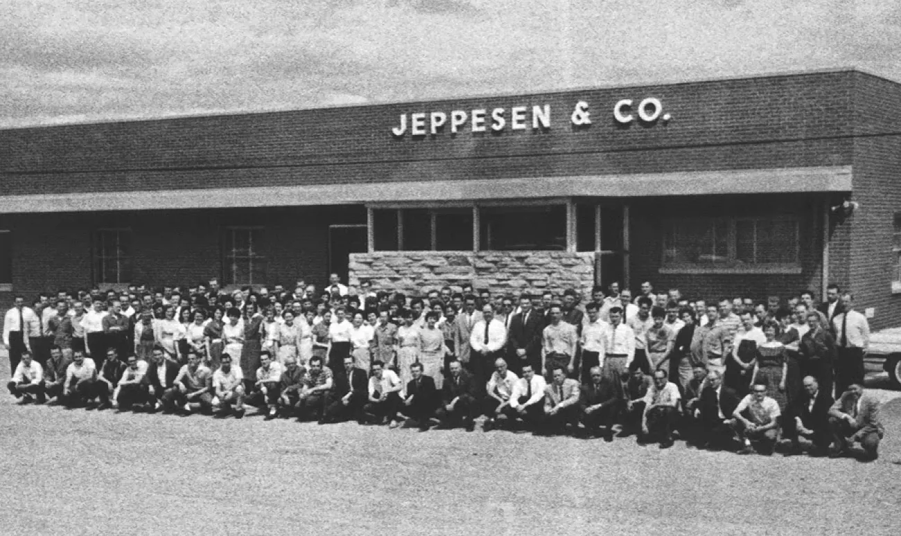
Farewell, Paper Jepps
It’s the end of an era. After nearly a century of keeping pilots flipping, folding...| International Ops 2025 – OPSGROUP
It’s the end of an era. After nearly a century of keeping pilots flipping, folding...| International Ops 2025 – OPSGROUP
Fall — my favorite season ‘cept for the fading of the light — has fallen here in Minnesota, and our thoughts are turning towards the question of what kind of winter it will be: easy or miserable. My winter is coming triple mile markers loom, the first dead ahead: Will it snow by Halloween? Will […]| Logos con carne

The Minnesota Twins did not have a good 2025 season. They finished their summer with a 70-92 (.432) record — putting them fourth in the AL Central. A record like that normally means last place in t…| Logos con carne

Gearbox Software title debuts at No.1 following September 12 release, ranks third in overall year-to-date sales| GamesIndustry.biz

In 2019 Chris Dalla Riva was the first hire when music-streaming service Audiomack set up its analytics team.| Music Ally
Ghost of Yōtei is the biggest first-party launch for PlayStation in Europe since Marvel's Spider-Man 2, according to GSD data. Read more| GamesIndustry.biz Latest Articles Feed
It was 2015, a year that has been etched into my memory. Barcelona had just conquered football, sweeping La Liga, the Copa del Rey, and.. The post Breaking Stereotypes in Women’s Football appeared first on Nightingale.| | Nightingale | Nightingale

Mortgage rates are on their way up.| journal.firsttuesday.us

The California Buyer Purchasing Power Index (BPPI) tells us a homebuyer with the same income is able to borrow 1.47% less purchase-assist mortgage money than a year ago.| journal.firsttuesday.us

Over the last few decades, savings has followed a path conversely proportionate to consumer confidence.| firsttuesday Journal
Available downloadable charts to the Winter 2022/23 issue of Vogue Knitting Magazine The post Winter 2022/23 appeared first on Vogue Knitting Magazine.| Vogue Knitting Magazine
Available downloadable charts to the Fall 2022 issue of Vogue Knitting Magazine The post Fall 2022 appeared first on Vogue Knitting Magazine.| Vogue Knitting Magazine
Available downloadable charts to the Spring/Summer 2022 issue of Vogue Knitting Magazine The post Spring/Summer 2022 appeared first on Vogue Knitting Magazine.| Vogue Knitting Magazine

WWDC is only weeks away, so it's time for me to update my wishlist. One wish came true last year, how many will it be in 2023?| FlineDev Blog – Insights on Swift, Xcode, and Apple Development
Interactive data-driven stories are an increasingly common way to communicate complex information—climate change, election outcomes, etc. Often, however, they are built for a broad audience... The post Why audience age matters: The Influence of Audience Age on Engagement with Interactive Narrative Visualization appeared first on Nightingale.| | Nightingale | Nightingale
Cross between New York City neighborhoods and you’ll be transported. Parents crowd Park Slope’s stroller-lined streets, where the child-to-adult ratio is rising–defying citywide trends in.. The post What your New York Neighborhood Says About You (Backed by Data) appeared first on Nightingale.| | Nightingale | Nightingale

We don't know whether you have noticed, but there are many phrases we casually let loose that cry out for visualisation.| Nightingale

I was invited to an elementary school in the Bay Area to introduce kids to the wonderful world of data.| Nightingale
Can you imagine using a computer without a mouse, keyboard, or touchscreen? Why would we even need to do that? In this article, we will learn how virtual on-screen ‘lenses’ can be controlled using eye-tracking technology, to magnify and show additional details on charts. Using your eyes to control a computer has some unexpected challenges, … Continue reading Look, no hands! Exploring data with your eyes→| Advait Sarkar
GT2 Pro members, download a high-res version of this image that you can use royalty-free anywhere:| Good Tech Things
Aloha and a happy new year...| Harmonic Code
Aloha,| Harmonic Code

Recently, I concluded a 6-weeks intensive Data Analytics Course in our local community.| Nightingale
Have you ever experienced cooking in a batch but end up messing the process due...| Writer | Food | Chef
GT2 Pro members, download a high-res version of this image that you can use royalty-free anywhere:| Good Tech Things

Now that I have your attention, let me ask you three simple yes-or-no questions.| Nightingale

We asked a data scientist what Q1 asset data tells us about the housing market. His finding? When gold rises early in the year, housing prices tend to fall soon after.| Spreadsheet Point
I’ve been posting images on Twitter and elsewhere lately that are largely green squares with red dots on them. While I intend to write a longer post on that later, for now, I’ll make a quick explanation of them. A sample image from January 4th is below; there is also a webpage with an updated … Continue reading "DIY Network Monitoring"| Xkeeper's blog
GT2 Pro members, download a high-res version of this image that you can use royalty-free anywhere:| Good Tech Things

Home prices falter across the metropolitan areas of California at the end of 2024.| journal.firsttuesday.us

As one of his first acts as president, Donald Trump has withdrawn the United States from the World Health Organization (WHO). Trump signed the executive order citing issues with the WHO's COVID-19 plandemic response.| SHTF Plan

What’s a broker to do until home sales volume takes off?| firsttuesday Journal

Where are mortgage rates now? Check out our weekly interest rate update to track the latest market rates.| firsttuesday Journal

In today's world, you need to run very fast just to stay in place.| Nightingale
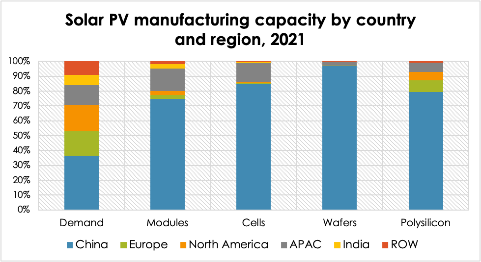
China dominates all phases of global solar energy equipment manufacturing.| Coalition For A Prosperous America
Many claim that school choice hurts public schools; in reality, research shows that it can actually help public schools!| OAK - Opportunity for All Kids

For more information, check out our ESA Fact Sheet!| OAK - Opportunity for All Kids

“If you give a donkey two servings of food, equidistant apart and of equal quality, then the animal starves.| Nightingale

This article is part 10 in a series on data exploration.| Nightingale

Wrestling with which data fit for a design is challenging, but it’s vital to avoid overstuffing designs that end up valuing content over negative space...| Nightingale

Many thinkers, especially those with an inkling of analytic idealism, lament how we have “taken the map for the terrain. ” The map is a metaphor| Nightingale
Our Spotify playlist of the best pop of 1964 The post Zenith: The Album appeared first on THIS IS ZENITH 1964 from Transdiffusion.| THIS IS ZENITH 1964 from Transdiffusion

Observation: The way to people's hearts through analytics is through their stomachs! This spring, while traveling around the world, I visited the capital...| Nightingale

In every field of human endeavour, the impulse to generalise—the urge to find parallels—never goes away fully.| Nightingale

In the business of consulting, our clients rely heavily on data visualization to make sense of complex information and drive decision-making.| Nightingale
It’s important to know exactly what kind of projects are used for each LEED rating system, no matter which exam you plan on taking. You will more than likely be asked questions about this on the exam, so I created this helpful chart to organize all of the information for you. Note that the Building […]| Green Exam Academy – Tips and Tricks to Pass the LEED AP Exam

Dashboard design elements There are five important elements to consider in the design phase for building great data visualizations.| Nightingale
GT2 Pro members, download a high-res version of this image that you can use royalty-free anywhere:| Good Tech Things
Log into your GT2 Pro account to download a high-res version of this image that you can use royalty-free anywhere:| Good Tech Things

Our first public release of EdWise in summer of 2015 included this mapping functionality.| Nightingale
Chart.js is a cool open source JavaScript library that helps you render HTML5 charts. It is responsive and counts with 8 different chart types. In this tutorial we are going to explore a little bit of how to make Django talk with Chart.js and render some simple charts based on data extracted from our models. Installation For this tutorial all you are going to do is add the Chart.js lib to your HTML page: <script src="https://cdn.jsdelivr.net/npm/chart.js@2.9.3/dist/Chart.min.js"></script> You...| Simple is Better Than Complex
I’m delighted to announce that I have been awarded the 2021 MusicID Digital Research Fellowship. In MusicID’s news post, founder and CEO Roger Press is quoted as saying ‘The Committee thought Dr Gamble’s submission was targeted, interesting, showed a clear methodology, and would make the best use of the MusicID platform. We also appreciated that Dr ... Read more| Dr Steven Gamble
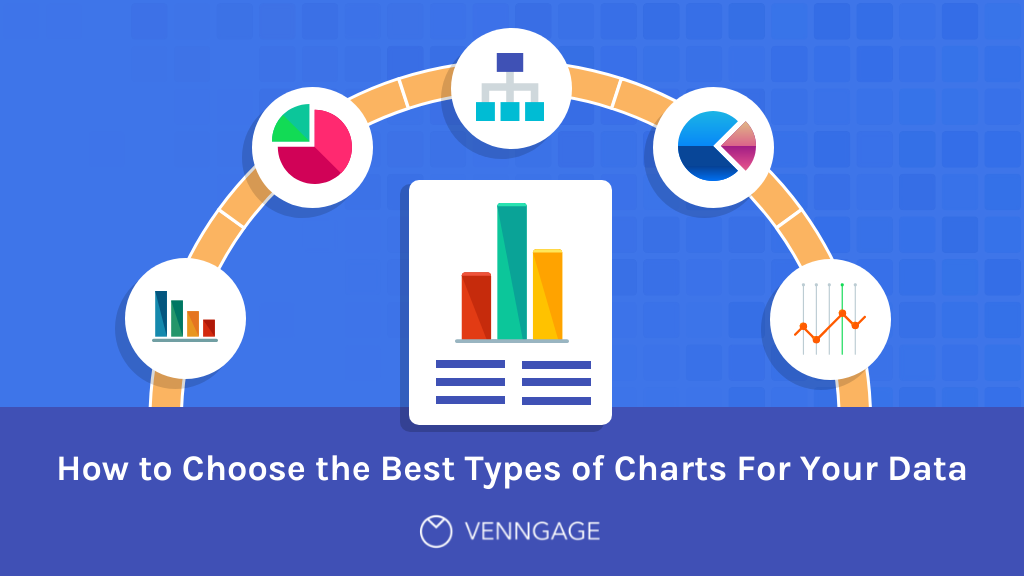
This guide will help you choose the best charts for your infographics so that you can make sure you are getting your data across in the best way possible...| Venngage
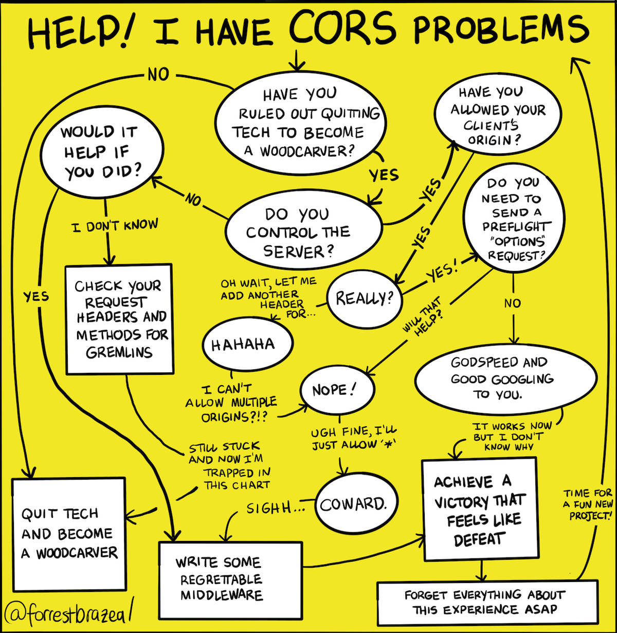
If you really are stuck, here are some actual helpful CORS resources: * Jake Archibald's unusually readable and informative history of why CORS is the way it is, plus his hands-on playground * Julia Evans' serious comics * The Mozilla docs on various CORS errors and how to resolve them Log into your| Good Tech Things
Log into your GT2 Pro account to download a high-res version of this image that you can use royalty-free anywhere:| Good Tech Things
The story of hip hop’s commercial success in the 21st century is one of a steady decline followed by a striking ascent. At the turn of the millennium, hip hop held a major presence on the charts, but never accounted for more than a sixth of the best-selling albums. By the end of 2020, hip…| Dr Steven Gamble

We typically think of charts as the end result of data analysis. To create a chart in Excel, you must first select some data. To produce a chart in Python or R using charting libraries, you must pr…| Advait Sarkar
Log into your GT2 Pro account to download a high-res version of this image that you can use royalty-free anywhere:| Good Tech Things
