
Edit raw files non-destructively with Serif Affinity Photo 2 | Amateur Photographer
Serif Affinity Photo 2 has lots of options for editing raw shots non-destructively, giving numerous options while keeping the original intact| Amateur Photographer
Serif Affinity Photo 2 has lots of options for editing raw shots non-destructively, giving numerous options while keeping the original intact| Amateur Photographer
In 1952, toward the end of the Korean War, Chilseong Shipyard was established in Sokcho, South Korea. The humble family operation built ships and served as a local fishery for generations. In 2017, third-generation owner Choi Yoonseong and his partner Baek Eunjeong restored it as a cultural space to preserve the shipyard’s legacy for future generations, so they could connect with the site. The new Shipyard includes a café, exhibition space, and playground, and also has a new look with a cu...| Typographica
Aside from being a delightful typeface family, Almost opens the door to the discovery of fifteenth-century printing types.| Typographica
Laica’s dislocated shapes and sprawling texture walk a fine line between sublimity and grotesqueness, as the world in 2019 also appeared to teeter on the brink of conflicts and crises.| Typographica
XingKai Next aims to find a place for a classical calligraphy face in contemporary graphic design. XingKai is a popular calligraphic typeface designed by Ren Zheng in 1980, inspired by the calligraphy works of Wang Xizhi in the fourth century. It has been digitized by numerous foundries and has appeared in all corners of China. While the design is indisputably popular, it is showing its age in various ways, not the least of which is old-fashioned aesthetics. Instead of dismissing it as mere a...| Typographica
The fonts of Jean Jannon, a.k.a. the would-be Garamond, were underrated by twentieth-century typographers. François Rappo sets the record straight with his crisp JJannon.| Typographica
With type styles and influences as divergent as contrasty Didones, chunky Clarendons and straightforward Transitionals, Quinn is a nicely done portmanteau. It can be used for sedate text as well as shouty yet elegant headlines.| Typographica
Antonia is a contemporary serif typeface that interlinks a sharp-edged character with cheerfulness. Combining characteristics that don’t seem to be compatible is one of the most difficult arts of type design and was one of the trends I recognized this year. Most often, such attempts result in unconventional display type. Sometimes, though, they add a fresh note to a more serious genre.| Typographica
Where other fonts are promoted as workhorses, this one is a mule. It is often said that “workhorses” do their work without a murmur, quietly and in the background, conforming to the text they carry without coming to the fore themselves. Those are not horses, but chameleons and butlers. Elmer’s mules will deliver the job without pretending to go unnoticed.| Typographica
Reduction in letterform has always been an appealing type-design idea. Trying to find the magical point that removes enough to create something new, but not so much that the vitality of the original is lost and the form becomes lifeless, is a subtle art.| Typographica
The difficulty in creating a Hangul–Latin multiscript design lies in the disparities between the tools of their original letterform constructions. While Latin type design descends from the broad-nib pen, Hangul descends from a pointed brush. Arvana meets these challenges by creating rhythm and fusing these different calligraphic models in an elegant, kinetic, and energetic manner.| Typographica
But what is Role all about? Anything. Or, almost. That’s its strength. In fact, when asked to detail what I found interesting about the family, my first thought was, “It’s not interesting.” As a book designer, that’s what I like. It’s a cohesive collection of good letterforms designed to help tell a story, not be the story.| Typographica
With Mexica, Gabriel Martínez Meave sought to create an ideal complement to Nahuatl, the indigenous language of the Aztecs spoken by about 1.5 million people today. His aim, not just to salute Nahuatl but to design a better tool for it, is evident and commendable.| Typographica
Although Pierre Haultin was a sixteenth-century Parisian punchcutter, the typeface bearing his name looks more like a seventeenth-century Dutch type than a sixteenth-century French one: sturdier, more angular, more compact.| Typographica
FS Kim’s liveliness confidently evokes a calligrapher’s hand. Flair, character, heft, and a touch of self-consciousness — FS Kim is both versatile and really rather lovely.| Typographica
Once in a blue moon, a revival contributes something missing, something lost. Berthe is rarer still because it actually contributes two things that today elude mainstream typography: a congenial evolution of the theatrical Didone style of type, and a viable alternative to the so-called “true” italic.| Typographica
Before I saw Kris Sowersby’s Heldane, I used to lament that Van den Keere didn’t receive as much enthusiasm from type designers as he deserved. Instead of directly interpreting a specific typeface, Sowersby summarizes what constitutes Van-den-Keere-ness, which he then refines and exaggerates.| Typographica
In an era of 1970s-inspired chonky serif typefaces, Empirica, by Tobias Frere-Jones and Nina Stössinger, traces the serif’s historical roots back much, much further. If the Romans had designed lowercase letters (and bold and italic letters), what would they look like?| Typographica
For Study, Jesse Ragan transformed Rudolph Ruzicka’s 1968 hand-lettering into a typeface that “feels somehow calligraphic, metal, and digital all at the same time.”| Typographica
DJR pushes type past expected usage: whether it’s his super-heavy take on De Vinne that exists somewhere beyond the intended design’s theoretical limits, or the Venetian-inspired Fern that performs robustly at tiny sizes while retaining calligraphic style, gesture, and intention.| Typographica
Adega Serif est une police à empattement très expressive, avec sa grande finesse renvoyant aux police renaissances, mais aussi avec des choix esthétiques propres, comme de larges contrepoinçons et la présence, parfois, de courbures inhabituelles (comme sur le e ou le k). Son auteur, Brésilien, la destine avant tout à de la communication imprimé … Continuer à lire ... "Adega Serif"| Une liseuse & des polices
Après Luiss Sans, Luiss Serif complète la gamme de polices d’écritures destinées à assurer une identité visuelle propre à une université italienne privée. Etant assortie à Luiss Sans, Luiss Serif en reprend les mêmes proportions, notamment une hauteur d’x faible, mais avec un aspect de police à empattements, dotée d’un contraste entre pleins et … Continuer à lire ... "Luiss Serif"| Une liseuse & des polices
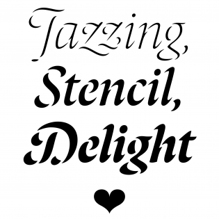
Bogidar Mascareñas has done something in type design that I absolutely love: he began with a commonly known premise and took it to a place where no one has been before. Laima: a stencil? It has been called that, and I guess it could work as one, but that’s not really what it is. It’s something that started at the stencil idea and was taken to another mental space entirely.| Typographica
