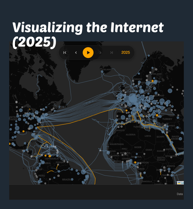
An all-new interactive map of the Internet, showing the evolution of undersea cables and internet exchanges with year-by-year animation and detailed statistics.| kmcd.dev
The structure of the data as released and the interactive tool to visualise it are a mess of bad choices that get in the way of helping other analysts derive useful understanding from the data. They could do much better. | policyskeptic
This is a guest blog post is from one| The Flerlage Twins: Analytics, Data Visualization, and Tableau
Long waits in A&E kill patients. A new analysis of mortality and A&E waits by the ONS–despite issues in the analysis and presentation of the...| policyskeptic.blogspot.com
In one of my many 'playing around with map stuff and then posting it on twitter' adventures, I recently posted a kind of comet map - see below. This started off as something completely different but once I had the basic idea I then wondered what kind of data I could apply it to, and that's why I did it to the UK political map of 2019. Read on below for how I did it, as well as how you can replicate it pretty easily in QGIS. Scroll straight to the bottom if you're just looking for the 'how-to'...| Stats, Maps n Pix
We’re once again thrilled to have a guest blog post from our regular contributor, Kasia Gąsiewska-Holc . Based in Poland, Kasia works remot...| The Flerlage Twins: Analytics, Data Visualization, and Tableau
Chart Spark by Alli Torban is a book about cultivating creativity through data visualisation. Find out more!| Voilà:
Analysis of the link verification feature in the fediverse.| stefanbohacek.com
A look at custom emoji used across the fediverse.| stefanbohacek.com
What it takes to power fediverse's curation system.| stefanbohacek.com
Exploring fediverse domain blocks, an important tool that keeps the fediverse safe.| stefanbohacek.com
Searching for popular posts on federated social media.| stefanbohacek.com
Visualizing the visual spectrum of the sun. Spectrum analysis, wavelengths of light, data visualization| kmcd.dev
Exploration of the exhibition "Huellas de desaparición" (Traces of disappearance) at La Tertulia Museum in Cali, Colombia.| Voilà:
Today, our theme is dinosaurs, which made me think about the Datasaurus Dozen! This wild set of datasets is an extension of the famous Anscombe’s Quartet. Despite having completely different-looking distributions when plotted, every single one of the Datasaurus Dozen datasets has the exact same summary statistics. The Datasaurus Dozen is a great reminder for all us data folks to always look beyond summary statistics like the mean and standard deviation to truly understand what’s going on ...| ddanieltan.com
Today’s theme is a data day, so I went over to browse the interesting datasets available from the Asian Development Bank. I found this dataset that shows the inflation levels for Asian countries from 2019 to 2023, with forecasted numbers for 2024 and 2025. As always, I enjoy analysing data from my home region as it’s less widely covered on a global news. So I thought to focus my chart on Southeast asia, in particular, I wanted to highlight the volatile inflation levels experienced by coun...| ddanieltan.com
Weather Today’s theme is Weather and I while searching for inspiration I came across these beautiful wind rose charts from the Lets-Plot gallery.opted for a simple interpretation of showing the changing monthly temperature distribution over a year. Data is taken from a Python version of Forecasting: Principles and Practise. As always, I like to adapt the examples to my home country of Singapore and data for Singapore’s wind readings was provided by Iowa State University’s Iowa Environme...| ddanieltan.com
Today’s theme is Historical and I opted for a simple interpretation of showing the changing monthly temperature distribution over a year. Data is taken from a Python version going through what I consider the best time series textbook, Forecasting: Principles and Practise. Codeimport polars as plfrom lets_plot import*LetsPlot.setup_html()bikes = pl.read_csv('https://raw.githubusercontent.com/nshahpazov/fpp-in-python/master/data/bikes/day.csv')daily_temp = (bikes .filter(pl.col("yr") ==1) # 2...| ddanieltan.com
Family For today’s #30DayChartChallenge, the theme is “Family.” I must admit, my mind initially wandered to the Kardashians – but let’s move on from that little embarrassment! I’ve been eager to experiment with Sunburst charts during this challenge. In my opinion, these visually striking charts have a unique ability to convey hierarchical relationships in a captivating way. Fortunately for me, the Python Plotly library comes equipped with a pre-built sunburst module, making my tas...| ddanieltan.com
The general consensus in data visualization is that tables aren’t great. This is because they don’t leverage any preattentive attributes ....| The Flerlage Twins: Analytics, Data Visualization, and Tableau
Today’s theme is Waffle and I would like to create a waffle chart. Waffle charts are excellent for displaying and comparing proportions or part-to-whole relationships within a dataset. They are particularly useful when you want to show how a whole is divided among different categories or segments. However, my visualisation library of choice lets-plot does not have a pre-made “geom” or layer specifically for waffle charts. This means that I have got to get a bit more hands-on to make one...| ddanieltan.com
Note This post is my contribution to this year’s #30DayChartChallenge. Check out my Day 1 post to learn more. Makeover Makeover day has arrived, folks! Time to dust off those old relics from the ancient data catacombs and give them a fresh coat of paint. Today’s lucky candidate? A vintage scatter matrix plot taken from an introductory Data Science course I took many years ago. The original scatter matrix plot, seen in the “Before” image, uses both histograms and scatter plots in a 4 p...| ddanieltan.com
Note This post is my contribution to this year’s #30DayChartChallenge. Check out my Day 1 post to learn more. Neo Today’s theme is Neo, and since I couldn’t immediately think of an associated chart, I decided to go with my first instinct: create something related to the groundbreaking 1999 movie, The Matrix. I remember watching The Matrix as a kid and being amazed by its mind-bending plot, cool 90s fashion, and fluid action scenes. Codeimport numpy as npimport polars as plfrom PIL impor...| ddanieltan.com
When I was young I used to watch reruns of the original Star Trek. But I didn’t know they were Read Now The post Tableau Trek: Exploring and Using New Features of Tableau and Tableau Prep at #DATA19! appeared first on VizPainter.| VizPainter
Last year, I went home from the Teknion Christmas party with a shiny, new Nest Learning Thermostat. Sure, I was Read Now The post Tableau Prep Tackles Nest Thermostat Data appeared first on VizPainter.| VizPainter