
Flexbox vs. Grid Containers in Elementor | by Greatives
Find out what are the Flexbox vs Grid Containers in Elementor, their benefits, and in which case you should choose each one of them.| Premium WordPress and HubSpot Themes
Flexbox can be difficult to understand just by using it. In this post, I explain what the browser does when you use display: flex to trigger a flex formatting context.| Los Angeles WordPress & web developer - Webinista, Inc.
Find out what are the Flexbox vs Grid Containers in Elementor, their benefits, and in which case you should choose each one of them.| Premium WordPress and HubSpot Themes

Tables once ruled web design, with nested tables causing both creativity and chaos. Replaced by CSS for layouts, they’re now a nostalgic tool still essential for data.| Web Designer Depot

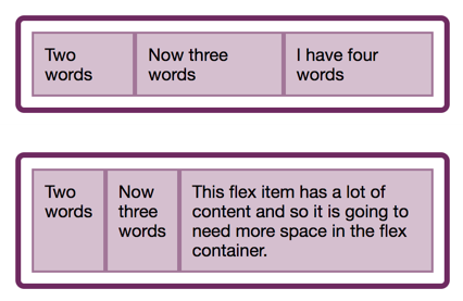
In the last two articles, we have looked at what happens when we create a flex container, and also taken a look at alignment. This time we explore the often confusing issue of sizing in Flexbox. How does Flexbox decide how big things should be? In this article, Rachel Andrew will explain some of the finer points of how Flexbox works out how big the flex items are. It can seem a little academic, however, taking some time to understand the way this works can save you huge amounts of time when u...| Smashing Magazine

For the entire history of CSS Layout, being able to properly align things on both axes seemed like it might truly be the hardest problem in web design. The alignment properties that you might think of as the flexbox alignment properties are now fully defined in the Box Alignment Specification. If you have ever been confused about when to align and when to justify, this article will make things clearer! Today, Rachel Andrew will take a look at the alignment properties in Flexbox while discov...| Smashing Magazine
In this article, the beginning of a series on Flexbox, Rachel Andrew will take a detailed look at what actually happens when you add display: flex to your stylesheet. She will take the initial values of Flexbox, in order to explain what actually happens when you say display: flex. It’s a surprising amount once you begin to unpack it, and contained within these few properties are many of the key features of flex layouts.| Smashing Magazine
In more recent years, design systems and component libraries have gained popularity. There is also a desire to build once, deploy anywhere. Meaning a component developed in isolation is intended to work in any number of contexts to make building complex interfaces more efficient and consistent. CSS container queries have landed and are now available for experimentation. Let’s look at what problem is being solved, learn how container queries work, and see how they compare with and complement...| Smashing Magazine
You'll learn how to leverage CSS Flexbox to recreate a layout from Spotify's mobile app| Freshman — Articles and Tutorials on Software Development
Learn how to use the Flexbox layout model to recreate a real-world product feature list| Freshman — Articles and Tutorials on Software Development
Learn how to use the Flexbox layout model to recreate a real-world navigation bar| Freshman — Articles and Tutorials on Software Development
A comprehensive tutorial to help you understanding the fundamentals of Flexbox layout| Freshman — Articles and Tutorials on Software Development

Our comprehensive guide to CSS flexbox layout. This complete guide explains everything about flexbox, focusing on all the different possible properties for the parent element (the flex container) and the child elements (the flex items). It also includes history, demos, patterns, and a browser support chart.| CSS-Tricks
