Today I launch my photography website for family, friends, and anyone who lands there to enjoy my pictures. For a long time after quitting Instagram in 2021, my photos were nowhere to be seen. Sometimes I would post a few pictures on my blog but it never felt quite right. I thought there had to be a reason to publish one or more pictures, or a similarity between them to build a story. With infinite gratitude to Simone for helping me so much, I am happy and proud to launch my new photography w...| Design & other obsessions by Silvia Maggi
Learn how to fix Elementor responsive design issues and ensure your site is fully optimized for mobile, tablet, and desktop devices. This guide covers breakpoints, customizing layouts, and testing your site on real devices for a smooth user experience. The post How to Fix Elementor Responsive Design Issues on Mobile & Tablet appeared first on Essential Addons for Elementor.| Essential Addons for Elementor
Do you want to build web pages but have no prior experience? This friendly guide is the perfect place to start. You'll begin at square one, learning how the web … - Selection from Learning Web Design, 6th Edition [Book]| O’Reilly Online Learning
Getting text to scale well across screen sizes takes a bit of work. Like many developers, I started with @media queries to manually adjust font sizes and| QBurst Blog
Web design software makers saw the pain caused by the design to developer hand off and built features to help. Unfortunately, these features don’t help as much as the software makers hope. At best, they are unwanted features to be ignored. At worst, they reinforce faulty assumptions that undermine design systems.| Cloud Four
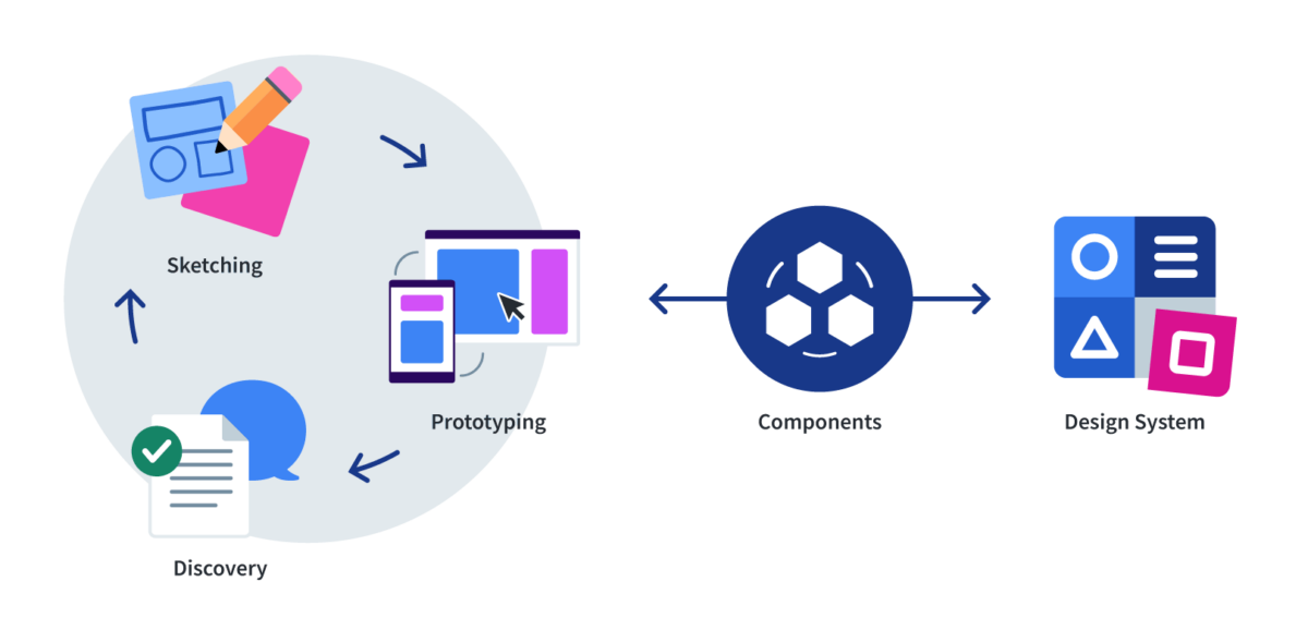
The traditional web design process hopes that static mockups—representing mobile, tablet, and desktop breakpoints—provide developers with everything they need to know to turn the designs into functional web pages. In reality, design happens between breakpoints.| Cloud Four
Boost your marketing campaigns with our free, easy-to-edit, and responsive newsletter templates that work across all devices and email clients.| Speckyboy Design Magazine
Responsive design sprints are a significantly better way to design and build for today's web than the traditional web design process. We provide the receipts. Unfortunately, not every organization can adopt this responsive design sprints. Why is that and what can be done about it?| Cloud Four
Responsive design broke the traditional web design and development process in fundamental ways. Despite this fact, many organizations continue to use this broken process.| Cloud Four
The web is being experienced on a wider range of screen resolutions than ever, but 1366 x 768 has remained steady as the most common for some years now. So| New Now
Over the last few years, we’ve written a quite a few articles about responsive images. Now that responsive images have landed in browsers, it seemed like a good time to step back and cover the basics for those who are just starting to tackle responsive images. Ergo, a…| Cloud Four