There are methods that enable the naming of lines and even grid areas. Using these methods enables easier placement of items by name rather than number, but also brings additional possibilities when creating systems for layout. In this article, Rachel Andrew will take an in-depth look at the various ways to name lines and areas in CSS Grid Layout, and some of the interesting possibilities this creates. Try not to get hung up on what is “right” or “wrong”. If you find a method confusi...| Smashing Magazine
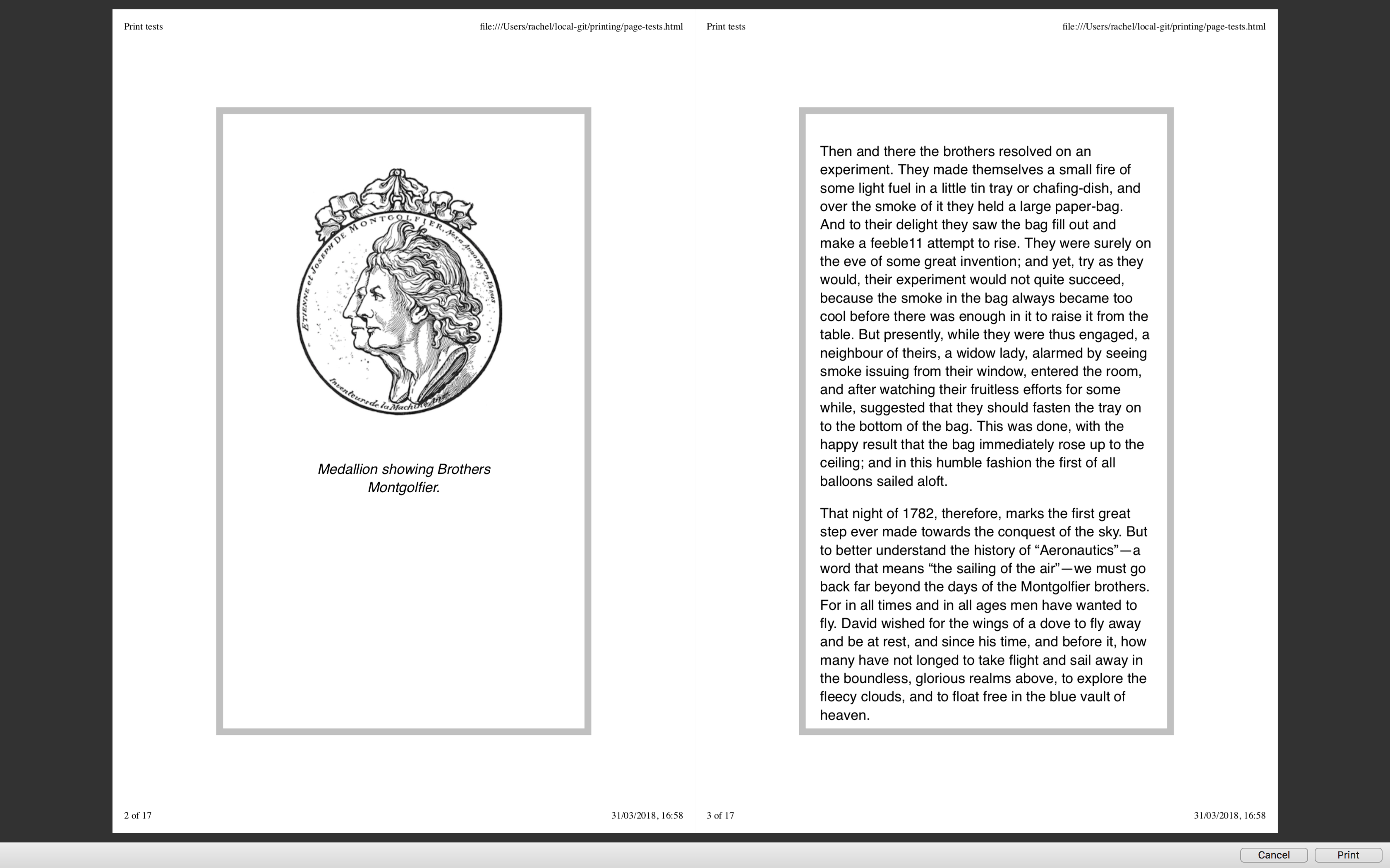
Printing pages directly from the browser is an experience that can lead to frustration with enormous images being printed out. We have covered print stylesheets in the past here on Smashing Magazine, but in this article, Rachel Andrew takes a look at the state of printing from the browser today. She will show you how you should include print styles in your web pages, and look at the specifications that really come into their own once printing.| Smashing Magazine
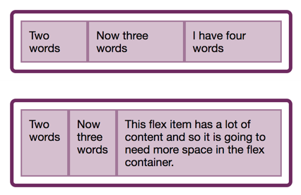
In the last two articles, we have looked at what happens when we create a flex container, and also taken a look at alignment. This time we explore the often confusing issue of sizing in Flexbox. How does Flexbox decide how big things should be? In this article, Rachel Andrew will explain some of the finer points of how Flexbox works out how big the flex items are. It can seem a little academic, however, taking some time to understand the way this works can save you huge amounts of time when u...| Smashing Magazine
In this article, the beginning of a series on Flexbox, Rachel Andrew will take a detailed look at what actually happens when you add display: flex to your stylesheet. She will take the initial values of Flexbox, in order to explain what actually happens when you say display: flex. It’s a surprising amount once you begin to unpack it, and contained within these few properties are many of the key features of flex layouts.| Smashing Magazine
In more recent years, design systems and component libraries have gained popularity. There is also a desire to build once, deploy anywhere. Meaning a component developed in isolation is intended to work in any number of contexts to make building complex interfaces more efficient and consistent. CSS container queries have landed and are now available for experimentation. Let’s look at what problem is being solved, learn how container queries work, and see how they compare with and complement...| Smashing Magazine
This members-only tutorial provides the steps to display primary navigation menu at the left, title area in the middle and secondary navigation menu at the right in Genesis Sample. Between 960px and 1399px (inclusive) we shall center the site header elements one below the other. 959px and below, it will appear as usual. with the menu…| Sridhar Katakam
You may not have thought much about lists, although we use them frequently in our markup. Many things can be marked up quite logically as a list. There is more to styling lists in CSS than you might think. In this article, Rachel Andrew starts by looking at lists in CSS, and moving onto some interesting features defined in the CSS Lists specification — markers and counters.| Smashing Magazine
Dynamic properties provide opportunities for new creative ideas, but also the potential to add complexity to CSS. Custom properties have a huge potential to change how we write and structure CSS and to a lesser extent, how we use JavaScript to interact with UI components. To get the most out of them, we might need a strategy for how we write and structure CSS with custom properties. In this article, Michael Riethmuller will show you how.| Smashing Magazine