Learn how to use Calc and Clamp to build responsive WordPress layouts. Discover what fluid CSS is, why it matters, and how modern builders like Gutenberg, Elementor, and Kadence support these functions.| Crocoblock
H2O Biofouling Solutions would like to invite you to visit us at the Aqua Netherlands Trade Fair. The event will take place in Gorinchem, The Netherlands on March 19, 20 & 21, 2024.| H2O Biofouling Solutions
In-No-Plastic (Innovative approaches towards prevention, removal, and reuse of marine plastic litter) is a three-year, EU-funded project that aims to develop and demonstrate nano-, micro-, and macro-plastic clean-up technologies in aquatic ecosystems.| H2O Biofouling Solutions
Thanks to the work of the In-No-Plastic project, which represents the synergies between technologies and community, you can dive into the plastic journey, uncovering the reality of plastic waste plaguing our lands and seas.| H2O Biofouling Solutions
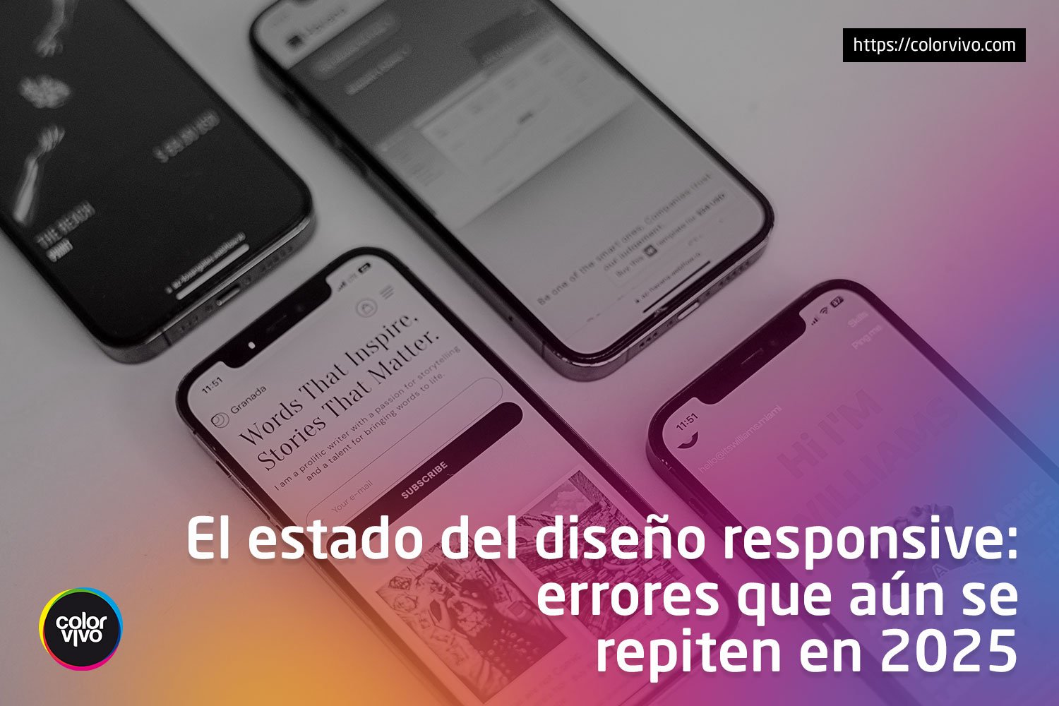
Han pasado más de diez años desde que el diseño responsive se volvió el estándar para sitios web modernos. En 2025, ya no es una tendencia, sino una| Color Vivo Internet
The biggest appeal of Flutter is being able to create apps that can run on multiple devices with just a single codebase. With the stable release of Flutter for the web, the apps you create become even more accessible.Even though the apps you create will run on all compatible devices, we are faced with the […] The post Create Responsive Flutter Apps with Minimal Effort appeared first on Reso Coder.| Reso Coder
In this guide, we’ll explore how to effectively prepare your corporate symbol for different uses, focusing on key steps like resizing, formatting, and adapting your design to meet the unique needs of each platform.| Zeka Design
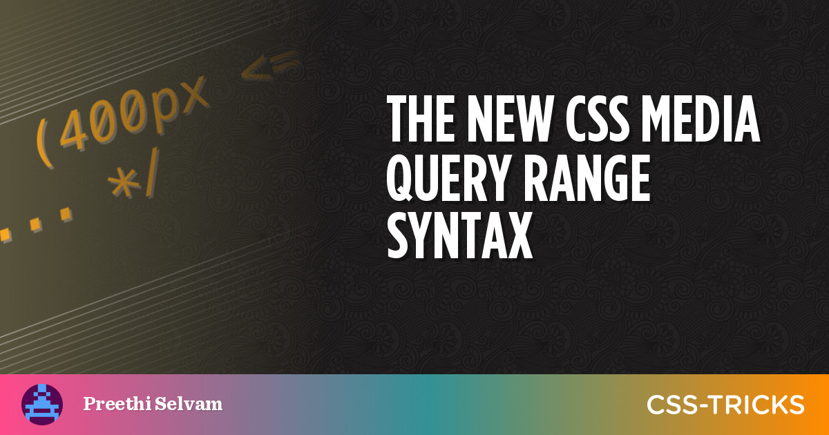
The Media Queries Level 4 specification has introduced a new syntax for targeting a range of viewport widths using common mathematical comparison operators, like , and =, that make more sense syntactically while writing less code for responsive web design.| CSS-Tricks
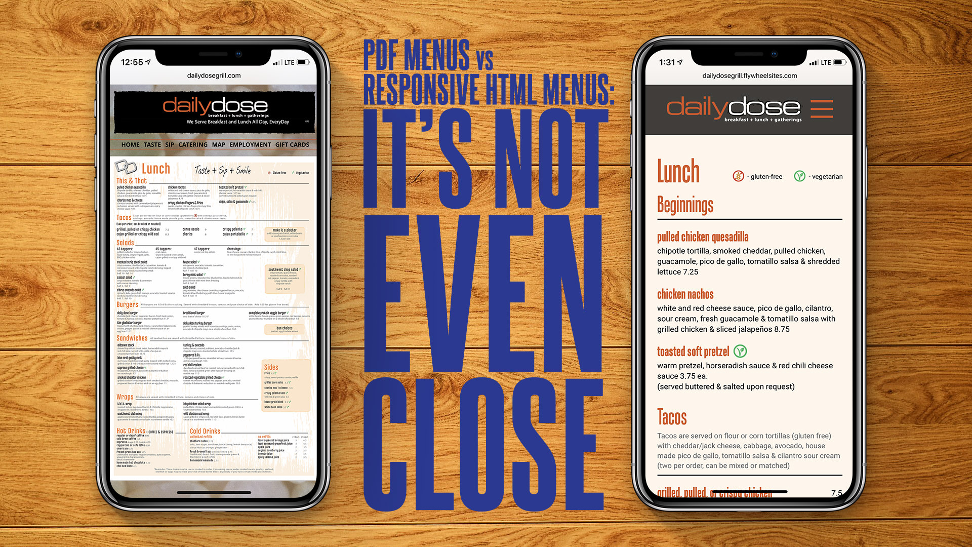
PDF menus on your restaurant website are bad for you and bad for your prospective customers. Why? What's better? Spoiler alert: it’s responsive HTML menus.| zenzino | design
You now have more fine-tuned control over how your websites behave on different screen sizes with Genesis Blocks. With the v1.3 release, we’ve introduced new responsive style controls that let you| StudioPress
Welcome to image alignment! The best way to demonstrate the ebb and flow of the various image positioning options is to nestle them snuggly among an ocean of words. Grab a paddle and let’s get started.| Mon(IoT)r Research Group


