
Piktochart vs Canva: Which One (If Any) Is Worth For You?
Comparing Piktochart vs Canva? Explore features, pricing, pros and cons, and find out if a third option is better for your design needs.| Venngage
Comparing Piktochart vs Canva? Explore features, pricing, pros and cons, and find out if a third option is better for your design needs.| Venngage
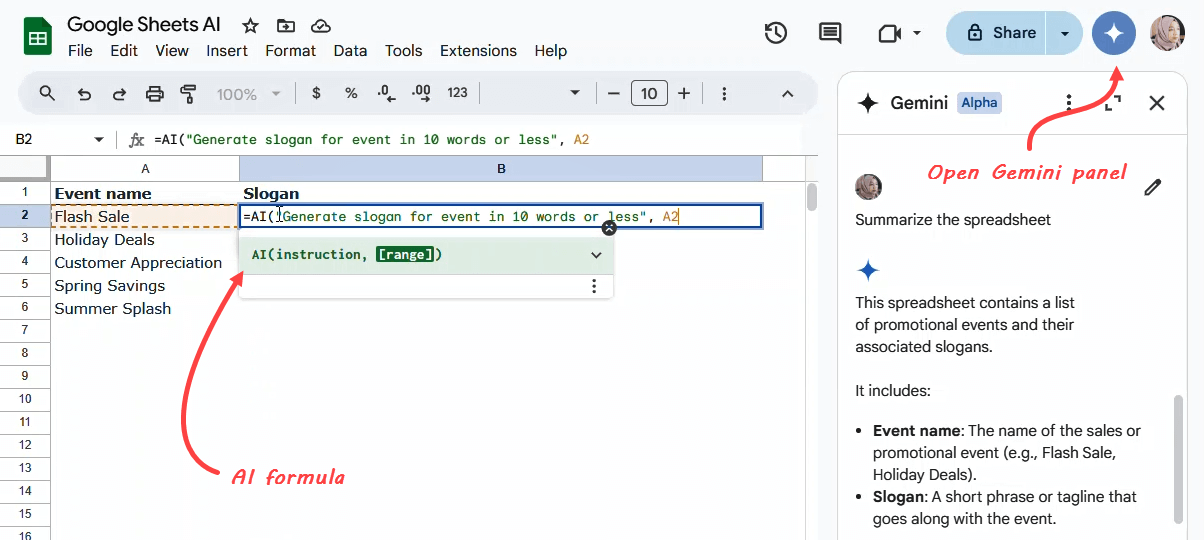
Master the Google Sheets AI formula with our quick guide. Learn to generate text, summarize information, categorize data, and analyze sentiment directly in your spreadsheets.| Coupler.io Blog
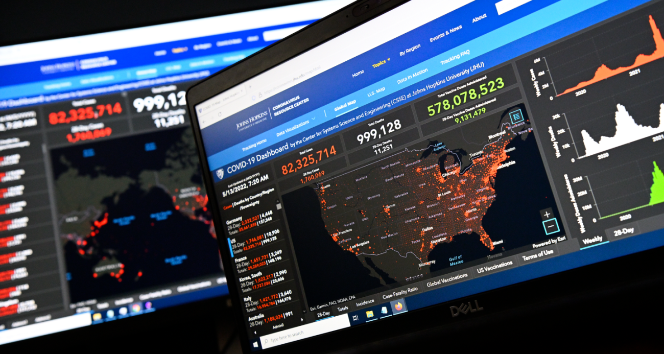
Experts say the tragic milestone, now recorded by the Coronavirus Resource Center tracker, likely occurred months ago and that higher vaccination rates could have prevented many fatalities| The Hub
Looking for ready-to-use Looker Studio Marketing dashboards? We’ve gathered 19 of the best for you to try out. The post 32 Best Looker Studio Marketing Dashboards for Data-Driven Decisions appeared first on Coupler.io Blog.| Coupler.io Blog
Microsoft Power BI is fast becoming one of the leading business intelligence applications. If you’re serious about a data career you need to be an advanced Power BI user. In this article I take a look at the different ways you can quickly learn Power BI and open up roles... Read more » The post 3 Fastest Ways To Learn Power BI In The UK & Progress Your Career appeared first on Big Data Analytics News.| Big Data Analytics News
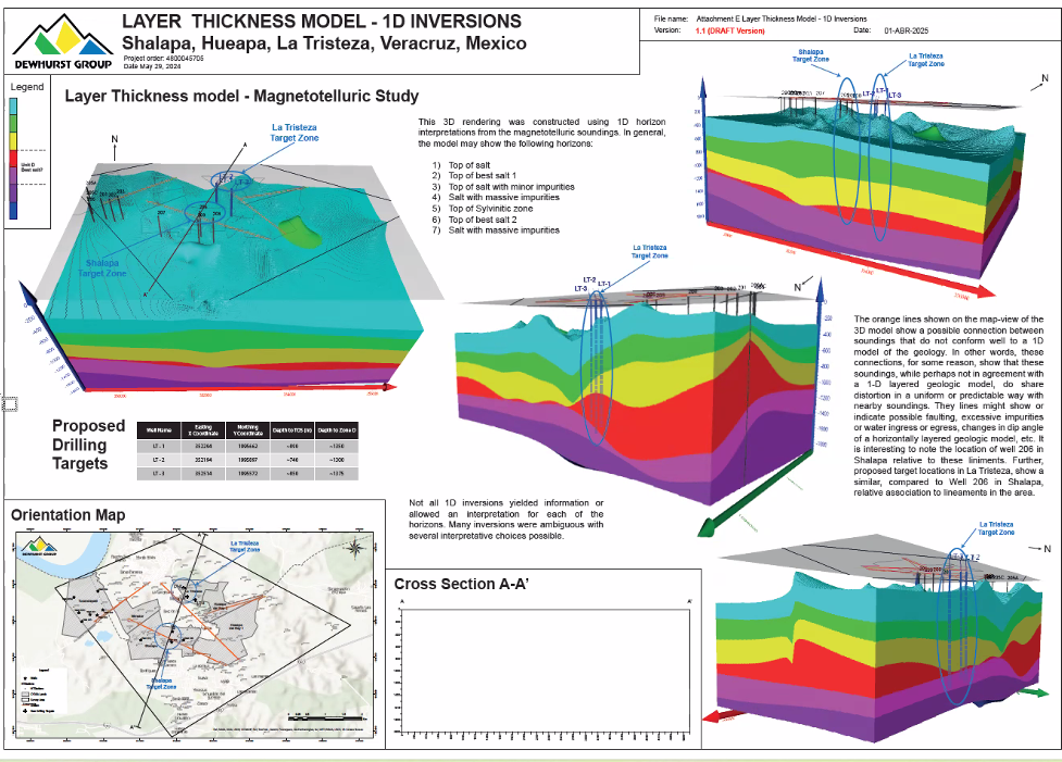
Recently, the Dewhurst Group had to take an untraditional data analysis approach to create a monster map that visualized pure salt in Mexico.| Golden Software
200 years of data visualization: Where 2026 trends are taking us Content This year we’ve seen it rise, and as we head towards 2026, visual storytelling is becoming an essential part of the research process. Picture this: You’ve just wrapped up a comprehensive market research study. The data is rich, the insights are golden, but […] The post 200 years of data visualization: Where 2026 trends are taking us appeared first on Forsta.| Forsta
It was 2015, a year that has been etched into my memory. Barcelona had just conquered football, sweeping La Liga, the Copa del Rey, and.. The post Breaking Stereotypes in Women’s Football appeared first on Nightingale.| | Nightingale | Nightingale

Do you know individuals who seem to focus on one thing for their whole life? I’m on the opposite side of the scale.| Nightingale
How Professor Mine Dogan Is Preparing Future Scientists at WMU’s Hydrogeology Field Camp Every summer, Western Michigan University (WMU) hosts a Hydrogeology Field Camp, an immersive, hands-on experience designed to equip the next generation of scientists with the tools they’ll need to succeed in the field. The camp lets students [...]| Golden Software

Learn how to create a benchmark report. Discover key components, data collection methods, and visual templates to present insights clearly.| Venngage
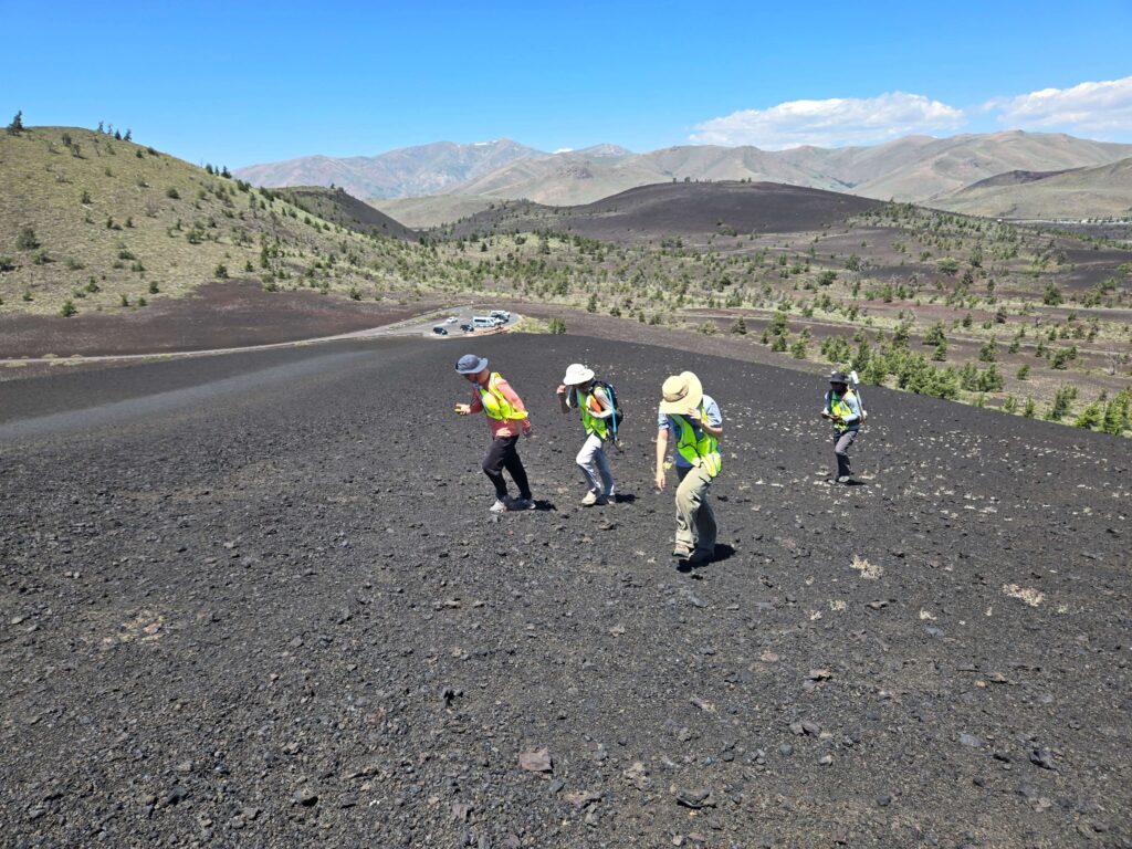
Get a glimpse into the University of South Florida's field camp, which includes a geophysics course in Idaho, advanced equipment, and Surfer.| Golden Software
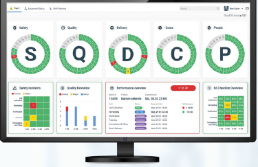
Eschbach's visual factory approach helps pharmaceutical plants overcome data chaos by using SQDCP boards and AI to provide clear, actionable insights, enabling teams to make faster, more informed decisions and accelerate batch release.| Drug Discovery and Development
Why use a map? Imagine a map of your hometown. Seeing that a creek runs along main street or that there are connecting side streets running adjacent to that one highway with the notorious stoplight is the kind of spatial information that could meaningfully impact your life. Now imagine a map of a town you’ve... The post Brain Cartography: Mapping a place that everyone knows, but (almost) no one has ever been appeared first on Stamen.| Stamen
The EU Data Act has become a critical focal point for organisations managing digital assets, data-sharing arrangements, and smart technology services across the EU. Designed to foster a single market for data, the Act introduces significant changes in how businesses access, use, and share data—particularly for companies operating in digital... Read more » The post Top Tips for Businesses on Ensuring Compliance with the EU Data Act appeared first on Big Data Analytics News.| Big Data Analytics News
Andy Cotgreave, Amanda Makulec, Jeffrey Shaffer, and Steve Wexler have a new book coming out on September 23, 2025—Dashboards That Deliver: How to Design, Develop,.. The post Behind the Scenes: Dashboards That Deliver appeared first on Nightingale.| | Nightingale | Nightingale
Dashboards That Deliver: How to Design, Develop, and Deploy Dashboards That Work, the upcoming book by Andy Cotgreave, Amanda Makulec, Jeffrey Shaffer, and Steve Wexler,.. The post Review: Dashboards That Deliver appeared first on Nightingale.| | Nightingale | Nightingale

Learning to read academic papers is a considerable challenge for many college students.| Nightingale
We're excited to announce the release of Heroku-Streamlit, a template that makes deploying interactive data visualization applications on Heroku simpler than ever before. Streamlit is an open-source app framework built for machine learning and data science projects. This Streamlit App brings together Heroku's scalable cloud platform and Streamlit's intuitive Python-based data application framework. Whether you're a data scientist, educator, or developer, you can now spin up a cloud-based Stre...| Heroku
The creation of visuals for three of the EU's monthly Data Stories| Visual Cinnamon
| Boost Labs – Digital Product Agency
| Boost Labs – Digital Product Agency
| Boost Labs – Digital Product Agency

Note: This blog post is part of a larger post I wrote for Sellers Dorsey and is available here. Have you ever explored a visualization where you can highlight a selected dimensional value, such as …| Viz Zen Data

Mozambique faces multifaceted challenges that make monitoring, evaluation, and learning (MEL) particularly complex. From protracted humanitarian crises in regions like Cabo Delgado to the effects of climate change in vulnerable rural areas, MEL practice requires innovative and adaptive approaches. This blog shares the practical experience of AVSI Mozambique and its partners in developing and implementing […]| Unstuck by UNDP
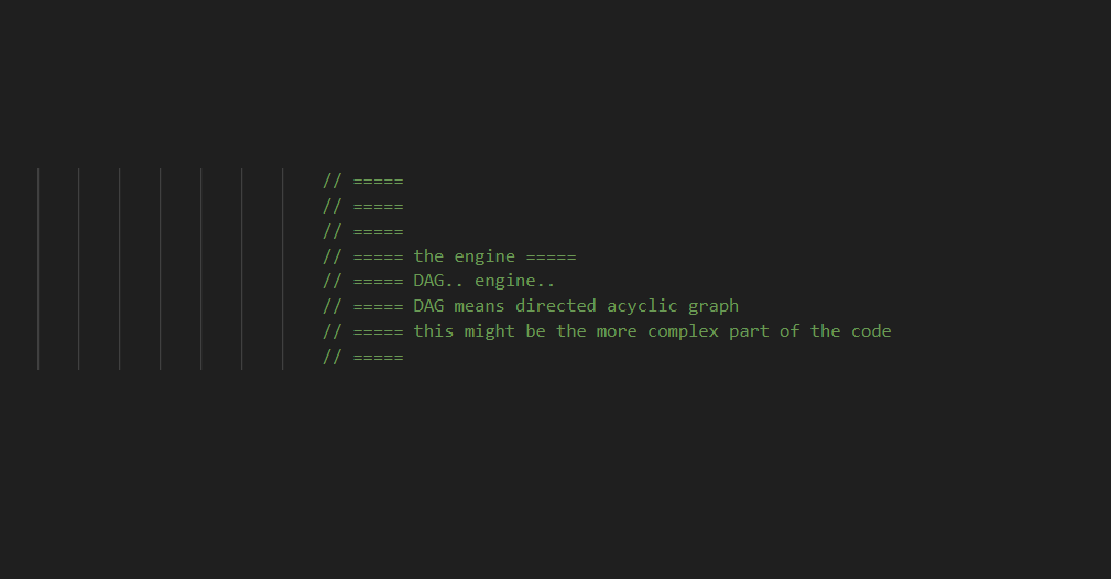
Familiar with graphs? How about DAGs? This is not a paradigm shift, but think of DAG as a cool way for tiny team in Austin/Dallas Texas to build an Extract Transform and Load software! Like a guitar pedal, there’s an input and output. Sometimes it’s just an output. Then you have your input only tools. […]| Dev3lop
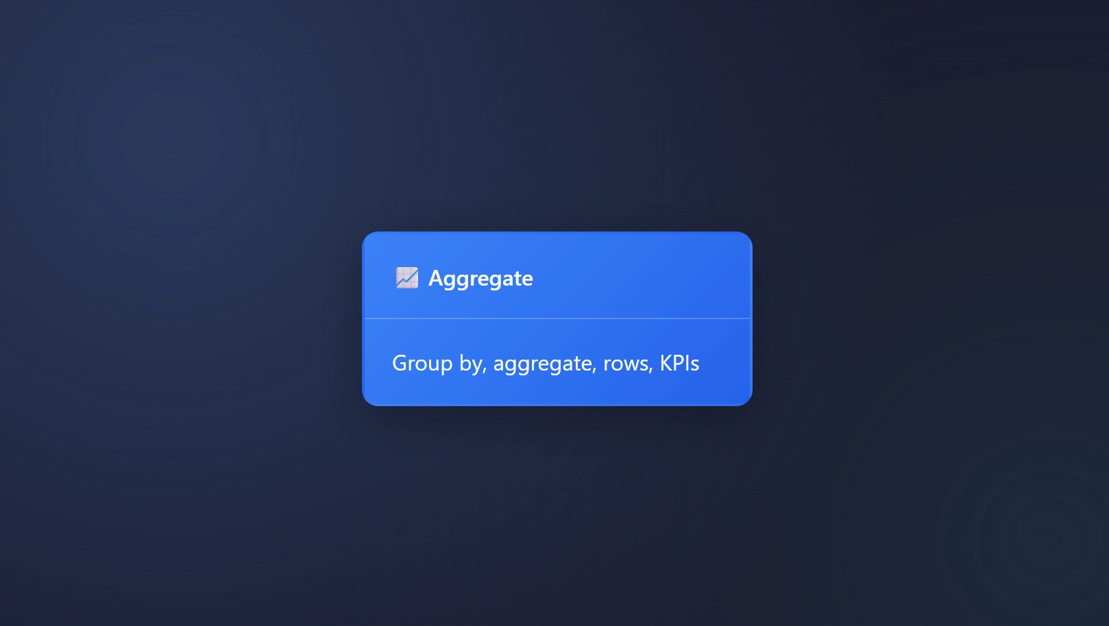
Aggregation, what a classic. Aggregating your data is a landmark trait for any data steward, data wrangler, or data analyst. In ET1, you can easily aggregate your data. The Power of Grouping (Group By) with the Aggregate Node Aggregations turn a sea of numbers into meaningful insights. Group by in ET1 is nested in the […]| Dev3lop
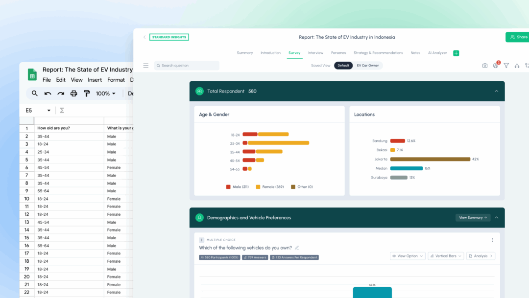
Learn how to visualize survey data in 3 easy steps. Discover the best free survey data visualization tools and create interactive reports in minutes.| Standard Insights

What separates a good chart from a great one? In this Data Viz Best Practices Webinar, Rebeca Pop, founder of Vizlogue, shares how data visualization can move beyond numbers and become a powerful tool for storytelling and change. Rebeca’s passion for data visualization began when she realized that most professionals were creating charts without the| Highcharts Blog | Highcharts
Last month, I led an interactive workshop at The Midwest Climate Adaptation Science Center’s Summer Symposium at the University of Illinois Urbana-Champaign in Urbana, Illinois. MW CASC is a consortium of research-focused academic, Tribal, and non-profit partners working collaboratively with the United States Geological Survey (USGS). The workshop focused on data visualization and mapping for... The post Data visualization and mapping for a scientific audience with USGS Midwest Climate Ad...| Stamen
Interactive data-driven stories are an increasingly common way to communicate complex information—climate change, election outcomes, etc. Often, however, they are built for a broad audience... The post Why audience age matters: The Influence of Audience Age on Engagement with Interactive Narrative Visualization appeared first on Nightingale.| | Nightingale | Nightingale
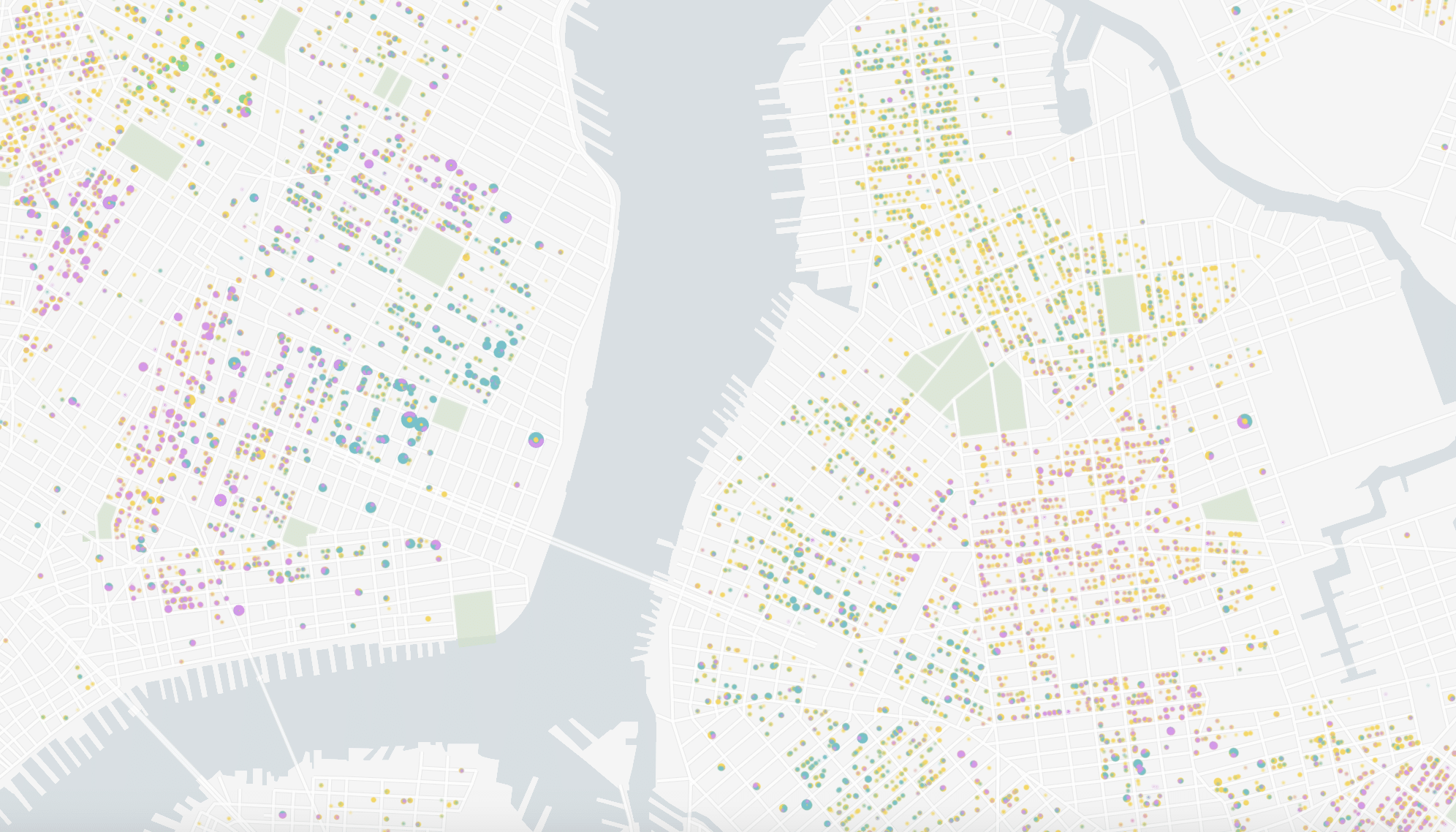
Cross between New York City neighborhoods and you’ll be transported. Parents crowd Park Slope’s stroller-lined streets, where the child-to-adult ratio is rising–defying citywide trends in.. The post What your New York Neighborhood Says About You (Backed by Data) appeared first on Nightingale.| | Nightingale | Nightingale

Do more foreigners mean more goals in English football?| blog.engora.com

An analysis of the effect of league tenure on goals scored for English football.| blog.engora.com
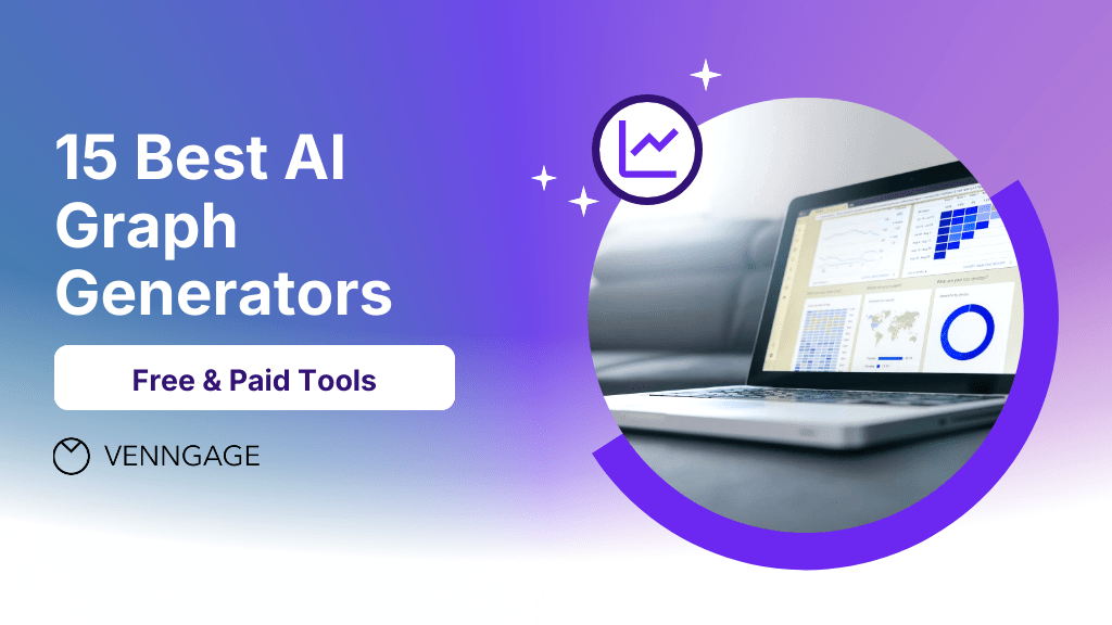
Explore the best AI graph generators to turn raw data into clear, engaging visuals fast. Compare free and paid options for every need.| Venngage
[Guest post by Mary E. Fissell, Professor in the Department of the History of Medicine, Johns Hopkins University]| The Innovative Instructor
In a world where digital noise is louder than ever, data-driven marketing is your strategic advantage. It empowers brands to make smarter decisions, personalize experiences, and ultimately drive higher conversion rate optimization. But collecting data isn’t enough, the key lies in transforming insights into actions that convert.| THAT Blog

"Bring your visions to life with custom 3D modeling services. From concept to creation, transform ideas into stunning, high-quality digital models for any industry.| Big Data Analytics News

12/11/2023 How to Read a Weather Map Weather maps are invaluable tools in forecasting weather conditions. They allow us to visualize complex meteorological data in a simplified manner. In this comprehensive guide, we'll delve deeper into understanding various elements of weather maps. How to Read a Surface Weather Map Surface weather maps provide a snapshot of various meteorological conditions at ground level. These maps include symbols representing different weather phenomena like rain, snow...| Meteomatics Articles - EN

11/27/2023 What Is a Weather Map? A weather map is a graphical representation that displays weather conditions across a specific geographical area. The depicted weather events can pertain to the past, present, or future forecasts. From a meteorological perspective, a weather map illustrates the current state of the atmosphere over a larger region. It provides information about various weather parameters, such as temperature, wind speed, wind direction, or precipitation. Weather observations o...| Meteomatics Articles - EN
How mastering data storytelling can transform your careerAs an industrial-organizational psychologist, I started my career with a clear plan. Study workplace behavior. Research. Consult. Maybe.. The post How Data Visualization Became My Career Catalyst appeared first on Nightingale.| | Nightingale | Nightingale
I’ve always been interested in the aesthetic side of dashboards beyond what the tools offer—importing custom backgrounds and graphic elements created outside of BI software.The.. The post Plastic Portrait: Visualizing Technical Skills Through Cable Ties appeared first on Nightingale.| | Nightingale | Nightingale

We don't know whether you have noticed, but there are many phrases we casually let loose that cry out for visualisation.| Nightingale

I was invited to an elementary school in the Bay Area to introduce kids to the wonderful world of data.| Nightingale
Data visualization tools provide many out-of-the-box elements that make our jobs as designers and developers easy. Tools like Tableau haveContinue reading| Viz Zen Data
The Theories We Learn As much as I’m a huge fan of color, I’m also an advocate for reducing itContinue reading| Viz Zen Data
Although summer is almost over, it is never too late to start to work on your beach body. My friends challenged me to do a sit-up every day for 100 days while increasing the number of sit-ups each day by one, so on the last...| InterWorks
In the modern world, we are constantly drowning in data. This overload is especially true for businesses, which examine key performance indicators (KPIs), financial data and customer feedback to make decisions. Strategic dashboards organize this information and provide clear, actionable insights, but so few make your job easier. They dump data in your lap and […] The post Creating Actionable Strategic Dashboards: Moving From Data Overload to Insight appeared first on AchieveIt.| AchieveIt
In a world where data guides our actions, dashboards are essential for decision-making. Yet, what if the visuals and tools we rely on to share this data aren’t accessible to all individuals? For example, imagine the challenges faced when the screen readers that some people depend on can’t read charts, when colors are indistinguishable for […] The post Accessible by Design: Making Data Visualization More Inclusive with Tableau appeared first on Kaleido Analytics.| Kaleido Analytics

A spread for Scientific American showing puzzling lack of exoplanets in a certain size range| Visual Cinnamon
Stamen is officially retiring Map Stack, a platform we previously hosted that gave everyone a straightforward way to mix and modify raster base maps. What was Map Stack? Created in 2013, Map Stack gave you an interface where you could select from a variety of raster base maps, tweak the images that made up the...| Stamen

Recently, I concluded a 6-weeks intensive Data Analytics Course in our local community.| Nightingale

From descriptive to prescriptive: How AI in data visualization is evolving from plotting the “What” to telling the “Why”.| Nightingale

Data viz expert Alberto Cairo explains how strong visual design sharpens your message and engages your audience. Communicators aren’t typically renowned for their data savvy. Writing, storytelling, crafting narrative – sure, they’ve got it. Numbers and data? Not necessarily their strong suit. Data literacy isn’t something communicators are typically trained on, said Alberto Cairo, associate […]| Ragan Communications
Nonprofit data maturity doesn’t begin and end with collecting donor data and impact information for internal fundraising use. Organizations with The post How to Use Data Visualization in Fundraising Reports appeared first on AlumniFinder.| AlumniFinder
You may have seen my previous blog post, A Review: Tableau’s Table Viz Extension, in which I reviewed Tableau’s Table Viz Extension and listed its pros and cons (if you haven’t checked it out, please do!). I wanted to see if this extension could replace the ‘Tableau trickery’ I use when creating a customized table […]| Kaleido Analytics
| Valentina Tanni
The Wait is Over. Watch this Tableau Dashboard Container Layout Video! This video was a long time coming. If you’ve ever dealt with layout containers in Tableau (which are about as intuitive as a Thomas Pynchon novel) you know they can leave you scratching your head if you’re new to the tool. And yes, I […]| Smoak Signals | Data Analytics Blog
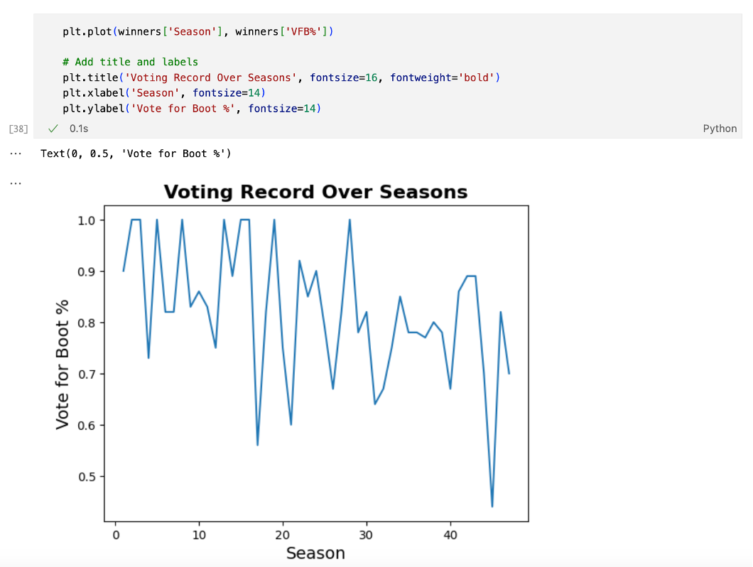
I am a die-hard Survivor fan. I was born the year after the show came out, and since then I have tuned in for every single episode, with season 48 being no exception. However, I’ve noticed a trend: the players I think are most deserving of the million dollars never end up winning! As a data lover, I was curious about what the stats said. What qualities make a Survivor winner? Did the players with the best stats end up winning the game? And, most importantly, can a model predict who will wi...| SAS Users

I love snowboarding: I’ve been doing it for the last 25 years.| SAS Users

This article will mark my last one as the Editor-in-Chief of Nightingale. It's time for me to pass the torch to our editorial team and reveal my master plan!| Nightingale

Now that I have your attention, let me ask you three simple yes-or-no questions.| Nightingale

Want to see data come to life? Explore data visualization examples that turn abstract numbers into visual stories.| Datamation

When dealing with chronic illnesses, it sometimes feels like you have less energy or time in the day to work with than someone without chronic diseases. The “spoon theory” is a helpful analogy to illustrate this. In spoon theory, each person has a certain number of “spoons” representing their daily energy available for tasks including…| DIYPS.org
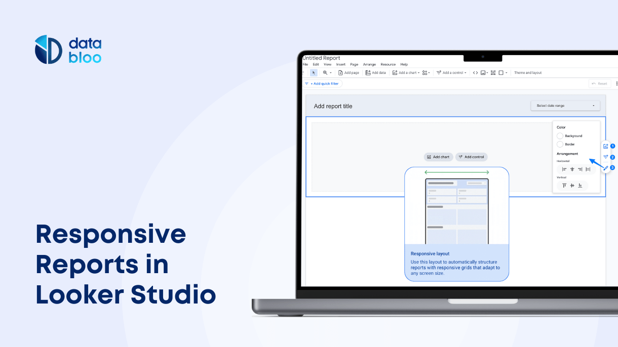
Learn how to create responsive reports in Looker Studio using mobile-friendly layouts and flexible sections to improve readability and performance across devices.| Data Bloo

What is the Connection Engine? The Congruence Engine (later renamed Connection Engine) is a three-year research project funded by the Arts and Humanities Research Council in efforts to digitally connect industrial heritage collections across the UK. Using advanced digital tools such as AI, it links museum objects, archives, photographs, and more, enabling historians and curators...| Stamen
Delve into white label analytics, its benefits, and use cases and get expert guidance on selecting the ideal solution tailored to your requirements.| Reveal Embedded Analytics
Learn what is the importance of drag and drop analytics, how it improves user experience and increases user satisfaction, and see it in action.| Reveal Embedded Analytics
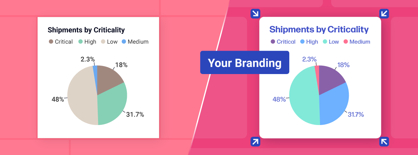
Learn about the benefits of custom visualizations, how they work in the Reveal platform, and how to easily create unique reports in just a few lines of code.| Reveal Embedded Analytics
A great embedded analytics solution can enhance data-driven decision-making and lead to improved outcomes with powerful, high-impact dashboards.| Reveal Embedded Analytics
Open Access Week is the perfect excuse to talk about a favorite topic of mine—making Smithsonian research more open! A couple years ago, I wrote a post about a Tableau more »| Smithsonian Libraries and Archives / Unbound
This analysis was made possible by the mdr R package, which used data originally compiled by Sam_Badi on Reddit. The data consists of all elevator dings in the Severance episodes along with the episode number, time stamp, pitch of the ding, and the action associated. Examining the plot below, we see across all dings the G is associated with both innie and outies going to sleep, the C# is consistently associated with both innies and outies waking up. (Spoiler: There is one notable exception, a...|
This analysis was made possible by the mdr R package, which used data originally compiled by the Severance wiki. Here, we create a little sentiment profile for each episode, binning them in three minute increments and calculating the AFINN average sentiment score in each. library(tidytext)library(mdr)library(tidyverse)df <- transcripts |>mutate(timestamp_seconds =as.numeric(timestamp), bin =floor(timestamp_seconds /180) *180) |>left_join(episodes, by =c("season", "episode"))df |>mutate(id = g...|
In this analysis, I use my mdr R package, which used data originally compiled by the Severance wiki. For each episode we count the number of words each of the four main characters (Mark, Helly, Dylan, and Irving) speak for in each minute and visualize them below. Click on the tabs to switch episodes. library(tidyverse)library(tidytext)library(ggiraph)library(mdr)make_plot <-function(input) {data <- transcripts |>mutate(speaker =case_when(grepl("Cobel", speaker) ~"Cobel", speaker =="Mark W"~"M...|
A Pluto.jl notebook containing simple graphs for evaluating Covid-19 situations in Vietnam| ltungv
Find out what is data-driven decision making and why is important. Learn about the 7 building blocks for becoming a data-driven company + examples and video| Reveal Embedded Analytics
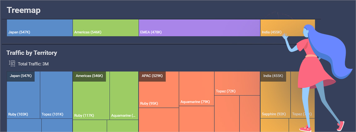
Treemap Chart Best Practices - Learn how to create Treemap Chart data visualizations using Reveal Embedded BI & Analytics.| Reveal Embedded Analytics

The start to 2025 saw the induction of four new Data Visualization Society board members.| Nightingale

The Error Message Longing or “How we should always treasure our mistakes" The conversation was loud and happy, scattered with high-pitched laughs that...| Nightingale

Stumbling into a small peer support community I arrived at Outlier 2021 eager to learn and explore.| Nightingale
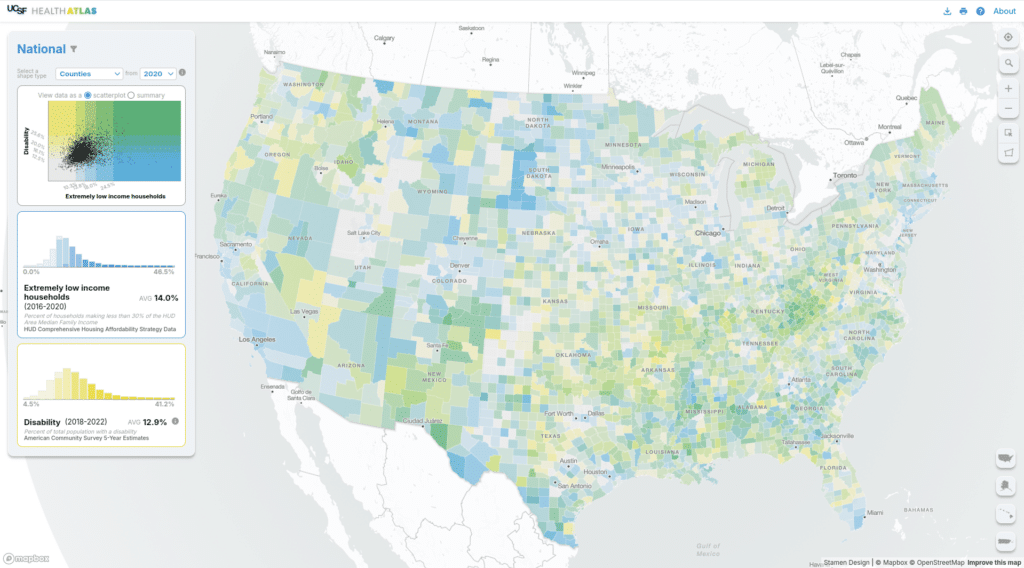
Stamen has been working with a team out of UCSF (University of San Francisco) Population Health and Health Equity to create and maintain their Health Atlas since 2019. You can read a bit about the initial launch in our blog post from 2020. In 2024 we had the opportunity to rebuild the Health Atlas and...| Stamen
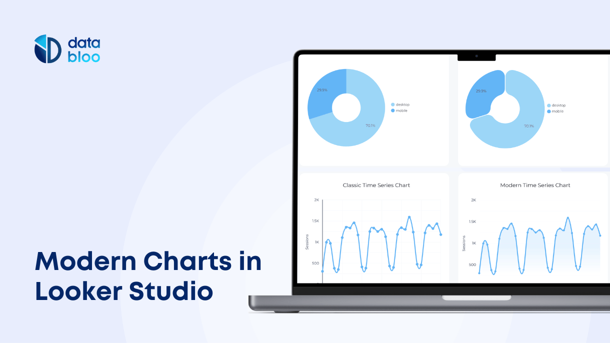
Discover Looker Studio's new Modern Charts with enhanced styling, rounded edges, gradients, and better customization for clearer data visualization.| Data Bloo

Discover the top secrets to smarter fraud detection in BFSI with real-time data visualization tools that drive proactive, data-driven responses to financial fraud.| Indium

An elaborate interactive network visualization showing how top contributors to a certain GitHub repository are connected to the (other) repos that they have made commits to| Visual Cinnamon

Feedback elevates work, but only when it is done right.| Nightingale
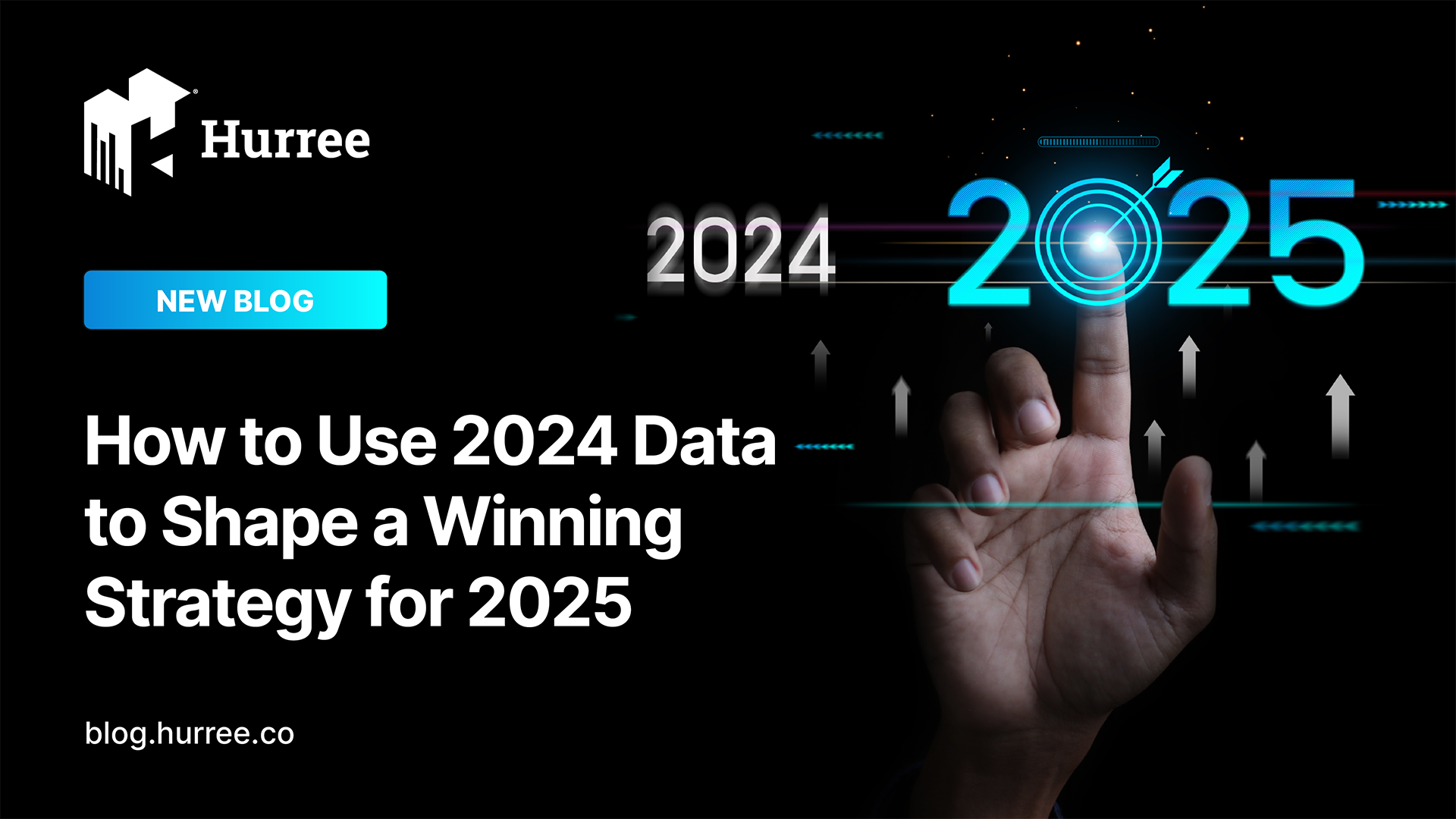
Unlock your business potential in 2025 by leveraging 2024 data insights. Learn how to set SMART goals, build strategies, and drive growth with effective data analysis.| blog.hurree.co
Content in this post comes from our presentation at the North American Cartographic Information Society (NACIS) 2024 Annual Meeting last week in Tacoma, WA. Mapping Historical New York: A Digital Atlas visualizes New York City’s transformations during the late-nineteenth and early-twentieth centuries both in terms of population and landscape. Drawing on 1850, 1880, 1910, and...| Stamen

CIESIN's mission is to make complex environmental, social and economic data easy to access and use so that people can make better decisions about pressing issues like climate change, disaster response and sustainable development.| State of the Planet
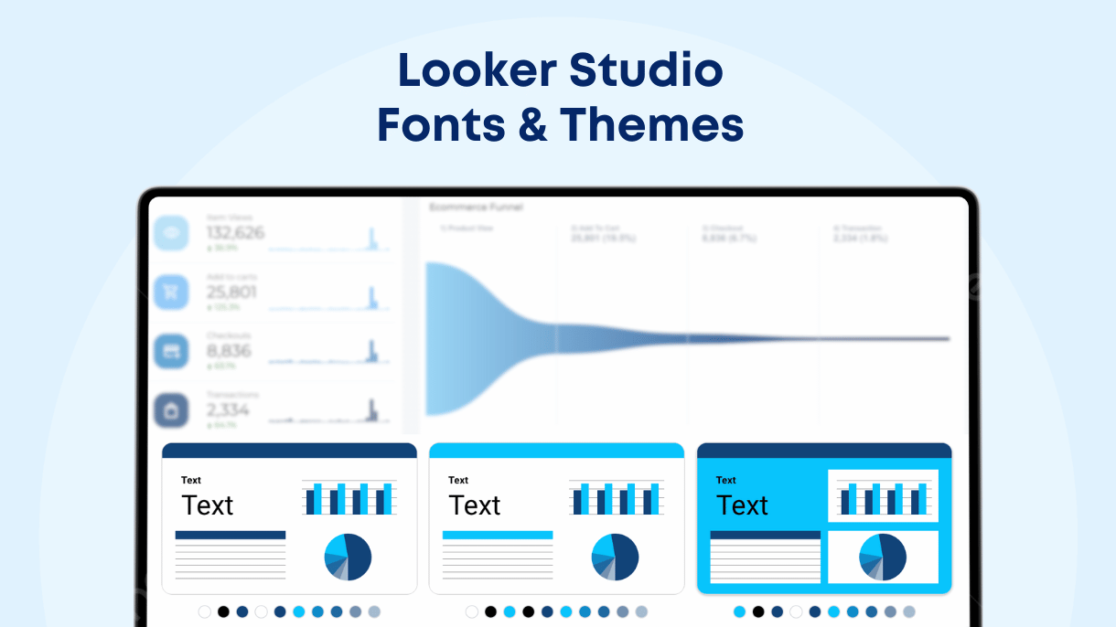
Learn how to use default and custom fonts, adjust themes, and apply dark mode or background images in Looker Studio to create professional and on-brand reports.| Data Bloo
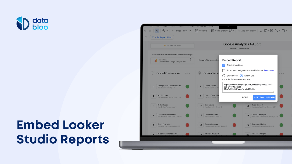
Learn how to embed Looker Studio reports into your website or other platforms, enhance branding, and optimize data sharing with custom parameters and practical solutions.| Data Bloo

How a person receives a product is as important as the product itself, with truck drivers being a great way in understanding this point.| Nightingale

The X,Y Files or "How do you communicate with extradatastrial clients?" The encounter took place in the last hours of the evening.| Nightingale

In today's world, you need to run very fast just to stay in place.| Nightingale

A look at one year's worth of edits of the English Wikipedia.| stefanbohacek.com
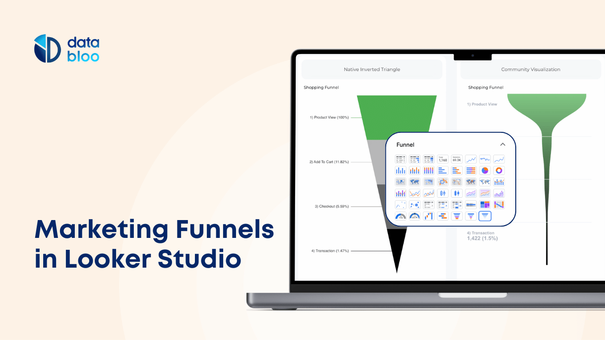
Learn how to create marketing funnels in Looker Studio using native charts and community visualizations. Discover types of funnels, metrics, data sources, and tips.| Data Bloo

In April of 2024, Taylor Swift released her latest album, The Tortured Poets Department (TTPD), which she wrote over the past two years, during her...| Nightingale

The Half-Full Learning Curve or “Could we be happy with what we already know?“ I sighed at the sight of the calendar I was holding in my hand.| Nightingale
Extensive book reviews about data visualization books| Visual Cinnamon


