Predict Trends with Linear Regression in Google Sheets (No Code Needed)
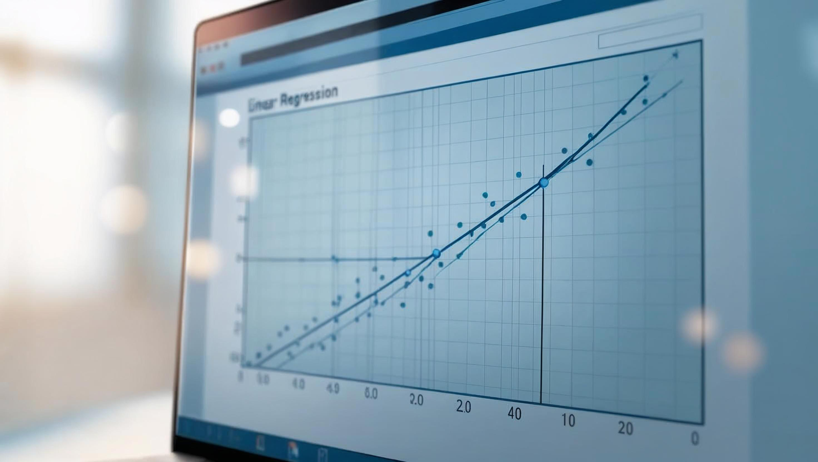
Follow this easy linear regression Google Sheets guide to learn how to perform regression calculations easily.| Spreadsheet Point
Across the bottom are the observed data values, sorted lowest to highest. You can see that just like on the histogram, the values range from about -2.2 to 2.2. (Note, these are standardized residuals, so they already have a mean of 0 and a standard deviation of 1. If they didn’t, the plot would standardize them before plotting). The post Anatomy of a Normal Probability Plot appeared first on The Analysis Factor.| The Analysis Factor
Follow this easy linear regression Google Sheets guide to learn how to perform regression calculations easily.| Spreadsheet Point

Stata code has a few simple rules and conventions. Knowing these will help you get started and greatly increase your efficiency.| The Analysis Factor
What is Regression?And Linear Regression| Machine Learning
Here’s a little piece on the different pictures of linear least squares I wrote for towardsdatascience. All the code used to generate the plots can be found in this github repo.| Param Hanji
