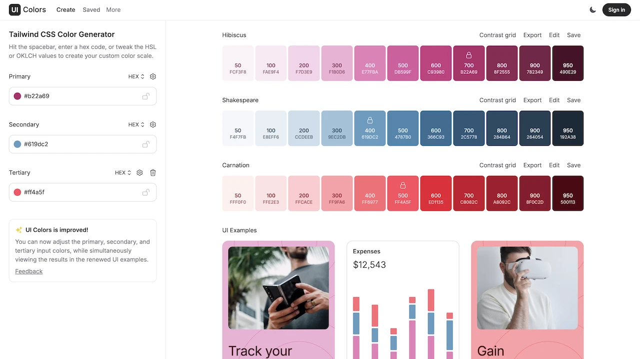
The phrase “less is more” comes to mind when I use this tool. Improving accessibility for users that suffer colour blindness has become paramount. Beyond accessibility problems, utilising colours that contrast correctly is a general must when it comes to design. The title mentions developers but I do believe anyone developing graphics could utilise this tool. What is so good about this tool? UI Colors has been built to work in unison with Tailwind CSS.