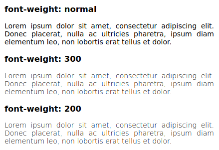
Many web pages these days set font-weight: 300 in their stylesheet. With DejaVu Sans as my preferred font, this results in very thin and light text that is hard to read, because for some reason the “DejaVu Sans ExtraLight” variant (weight 200) is being used for weights < 360 (in Chrome; in Firefox up to 399). Let’s investigate why this happens and what can be done about it.