
Dashboard Design Best Practices – Do Mo(o)re with Data
This blog post introduces an interactive presentation on Best Practices for Dashboard Design in Tableau.| Do Mo(o)re with Data
This blog post introduces an interactive presentation on Best Practices for Dashboard Design in Tableau.| Do Mo(o)re with Data

This blog post provides an in-depth walk through on how to create stunning gradients in Tableau. It includes three different methods that vary in complexity and appearance.| Do Mo(o)re with Data

If we build (or buy) the best data platform we can afford, the users will be clamoring to use it, right? …and when they don’t, we’ll blame the software, switch platforms, and repeat the cycle…| Do Mo(o)re with Data
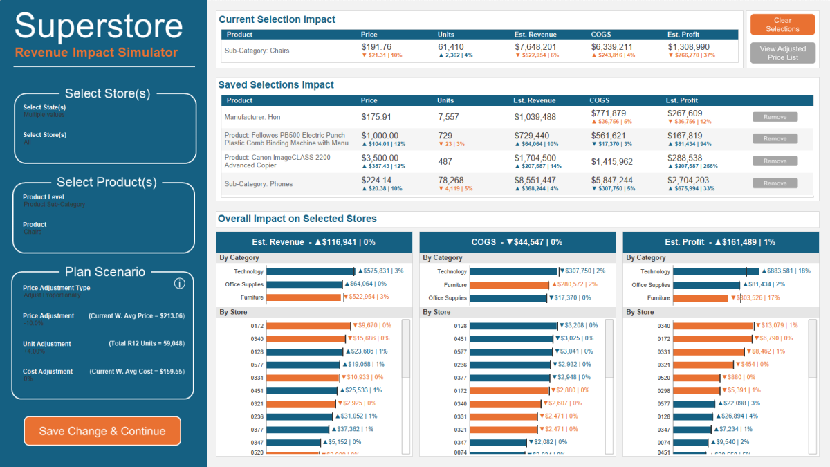
This post walks through how to create a powerful simulation tool in Tableau| Do Mo(o)re with Data

This guest post from Jhoie Victor demonstrates how to use the Tableau Drawing Tool and it’s various features| Do Mo(o)re with Data

How being curious about the unmet user needs can help dashboard designers navigate requests for spreadsheets as data sources, and requests for the ability to export dashboards to Excel| Do Mo(o)re with Data

By going through a list of common data source and publishing checklist items before publishing, you can prevent a lot of common issues with data sources and dashboards from making it to your users.| Do Mo(o)re with Data

This post walks through my process for building unique visualizations in Tableau| Do Mo(o)re with Data

This installment of “It Depends” covers three different methods for using Tableau to do Market Basket Analysis| Do Mo(o)re with Data

What do optical illusions have to do with data visualization? Aside from being kind of fun, optical illusions tell us a lot about how human visual perception changes how we interpret what we see. T…| Do Mo(o)re with Data
