
What we think - Voilà:
Newest post Most populars Archives| Voilà:
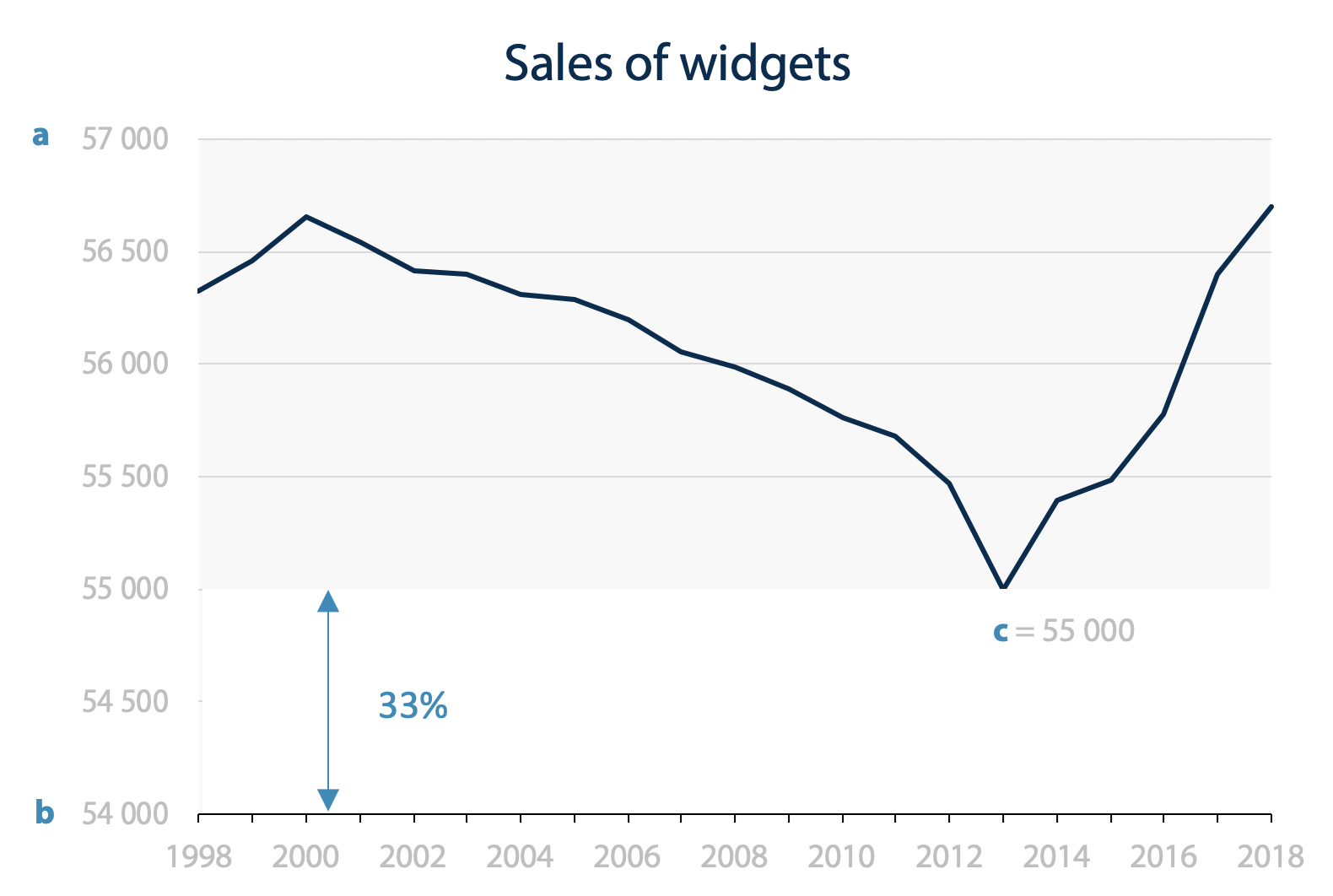
While we hold that bar charts should start at zero, there is no such expectation for line charts. But you’ll always find someone on social media to denounce a “dishonest” line chart that enhances the variations by truncating the y-axis. There is usually ample pushback, but it often leads to the question: Where should it […]| Voilà:

How can we show the impact that climate change will have on the health of Canadians, especially the most vulnerable, and the costs involved?| Voilà:
What did 2024 look like at Voilà:? Over the years, those retrospectives allow us to capture the progress that has been made.| Voilà:
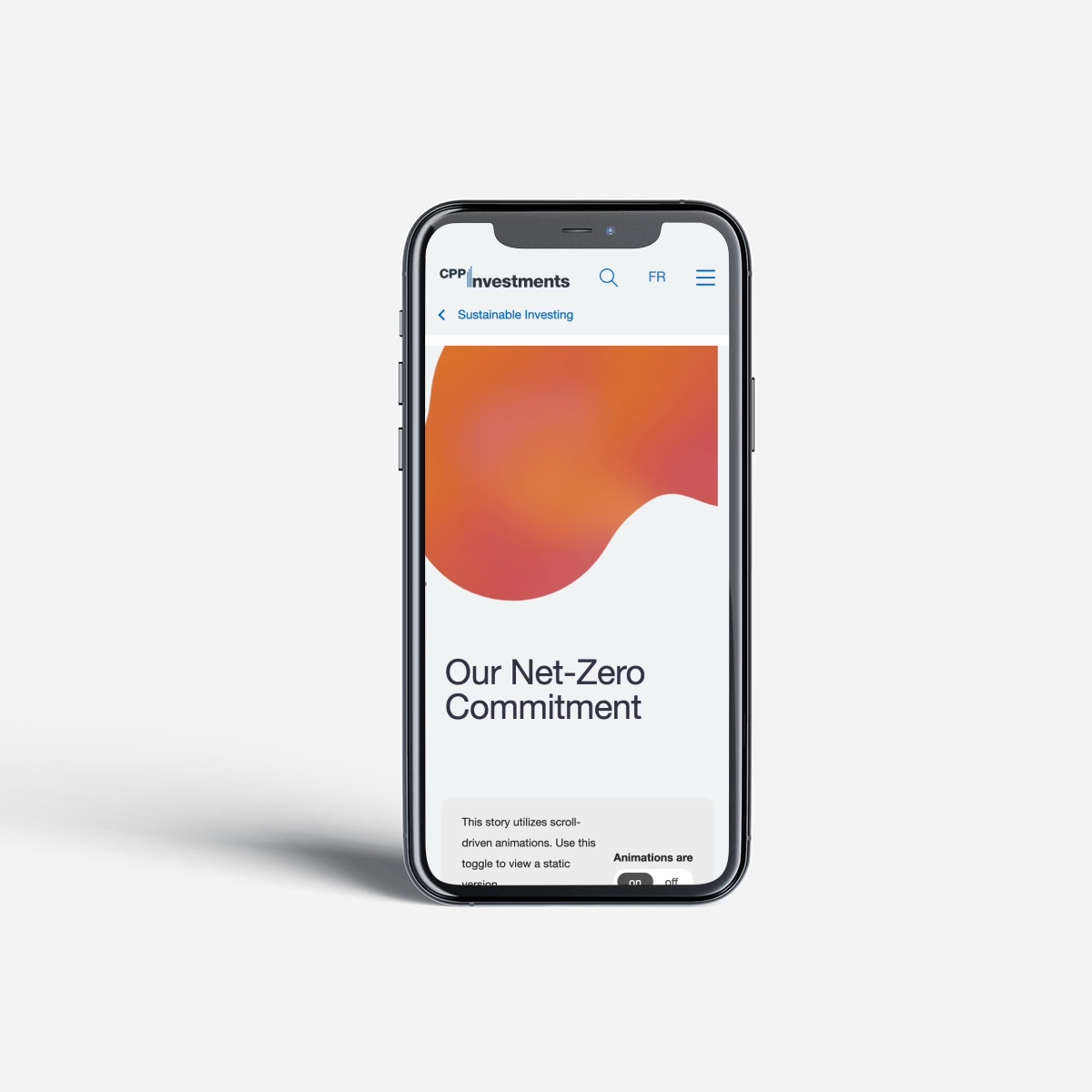
How to effectively communicate the nuance and details of CPP Investments’ net-zero commitment to a general audience?| Voilà:

As part of Voilà:'s tenth anniversary celebrations, we created a visualization of the multidisciplinary talent of our team. Click for more!| Voilà:

Two information designers look at a series of graphics, attempt to redesign them and draw lessons from it. Find out what they've learnt!| Voilà:
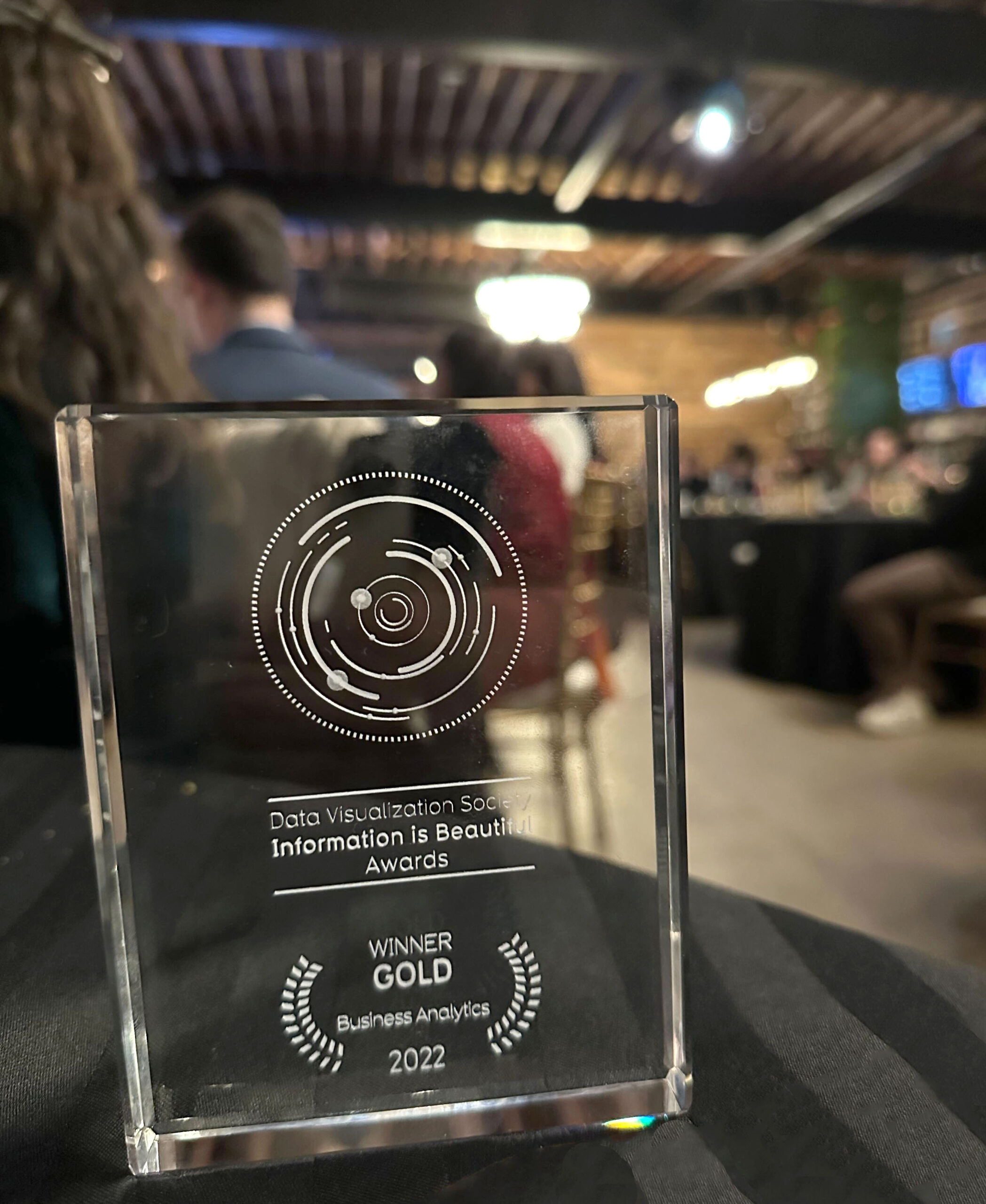
Out of 1250 entries, Voilà: won one of the 10 gold awards at the Information is Beautiful Awards 2022, in the Business Analytics category, for the project “The Star of our Work” designed by Celia Albano and Francis Gagnon. The ceremony was held in Washington D.C. on November 30th. Silver went to the Growth Lab, […]| Voilà:
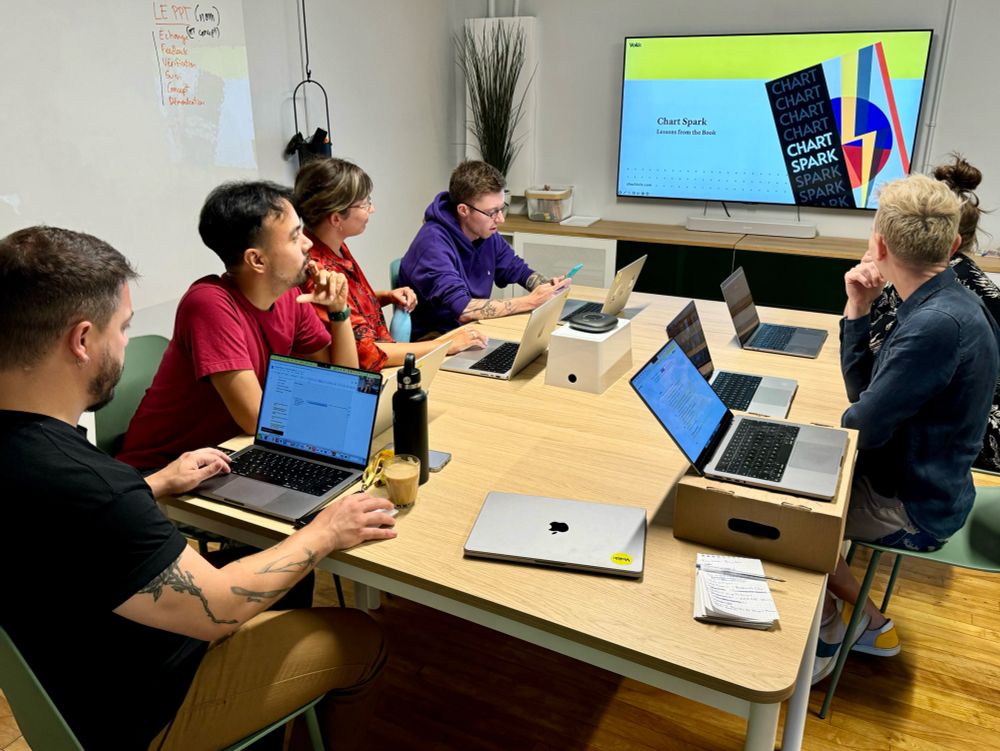
Chart Spark by Alli Torban is a book about cultivating creativity through data visualisation. Find out more!| Voilà:

Every year, I write this retrospective for the future: I like to reread them a few years later to see how far we’ve come and to recall some memorable moments. I share it with you and salute the Francis of the future at the same time. Human resources The team remained stable at nine members, […]| Voilà:
