
A review of "Mistakes Were Made (but not by me)" any why my readers should read it.| Data Revelations
ORDER FROM AMAZON ORDER FROM Walmart DOWNLOAD E-SAMPLER "You need a license to drive a car, and you should be required to read this book before you use a chart, a graph, or a table in a presentation. It’s fun, clear, and useful. Numbers and words are not| Data Revelations

With in-person workshops, keynote speaking engagements, and instructive books, Data Revelations can make your organization fluent in dashboards. Book Steve Wexler today.| Data Revelations
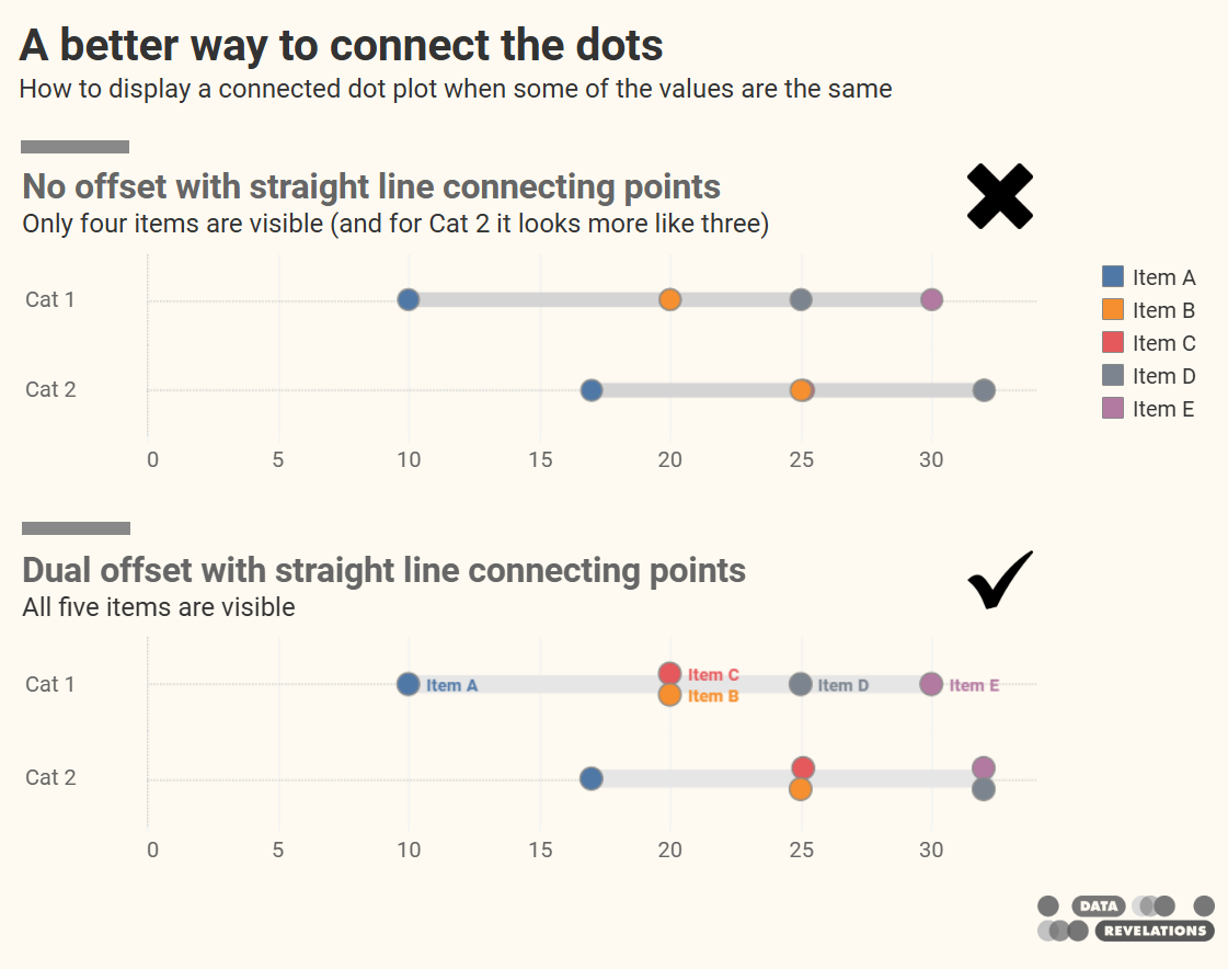
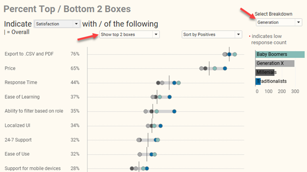
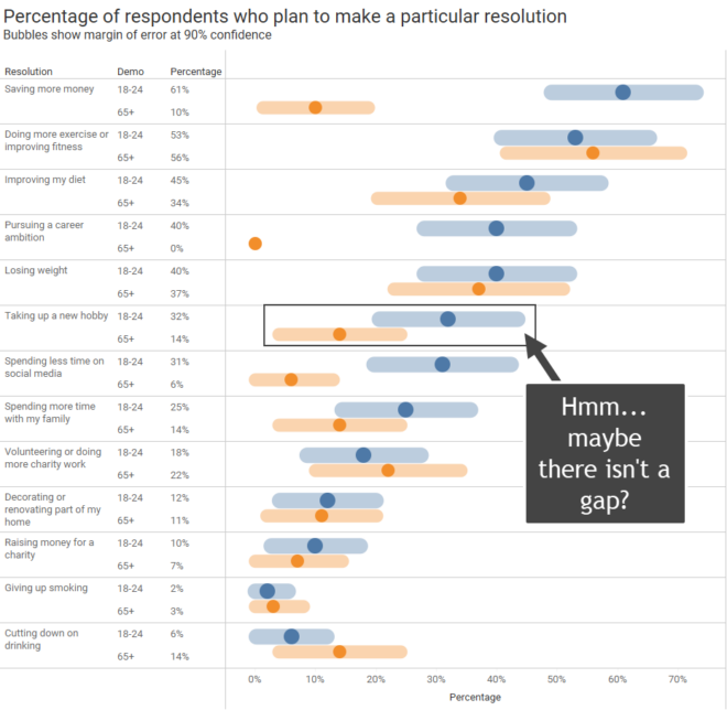
A deep thanks to Ken Flerlage for helping me out with one of the tricky parts. The connected dot plot (aka, gap chart, dumbbell chart, and barbell chart) has become my “go to” for showing the differences within demographic groups for virtually any survey data question type (Percent top two boxes, Check-all-that-apply, Median hours worked, [...]| Data Revelations
I recently saw a post on LinkedIn from Salma Sultana. If you don’t already follow Salma I encourage you to do so. Salma covers a lot of ground in her post, citing an example from Scott Berinato’s book Good Charts where Berinato underscores the importance of sketching and how he and Walter Frick brainstormed on [...]| Data Revelations

I think the number one infraction in data visualization is the misuse of color. If I were pressed for time and had to distill my recommendations on color into a Haiku, it would be this: Make everything gray Except the few things you think Should be highlighted Yes, this is simple, bordering on the simplistic, [...]| Data Revelations
I hadn’t planned on founding Data Revelations in 2011. It was thrust upon me by a layoff. Out of work, I put a web site together and started blogging about visualizing survey data using Tableau. My hope was that these posts would help me land a consulting gig. As I waited for the phone to [...] The post Let people know that you see them and hear them appeared first on Data Revelations.| Data Revelations
Last week I saw a reprehensible and delusional post from Elon Musk on his social media platform, X. Shortly thereafter I read Robert Reich’s Guardian opinion piece on how Elon Musk has gained a concerning level of power over US national security. For certain, Musk is a genius. He is our era’s Thomas Edison and [...] The post Why I Quit X (Twitter) appeared first on Data Revelations.| Data Revelations

How do you explain what data visualization is and how helpful it can be? Join the discussion here. Background I recently had to address some serious health issues that required a lengthy hospital stay followed by a long in-patient rehab. I won’t go into the details, but over the course of my stays people would […]| Data Revelations
Delight, dismay, and why it’s your responsibility to vet the data Thank you to Alli Torban, Anna Foard, and Ben Jones for their feedback. My Delight A few weeks ago, I saw this terrific interactive graphic in one of my social media feeds. It was part of a recent Makeover Monday challenge. What a great […]| Data Revelations
And how many colors are too many, too? Overview There are a lot of ways to show measures over time for multiple categories. I want to explore what works, when it works, and make sure that a particular technique catches your interest. But first… a big shout out to Nick Desbarats whose book, Practical Charts, [...] The post How many lines are too many? appeared first on Data Revelations.| Data Revelations
I recently participated in a LinkedIn Live discussion about how to visualize uncertainty in survey data with Bob Walker, Anna Foard, and Jon Cohen. I find myself contemplating whether we have a type of moral obligation to try to make sure our audience understands that there may be a big difference between the survey results [...] The post More thoughts on visualizing uncertainty in survey data appeared first on Data Revelations.| Data Revelations
Helping your stakeholders see and understand margin of error in survey data. A deep thanks to Anna Foard and Jonathan Drummey for their assistance, Ben Jones for the foundational work behind for my initial explorations, and Ryan Corser for asking me to look into this. Update: an earlier version of this post was titled "Visualizing [...] The post Visualizing Uncertainty in Likert Data Over Time appeared first on Data Revelations.| Data Revelations