
Jim Parkinson, 1941–2025 – Typographica
Jim Parkinson—lettering artist, type designer, and painter—died today at his home in Oakland, California, after a long struggle with Alzheimer’s.| Typographica
Jim Parkinson—lettering artist, type designer, and painter—died today at his home in Oakland, California, after a long struggle with Alzheimer’s.| Typographica
This website just passed its twentieth birthday. In web years, that’s more like a centennial. At the risk of waxing nostalgic, I’m posting a few highlights from our first year.| Typographica
Argetsinger aims to teach a new generation of designers how to uphold the standards and principles of the printers of old, in this strange new era when the composing stick is a text frame and the ink stone is a menu of swatches.| Typographica
Can the world’s longest-running type design competition reimagine itself as a truly global display of abundance? Tanya George interviews this year’s cochairs.| Typographica
We just launched the Typographica Library, a digital bookshelf of type and lettering resources to aid research and selection.| Typographica
Craig Eliason explores how the peculiarities inherent to type design shed light on the purpose and practices of the design museum in the contemporary world.| Typographica
In 1952, toward the end of the Korean War, Chilseong Shipyard was established in Sokcho, South Korea. The humble family operation built ships and served as a local fishery for generations. In 2017, third-generation owner Choi Yoonseong and his partner Baek Eunjeong restored it as a cultural space to preserve the shipyard’s legacy for future generations, so they could connect with the site. The new Shipyard includes a café, exhibition space, and playground, and also has a new look with a cu...| Typographica
I can count the number of times I’ve used a blackletter (unironically, anyway) on one hand. But something about Elfreth caught my attention and held onto it like a Brockhaus-Heuer Schraubstock.| Typographica
Anyone who is from or has lived in Spanish-speaking countries will be familiar with the concept of perreo. It’s a word that describes how we dance to rhythms like reggaeton or funk carioca. The way perreo flows through Tomasa is palpable.| Typographica
Swedish typographer and type designer Carolina Laudon is the first woman president of the ATypI. Ksenya Samarskaya caught up with her after last year’s conference to discuss her role in, and vision for the organization.| Typographica
“I hope that we can have more frank discussions about the problems of industry inclusiveness and the approach and sense of responsibility around design, specifically in the world of type. With that in mind, I had a candid conversation with Elizabeth Carey Smith, a design director in New York and a past president of the Type Directors Club.” —Agyei Archer| Typographica
Aside from being a delightful typeface family, Almost opens the door to the discovery of fifteenth-century printing types.| Typographica
Typotheque collaborated with Indian type designers for Devanagari, Kannada, and Telugu extensions of Lava. Knowing these scripts as natives gave the designers the confidence to stretch and play with the design within the constraints of an editorial brief. In my opinion, this confidence and familiarity are what bring all of the scripts into harmony while keeping them true to their individual nature.| Typographica
Whenever I’m in Germany I’m struck by the prevalence of hand-lettered book covers. German publishers also seem particularly unafraid of omitting imagery from their covers, letting the title do all the selling of the book. This works especially well when the title is rendered by expressive lettering, and there are few examples as effective as Fritz Blankenhorn’s for Deutscher Bücherbund. On these covers, the text is the image.| Typographica
Graphit manages to convey a distinct voice by using elements from sources that might appear almost antithetical.| Typographica
Laica’s dislocated shapes and sprawling texture walk a fine line between sublimity and grotesqueness, as the world in 2019 also appeared to teeter on the brink of conflicts and crises.| Typographica
The eighties are everywhere. Love them or hate them, over the past several years it has been almost impossible to escape the resurgence of bright neon colors, flashy animal prints, neoliberal ideas, and catchy synth chords. For graphic designer Ivana Palečková and type designer Jitka Janečková, thinking about this decade brings back a very special piece of typographic nostalgia.| Typographica
There is so much to say about ABC Whyte and ABC Whyte Inktrap that a review of these non-identical twins from Dinamo could easily consist of two separate articles. The typefaces offer a clear reference to a milestone in type history and demonstrate an appreciation of past technological considerations through reinterpretation — a reflective practice using contemporary tools.| Typographica
I’ve never understood why people cut the crusts off of sandwiches. I guess it’s just my aversion to wasting food. I’ll admit, however, the neatness of those unnaturally sharp edges sparks a certain satisfaction. Lyyra’s vertically sliced stroke endings do just that.| Typographica
Archives are ambivalent places. They promise access to endless knowledge and information — but retrieving it, as most type designers know, can be difficult. The FACIT Model opens the gates to a specific archive that has barely been explored until now. It represents meticulous visual research into the ephemera produced between the 1950s and the 1970s by the Swedish typewriter and office machine manufacturer FACIT AB.| Typographica
Several remarkable typefaces were released in 2019, but none of them made me want to roller-skate as much as PSTL’s Pika Ultra, which evokes the rhythm of ’70s bold lettering but avoids the popular trend of bottom-heavy psychedelic fonts. For me, the parallel here lies more in the wavelike cadence of the letterforms and bold silhouettes of words and letter combinations. Caneso has found an incredibly delightful balance between funky and uniform.| Typographica
XingKai Next aims to find a place for a classical calligraphy face in contemporary graphic design. XingKai is a popular calligraphic typeface designed by Ren Zheng in 1980, inspired by the calligraphy works of Wang Xizhi in the fourth century. It has been digitized by numerous foundries and has appeared in all corners of China. While the design is indisputably popular, it is showing its age in various ways, not the least of which is old-fashioned aesthetics. Instead of dismissing it as mere a...| Typographica
PF Marlet is a type system consisting of five families with distinct voices and purposes. Despite the differences in their design, each family conveys an edgy feeling of elegance in its own way. This creates a cohesive system that is functional but has a strong personality.| Typographica
What makes my Cyrillic heart beat faster is the role Cyrillic plays in this design. I’m under the impression that the Latin lettershapes of CoFo Peshka follow rules established by the Cyrillic, which is what gives the Latin part of the typeface such a captivating freshness.| Typographica
It might be tempting to label Maršo’s sans serifs as lesser communist rip-offs of the popular capitalist typefaces Helvetica and Univers (issued just a few years earlier), but that would not be a fair assessment. Where the Swiss modernists shed any remnants of calligraphy, Maršo embraces the artifacts of the written letter for their own graphic expressiveness, and he was not afraid to rotate the pen.| Typographica
Optique is a font family for Hangeul and Latin that follows the traditional writing tools of each script. The Hangeul stroke shape is based on the pointed brush, while the Latin stroke is based on the broad nib. Even though both scripts allude to different tools, they go well together because they have similar contrast and harmonious shapes.| Typographica
The fonts of Jean Jannon, a.k.a. the would-be Garamond, were underrated by twentieth-century typographers. François Rappo sets the record straight with his crisp JJannon.| Typographica
29LT Zarid Display presents surprising twists and turns, and brings new dimensions to the way multilingual display typefaces are designed, which will only benefit designers and readers.| Typographica
The type community in Berlin is expanding more and more, even in these pandemic times. It makes me reflect on how important it is to be where things happen, to inhabit the right place to be inspired, and to observe. In Berlin, René Bieder designed a typeface inspired by a shop sign he discovered while walking the streets of his new neighborhood, in his hometown. With its luxurious and exquisite style, Bieder’s typeface lives up to its name: Magnat.| Typographica
There are many “types” of English: American English, British English, and, for me, Indian English. The character and personality of Oli seemed to capture the last point. I found it warm, approachable, witty, and expressive, yet having its own distinct character.| Typographica
With Brucker, Tankard once again consciously questions conventions — particularly the idea that a typeface requires consistency. Like watching a performer on a tightrope, or a live improvised show: there are moments where the performance almost falters, and the whole thing seems dangerously close to falling apart, but it somehow doesn’t, and that’s thrilling, and you can’t look away.| Typographica
Typefesse gives a whole new meaning to type anatomy. Defying logic or reason, each letter manages to squeeze in a contorted foot, leg, and buttock or two while maintaining a surprising level of readability. Given the year the world has endured, we all deserve more moments of collective levity, more silly quips, and more type that kicks some ass.| Typographica
Broome Sound, a custom typeface designed by Tré Seals for the third issue of Umber Magazine, intrigues me for several reasons: its important historical reference; its craft; its simple beauty; and, above all, its status as a work of distinct experience — an optical translation of sound.| Typographica
At first glance, Roba may appear to be a deco revival display face useful only on rare occasions. And indeed, Franziska Weitgruber has created two subfamilies that echo the geometry- and contrast-loving 1920s. But the families go much further by offering humanist details that help Roba avoid placement within any specific era.| Typographica
Zangezi Sans doesn’t come across as just another naked sans or neutralized friend of a serif family. Varied stroke weight, fluid counters, and spiky tails give Zangezi Sans a nonbinary vibe. This typeface bridges the serif/sans divide with shapes that borrow from calligraphy, stone carving, and snakes in the grass.| Typographica
As a reverse-contrast typeface in Latin, Japanese, and Chinese, Ribaasu is a hall of mirrors, with the scripts looking at one another in mind-bending and positively unexpected ways.| Typographica
I have always been fascinated by the various tools used to create letterforms. How an object like a nib, a chisel, or even an imaginary tool can shape glyphs is what I find most interesting in type design. These tools are usually limited by the human body — the hand, in particular. So when I heard that Movement was inspired by a dancer, I was especially intrigued.| Typographica
In a marketplace full of puffery, the typeface name “Okay” seems like a declaration of mediocrity, but this may become a new go-to type for when volume and affability need to be high.| Typographica
With type styles and influences as divergent as contrasty Didones, chunky Clarendons and straightforward Transitionals, Quinn is a nicely done portmanteau. It can be used for sedate text as well as shouty yet elegant headlines.| Typographica
We love RVI because of its high educational value. In its own humble way, this typeface actually teaches its users. With all of the little changes that pile up, the differentiation between slantation and construction, and the precise freedom it allows — RVI makes you look carefully, pay attention to details, and learn a thing or two about italics.| Typographica
Arabic typography has long suffered from stagnation due to the sacralization of calligraphy. Brando Arabic is an innovative contribution to the Arab world, which now produces publications of all sorts and embraces modern requirements of communication.| Typographica
Although I agree with Sowersby’s description — “Söhne is the memory of Akzidenz-Grotesk framed through the reality of Helvetica” — I would argue that Söhne contains more Akzidenz-Grotesk than Helvetica. It’s more unique, less monotonous, more dynamic, less boring. A beautiful yet universal sans serif family.| Typographica
Antonia is a contemporary serif typeface that interlinks a sharp-edged character with cheerfulness. Combining characteristics that don’t seem to be compatible is one of the most difficult arts of type design and was one of the trends I recognized this year. Most often, such attempts result in unconventional display type. Sometimes, though, they add a fresh note to a more serious genre.| Typographica
Business, let’s keep it casual Let’s keep it fun for you and me, so you can see| Typographica
The visuals for Nirvana are both a throwback and futuristic. An off-the-beaten-path seventies cult, reborn with more technology and burnished lines. They straddle the unfamiliar. The video Anthony Vernery and Hugo Dumont captured it in nods to Michel Gondry, to not-quite Švankmajer. To a past visual of an imagined offshoot future. Plopping Nirvana on a book cover is a done-deal design, a travelogue toward elsewhere or elsewhen.| Typographica
A reaction to a piece of brutalist Norwegian architecture, Viksjø is an anomaly as a typeface. It lives in a universe of its own, with no equivalent past or present.| Typographica
There is a fluidity of movement that is very appealing in this typeface. The low contrast and openness of forms helped to create the contemporary feel. Both of these design features capture a sense of joie de vivre, and a light and pleasant atmosphere in spite of the boldness of weight.| Typographica
Where other fonts are promoted as workhorses, this one is a mule. It is often said that “workhorses” do their work without a murmur, quietly and in the background, conforming to the text they carry without coming to the fore themselves. Those are not horses, but chameleons and butlers. Elmer’s mules will deliver the job without pretending to go unnoticed.| Typographica
Type can be a helpful means of escape. The mad toyshop designs of Arthur Reinders Folmer’s Typearture foundry are kind treats to puzzle over in bad times. In appearance, Schijn is a product of its pre-COVID era — a faceted 2019 rife with Instagram crystals and fragmentation on the pop-culture brain. But the font belongs to 2020 because it looks purpose-built for use in a gentle iOS or Nintendo Switch game, the kind played to seek out private calm in a tense quarantined household. Thos...| Typographica
I appreciate and adore Maelstrom and its wacko Italian Futurist approach to reverse-stress letterforms, with the historically noteworthy (and entirely crackpot) E. But I didn’t expect to like the sans as much as, or even more than, the serif.| Typographica
Reduction in letterform has always been an appealing type-design idea. Trying to find the magical point that removes enough to create something new, but not so much that the vitality of the original is lost and the form becomes lifeless, is a subtle art.| Typographica
Thomas’ typefaces are a set of rigorously designed, extensive, and genuinely fresh explorations of a flamboyant genre, seriously playful or playfully serious depending on mood or message. The copy accompanying Type By’s web specimens for Gustella calls the eye-catching collection “a very specific cherry on the pie”, and that’s true. But there’s a lot of pie underneath the cherry as well.| Typographica
The difficulty in creating a Hangul–Latin multiscript design lies in the disparities between the tools of their original letterform constructions. While Latin type design descends from the broad-nib pen, Hangul descends from a pointed brush. Arvana meets these challenges by creating rhythm and fusing these different calligraphic models in an elegant, kinetic, and energetic manner.| Typographica
This typeface is far from static. There are hardly any straight lines to be seen. Extreme flaring, waisting, and cupping can bestow a cartoonish quality on type. Cloisterfuch definitely walks that line, but doesn’t cross it.| Typographica
An annual review of the most interesting type of the year, as selected by graphic designers, type designers, and scholars.| Typographica
But what is Role all about? Anything. Or, almost. That’s its strength. In fact, when asked to detail what I found interesting about the family, my first thought was, “It’s not interesting.” As a book designer, that’s what I like. It’s a cohesive collection of good letterforms designed to help tell a story, not be the story.| Typographica
With Mexica, Gabriel Martínez Meave sought to create an ideal complement to Nahuatl, the indigenous language of the Aztecs spoken by about 1.5 million people today. His aim, not just to salute Nahuatl but to design a better tool for it, is evident and commendable.| Typographica
To my mind, Benguiat Montage is the quintessential Photo-Lettering, Inc. typeface. Used on the covers of its Alphabet Thesaurus specimen books during the company’s peak in the sixties and seventies, it was central to PLINC’s brand identity.| Typographica
Why must government design be subjected to utilitarian austerity? Like any brand or institution, governments have their own design sensibilities and needs, and a good typeface can help provide a unique and recognizable visual language. The privilege and mandate of government designers is that we design and build for everyone.| Typographica
Titus Nemeth has done an admirable job translating Omnes’ relationship of structure and surface into the Arabic script, creating a design that is unmistakably Omnes while also respecting the proportions, patterns, and rhythm of Arabic.| Typographica
In an alternate universe, where typefaces are reptiles and designers’ computers are secret laboratories for genetic modification, the Black Mamba is a finely orchestrated accident of interbreeding. Its bite to the graphic designer may result in dangerous conditions like awakened typographic consciousness, beautifully dissonant compositions, or increased experimental attitudes.| Typographica
I think I first fell in love with Obviously while I was standing in front of a six-foot-tall version of it, struggling to frame a selfie. Because it was blown up so big, I could see it wasn’t just another heavily interpolated, meet-every-need sans family.| Typographica
Although Pierre Haultin was a sixteenth-century Parisian punchcutter, the typeface bearing his name looks more like a seventeenth-century Dutch type than a sixteenth-century French one: sturdier, more angular, more compact.| Typographica
Maybe it’s because I’m writing this in 2020, both with the benefit of seeing the next iteration of Aglet and also against the backdrop of a particularly tumultuous year, but there is something prescient in the structured softness of Aglet Sans. This year has demanded more flexibility, more warmth, and more vulnerability than we as a society are comfortable with.| Typographica
Named after the caverns of space found in lava flows, Pilowlava evokes a feeling of carved-away whitespace like a Cyrus Highsmith drawing but with the mechanics of a CNC router. Straight lines and rounding throughout make its name also perfectly describe its two main attributes: pillow for soft, and lava for flow.| Typographica
Although invented writing systems are not an alien concept, ones for cultures that don’t actually exist are rather rare. Thankfully, that didn’t stop the cosmically inventive Jeremy Tankard from designing not one but three styles of Queezoid for the Royal Manchester Children’s Hospital. The Queezies are a decidedly cuddly alien race that infiltrates the hospital, leaving its mark — literally.| Typographica
Most type families set a consistent style and flex other parameters, like weight, optical size, and slant. Nostra ditches the style-centric paradigm and achieves cohesiveness through tension.| Typographica
Commercial Classics serves as a catalog of typefaces that investigate and bring back to life some of the most notable milestones of English design during the Industrial Revolution / Victorian era. Although the designs of this epoch are sometimes criticized for lacking a clear conceptual direction, this period was nevertheless one of the most prolific and innovative periods in the history of type, bringing us new genres and styles. Caslon Doric is one of the most remarkable outcomes of this pr...| Typographica
What is obvious from Birra Bruin is that Elena had fun drawing it. We don’t talk a lot about that in our work, I find. In a lot of cultures you’re supposed to live to work, and in reaction to that we’re often told that we should do what you love. What Elena accomplishes with Birra Bruin is an expression that shows me that the designer loved the work she was doing.| Typographica
At first, Chikki seems contradictory: How can something brittle, crisp, and textured evoke a feeling of such warmth and familiarity? If you are familiar with chikki, the Indian snack food to which this typeface owes its inspiration and name, you will understand.| Typographica
Clavichord looks tarted up like a scrawny Christmas tree weighed down with a multitude of frills, swashes, flourishes, and ball terminals like so many garish and pendulous ornaments. Sounds godawful, doesn’t it? Yet the more I look, the more I like, despite all my efforts to resist.| Typographica
We’re trying something new this year: rather than publish the entire list of Favorites at once, we’re releasing them in batches. We hope this gives readers time to savor the reviews and explore every typeface instead of being overwhelmed by a sudden feast. You can catch each dish while it’s hot by following us on Twitter or RSS.| Typographica
Neebinnaukzhik (Neebin) Southall (she/they/he) is a designer based in Santa Fe, New Mexico, and a member of the Chippewas of Rama First Nation. The Chippewa, also known as Ojibwe, is one of the tribes belonging to the larger Anishinaabe people. Southall predominantly focuses on work impacting and involving Native communities, including writing on Native artists and designers; photography encompassing portraits, fashion, artwork, and jewelry; and graphic design projects for cultural and arts o...| Typographica
Arabic for “enough!”, this noble design proves not only that actions speak louder than words, but also that typefaces can amplify voices of dissent and resilience.| Typographica
A page of links, recommended reading, and strategies (to come) for students of the Crash Course in Type Selection workshops from Type West at Letterform Archive.| Typographica
María Carla Mazzitelli, was inspired by gestural graphic expressions, like paper cut-outs (découpes!) and spontaneous handwriting.| Typographica
Maria Doreuli was able to take the fearless ideas she had as a student to a professional level. I believe the market needs more typefaces like CoFo Chimera — fewer rushed ideas, more confidence in execution.| Typographica
As a fan of error, serendipity, and misuse, I’ve always enjoyed the winks of oversized ink-trapped type. Though these days, the form falls more and more into pastiche. Karelia’s Outtakes style takes a fresh sidestepped approach to this genre.| Typographica
I picture five-year-old James Edmondson, sitting on the floor of his dad’s graphic design studio back in the early 1990s, poring over vintage Letraset catalogs and copies of U&lc from the 1970s, absorbing it all like a sponge.| Typographica
Hesse Antiqua is a titling face that, like a particularly fine wine, is best reserved for special occasions. These are letters that can lend a sense of dignity and permanence to titles and inscriptions.| Typographica
Like other serial or “multiform” type families, Reforma explores versatility by way of a common skeleton wearing different outfits. In this case, though, Lo Celso also wanted to convey the nature and values of the institution that commissioned the project (the Universidad Nacional de Córdoba in Argentina): tradition, excellence, diversity, research, and inclusion.| Typographica
The way Katyi allows elements of broad-nib translation to become the raw material for abstraction reminds me of the limited palette that gives concrete poetry its striking power.| Typographica
FS Kim’s liveliness confidently evokes a calligrapher’s hand. Flair, character, heft, and a touch of self-consciousness — FS Kim is both versatile and really rather lovely.| Typographica
NN Rektorat, a typeface family currently consisting of fourteen cuts, features squarish, geometric glyphs whose origins date back to the early 1930s. Rudolf Barmettler has resurrected the family in collaboration with the Swiss type design studio Nouvelle Noire.| Typographica
Once in a blue moon, a revival contributes something missing, something lost. Berthe is rarer still because it actually contributes two things that today elude mainstream typography: a congenial evolution of the theatrical Didone style of type, and a viable alternative to the so-called “true” italic.| Typographica
Ziza is the second digital font release to emerge from Mark van Wageningen’s ongoing experiments in constructing, deconstructing, and reconstructing type, exploring the connections between various type technologies and materials, and — most flamboyantly — revisiting and exploring the possibilities of color type.| Typographica
Before I saw Kris Sowersby’s Heldane, I used to lament that Van den Keere didn’t receive as much enthusiasm from type designers as he deserved. Instead of directly interpreting a specific typeface, Sowersby summarizes what constitutes Van-den-Keere-ness, which he then refines and exaggerates.| Typographica
In an era of 1970s-inspired chonky serif typefaces, Empirica, by Tobias Frere-Jones and Nina Stössinger, traces the serif’s historical roots back much, much further. If the Romans had designed lowercase letters (and bold and italic letters), what would they look like?| Typographica
Tangly’s characters are composed by lines with subtle differences in thickness as they move through their square units. Connecting points are consistently placed on the four sides of each unit, so they can be all combined with each other, allowing almost endless possibilities of patterns. It is simply dazzling!| Typographica
“Over the past few years, Sharp Type have assembled an eclectic team of skilled young designers in an effort to produce audacious, high-quality work, while trying to change the industry from the inside. At the heart of this team is the workaholic memelord Connor Davenport. … I watched Garnett grow and evolve, both on Davenport’s Tumblr and on his Instagram. And — with all of its quirkiness — it started to grow on me, too.”| Typographica
For Study, Jesse Ragan transformed Rudolph Ruzicka’s 1968 hand-lettering into a typeface that “feels somehow calligraphic, metal, and digital all at the same time.”| Typographica
Mizan strikes a balance between aesthetics and legibility and, as such, provides a great starting point for graphic designers working with the Arabic script.| Typographica
A typeface’s identity rarely lies in the design of a single glyph but rather in the texture and rhythm created by the sequence of letters, words, paragraphs. And this is where Beatrice Display is at its best.| Typographica
Some strokes wind with a slight kink, some more traditionally swing into curve, and others are blunter, abruptly tapering and expanding. This is one of many instances where this typeface plays with contrast by harmonizing and mixing curves with sharp, straight edges.| Typographica
DJR pushes type past expected usage: whether it’s his super-heavy take on De Vinne that exists somewhere beyond the intended design’s theoretical limits, or the Venetian-inspired Fern that performs robustly at tiny sizes while retaining calligraphic style, gesture, and intention.| Typographica
Annual review of the most interesting typefaces of the year, as individually selected by graphic designers, type designers, and scholars.| Typographica
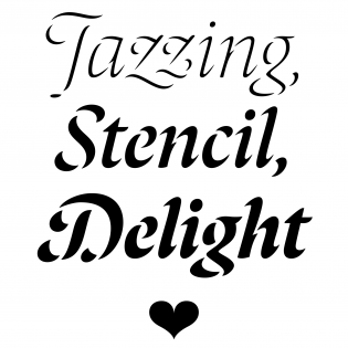
Bogidar Mascareñas has done something in type design that I absolutely love: he began with a commonly known premise and took it to a place where no one has been before. Laima: a stencil? It has been called that, and I guess it could work as one, but that’s not really what it is. It’s something that started at the stencil idea and was taken to another mental space entirely.| Typographica

James Edmondson took what was good about Eckmann-schrift and Sintex and brought those ideas to the next level, replacing old design decisions with a healthy dose of funk.| Typographica

Even with all of the innovations in contemporary typeface design, one might expect some basic concepts to be set in stone — like what constitutes an italic, for example. Savoie, however, offers a wholly unexpected and fiercely original interpretation.| Typographica

If you’re looking for a blackletter without the baggage, Bradley DJR may be the typeface for you. David Jonathan Ross’ first attempt at producing a blackletter, Bradley DJR is a revival of an 1895 ATF face based on lettering done by the prolific American graphic designer Will Bradley, whose style straddled the gap between arts and crafts and art nouveau.| Typographica
