
Snake on a Globe - Engaging Data
Play this unique twist on the classic snake game, where your mission is to eat as many apples as you can given their location and navigate the globe.| Engaging Data
Play this unique twist on the classic snake game, where your mission is to eat as many apples as you can given their location and navigate the globe.| Engaging Data
How is your income distributed across tax brackets? I previously made a graphical visualization of income and marginal tax rates to show how tax brackets work. That graph tried to show alot of info on the same graph, i.e. the breakdown of income tax brackets for incomes ranging from $10,000 to $3,000,000. It was niceRead More The post Understanding Tax Brackets: Interactive Income Tax Visualization and Calculator appeared first on Engaging Data.| Engaging Data

This treemap shows the 10 largest economies in the world, including California which is the 4th largest, and has the smallest population.| Engaging Data
Which majors are most competitive across the University of California system?| Engaging Data
Which majors are most competitive across the University of California system?| Engaging Data

Transform your ordinary text into eye-catching stylized text. Bold, outline, upside down, cursive, caligraphy, etc... Use for social media and messages.| Engaging Data
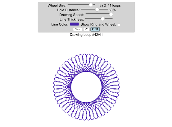
Play with an interactive spirograph that animates your drawing and lets you vary the drawing parameters and then share your creations| Engaging Data

Daily graph showing a live look at current California electricity generation by type of power plant and fuel source.| Engaging Data
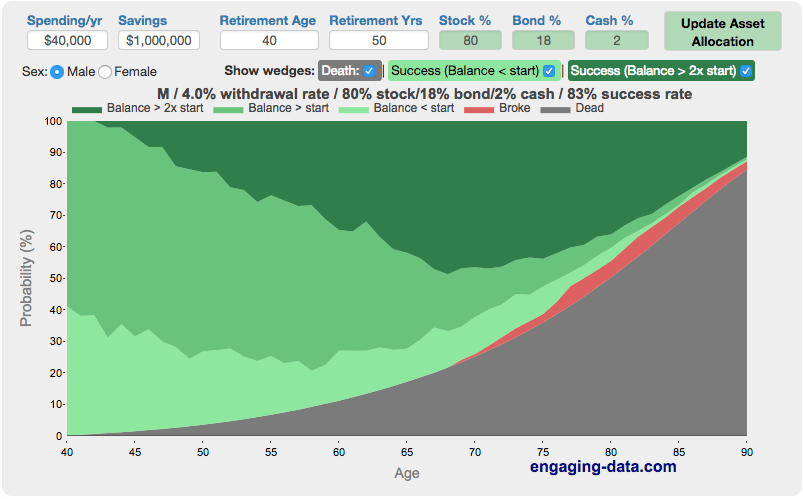
A FI/RE early retirement calculator visualizing longevity risk in early retirement and enables you to compare the probability success, failure and mortality.| Engaging Data
