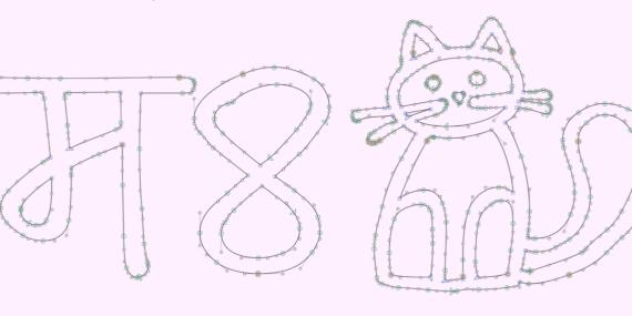
After a couple of years in development, A Hand-Drawn Font is finally ready to meet the world. Yes, the font family is called A Hand-Drawn Font 🤷🏽🤪 It didn’t start in my sketchbooks, but from something more practical: lettering I used to label tools and materials around the studio. Later, while working on an autobiographical … Continue reading So I Made A Hand-Drawn Font… →| Mota Italic
Well 2020 was a weird year – for us all. We are happy to report that we got through it mostly unscathed, and while at times it felt slow and never-ending, when we look back, we did actually do some interesting things 😄 Here are some highlights 👇️ New Beta Fonts Program 🔠 We have … Continue reading 😷 2020 Recap: 🔠🇮🇳🇩🇪🧂🖼️ →| Mota Italic
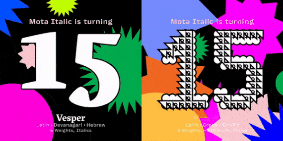
Let’s party 🥳 Mota Italic is celebrating 15 years in the font game! Now seems like an opportune time to share a chronicle of all our ups and downs, all the adventures we had between founding in Berlin in 2008, to relocating to India for six years, to moving back to Berlin in 2020… a … Continue reading Celebrating 15 Years of Type! →| Mota Italic
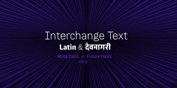
We are very excited to announce the launch of the text companion to Interchange Display – Interchange Text! Interchange is growing into a large family that will contain 80 fonts (4 optical sizes, 10 weights, plus italics). So for these FutureFonts releases, we broke the family up into two parts: Text & Display, small & large, legible & funky; … Continue reading Interchange Text Released! →| Mota Italic
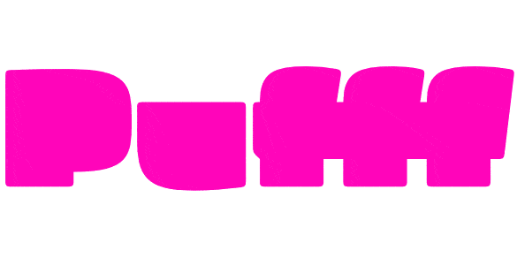
The following text was written by Steven Heller, and what a beautiful piece it is! This page is a cross-posting of the original over at I Love Typography. Thank you so much to Steven & I Love Typography for selecting Pufff! 🖤 Show me a font where most of the letters appear to be made … Continue reading Pufff: Steven Heller’s Font of the Month! →| Mota Italic
Just like a film with several unrelated plot lines that finally intersect at the climax, I’ve been contemplating a few different philosophical questions that all came together thanks to the final step of one project. The first question was: When should I release v1.0 of Show Me the Mono? The plan was to put it … Continue reading Philosophical Musings On Fonts & Releases… & Announcing v1.0 of Show Me the Mono! →| Mota Italic
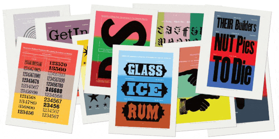
Two years ago I began creating a series of hand-drawn typographic prints based on beautiful vintage type specimens – we called them »Show Letters« Prints. Today the series is getting some big updates! First of all: what’s “All New” 1) Seven new designs have been added to the collection. These range from some of Hamilton’s funky … Continue reading All New »Show Letters« Prints →| Mota Italic
When I moved to Mumbai in 2014 I was missing a type community – especially after the amazing scene in Berlin. At that time, there were no other regular typographic events in India, so starting a small and simple meetup was a no-brainer. And as it turns out, it was a worthwhile experience :) We … Continue reading Leaving the Mumbai Typostammtisch →| Mota Italic
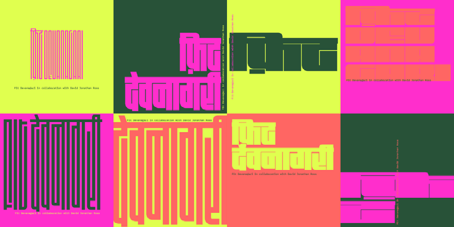
We have a super exciting, major update for you today. Our beloved Maku typeface has been radically expanded and is now a highly useful family for all your informal typesetting needs. Maku is based on Kimya’s unique & quite pretty (Devanagari) handwriting. So the Devanagari is where it all began and where most of her … Continue reading Maku 2.0 Update →| Mota Italic