Users spend most of their time on other sites. This means that users prefer your site to work the same way as all the other sites they already know. Design for patterns for which users are accustomed. (2 min. video w. Jakob Nielsen)| Nielsen Norman Group
Anything done by more than 90% of big sites becomes a de-facto design standard that must be followed unless an alternative design achieves 100% increased usability.| Nielsen Norman Group
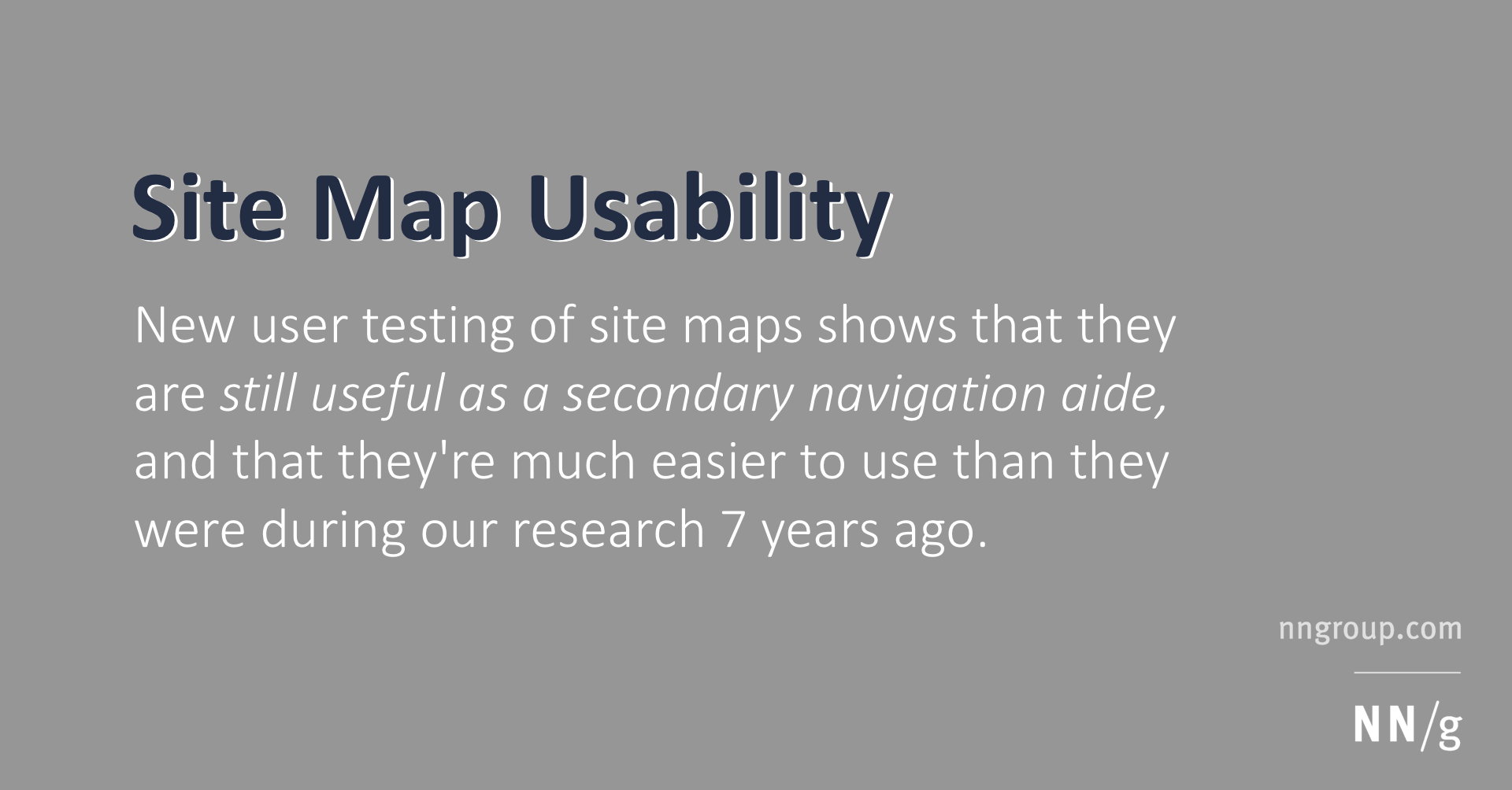
New user testing of site maps shows that they are still useful as a secondary navigation aide, and that they're much easier to use than they were during our research 7 years ago.| Nielsen Norman Group
The website is becoming a less prominent locus of experience as people use search engines to bring up answers to their current questions. How can sites cope with masses of freeloaders?| Nielsen Norman Group
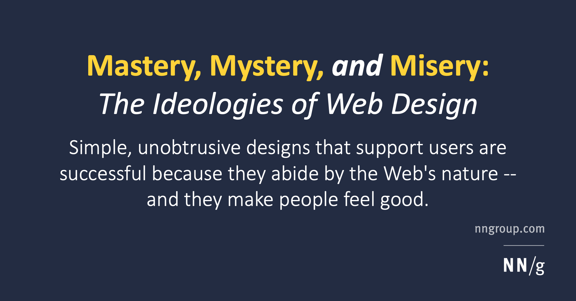
Simple, unobtrusive designs that support users are successful because they abide by the Web's nature -- and they make people feel good.| Nielsen Norman Group
People get lost and move in circles when websites use the same link color for visited and new destinations. To reduce navigational confusion, select different colors for the two types of links.| Nielsen Norman Group
One line of text shows a page's location in the site hierarchy. User testing shows many benefits and no downsides to breadcrumbs for secondary navigation.| Nielsen Norman Group