There are a few ways to access how good a team is. In this post I use Partial Least Squares Path Modelling to construct a team success index for NBA teams during the 2015-16 Playoffs.| The Data Game
This visualisation in R displays the origins and destinations of players participating in the 2015 NBA Draft using Sankey diagrams. A Sankey diagram is a visualisation used to depict a flow from on…| The Data Game
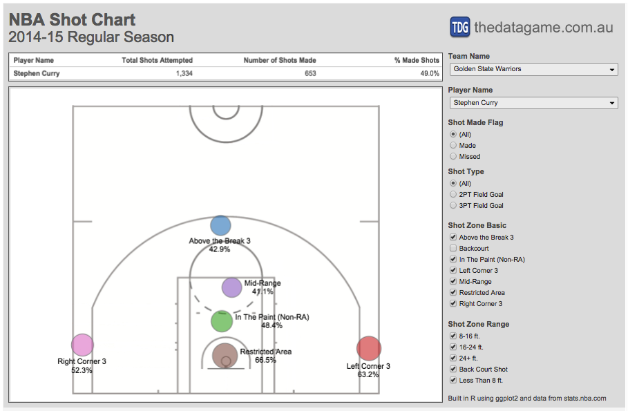
I ran the accuracy shot chart for Stephen Curry again using data from stats.nba.com, this time for the first 19 games of the 2015-16 regular season and the conclusion is: version 15-16 is better t…| The Data Game
In my last post I produced some NBA shot charts in R using data scraped from stats.nba.com and ggplot2. This time I extracted all shot location data available for 490 players and linked it to a Tab…| The Data Game