For our inaugural AI and the Creative Frontier Study, we surveyed over 2,000 creative professionals in the U.S. to explore their evolving relationship with generative AI. The findings reveal that while creators mostly see benefits like time savings and support in brainstorming with this transformative technology, they also demand greater transparency and control over their content.| blog.adobe.com
'Alphabet in Motion: How Letters Get Their Shape' takes the user on a journey of typefaces from an architectonic perspective. The post The Daily Heller: Kelli Anderson’s Moveable Type appeared first on PRINT Magazine.| PRINT Magazine
'Jewish Worlds Illuminated' is the most extensive display ever of the The Library of the Jewish Theological Seminary's manuscript treasures. The post The Daily Heller: Jewish Books Lettered, Typeset and Illuminated appeared first on PRINT Magazine.| PRINT Magazine
The Typographer app, created by The Type Founders, is a curated, nimble, workflow-friendly resource for creative play and pitching with type. The post This New Typography App Reduces Workflow Friction appeared first on PRINT Magazine.| PRINT Magazine
Fast-food chains use specific design choices to make readable and memorable logos that keep consumers coming back. Get inspired to refresh your own logo.| Designerly
Web design trends in 2025 are embracing boldness, personality, function and accessibility. Discover key trends shaping the internet this year.| Designerly
It’s the time of year again when browser makers ask which shiny new features they should implement in preference to fixing outstanding bugs. Despite my cynicism, I’m trying again with these submissions. They’re mostly typographic but in some cases important.| clagnut.com
LoveFrom has created a new visual identity for the 50-year-old book shop, using design elements from its past and bringing them to the digital.| PRINT Magazine
Today, at Adobe MAX, we released the latest version of Creative Cloud, which helps creators cope with current challenges with innovations in speed, ease and superpowers, collaborative creativity and creating for 3D and immersive experiences.| blog.adobe.com
Gain the power to reinforce your typography and make it more eloquent with a selection of pro-grade free text styles for Photoshop. The post ⬆ 70+ Best Photoshop Text Effect PSD Templates appeared first on The Designest.| The Designest
Don't be afraid to embark on a new project 'cause the true horror is not having enough assets to do so. The post 45+ Best Scary & Horror Fonts appeared first on The Designest.| The Designest
The CSS `clamp()` function is often paired with viewport units for “fluid” font sizing that scales the text up and down at different viewport sizes. As common as this technique is, several voices warn that it opens up situations where text can fail WCAG Success Criterion 1.4.4, which specifies that text should scale up to at least 200% when the user’s browser reaches its 500% maximum zoom level. Max Barvian takes a deep look at the issue and offers ideas to help address it.| Smashing Magazine
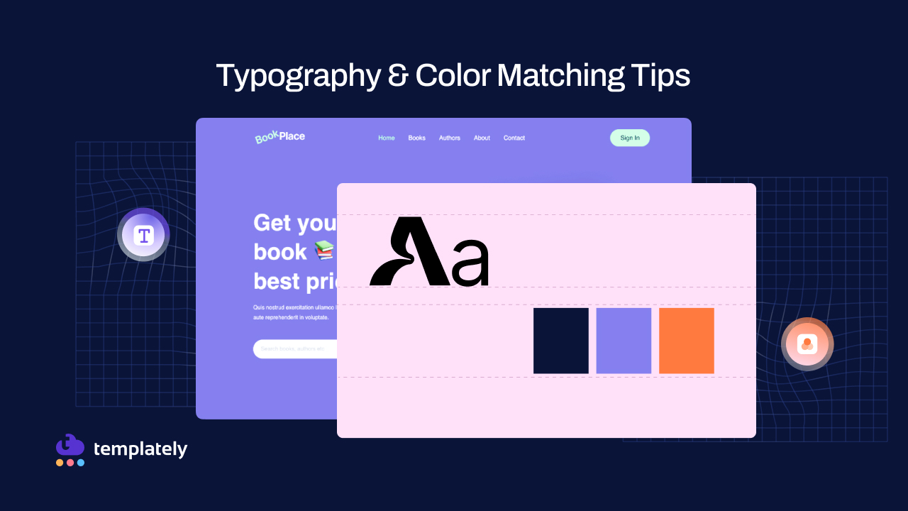
Typography & color matching tips to choose the right fonts & colors while using ready WordPress templates and design brand-aligned, and professional websites.| Templately Blog
icrosoft has been planning a design revamp when it comes to the typography of their whole Office product line; and probably beyond that. They have worked on selecting their new default font for quite a bit1. The finalists among which the successor to the familiar Calibri typeface2 was to be chosen were long known: Bierstadt, Grandview, Seaford, Skeena, and Tenorite. The decision, however, hadn’t been made and apparently no winner was yet selected nor known. That all changed today, though, a...| Jayson Salazar Rodriguez | @jdsalaro | Blog
Many developers seem to have a fanatic obsession with monospace fonts and using them to make their blogs look “cool”. I won’t call out anyone’s blog specifically, but you don’t have to look to hard to find some. As an example theme using a monospace font by default, look at hugo-theme-terminal, which has over 2,400 stars on GitHub. If you have a blog or are thinking about starting one, and you are writing mostly prose (you probably are), I have one suggestion for you about fonts: Do...| Lambda Land
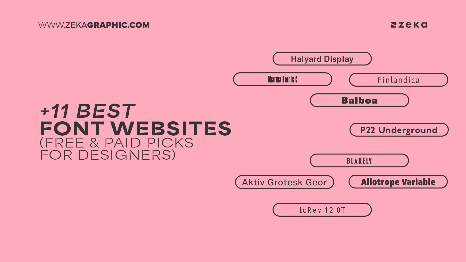
Discover the best websites for fonts (both free and premium) perfect for branding, web design, UI/UX, and more. Curated for graphic designers who value quality and creativity.| Zeka Design
In order to use variable fonts on the web, you'll need to know which axes you can modify. Here's how to find out what they are if your font documentation doesn't reveal it.| Los Angeles WordPress & web developer - Webinista, Inc.
LaTeX is a powerful typesetting system hamstrung by a few decades-old decisions and some… ahem… questionable design decisions. Nevertheless, its ability to typeset technical documents remains unmatched, and it enjoys wide support across STEM fields. Learning LaTeX is a worthy use of your time, if you intend to pursue a career in science. This is meant as a short and simple how-to guide for learning LaTeX. It is not meant to be comprehensive, but rather serve as a guide of where to look to...| Lambda Land
I used to make fonts just to give them away. I still do that too, but somewhere between 2016 and, well, now, I migrated web hosts, changed content management systems, and got a little lackadaisical in my free fonts distribution. What I'm trying to say is that two of the fonts I made (and like!) to g| Ty Finck, Graphic Design in Ithaca, New York
This is a response to Miriam Suzanne’s excellent post on Reimagining Fluid Typography. She poses lots of really interesting questions, some of which I disagree with, but most of all they got me thinking… and writing. Read more.| Clagnut summaries
I don’t know if it’s just me, or if something’s happened in the last few months, but I keep seeing faux bolds everywhere. The fix is tiny and simple, although frankly the mistake is pretty basic – there’s no excuse for it being so prevalent. Read more.| Clagnut summaries
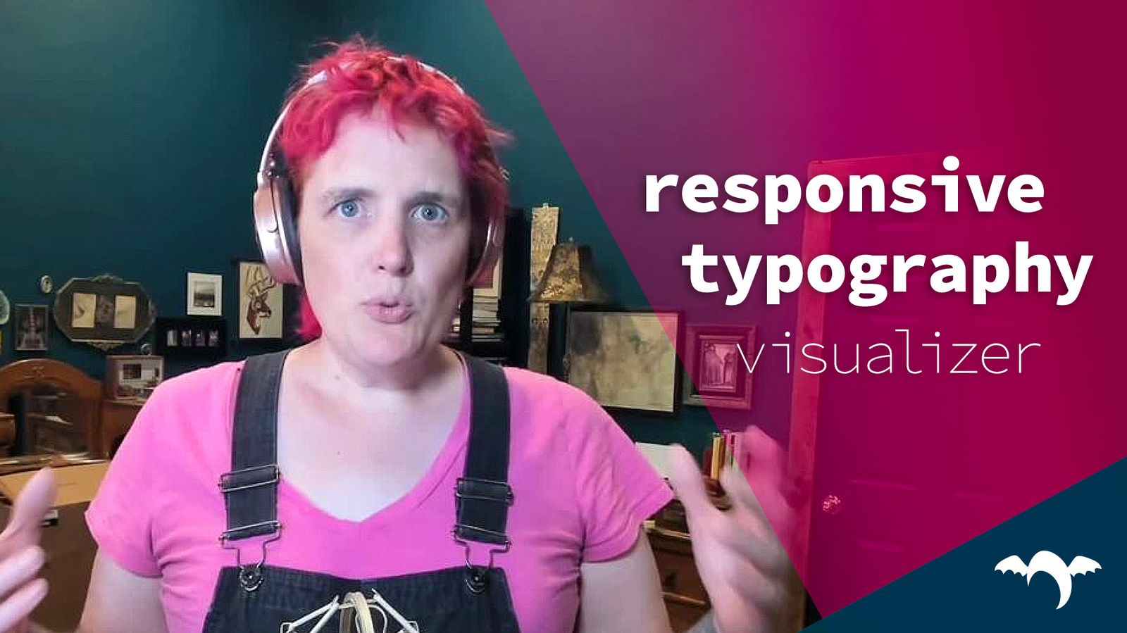
Join Miriam Suzanne, Stacy Kvernmo, and special guest Alan Stearns -- typography enthusiast, co-chair of the CSS Working Group, and self-described CSS Panjandrum -- for a conversation about typography. Responsive Typography has been around for at least a decade in various forms, but has become even more popular with tools like Utopia.fyi, Fluid.style, Typetura, and more -- all relying on the latest CSS units and math functions. But there are still a lot of questions worth asking.| OddBird
The short answer is: quite a lot. The long answer covers some accessibility issues, some new CSS, some slightly older CSS, some high level colour theory, a bit about SVGs, and some typography finessing; all of which I’ll cover in this post. Read more.| Clagnut summaries
The way text is presented plays a crucial role in how it is comprehended and can greatly affect how the reader approaches research findings.| Zeka Design
Discover how strategic typography choices can elevate your brand identity. Learn techniques to create a cohesive visual language across all platforms.| Azura – Think Brighter
This post came up following a conversation I had with Emilio Cobos — a senior developer at Mozilla and member of the CSSWG — about the last CSSWG group| CSS-Tricks
Transform your brand with our expert graphic design services. Let us help you stand out in a crowded market with customize graphic design!| EWR Digital
You’ve spent the last however-many months (or years) writing and editing your book and you’re finally ready to self-publish it. Congratulations! That in itself is a huge accomplishment! Now that you’re ready to self-publish, you’re probably wondering about all the steps involved and one thing is likely top-of-mind: coming up with some book cover ideas […]| The Book Designer
What catches a potential reader’s eye when they scan through rows of fantasy books? The short answer is that it’s the book cover design. Often, it’s the font on the cover that makes a crucial first impression. Great fantasy fonts do more than just grab attention; they convey the mood and themes of the story […]| The Book Designer
Assumed Audience: lovers of books… and typography. I keep my book review ratings simple—they’re either required, recommended, recommended with qualifications, or not recommended. If you want the TL;DR, this is it: Required.Beowulf is the great work of Old English literature, the oldest literary work in English full stop. It should be required reading (in a good translation!) for every high school student in English-speaking nations. I am not going to try to review it here; I’m not su...| Chris Krycho
Assumed Audience: design types and typography nerds… and digital economics and licensing geeks. Yesterday, I wrote a post extolling the virtues of the lovely (and quirky!) typeface Cronos. Today, I’m back to report on at least one of the reasons why it’s not in wider use. In short: Adobe has made it available for web font usage only if you’re on a subscription plan through Typekit or one of their other partners (e.g. Fonts.com). For context, most web fonts are licensed on a per-pagev...| Chris Krycho
Assumed Audience: design types and typography nerds. I’m not sure when I first stumbled on Cronos, but it was a long time ago at this point. I launched a version of this website using Cronos for titles back in 2012. I’ve experimented with a number of typefaces for the body text since then—including Minion, Gentium, and finally Sabon—but Cronos has never changed. Every time I’ve thought about moving away from it, I’ve been dissatisfied with everything else I’ve looked at using in...| Chris Krycho
Designers can find inspiration in many places, but these latest developments in the industry only serve to give more help, and fewer design headaches.| L+T
In this article, Adrian Bece will explore fluid typography principles, use-cases, best practices, implementation with CSS clamp function and how to calculate the right parameters. He’ll also show you how to address some accessibility concerns and watch out for one important issue that you cannot fix as of yet, but have to be aware of regardless.| Smashing Magazine
Corona 1951 :: Linotype Company A specimen of the typeface Corona by Linotype. It was part of the Legibility Group series of newspaper types by Linotype and developed by their in-house design team. The lead type designer on this project was Chauncey H. Griffith, who was also known for his work on Bell Gothic. Language: English| archives.design
Foundry Univers 1968 :: Paris :: Deberny et Peignot The type specimen booklet for Foundry Univers. While it was released by Deberny et Peignot and distributed in the United States by the American Type Founders, the type family itself was designed by Adrian Frutiger. The concept for the type family was to take advantage of the then new technology of phototypesetting, but it was also released as metal type. Language: English Publisher: American Type Founders (ATF) Designer: Adrian Frutiger| archives.design
Humans have been using logos for centuries. A good logo can be a make or break factor for your company. It is imperative you read this!| Simple Infographic Maker Tool by Easelly
When it comes to choosing the right Typography for your brand, all is not as straightforward as it initially seems. Just like colour, typography has a large influence base on the outcome of your brand identity and decisions should not be taken lightly. When you arrive at the decision-making point, you will likely have a brand strategy| Iconic Fox
While a good measure does improve the reading experience, it’s only one rule for good typography. Another rule is to maintain a comfortable font size. Designing on a desktop or laptop browser means that we are spending most of our time at an arm’s length from the text, and we don’t spend much time seeing how the text renders on small devices. A good font size (not too small) is readable. A good font size (not too big) promotes horizontal eye motion. A good font size with the proper line...| Smashing Magazine
When using the font-face local() function to load fonts installed on a user's system, double-check that sure you're requesting the right font family.| www.aleksandrhovhannisyan.com
95% of the information on the web is written language. It is only logical to say that a web designer should get good training in the main discipline of shaping written information, in other words: Typography.| iA
Typography is one of the most overlooked elements of UX design. How the text on a website looks can have a big impact on users experience.| Browser London
Default rendering behavior for web fonts in browsers can be fraught with peril, and sometimes can even cause accessibility problems. Learn how you can regain control of web font rendering with ease using the CSS `font-display` property!| CSS-Tricks