
Sketch your Mind | x28's new Blog
I realized how different the ‘visual thinking’ is that they all must try to cover for their clients and readers.| x28's new Blog
Example of using Notion for coffee indexing| xvw.lol
The Power of Divergent Thinking: Creativity, ADHD, and the Genius of Distraction Focus and discipline are celebrated as the cornerstones of productivity. But what if your greatest breakthroughs don’t come from laser focus, but from distraction, curiosity, and chaos? For many, divergent thinking—exploring many ideas instead of narrowing in on one—is not just a quirk, … Continue reading "The power of divergent thinking" The post The power of divergent thinking appeared first on Key To S...| Key To Study
Diving into the world of astrology can be both fascinating and enlightening, offering insights into personal traits, aspirations, and challenges. The allure of uncovering what each day might hold through a daily horoscope continues to captivate the minds of millions. By interpreting the cosmic dialogue written in the stars, daily horoscopes give a glimpse of … Continue reading "Reading Your Daily Horoscope: Understanding What’s in Store for You" The post Reading Your Daily Horoscope: Unde...| Key To Study
I realized how different the ‘visual thinking’ is that they all must try to cover for their clients and readers.| x28's new Blog
200 years of data visualization: Where 2026 trends are taking us Content This year we’ve seen it rise, and as we head towards 2026, visual storytelling is becoming an essential part of the research process. Picture this: You’ve just wrapped up a comprehensive market research study. The data is rich, the insights are golden, but […] The post 200 years of data visualization: Where 2026 trends are taking us appeared first on Forsta.| Forsta
It’s tempting to overlook chain restaurants as simple places to stop for a quick meal on a roadtrip, but the chain restaurant is so much more. In many ways, these dependable outposts are pillars of American dining culture, offering reliable meals at affordable prices in comfortable, family-friendly atmospheres. Today, these restaurants serve as nostalgic reminders of the ‘90s and early ‘00s, a factor that is certainly driving some chains’ stunning post-Covid resurgence. Before many of...| VinePair

2024 wasn’t a great year for the craft brewing industry. In the U.S., craft beer production was down to just 23.1 million barrels, a 3.9 percent decrease year-over-year. Moreover, the number of brewery closures outpaced the number of new brewery openings for the first time since 2005. But while things certainly aren’t booming in craft beer right now, not everything is bad. Not only was craft beer’s dollar share up 3 percent year-over-year, but employment in the category was up, too, mea...| VinePair
I recently stumbled across this post on lobste.rs about a project called traceboot which allows visualizing the Linux boot process using lightweight ftrace events and Perfetto. The author had some commentary about their experience trying to order tracks in Perfetto: Ordering tracks with perfetto has been ridiculously complicated. It has taken the majority of the time of this project! Upstream’s answers are basically that the main user is Android (Perfetto is a Google project) so others come...| Lalit Maganti
Sources: International Transport Forum, WorldACD, the UK Government Office for Science, and PLANCO Consulting GmbH. Read more: Beyond trucks: Toward a greener global freight transportation system The post Global freight activity and carbon emissions by freight mode in 2020, and estimated cost and efficiency appeared first on International Council on Clean Transportation.| International Council on Clean Transportation
Source: Expanding the lithium value chain in Chile: Mining, batteries, and recycling The post Projected gross revenue from the development of battery supply chain industries to meet the demand for LFP batteries in Latin America appeared first on International Council on Clean Transportation.| International Council on Clean Transportation
| jeantimex.github.io
The Mondrian introduction to functional optics| Marcoshplace

It’s no secret that 2024 was a tough year for the craft brewing industry. But even in the face of tremendous challenges, craft brewers carry on. The Brewers Association (BA) recently released its annual production report recounting the state of the craft brewing industry in the United States. Last year, the number of craft breweries that closed outpaced the total number of brewery openings nationwide for the first time since 2005. Over the course of 2024, 529 breweries closed their doors, w...| VinePair
Last month I looked at all Wikimedia Commons revisions and managed to generate some data and graphs for the usage of depicts statements since they were introduced on the project. This month, I have…| addshore
Data is everywhere, but making sense of it is another challenge altogether. This is where...| Spiralytics
On a single page in an academic paper, space is just too scarce for ambitious overviews such as a meta-visualization of visualizations. Continue reading →| x28's new Blog

Imagining exercise can actually make you stronger – AND it doesn’t matter how old you are. I say this because most previous studies have focused on younger people. But the youngest person in this study was 68.| David R Hamilton PHD
So What? Marketing Analytics and Insights Live airs every Thursday at 1 pm EST. You can watch on YouTube Live. Be sure to subscribe and follow so you never miss an episode! In this episode of So What? The Trust Insights weekly livestream, you’ll learn how to leverage Generative AI for web design to rapidly improve [...]Read More... from So What? Summer Makeover Series: Generative AI for Web Design| Trust Insights Marketing Analytics Consulting
Ledger.| lock.cmpxchg8b.com
why is japanese web design different?| sabrinas.space -
Can you imagine using a computer without a mouse, keyboard, or touchscreen? Why would we even need to do that? In this article, we will learn how virtual on-screen ‘lenses’ can be controlled using eye-tracking technology, to magnify and show additional details on charts. Using your eyes to control a computer has some unexpected challenges, … Continue reading Look, no hands! Exploring data with your eyes→| Advait Sarkar

image: iStock The Pain-Relief Technique You Can Do With Your Eyes Closed This week’s Better You, Backed by Science is about reducing pain -| David R Hamilton PHD
No more headache with copy-pasting huge plans from psql to explain.dalibo.com and explain.depesz.com|
What's in a code repository? Usually you'll find the source code, some configuration and the deployment infrastructure - basically the things needed to develop & deploy something. It might be a service, an app or a library. A Monorepo contains the same things, but for more than one artifact. In there, you will find the code, configurations and infrastructure for several services, apps or libraries.| Agile & Coding

Did you know that your subconscious mind can do anything? All it takes is to use its power wisely. You need to start taking care of your subconscious mind.| Learning Mind

Explore how to use Amazon Search API along with Python's visualization libraries like Matplotlib and Seaborn to derive actionable, visual insights from Amazon search data.| SerpApi

When LMT, Latvia's largest telecom provider, had to monitor over 3,000 hosts and 500,000 items, they turned to Zabbix. Here's why.| Zabbix Blog

XR Today reports on the latest extended reality news from around the globe, including virtual reality, augmented reality and mixed reality.| XR Today
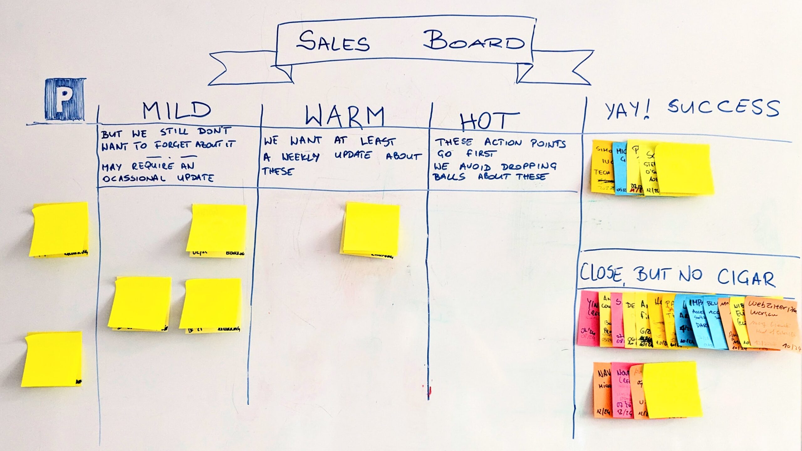
Despite the ubiquity of digital tools, physical visual boards offer unique value whenever we can get away with a whiteboard.| Pawel Brodzinski on Leadership in Technology

The MapLibre Organization is an umbrella for open-source mapping libraries.| maplibre.org
June 10, 2020 by Patrick van der Bogt Visualisation was one of the key components of last week’s Learning Experience Design Conference. So let’s practice what we preach. On Wednesday June 3rd Marieke Welle Donker and I put together a Design Lab session about testing. We chose an interview format where I would ask her questions based on a general ... Het bericht From talking points to open canvasses: presenting 8 principles for testing verscheen eerst op Learning Experience Design.| Learning Experience Design
The churches of the North are filled with saints, those of the South, with the Virgin Mary. A long-form article about who the churches and chapels in Spain are dedicated to (Saints, Virgins, Apostles…), which visually communicates information from the database of the Spanish Episcopal Conference using Open Street Map technology. The images of the saints and virgins have been generated using DALL·E Artificial Intelligence. LINK| European Newspaper Award
MuSA_RT 3.1 is out! This latest version features RealityKit-based graphics, support for audio file input, and the ability to stream result analysis to other MuSA_RT clients for local rendering.| ARJF
| ARJF
| ARJF

I think one of the reasons why I was able to do good performance work over the years is that at some point I started taking benchmarking seriously enough to write my own library. I used to use Goog…| Probably Dance

How can we wrap our minds around futures that are at once immensely complex, and riddled with uncertainty? How can we assess the likelihood of a whole range of possible outcomes? Jon Worth, Brexit …| Tim van Gelder
Buckaroo - the data wrangling assistant for pandas. Quickly explore dataframes, and run pandas commands via a GUI. Works inside the jupyter notebook. - paddymul/buckaroo| GitHub
| European Newspaper Award
| European Newspaper Award
| European Newspaper Award
| European Newspaper Award

How much minimalism is too much minimalism? I explore this question and propose the most minimalist, highest scoring data-to-ink ratio on a visualization ever made as a thought piece. Why? Well novices learning to make data visualizations are often taught to avoid ‘chart junk’ and strive towards visual minimalism. But they aren’t told when to stop.| Frank Elavsky
I wrote a post in February 2025 looking at what the Wikibase ecosystem (might) look like, according to the data that had at that point been collected on wikibase.world. Now that data has had some t…| addshore
Looking at using ACSets to structure and solve a fundamental network optimization model.| blog.algebraicjulia.org

Some emotions stick with us for years—sometimes, they’re not even ours to begin with. Four-time Emmy-winning Journalist turned Energy Healing expert, Frank Elaridi, reveals how trapped emotions and inherited trauma shape our lives in ways we don’t even realize.| The Mindvalley Podcast With Vishen Lakhiani | Listen Now
The CSV magician. Contribute to medialab/xan development by creating an account on GitHub.| GitHub
The blog, photos, and book reviews of Dan Snow| sno.ws

The DuckDB team and MotherDuck are excited to announce the release of a local UI for DuckDB shipped as part of the ui extension.| DuckDB
In October last year, I wrote a post starting to visualize the connections between Wikibases in the ecosystem that had been found and collected on wikibase.world thanks to my bot that I occasionall…| addshore
Building intuition for Receiving Operator Characterstic (ROC) curves and what they measure through visualization.| machine learning musings

In this conversation, Zoe Saldana's husband and visionary artist, Marco Perego-Saldana, shares how he uses tools like visualization and intuition to fuel his creativity, and how he manifested working with Martin Scorsese on his film, The Absence of Eden.| The Mindvalley Podcast With Vishen Lakhiani | Listen Now

Unlock your personal development and self-motivation with our curated collection of vision board examples and ideas. Discover the transformative power of visualization, positive mindset, and goal-setting. Spark ideas to create your own unique vision board. Personal Growth | Self Development | Work Vision Board | Visions Board Ideas | 2024 goals vision board | Motivation Board | Vision Board Titles | Unique Vision Boards | Vision Board Sample | Vision Board Template | Vision Board Images| Develop Good Habits
Another year of data from Société de Transport de Montréal, Montreal's| veronneau.org
Presidential election campaigns are heating up and you all know what that means. Word clouds 🙂 I still remember visualizations summarizing Romney-Obama debates in 2012 but one thing that slightly bothered me back then was that almost everything I saw were just counting single words so even the one of the most memorable phrases in […]| Bora Beran
Correspondence analysis is an exploratory data analysis method for discovering relationships between two or more categorical variables. It is very often used for visualizing survey data since if the matrix is large enough (which could be due to large number of variables but also possible with small number of variables with high cardinality) visual inspection […]| Bora Beran

Tableau provides a good set of trend line, reference line and band options but sometimes you want to overlay curves based on a custom equation. Logistic regression curves, sine curves, quantile reg…| Bora Beran

I was interviewed on a podcast recently in which most of the discussion was around mental training. (Of course, I’ll share that with you once it is live.) But we happened on a concept I hadn’t quite thought about before. The fact is… You are ALWAYS mental training…whether you think ... From You’re ALWAYS Mental Training - Legendary Strength| Legendary Strength
Building a Grafana dashboard for AWS VPC Flow Logs and Kubernetes using VictoriaLogs. Migrating Grafana Loki and LogQL queries to VictoriaLogs and LogsQL| RTFM: Linux, DevOps, and system administration | DevOps-engineering, and syst...
After learning about indexes, I understood their basic structure, but I wanted to dig deeper — to ...| mrsuh.com
I recently made some optimizations at work that saved more than| Anantha Kumaran
Background Over the past 200 years, film, as an art form has drawn on several earlier traditions in the fields such as (oral) storytelling, literature, theatre, and visual arts, has been changed from the media triggering people’s curiosity into one of the important media for culture communication and entertainment. Although the start of the history…... Read more →| Student Work
Introduction Nintendo is a Japanese multinational consumer electronics and video game company located in Kyoto, Japan. Supplying over a million different consoles, Nintendo’s mission is to place a smile on the faces to the people they touch through their electronics. Video Game users have an endless amount of console options they can choose from. Dating…... Read more →| Student Work
Humans are innately curious about the world around them. The first of our kind only knew the universe extended as far as they could travel. Maps were borne out of a desire to make sense of and bring order to the world. Beginning with rudimentary drawings on cave walls, cartography has evolved to using satellites…... Read more →| Student Work
Introduction Graphic design serves as a visual representation of every digital and physical product through the combination of images, fonts, and colors. It holds an important position in modern advertising, branding, web and editorial design, packaging, and in many other areas. The idea to explore the history of graphic design as a part of this…... Read more →| Student Work
Introduction The aesthetics of our digital screens may seem to go through revolutionary design changes year after year. But many elements of the earliest graphic user interfaces survive to this day. Far from being unrecognizable, even the earliest and most rudimentary screen designs inform current visual design choices. From the first commercial desktop computer to…... Read more →| Student Work
Introduction Weather forecast has never been the same as today. There was no such thing as a daily weather forecast at the beinging of 20th century. It took decades of data collection to publish a single weather map. However, as technology advanced, so did our methods of data collection and interpretation. Weather maps are synoptic…... Read more →| Student Work
Introduction Apple is a technology giant with global influence. Jony Ive worked at Apple for nearly 30 years and he is Apple’s Chief Design Officer (CDO). If Steve Jobs is the man who gave the soul of Apple, then Ive shaped Apple’s body. Just last year, as soon as the news of Ive’s departure came…... Read more →| Student Work
Introduction I first became familiar with John Snow’s groundbreaking map used to successfully trace the origin of London’s 1854 cholera outbreak when reading Stephen Johnston’s, The Ghost Map: The Story of London’s Most Terrifying Epidemic–and How It Changed Science, Cities, and the Modern World. The map is the epitome of what good data and effective…... Read more →| Student Work
Introduction Sports have always been fascinating to me – it doesn’t matter if it’s an outdoor or indoor sports. The game, rules, joy, victory, flags, colors, and chants of the sports unite people all over the globe. It interests me how nonliving things can play a critical role in living beings’ life, hence this topic…| Student Work
DjangoViz has been deprecated. Please refer to the Atlas Django Provider documentation for up to date instructions.| atlasgo.io
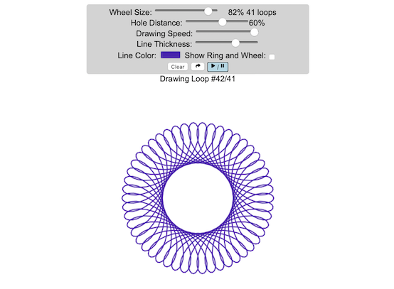
Play with an interactive spirograph that animates your drawing and lets you vary the drawing parameters and then share your creations| Engaging Data
Why do we keep building visual programming environments? Why do we never use them? What should we do instead?| blog.sbensu.com
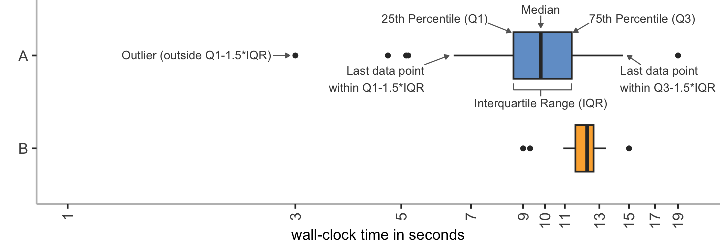
Bar charts oversimplify and should be avoided: Box Plots, Or Better!| stefan-marr.de
In 2021 I made a series of diagrams for a book called Critical Visualization by Peter A. Hall and Patricio Davila. It was published at the end of 2022 and the contributor copies recently arrived. As the title suggests, this work takes an in depth look at how data is presented and how the viewer of visualizations can understand and accommodate for the inevitably biased systems that produce the data and its representations. It is ... >> read more The post Diagrams for Critical Visualization app...| Happy Sleepy

Daily graph showing a live look at current California electricity generation by type of power plant and fuel source.| Engaging Data
Zig's New CLI Progress Bar Explained| andrewkelley.me

XR Today reports on the latest extended reality news from around the globe, including virtual reality, augmented reality and mixed reality.| XR Today

I recently implemented a small program to visualize the inner workings of a scheme that compresses floating point timeseries by XORing subsequent values. The resulting visualizations are quite neat…| Clemens' Blog
THIS POST IS CURRENTLY UNDER CONSTRUCTION| Matthew N. Bernstein

To make it easier to find up-to-date information on pro-Palestine and pro-Israel protest activity in the United States since October 7, 2023, we recently created a pair of interactive data dashboar…| Counting Crowds
Authored by Badr Ouali and Umar Farooq Ghumman Welcome to VerticaPyLab, a transformative solution that paves the way for effortless Machine Learning and Data Analytics. If the world of Python’s […] The post Exploring VerticaPyLab: A Quick Start to ML, Data Analytics, and Vertica appeared first on OpenText™ Vertica™.| OpenText™ Vertica™
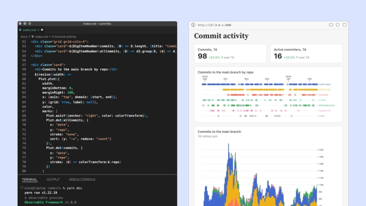
Launch of Observable 2.0: an open-source tool for building data apps and dashboards with a seamless developer workflow and optimal user experience.| Observable
TL;DR Use codegraph to visualize| 200ok - Accelerating Publishing

Major James Nesmeth was a golfer. Not a very good one, mind you. He shot in the high 90s, which would categorize him as “a hacker” in clubhouse terms. He stopped playing for seven years, but eve…| Build Your Walls! Guard Your Gates!

On a website called fanfiction.net, users write millions of stories about their favorite stories. They have diverse opinions about them. They love some stories, and hate others. The opinions are no…| Christopher Olah's Blog

A data tool that tracks the daily Cook County Jail and Community Corrections population.| Loyola University of Chicago Center for Criminal Justice
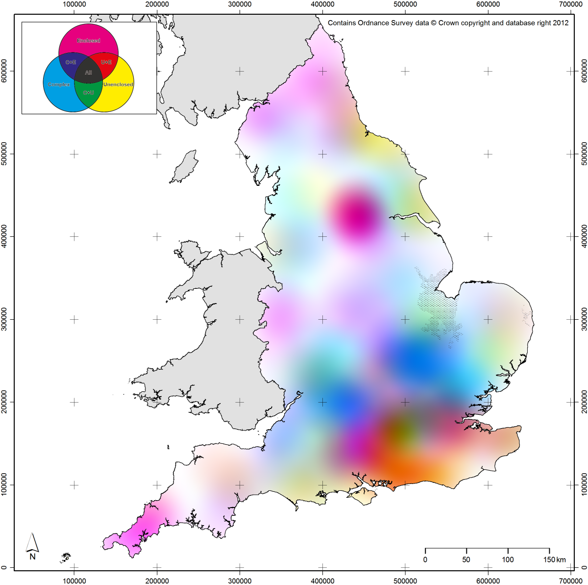
This post follows on in part from a post I wrote a couple of years ago on regionality. It will also begin with an apology: the maps presented here will be very difficult for colour blind readers to…| English Landscape and Identities
What books should I read to learn data visualization? Where do I learn current trends and best practices?| Frank Elavsky
The scale of inaccessibility is enormous and things aren’t looking too good.| Frank Elavsky
A preliminary outcome of our Commonplace Cultures Digging into Data project, we have developed a web-based visual analytics system called ViTA: Visualization for Text Alignment. Hosted by the Oxford e-Research Centre at the University of Oxford, ViTA is a web-based visual analytics interface that enables domain experts to construct a text alignment pipeline, visualize the components and connections for any given method (i.e., an alignment model) using image processing techniques, and then tes...| Glenn Roe
This tool presents data comparing existing Cook bond decisions with the new PFA detainable groups.| Loyola University of Chicago Center for Criminal Justice
Yesterday, I showed a graphic that lays out popular devices by display size. In this post, I want to show a version created using HTML, CSS, and JavaScript. The upside of doing this programmatically rather than manually in a drawing program is that it's easier to update, adjusts to each user's viewport, and can be| Thomas Park
With new devices being released at such a rapid pace, it's hard to keep up. Perhaps the most frenzied of the bunch has been Samsung, who's adopted a mentality of "let's release everything and see what sticks". This really comes out when graphing some of the most popular devices by display size. As you can| Thomas Park

OCR Journal #001 Each journal has a unique data-generated cover. Sold out, alas. From the Office for Creative Research.| Word Object

Visualize (picture, imagine, whatever you want to call it) a ball on a table. Now, imagine someone walks up to the table and gives the ball a push. What happens to the ball?| Aphantasia Network

July 15th, 2022 Dear readers: I started writing this blog 10 years ago and it is to date one of the things I am the most proud of. This is a big milestone for me, so I would like to begin with than…| MyCarta
I love me some fantasy baseball. Mainly when I'm near the top. With the regular season winding down and the playoffs set to start, my team sits comfortably in second place (in a league of 12). But this post is only partly to brag about the Mythical Man-Moths. It's also to reflect on them. How| Thomas Park
The numbers had already left impressionable marks on me, and as they swirled in my head for some months I certainly had a sense for the urgent warning they wanted me to hear. But it wasn’t until I rubbed the numbers together that the message really rang out. Then plotting the historical evolution shook me anew. I was staring at the ecological cliff we appear to be driving over.| Do the Math

