A few months ago ABC aired a documentary about how much waste we produce called War on Waste. The episode revealed that Australians use about 28 disposable takeaway coffee cups per second, triggeri…| The Data Game
In the quantitative finance world the Single-Index Model (SIM) is commonly used to price assets by measuring both volatility and return of a stock. According to this model, the return of any stock …| The Data Game
There are a few ways to access how good a team is. In this post I use Partial Least Squares Path Modelling to construct a team success index for NBA teams during the 2015-16 Playoffs.| The Data Game
This visualisation in R displays the origins and destinations of players participating in the 2015 NBA Draft using Sankey diagrams. A Sankey diagram is a visualisation used to depict a flow from on…| The Data Game
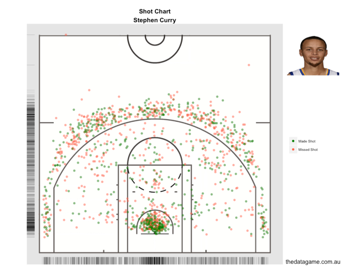
I ran the accuracy shot chart for Stephen Curry again using data from stats.nba.com, this time for the first 19 games of the 2015-16 regular season and the conclusion is: version 15-16 is better t…| The Data Game
I found a fantastic dataset on Australian Rules Football (or Australian Football League – AFL). The AFL Machine Learning Competition, promoted by Sportsbet, provided statistics on every match…| The Data Game
In my last post I produced some NBA shot charts in R using data scraped from stats.nba.com and ggplot2. This time I extracted all shot location data available for 490 players and linked it to a Tab…| The Data Game
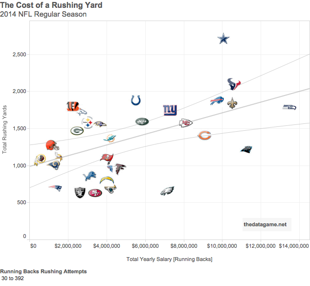
NFL teams spend a lot of money on their key players, specially running backs. But how to measure the return on investment in running backs? Are teams getting the return expected? How much does a ru…| The Data Game
I had access to surfing data from surf-stats.com, a site that collects data for fantasy surfing. It contains average scores for 55 surfers in the 2014 World Surfing League under different conditio…| The Data Game
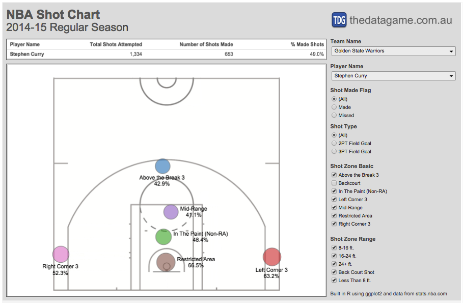
A while ago I found this fantastic post about NBA shot charts built in Python. Since my Python skills are quite basic I decided to reproduce such charts in R using data scraped from the internet an…| The Data Game