EU Data Stories | Visual Cinnamon
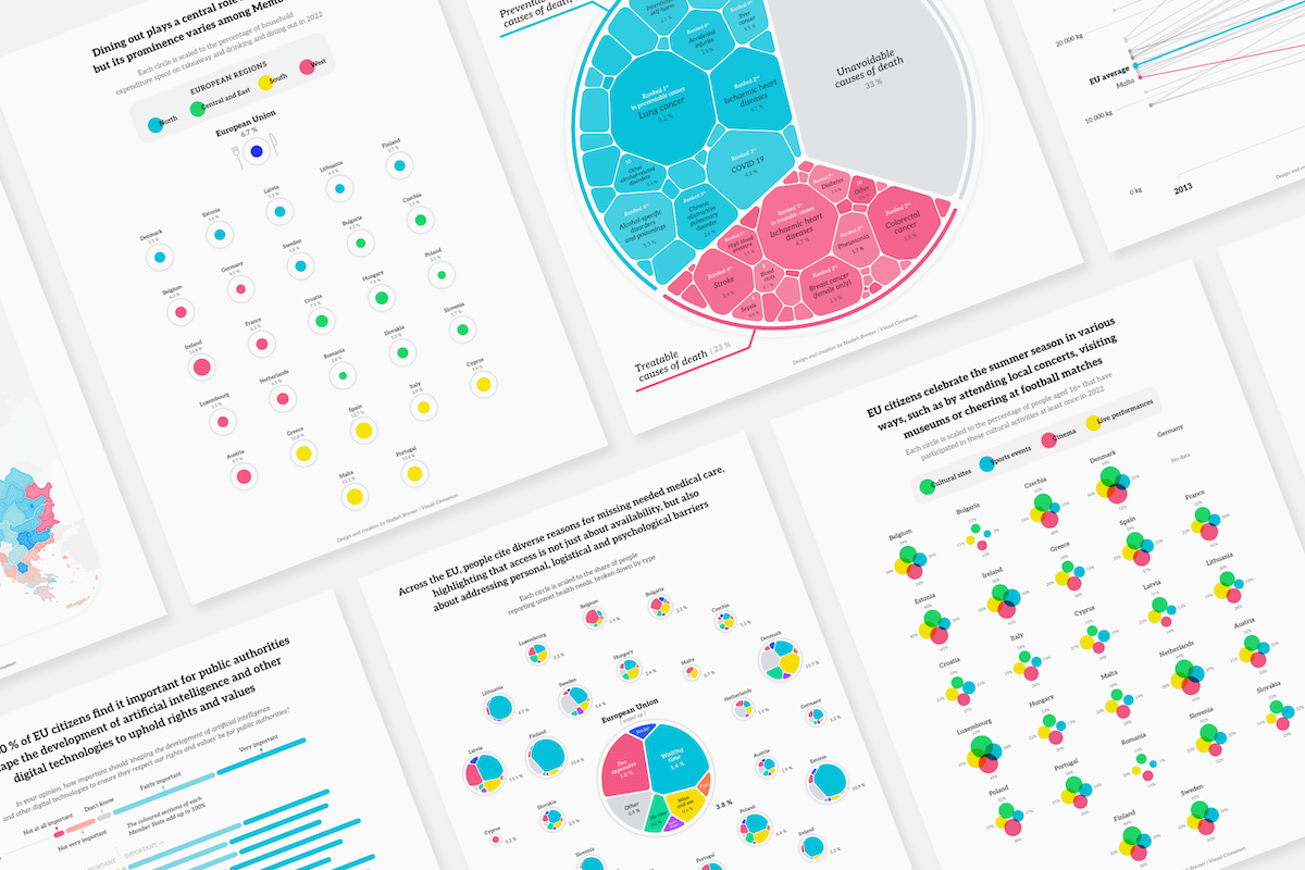
The creation of visuals for three of the EU's monthly Data Stories| Visual Cinnamon
The creation of visuals for three of the EU's monthly Data Stories| Visual Cinnamon

A spread for Scientific American showing puzzling lack of exoplanets in a certain size range| Visual Cinnamon
Each year almost 4 million babies are born in the US. Although thinking of 4 million unique names is pretty difficult, theoretically it is not impossible. Nonetheless, there are always many babies given the same name. For example, in 2013 more than 18,000 boys were named Noah and more than 21,000 girls named Sophia, the most popular boy and girl name of that year. The top 10 baby names since 1880 shows the top 10 names given to babies per year and per gender since 1880. You can investigate a...| Portfolio | A Freelancing Data Visualization Designer & Data Artist on Visual...
Societies are shifting from having a rural nature to a more and more urban nature. We face the opportunity to set the course of urbanization on a more sustainable and equitable path. This visualization is based on data on urbanization in East Asia between 2000 and 2010 collected by the World Bank using Satellite images and population models. It aims to provide you with a clear view on the magnitude of changes that can happen in only one decade and challenges you to think about the impact ...| Portfolio | A Freelancing Data Visualization Designer & Data Artist on Visual...

Explaining a chord diagram through 'storytelling with data'| Visual Cinnamon
I created a large poster for Janssen that provides an overview of the ingredients within their product portfolio, and the extent to which those ingredients are observed across a network of healthcare data that is available throughout the Johnson & Johnson enterprise. Revealing insights such as seasonality in use, and in which areas of the world the ingredients are taken the most. This poster was created to make the employees of Johnson & Johnson, the mother company of Janssen, aware of the we...| An Award-winning Data Visualization Designer on Visual Cinnamon
The New York Times had done a fascinating research on the insane number of digital trackers that you gather when you browse the web, well, anywhere. This resulted in a large dataset of trackers and metadata about what these trackers gathered and from which domain / company they originated. The New York Times reached out to me to help turn this large dataset into an eye-catching and illustrative visualization that would go in both the printed edition and online, revealing just how much informa...| An Award-winning Data Visualization Designer on Visual Cinnamon
Lighthouse reports was working together with news organizations across Europe to reveal that a massive deportation machine, Frontex, has grown up in Europe in the last decade. Through “Freedom of Information” requests they had gotten information about each Frontex flight that send deportees back home. They asked me to create an animation that would reveal the enormous growth of these deportation flights in the last few years, and reveal the surge in budgets that Frontex now gets to work w...| An Award-winning Data Visualization Designer on Visual Cinnamon
Planet’s goal of imaging the entirety of the Earth every day became achievable with the unprecedented fleet of small satellites, called “doves”. The main visualizationshowcases one day in the life of these satellites and the astounding 600,000 images captures on that day. Following the main flocks of satellites as white spheres circling the Earth several times a day, and seeing exactly when and where each photo was taken. There is a second section of the story that focuses on the differ...| An Award-winning Data Visualization Designer on Visual Cinnamon
In Why do cats & dogs …? the viewer can explore the most popular questions asked on Google that start with “why does/are/is my/a cat(s)/dog(s)”. What do people most want to know about these two pets? What “strange” behavior is asked so often that it appears to actually be quite normal behavior perhaps. What’s up with cats and cucumbers, while dogs have a fascination with poop. This dataviz-driven exploration takes you through the most interesting and funny insights found in the da...| An Award-winning Data Visualization Designer on Visual Cinnamon
Adyen wanted to feature more then just text and tables in their second ever shareholder letter & annual report and reached out to me to help them. Looking at the data that is presented in the report, I looked at what information would lend itself to be visualized in an interesting and effective manner. This eventually turned into the creation of four more extensive visuals about the income statement, costs, regional and FTE growth.| An Award-winning Data Visualization Designer on Visual Cinnamon
alis_ was looking for a way to visualize the services running on their custom alis_ OS. To reveal if the OS was running well, which tasks were failing. But also to show the dependencies of services having created new services and so on. And to have a clear differentiation between their domains. Finally, the final visual was going to be used both for management and marketing purposes and thus had to be really effective, still look good, and on brand. After a longer design phase to investigate ...| An Award-winning Data Visualization Designer on Visual Cinnamon
Since 2003 UNESCO safeguards an ever growing list of our Intangible Cultural Heritage and these days there are almost 500 unique cultural elements inscribed on the list. Four interactive and unique visuals help people understand and discover their cultural heritage, and how this is connected to other cultures through connections such as regions, countries, World Heritage Sites and concepts such as Family, Trees, Dance, and more. In March I was approached by UNESCO to help them visualize Intan...| An Award-winning Data Visualization Designer on Visual Cinnamon
The client, scenarioDNA, has a (patented) data-driven method that addresses the study of people and their ideologies over time. The best way to understand where ideas are going is to see where they live in the context of near neighbors and contrasting ideologies. They had an existing interactive tool that let their users explore the data and insights. However, this tool was perceived as being too dense and complex to understand. ScenarioDNA asked me to create a new version that would hold tru...| An Award-winning Data Visualization Designer on Visual Cinnamon
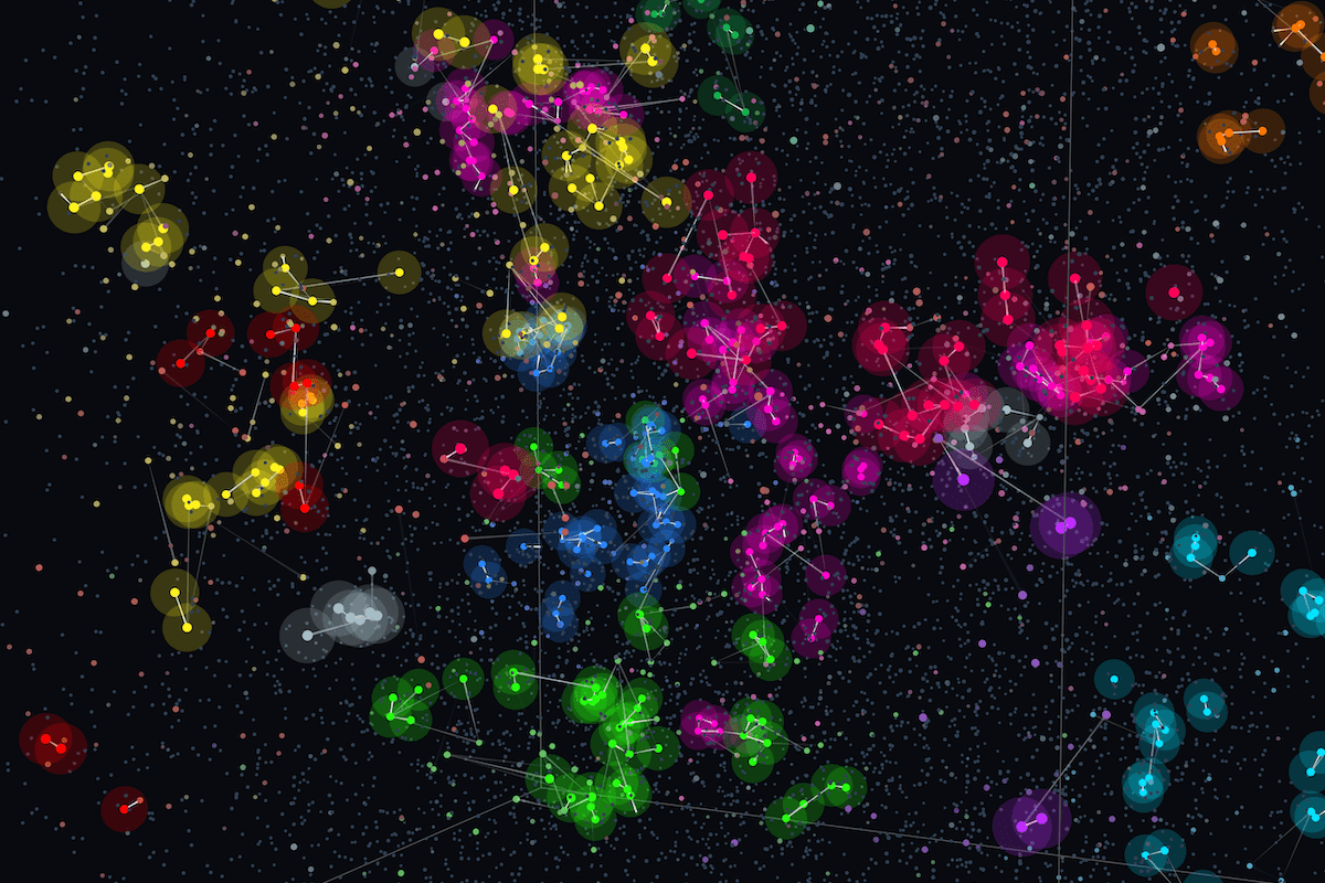
No matter where you are on Earth, we all look up to the same sky during the dark nights. You might see a different section of it depending on your exact location, time & season, nevertheless the stars have fascinated humans across time and continents. Our own creativity combined with stories about local legends and myths have created a diverse set of different constellations. And even though the stars don’t change, people have found many different shapes in the same sky. This interactive vi...| An Award-winning Data Visualization Designer on Visual Cinnamon
This data art piece conveys the intricacies of a year’s worth of flights performed by Transavia, a Dutch airline. Each flight is turned into an abstract shape whose appearance is completely determined by the meta-data of that flight. Together they create a piece that is unique and crafted only from Transavia’s own data that still conveys general trends (holidays, destination shifts depending on season, charter flights, etc.), while also having an artistic feel. The final piece, measuring ...| An Award-winning Data Visualization Designer on Visual Cinnamon
This visual shows all the stars that we’ve discovered within 20 light years from our Solar system, and the exoplanets belonging to 12 of those stars. When comparing the types of stars, it becomes clear that most are found around M-type stars. That is why projects such as NASA’s Transiting Exoplanet Survey Satellite has a prioritized list of similar type stars to look for even more exoplanets. The visual appeared in the 2017 December issue of the Scientific American.| An Award-winning Data Visualization Designer on Visual Cinnamon
Cardcaptor Sakura is one of the most beautiful and adorable manga series ever created and this project is my ode to the wonderful series. CCS was written and illustrated by the manga artist group CLAMP between 1996 and 2000, but is still extremely popular today. This visualization brings together several different aspects of the series; the main characters, the chapters, relationships and the wonderful cover art of each of the 50 chapters. By visually connecting these different aspects of Car...| An Award-winning Data Visualization Designer on Visual Cinnamon
How America moves its homeless | Each year, US cities give thousands of homeless people one-way bus tickets out of town. An 18-month nationwide investigation by the Guardian reveals, for the first time, what really happens at journey’s end. There are several data visualizations in this article. Many of which are created in a Scrollytelling style, where scrolling down the page will trigger animations in the data visualizations. Through these visualizations, video, photography, and of course,...| An Award-winning Data Visualization Designer on Visual Cinnamon
Article 19’s new Expression Agenda (XpA) metric gives a comprehensive picture of the state of freedom of expression and information internationally in 2016. The metric examines 350 aspects of democracy in 172 countries to provide an analysis that captures the challenges and complexity of the freedom expression across the world. By examining freedom of expression through this holistic approach, a far deeper understanding can be achieved of the benefits, risks and global trends that impact on...| An Award-winning Data Visualization Designer on Visual Cinnamon
Charts often aggregate across time to simplify the numbers. Instead, for this visual made for Scientific American, the focus has been on visualizing the number of babies born across different time frames; from weeks down to the minute, to reveal the role of scheduling & intervention in births. Nuanced insights about data design, visual form, and graphic design resulted in these unique charts that compare the birth of babies to the average. And people have much more influence than expected!| An Award-winning Data Visualization Designer on Visual Cinnamon
We all know that our Earth goes through a seasonal cycle, especially for the latitudes farther away from the equator. In the fall the “deciduous” plants lose their leaves only to grow back again in the next spring. The animation happening in “Breathing Earth” shows how 50.000 circles move through all 52 weeks of 2016 and visualize the seasonal cycles. Thereby displaying the how vegetation health changes throughout the year and how plant growth & decline occur on different times and sc...| An Award-winning Data Visualization Designer on Visual Cinnamon
Beautiful in English let’s the viewer dive into the most popular words translated into English through Google Translate. It focuses specifically on nouns and adjectives. From the most translated word being beautiful, to the most translated word per language, the top 10 per language and finally the similarities between all languages. See which languages seem related through the words they both translate. But also how culture defines unique words, such a gentleman for the French.| An Award-winning Data Visualization Designer on Visual Cinnamon
Dive into all 200 fights that happened during Dragon Ball Z. Starting with the first fight between Picollo and Raditz, each fight is represented by a cluster of circles. Swooshing lines representing a particular character makes it easier to understand their fighting patterns. By hovering over a fight you get more insight into the what happened and who was fighting whom. Seeing the overview of all the fights in this manner reveals interesting insights that might’ve been hidden otherwise. Suc...| An Award-winning Data Visualization Designer on Visual Cinnamon
This infographic looks at the Top 2000 songs ever made and how they are spread according to their year of release. From the 60’s in the bottom left corner to 2016 in the top right, each song is represented by a circle. The circles are sized according to their position in the Top 2000 and the darker a circle, the higher the position it reached in the weekly top 40s. Several groups of special songs are highlighted. Such as all 38 tracks from the Beatles in blue, David Bowie in yellow and Prin...| An Award-winning Data Visualization Designer on Visual Cinnamon
In Magic is Everywhere I’ve investigated the titles of ±900 fantasy books to look for trends in their titles. Magic is the most common word in all titles. Followed by fire, dark & red. In general, terms relating to unpleasant things are more common than those relating to positive aspects. Nevertheless, titles relating directly to magic can be found throughout the visual, indicating that the one thing that binds fantasy books together is, not surprisingly, Magic.| An Award-winning Data Visualization Designer on Visual Cinnamon
Royal & aristocratic families are known for their fondness of marrying within their own clique. This leads to very interesting & entangled family trees which the Royal Constellations visual tries to convey. Dive into the web of family relations to see how all 10 of the current hereditary royal leaders of Europe can be connected to each other through their ancestors. By hovering and clicking on one of the 3000 stars, each of which represent a person, the web reveals aspects such as 6-degrees o...| An Award-winning Data Visualization Designer on Visual Cinnamon
More than 5000 Olympic events have had a winner in the Summer Olympics since the first games of 1896. In Olympic Feathers you can investigate how each of these medals has been won in the 56 different sporting disciplines that have competed at the games, of which 41 are still held at Rio 2016. To see patterns appear in certain sports, such as weightlifting going from mostly European medals to Asian countries during the recent Olympic Games, or get a sense of the number of events that each spor...| An Award-winning Data Visualization Designer on Visual Cinnamon
In more than 11 hours of the Lord of the Rings trilogy all characters combined speak approximately 32,000 words. The 9 members of the Fellowship alone take up about 17,000 of these words, a bit more than half. In this visualization you can find out how many words a member has spoken at each different location throughout the trilogy. Did you realize how much Sam truly spoke. Or that Legolas said even less than Boromir!| An Award-winning Data Visualization Designer on Visual Cinnamon
Through the Builders program (previously MIECO) of Mozilla, I collaborated with Adam Bouhenguel to create an interactive visualization that shows the entire commit history of a GitHub repository. It includes an option to highlight those contributors that have been awarded with ORCA. (The Open Retrospective Compensation Agreement (ORCA), conceived by Adam, is a simple agreement for businesses to share revenue with the open source contributors who make that revenue possible.) This visual is cre...| An Award-winning Data Visualization Designer on Visual Cinnamon

An elaborate interactive network visualization showing how top contributors to a certain GitHub repository are connected to the (other) repos that they have made commits to| Visual Cinnamon
A visualization about the top 10 best-selling Nintendo Switch games, as of June 30th, 2024 created with Blender. I made this visualization specifically for my (upcoming) book about creative data visualization, showing how you can look outside of the “standard” tools and software and be inspired by other fields to create captivating and unique visualizations of data. I gave myself one week to learn Blender and create a unique and custom data visualization using a relatively simple dataset.| An Award-winning Data Visualization Designer on Visual Cinnamon
ACE was preparing for the soft launch of their rebrand to Cæmpus. They tasked me with analyzing data from the past decade (and beyond), during which they supported academic entrepreneurs in starting and growing their companies. My goal was to identify trends and interesting patterns that could be shared with the audience at the event. Additionally, during the event we highlighted the gaps in the existing data, emphasizing the importance of contributions from the community to ensure that futu...| An Award-winning Data Visualization Designer on Visual Cinnamon

Creating an interactive data visualization for IHRA to show the historic holocaust sites, what threats they face, and what solutions could help| Visual Cinnamon

A massive data art piece visualizing a full year of operation in the Swiss extra-high-voltage electrical grids| Visual Cinnamon

An interactive visualization of every gravitational wave event spotted so far| Visual Cinnamon

Presenting an overview of all still active satellites in space| Visual Cinnamon

Re-imagining a 'Gold Record' by using data from the song itself and it's streaming history for Sony Music| Visual Cinnamon

Showing how the number of satellites orbiting Earth has soared recently| Visual Cinnamon

Celebrating the Hubble Space Telescope's 30 year anniversary with two extensive visuals| Visual Cinnamon
Revealing the results of a simulation on spacefaring civilizations in the Milky Way| Visual Cinnamon

Visualizing the staggering amount that the top agrochemical companies make selling highly hazardous pesticides| Visual Cinnamon

Visualizing the results of the full ranked-choice preference of US voters leading to the 2020 elections| Visual Cinnamon

A video and poster for Kantar Consulting that reveal a new way of looking at America's counties outside of geographic proximity| Visual Cinnamon

Two animations about the history and yearly energy producing potential of all the solar panels in Switzerland| Visual Cinnamon

Four visuals for the OECD's Global Plastic Outlook| Visual Cinnamon

A visualization of the 100 tallest buildings in the world, which appeared in the third issue of Nightingale Magazine.| Visual Cinnamon

A custom map of Senja, Lofoten & Vesterålen in Norway showing our personal location data| Visual Cinnamon

Creation of a network to convey the complexity of the 'Small World of Words' network of word associations| Visual Cinnamon
