
The Modern Guide For Making CSS Shapes — Smashing Magazine
In this comprehensive guide, Temani Afif explores different techniques for creating common shapes with the smallest and most flexible code possible.| Smashing Magazine
In this comprehensive guide, Temani Afif explores different techniques for creating common shapes with the smallest and most flexible code possible.| Smashing Magazine

Personas have been in use since the mid-’90s and since then have gained widespread awareness within the design community. Once Shlomo Goltz understood why personas were valuable and how they could be put into action, he started using them in his own work, and then his process became more efficient and fun, while the fruits of his labor became more impactful and useful to others. Personas will supercharge your work and help you take your designs to the next level.| Smashing Magazine

Richard Shepherd dives into how the Nike Better World website was made. Learn how it was put together, and then use similar techniques to create our own parallax scrolling website.| Smashing Magazine
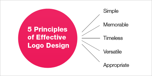
There have been numerous creative logo design showcases, logo designresources and logo design tutorials posted across the Web. While these help you to create a powerful toolbox for your logo designs, first you need to gain a solid understanding of what makes a logo design good and what you need to consider before starting using this toobox.| Smashing Magazine

The CSS `clamp()` function is often paired with viewport units for “fluid” font sizing that scales the text up and down at different viewport sizes. As common as this technique is, several voices warn that it opens up situations where text can fail WCAG Success Criterion 1.4.4, which specifies that text should scale up to at least 200% when the user’s browser reaches its 500% maximum zoom level. Max Barvian takes a deep look at the issue and offers ideas to help address it.| Smashing Magazine

Since the introduction of CSS viewport units in 2012, many of us have been using `width: 100vw` as a way to set an element’s width to the full width of the viewport. But, as Šime Vidas explains in this deep dive, `100vw` does not always represent the full width of the viewport due to differences in how browsers handle scrollbars.| Smashing Magazine
In this article, Sacha Greif tries to anticipate future CSS trends and takes a look at some far-fetched and futuristic CSS features that might one day make their way to the browser.| Smashing Magazine
Magazine on CSS, JavaScript, front-end, accessibility, UX and design. For developers, designers and front-end engineers.| Smashing Magazine

In this article, the author explains why 16 pixels should generally be the minimum size for body copy in modern Web design.| Smashing Magazine
We love useful stuff, and we love quality writing. Every Tuesday, we send out an editorial email newsletter with useful tips and techniques for designers and developers — thoroughly collected, written and edited by us exclusively for our readers. Once subscribed, you’ll receive a small token of appreciation — a free eBook just for you.| Smashing Magazine
Iconography lies at the heart of UI design. It can make or break the usability of an interface. Every icon should serve a purpose. When done correctly, they communicate the core idea and intent of a product or action, and they bring a lot of nice benefits to user interfaces, such as saving screen real estate and enhancing aesthetic appeal. In this article Nick Babich will show you how to make that possible. If you want to take a go at creating your own icons, you can download and test Adobe's...| Smashing Magazine

The best error message is the one that never shows up. It is always better to prevent errors from happening in the first place by guiding users in the right direction ahead of time. But, when errors do arise, well-designed error handling helps teach users how to use the app as you intended. In this article, Nick Babich will examine how the design of apps can be optimized to prevent user errors and how to create effective error messages in cases when errors occur independently of user input.| Smashing Magazine
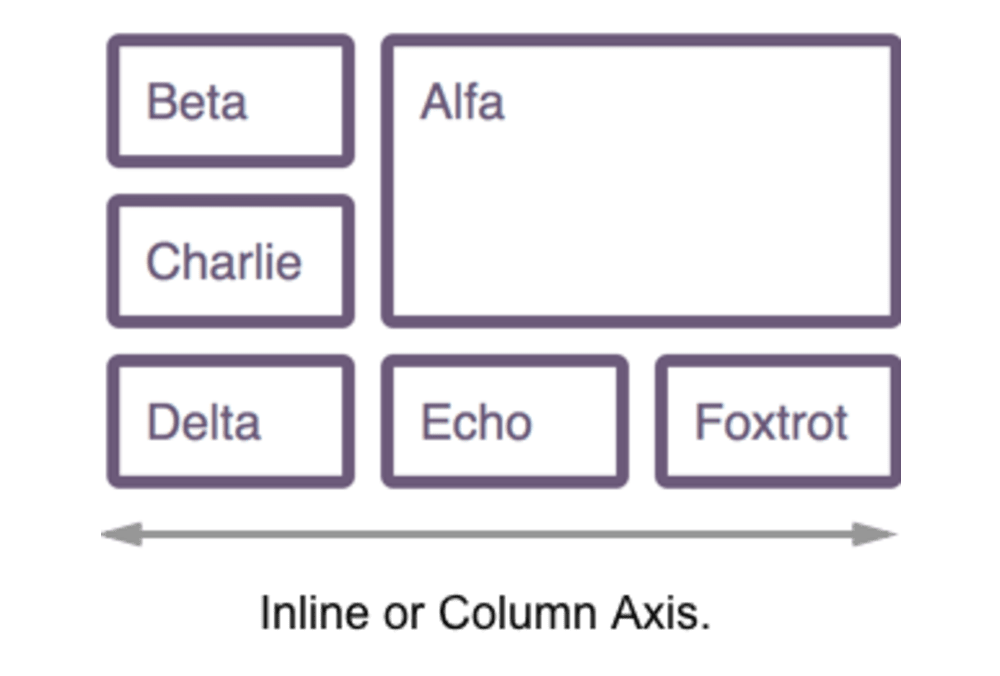
There are methods that enable the naming of lines and even grid areas. Using these methods enables easier placement of items by name rather than number, but also brings additional possibilities when creating systems for layout. In this article, Rachel Andrew will take an in-depth look at the various ways to name lines and areas in CSS Grid Layout, and some of the interesting possibilities this creates. Try not to get hung up on what is “right” or “wrong”. If you find a method confusi...| Smashing Magazine
Browsers’ visual display of headings nested inside `` elements makes it look as if they are assigning a logical hierarchy to those headings. However, this is purely visual and is not communicated to assistive technologies. In this article, Bruce Lawson explains what use we have of `` and how authors should mark up headings that are hugely important to AT users.| Smashing Magazine
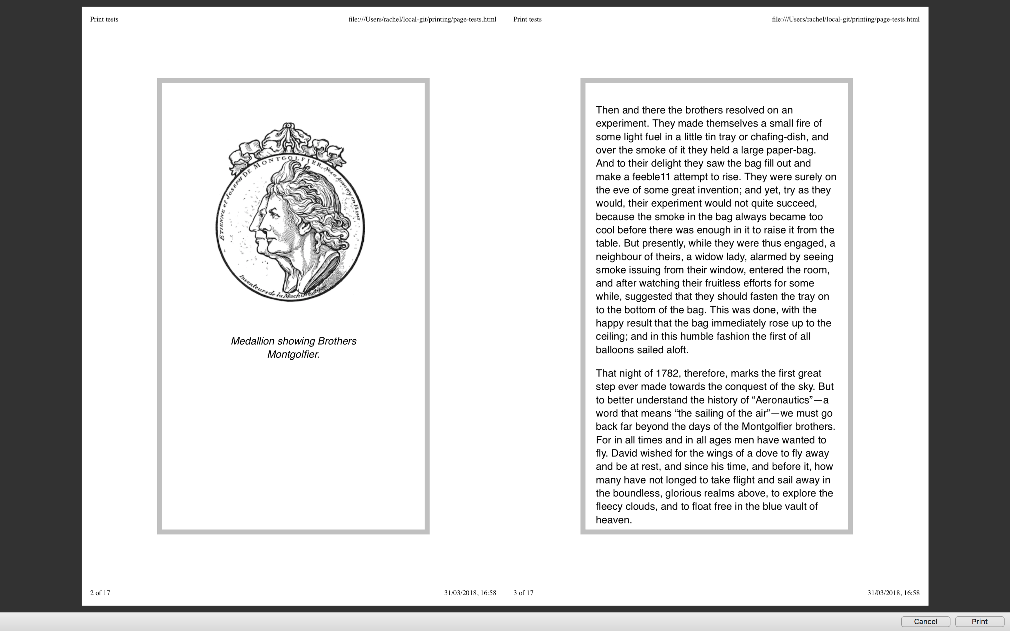
Printing pages directly from the browser is an experience that can lead to frustration with enormous images being printed out. We have covered print stylesheets in the past here on Smashing Magazine, but in this article, Rachel Andrew takes a look at the state of printing from the browser today. She will show you how you should include print styles in your web pages, and look at the specifications that really come into their own once printing.| Smashing Magazine
Developers often reach for UI frameworks like Bootstrap or Material UI, hoping that they’ll save a bunch of time and quickly build a professional-looking app. Unfortunately, things rarely work out this way. Let’s talk about it.| Smashing Magazine

Have you run into a situation where you need the padding of one element to align with the padding of another element? In this article, Brecht De Ruyte demonstrates the issue with a full-width slider component that breaks out of the main page container and shares a couple of techniques to keep it visually aligned with other elements on the page.| Smashing Magazine

WCAG provides guidance for making interactive elements more accessible by specifying minimum size requirements. In this article, Eric Bailey discusses the nuances of interactive element sizes and clarifies what it looks like to provide accessible interactive experiences using WCAG-compliant target sizes.| Smashing Magazine

Preethi Sam walks through an example that demonstrates where custom properties are more suitable than variables while showcasing the greater freedom and flexibility that custom properties provide for designing complex, refined animations.| Smashing Magazine

Do perfect Lighthouse scores mean the performance of your website is perfect? As it turns out, Lighthouse is influenced by a number of things that can be manipulated and bent to make sites seem more performant than they really are, as Salma Alam-Naylor demonstrates in several experiments.| Smashing Magazine

To use color effectively, you’ll need to understand color concepts and terminology, such as chroma, saturation, value, tones and shades.| Smashing Magazine

Conducting UX research that includes participants with a variety of disabilities is vital to building inclusive technology, but most prototypes used for testing are inaccessible. Rather than continuing to leave out feedback from disabled consumers, which ultimately leads to exclusive technology, researchers must get creative in their workarounds and be relentless in their efforts.| Smashing Magazine

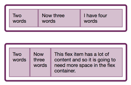
In the last two articles, we have looked at what happens when we create a flex container, and also taken a look at alignment. This time we explore the often confusing issue of sizing in Flexbox. How does Flexbox decide how big things should be? In this article, Rachel Andrew will explain some of the finer points of how Flexbox works out how big the flex items are. It can seem a little academic, however, taking some time to understand the way this works can save you huge amounts of time when u...| Smashing Magazine
For the entire history of CSS Layout, being able to properly align things on both axes seemed like it might truly be the hardest problem in web design. The alignment properties that you might think of as the flexbox alignment properties are now fully defined in the Box Alignment Specification. If you have ever been confused about when to align and when to justify, this article will make things clearer! Today, Rachel Andrew will take a look at the alignment properties in Flexbox while discov...| Smashing Magazine
In this article, the beginning of a series on Flexbox, Rachel Andrew will take a detailed look at what actually happens when you add display: flex to your stylesheet. She will take the initial values of Flexbox, in order to explain what actually happens when you say display: flex. It’s a surprising amount once you begin to unpack it, and contained within these few properties are many of the key features of flex layouts.| Smashing Magazine
Automated accessibility testing is a process where you use a series of scripts to test for the presence, or lack of certain conditions in code. These conditions are dictated by the Web Content Accessibility Guidelines (WCAG), a standard by the W3C that outlines how to make digital experiences accessible. Automated accessibility tests are a great resource to have, but they can’t automatically make your site accessible. Use them as one step of a larger testing process. Today, Eric Bailey wil...| Smashing Magazine

The CSS relational selector :has() offers what was previously impossible without JavaScript. Let’s explore some magical powers that :has brings.| Smashing Magazine
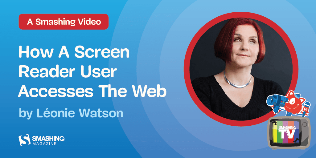
In this Smashing TV webinar recording, join Léonie Watson (a blind screen reader user) as she explores the web, and find out about some unexpected properties of HTML elements that not only have a huge impact on accessibility, but also turn out to be pretty good for performance, too. We felt that the webinar was so valuable that we would open it up so that it’s free for everybody to use. Hopefully, it will serve as a resource for the whole web development community to understand how — and...| Smashing Magazine
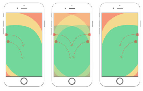
If there is one thing that will stand the test of time, it’s thumb placement on mobile devices. This makes consideration of the "thumb zone", a term coined in Steven Hoober’s research, an important factor in the design and development of mobile interfaces. In this article, Samantha Ingram will share the knowledge she’s acquired about the thumb zone and how to apply its rules to navigation, cards and swipe gestures.| Smashing Magazine
PWAs take advantage of the latest technologies to combine the best of web and mobile apps. Think of it as a website built using web technologies but that acts and feels like an app. In this article, Kevin Farrugia will look into recent advancements in the browser and the opportunities you, as developers, have to build a new generation of web apps. This is merely an appetizer for progressive web apps. You could do a lot more to create that app-like experience users are looking for, whether by ...| Smashing Magazine
In this article, Adrian Bece will explore fluid typography principles, use-cases, best practices, implementation with CSS clamp function and how to calculate the right parameters. He’ll also show you how to address some accessibility concerns and watch out for one important issue that you cannot fix as of yet, but have to be aware of regardless.| Smashing Magazine

CSS is evolving faster than ever. With all of the new features that are now available — and forthcoming — since we got Flexbox and Grid years ago, the way we write CSS is evolving, too. In this article, Geoff Graham shares which features have had the most influence on his current approaches to CSS, as well as those that have not (at least yet).| Smashing Magazine
What are the key qualities of a well-functioning, enduring design system? Throughout the book, Alla will share an approach that will help you every day with your work.| Smashing Magazine

Dependencies are everywhere. They’re unavoidable. They aren’t inherently bad, but if you don’t consider the possibility a given dependency might not be met, you run the risk of frustrating your users. Reducing dependencies improves the likelihood that your site will be usable by the greatest number of people in the widest variety of scenarios. Even knowing this, however, it’s easy to overlook the most basic dependencies our projects have, undermining their resilience in the process. T...| Smashing Magazine
(This article is kindly sponsored by Adobe.) When designing your user interface, it helps to have a system in place. Spend some time to establish a considered design system. Not only does this ensure that your design is consistent, but it also helps keep your team on the same page and provides any freelancers working on the project with all the guidance they need in one central location. With this guide, Christopher Murphy will help you find a solid UI approach that will stand the test of tim...| Smashing Magazine
In this article, Olushuyi explores a mental model that helps you decide between the `` and `` elements when writing documents. You will explore how grouping content affects accessibility and how you can make it all count for users.| Smashing Magazine

Everything you need to know about responsive design to get started. Let’s explore how to respond to the user’s behavior and environment based on screen size, platform, and orientation.| Smashing Magazine

Animation and accessibility are often seen as two separate powers at odds with one another. How is it possible to strike a balance between elements that move and the possible negative effects they expose to users who are sensitive to motion? Oriana García explains how her team at Mercado Libre tackled the challenge by creating guiding principles for applying animation to user interfaces and incorporating them into the team’s design system.| Smashing Magazine
How can we make disabled buttons more inclusive? When do they work well, and when do they fail on us? And finally, when do we actually need them, and how can we avoid them? In this article, Vitaly Friedman will take a look to common usability issues with disabled buttons, how to fix these issues and when disabling buttons actually makes sense. We’ll start from the beginning, looking into when disabled buttons cause more trouble than help.| Smashing Magazine

Despite our pursuit to do a better job every day, sometimes we forget about accessibility, the practice of designing and developing in a way that’s inclusive of people with disabilities.These days, we build a lot of client-rendered web applications, also known as single-page apps, JavaScript MVCs and MV-whatever. AngularJS, React, Ember, Backbone.js, Spine: You may have used or seen one of these JavaScript frameworks in a recent project. Common user experience-related characteristics includ...| Smashing Magazine
In more recent years, design systems and component libraries have gained popularity. There is also a desire to build once, deploy anywhere. Meaning a component developed in isolation is intended to work in any number of contexts to make building complex interfaces more efficient and consistent. CSS container queries have landed and are now available for experimentation. Let’s look at what problem is being solved, learn how container queries work, and see how they compare with and complement...| Smashing Magazine
Thanks to the wide support of the prefers-reduced-motion-media feature, we now have more advanced ways to design motion that can be creative and innovative while also being safer for those with motion sensitivities.| Smashing Magazine
Magazine on CSS, JavaScript, front-end, accessibility, UX and design. For developers, designers and front-end engineers.| Smashing Magazine

**No, they shouldn't**. At first glance the decision to open links in new windows or not depends on the given site and the preferences of its visitors.| Smashing Magazine
There are so many websites out there that have not considered the overall usability of their visually impaired users. When it comes to designing better links and sending better emails, Slava Shestopalov has a few tips on how to improve your website’s experience while accessibility in mind.| Smashing Magazine
The placeholder attribute contains a surprising amount of issues that prevent it from delivering on what it promises. The presence of a placeholder attribute won’t be flagged by automated accessibility checking software. However, this doesn’t necessarily mean it’s usable. Ultimately, accessibility is about people, not standards, so it is important to think about your interface in terms beyond running through a checklist. In this article, Eric Bailey will clarify why you need to stop us...| Smashing Magazine
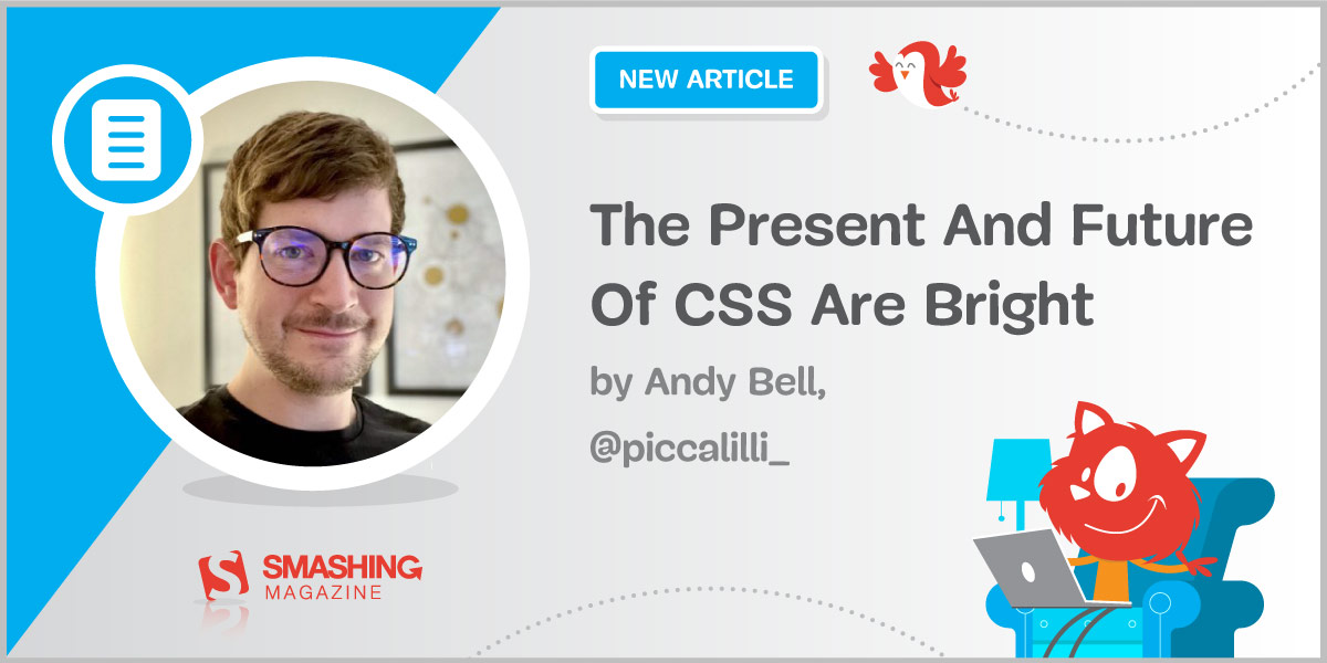
The present and future of CSS are very bright indeed and if you take a pragmatic, progressive approach to your CSS, then things will continue to get better and better on your projects, too. Some of the really handy powers CSS gives you might have slipped you by, so in this article, Andy Bell will take a look into masonry layout, :is selector, clamp(), ch and ex units, updated text decoration, and a few other useful CSS properties.| Smashing Magazine

Pagination is still the most popular way to load new items on a website. However, the usability test sessions found “Load more” buttons combined with lazy-loading to be a superior implementation, resulting in a more seamless user experience. In this article, Christian Holst will present Baymard Institute’s usability research findings for both “Load more” buttons, infinite scrolling and pagination, including for both mobile and desktop. He’ll see how search results need to be...| Smashing Magazine

Interface designers use affordances all the time. They have to. Unlike physical objects, web and mobile interfaces must gain all of their affordance through design. For most designers, this is intuitive and instinctive, based on the thousands of design patterns we see every day. But have you ever thought about the qualities that make an object afford clicking, sliding, pulling or pushing? By deeply understanding how affordance works, you’ll better master interface or product design. Better...| Smashing Magazine
CSS Logical Properties and Values aren't quite ready to be used yet, however learning about them can help you to understand CSS Layout, and the interaction with Writing Modes. In this article, Rachel Andrew is going to explain how CSS is changing to support writing modes, and in doing so, she’ll clear up some of the things that might confuse you about Flexbox and Grid.| Smashing Magazine

In this article, Rachel Andrew will look at the basics of HTTP2 as they apply to web designers and developers. She’ll explain some of the key features of the new protocol, look at browser and server compatibility, and detail the things you might need to think about as we see more adoption of HTTP2. You will get an overview of what to consider changing in your workflow in the short and long term. Rachel will also include plenty of resources if you want to dig further into the issues raised....| Smashing Magazine

The element supports a number of different types of fallback content, but the current implementation of these fallbacks is problematic. In this article Dave Newton will explore how the fallbacks work, how they fail and what can be done about it.| Smashing Magazine

How much thought have you put into your primary input device? Ever considered how much better your interface with your computer might be? For decades, keyboards have been the primary mechanisms by which we interact with our computers. In this article, Ben Frain is going to dive into the possibilities of mechanical keyboards. The different layouts, switch types and even keycap material. Strap yourself in — this will be a deep dive!| Smashing Magazine

Not everything that’s round and stands out is considered to be a button. In this article, Vadim explains how you can create a proper interactive button for your users — one that shouldn’t be confused for anything else.| Smashing Magazine
Nothing is more frustrating than stubborn management entangled in dated workflows and inefficient processes. That’s why we created “Digital Adaptation”, a new practical book on how to help senior management understand the Web and adapt the business, culture, team structure and workflows accordingly. **The web has changed the rules of business**. The best practices of the industrial economy no longer apply in the digital age. What was once safe ground is no longer so, and organizations n...| Smashing Magazine
The web has become a noisy place with millions of companies trying to get users’ attention. No wonder many of them apply increasingly desperate techniques to encourage users to act on their websites. We’ve seen an explosion of dark patterns attempting to manipulate users into handing over personal data or make a purchase. Jump to table of contents. However, these manipulative techniques come with hidden costs in customer service, maintenance, support, return processing fees, and social me...| Smashing Magazine
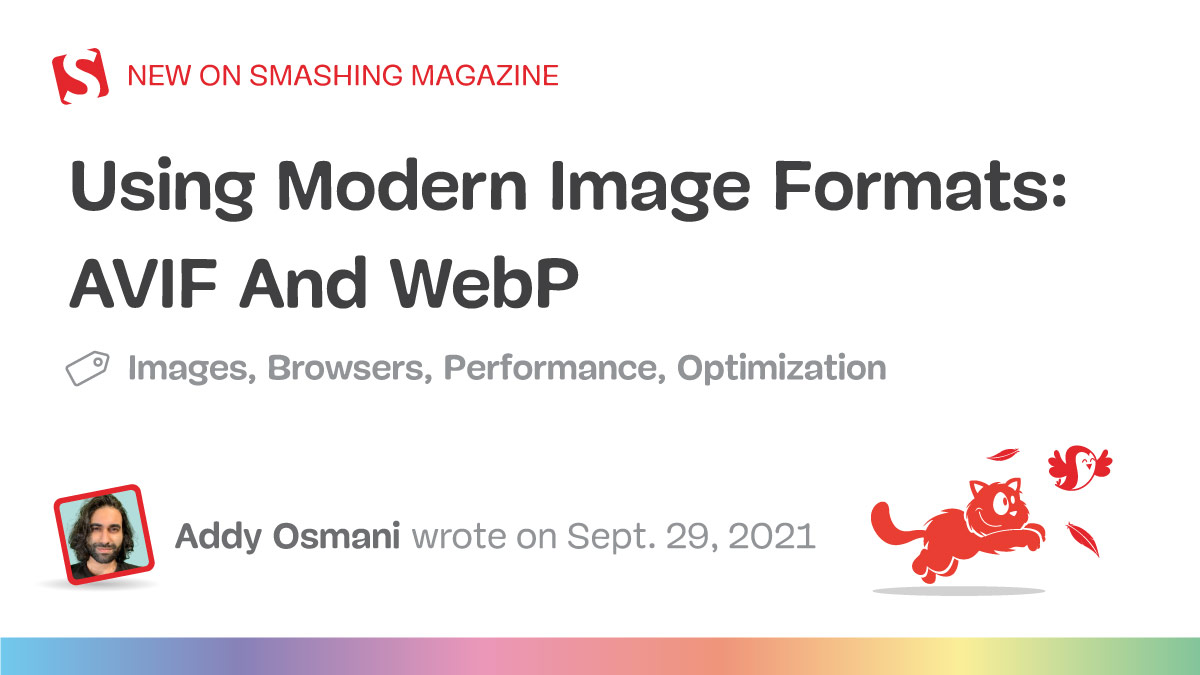
In this article, we’ll highlight how modern image formats (AVIF or WebP) can improve compression by up to 50% and deliver better quality per-byte while still looking visually appealing. We’ll compare what’s possible at high-quality, low-quality and file-size targets.| Smashing Magazine
While a good measure does improve the reading experience, it’s only one rule for good typography. Another rule is to maintain a comfortable font size. Designing on a desktop or laptop browser means that we are spending most of our time at an arm’s length from the text, and we don’t spend much time seeing how the text renders on small devices. A good font size (not too small) is readable. A good font size (not too big) promotes horizontal eye motion. A good font size with the proper line...| Smashing Magazine
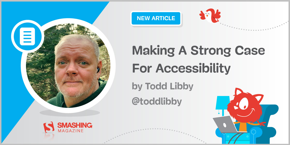
Accessibility is often overlooked or bolted on to the end of a project from the experiences in Todd’s career in web development and design. The case for accessibility is something we as people who create and build things for the web should be implementing and advocating for from the inception of a project to the release or handoff and beyond.| Smashing Magazine
HSL colors are very powerful when we use them the right way. They can save us time and effort and even help us to explore options for how to apply color to design. In this article, Ahmad Shadeed explains what HSL is, how to use it, and shares some of the useful use-cases and examples that you can use right away in your current projects.| Smashing Magazine
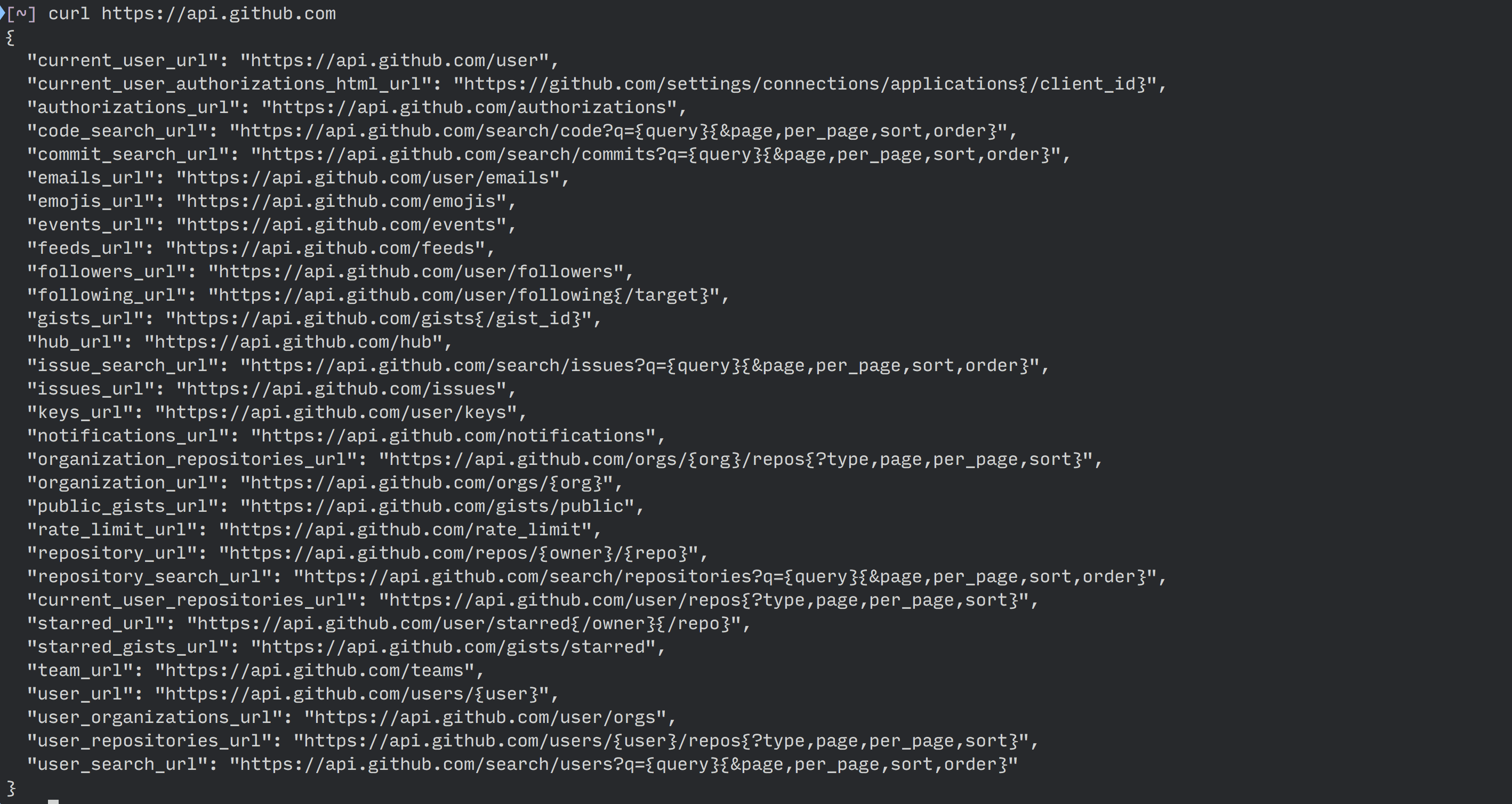
Everything you need to know about REST APIs, from start to finish. How and why to use REST APIs, how to deal with headers, error messages and API versions. In this article, Zell Liew will show you everything you need to know about REST APIs to be able to read API documentations and use them effectively. In addition, you will also learn how to authenticate your requests with the -u option, and what HTTP statuses mean. Let’s get started!| Smashing Magazine

You may not have thought much about lists, although we use them frequently in our markup. Many things can be marked up quite logically as a list. There is more to styling lists in CSS than you might think. In this article, Rachel Andrew starts by looking at lists in CSS, and moving onto some interesting features defined in the CSS Lists specification — markers and counters.| Smashing Magazine
After almost five years in development, the new HTTP/3 protocol is nearing its final form. In this second part, Robin Marx will zoom in on the performance improvements that QUIC and HTTP/3 bring to the table for web-page loading. We will, however, also be somewhat skeptical of the impact we can expect from these new features in practice.| Smashing Magazine
Dynamic properties provide opportunities for new creative ideas, but also the potential to add complexity to CSS. Custom properties have a huge potential to change how we write and structure CSS and to a lesser extent, how we use JavaScript to interact with UI components. To get the most out of them, we might need a strategy for how we write and structure CSS with custom properties. In this article, Michael Riethmuller will show you how.| Smashing Magazine
Most of the time, we develop websites without understanding what the browser is actually doing under the hood. How exactly does the browser render our web pages from the HTML, CSS and JavaScript that we create? Google’s PageSpeed Insights tool can be very helpful when trying to profile a web page and find areas for improvement. You simply enter the URL of the page that you want to test, and the tool provides you with a list of performance suggestions. Fortunately, the solution to this pro...| Smashing Magazine
CSS Custom Properties can be used for far more than just color, and their values update in realtime, both via display mode updates and JavaScript logic. This is powerful stuff. Eric explains how modern CSS is a powerful piece of assistive technology that can thread into it to create flexible, maintainable and adaptive digital experiences.| Smashing Magazine

What is that preload? What does it do? And how can it help you? Preload gives developers the ability to define custom loading logic without suffering the performance penalty that script-based resource loaders incur. In human terms, it’s a way to tell a browser to start fetching a certain resource, because you as authors know that the browser is going to need that particular resource pretty soon.| Smashing Magazine

We all have run into CSS collisions and sudden regressions in our codebases when new styles are written or 3rd-party styles are added. This is because of the interdependence of styles due to source order, specificity, and inheritance. Some ways to control the cascade have included methodologies like ITCSS and BEM and other newer native features. Cascade layers will be the ultimate native solution for resolving conflicts between multiple sources of styles. Cascade layers introduce the new at...| Smashing Magazine
You can find Markdown in many places on the Internet. This article covers different aspects of Markdown and how it interacts with other technology.| Smashing Magazine

Successful web accessibility is about anticipating the different needs of all sorts of people, understanding your fellow web users and the different ways they consume information. Armed with this understanding, accessibility becomes a cold, hard technical challenge. How do assistive technologies present a web application to make it accessible for their users? Where do they get the information they need? One of the keys is a technology known as the accessibility API.| Smashing Magazine
Overcorrecting for one form of disability may unintentionally negatively impact the experience for other forms of disability. For example, partially visually hidden link names may work great for people who use screen readers, but this approach can be problematic for people who rely on voice control software. Because of this, your designs need to be flexible and adaptable, as well as accommodate the many different ways people can interact with them.| Smashing Magazine
In this article, we’ll see how to make our sites friendly for Windows High Contrast Mode by using a good set of practices, including the media query `forced-colors` and its toolset.| Smashing Magazine

Image placement on the modern web is highly intentional, helping to communicate the overall purpose of a page or view. This means that nearly every image you declare needs to have an alternate description. Nulling an image indicates that it is for decorative purposes only. In this context, decorative means that the image does not visually communicate information that is important to understanding the purpose of the page or view, and why the image is included as a part of that.| Smashing Magazine
Our industry tends to place a lot of focus on how, often at the expense of why. An equivalent experience is one that has been deliberately conceived of and built to be able to be used by the widest possible range of people. To create an equivalent experience, you must understand all the different ways people interact with technology, as well as common barriers they experience. Once you have a common understanding established, Eric Bailey will then discuss how to go about implementing equiva...| Smashing Magazine

Dialogs are everywhere in modern interface design (for good or for bad), and yet many of them are not accessible to assistive technologies. In this article, we will dig into how to create a short script to create accessible dialogs.| Smashing Magazine
Markdown in all its flavors, interpretations, and forks won’t go away. However, it’s important to look at emerging content formats that try to encompass modern needs. In this article, Knut shares his advice against Markdown by looking back on why it was introduced in the first place, and by going through some of the major developments of content on the web.| Smashing Magazine
