Before we get into this blog post, I want to give a big shoutout to Andy Kriebel. He is the first person I ever saw place the label above a bar chart. He also developed an absolutely brilliant technique for doing this, which you can accessed here. This blog post will build upon his work and provide an alternative method for placing labels above the bars and give a bit of flexibility for how close those labels are to the bars.| The Flerlage Twins: Analytics, Data Visualization, and Tableau
Often our goal is for Tableau to become a truly self-service tool—one where almost anyone in our organization can quickly connect to data an...| The Flerlage Twins: Analytics, Data Visualization, and Tableau
Ladies and gentlemen, we’re just now entering the part of the year that so many of us look forward to for months and months: The holiday season is just around the corner. Celebrations, time with friends and family, great meals, the works — It’s finally...| InterWorks
I often create collapsing instructional menus that show users how to read my dashboards. I tend to build these in PowerPoint, by exporting an image of the dashboard out of Tableau, adding in a bunch of information in PowerPoint, exporting that image, then bringing it in as an image in Tableau. In fact, here is a great blog post from Heidi Kalbe showing exactly how to do this.| The Flerlage Twins: Analytics, Data Visualization, and Tableau
Looking to know the 2025 Tableau Data Analyst salary? Explore job market demand, salary insights, and career growth opportunities with Tableau certification.| Whizlabs Blog
Discover how Wiiisdom solutions help streamline EUC compliance, reduce manual effort, and ensure audit-ready BI content for data-driven organizations.| Wiiisdom | Analytics Governance Solutions
A roadmap is an invaluable tool to help ensure the success of any digital product development. A less experienced team may only see the tip of the iceberg: the 10% of the work and collaboration that they can easily imagine. As an experienced product manager, you know that it’s the 90% that is beneath...| Boost Labs – Digital Product Agency
We’re a digital development company, with an experienced team of developers and designers who build digital products and help you tell your story with your data. But that doesn’t mean that we’re always the right fit for companies who need digital product development...| Boost Labs - Digital Product Agency
In a world of daily technological advances, many business analysts and executives continue to lean on the comfort of their crosstabs as a preferred mode of consuming their corporation’s data. A crosstab, more commonly known as a data table, displays a relationship between two or...| InterWorks
I find myself creating "KPI Cards" (like the one above) very often. In this blog post, I'm going to walk through creating one. If you've...| The Flerlage Twins: Analytics, Data Visualization, and Tableau
Within Tableau, you may have used the option “Show Empty Rows” under the Analysis menu to force a table to show rows that do not have data based on the current selection, or just don’t have a possi…| Viz Zen Data
When delivering dashboards for our clients, it’s easy to get caught up in the layout, containers and design while ensuring the experience is up to corporate standards and is “production” ready. For me, it’s oftentimes the little things that matter most in life. And with...| InterWorks
When tasked with the ambiguous project to “create a dashboard,” I spun my wheels for a while trying to think of the perfect idea for my first Tableau Public dashboard. If you know me, you know I am a “recovering” perfectionist, and the worst thing you can do to someone like me is give me a completely open-ended project. If the world was my oyster, then I had a world of data to filter through — and that is just way too much to “perfect.”| InterWorks
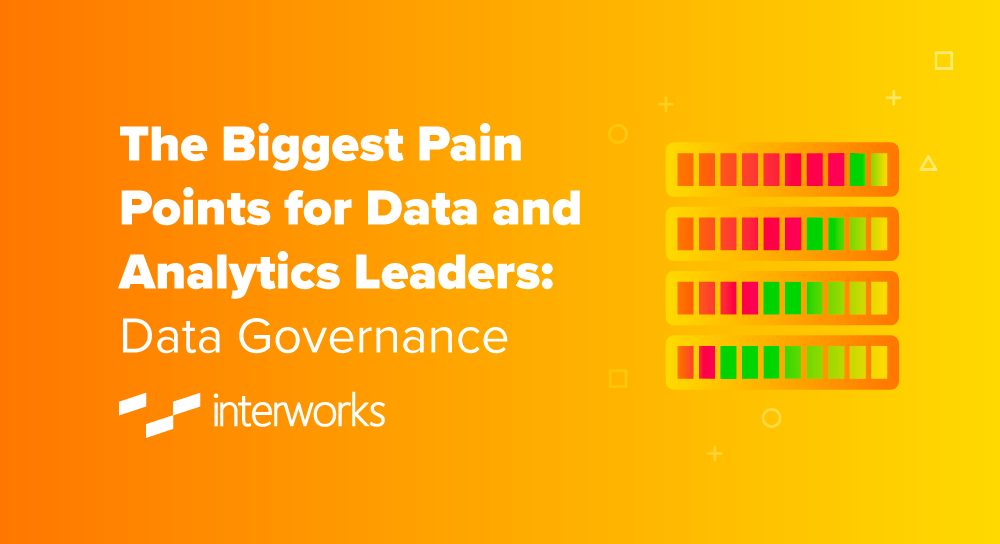
In a recent white paper by Robert Curtis, there was discussion of what the biggest pain points were for data and analytic leaders. The information was based on a multi-industry survey conducted across hundreds of clients, which provided insight on the main problems. From there, InterWorks took the time to formulate potential solutions rooted in decades of expertise to figure out how we can best help you navigate these complications. The first (and most common) pain point we’ll cover is data...| InterWorks
Mercredi 27 août 2025 — 10h45 Plongez au cœur d’un des ensembles privés majeurs de la peinture française des XVIIᵉ–XVIIIᵉ siècles, lors d’une visite exceptionnelle conduite par Dominique Brême, historien de l’art et grand spécialiste du portrait classique. Parentignat, souvent surnommé le « petit Versailles d’Auvergne », conserve une collection... The post Visite avec Dominique Brême | Château de Parentignat first appeared on Château de Parentignat.| Château de Parentignat
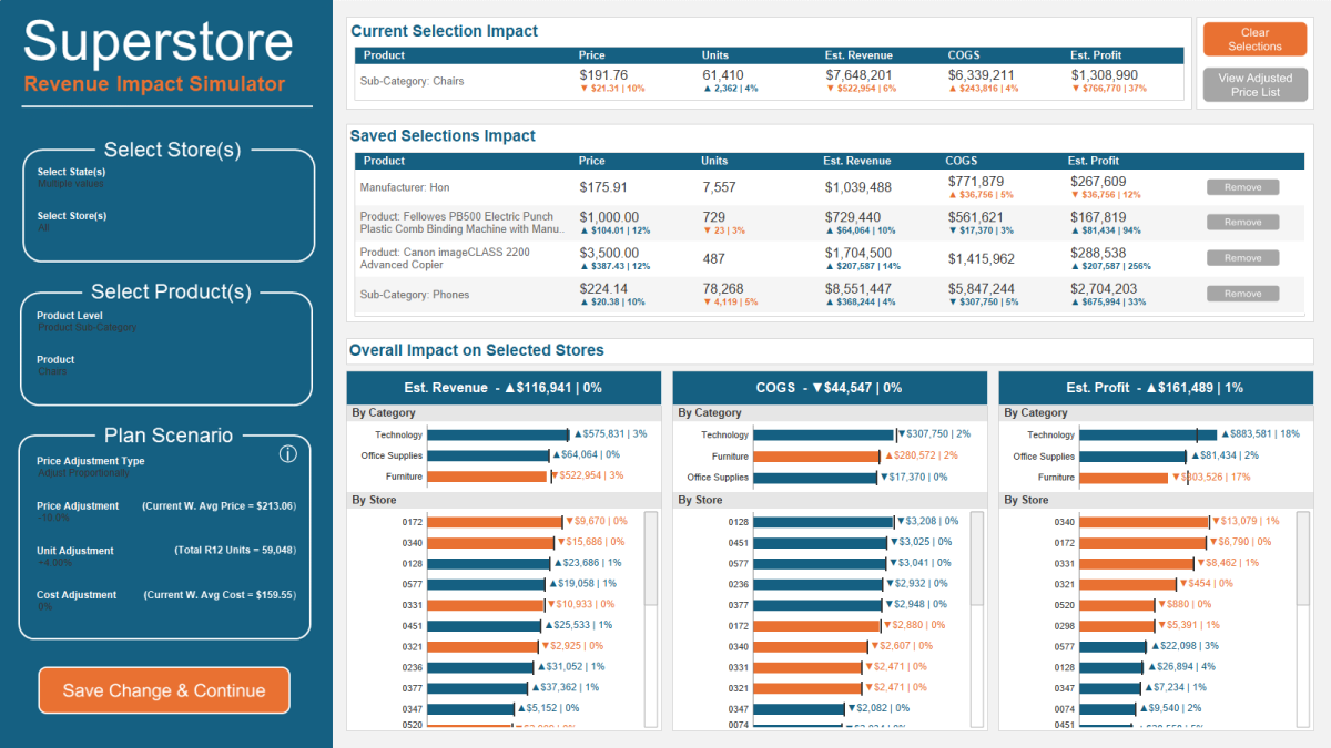
Recently, we built a dashboard in collaboration with a client and their incredibly talented team. This Superstore KPI dashboard was inspired by this dashboard. I would call this the "light" version as it does not include a pile of functionality that is included in the actual dashboard (including the ability to choose from numerous different time frame options such as previous month, previous year, YTD, custom date range, etc). You can check it out here or by clicking on the image below. Hope...| The Flerlage Twins: Analytics, Data Visualization, and Tableau
This guest blog post comes from one of our regular contributors, Kasia Gąsiewska-Holc- Senior BI Analyst at EcoVadis, Tableau Public Ambassador and data viz enthusiast based in Poland. This time, however, she’s teaming up with someone new to the Tableau world and #datafam: her husband, Łukasz Holc, a software architect and the mastermind behind the Tableau Workbook Explorer tool featured in this post. Kasia shared the wishlist, Łukasz brought it to life.| The Flerlage Twins: Analytics, Data Visualization, and Tableau
Throughout my years working in data visualization, I have experienced an intriguing evolution. When I started using Tableau 10 yearsContinue reading| Viz Zen Data
Data visualization tools provide many out-of-the-box elements that make our jobs as designers and developers easy. Tools like Tableau haveContinue reading| Viz Zen Data
The following is a guest blog post from Ethan Hahn (a regular contributor on our site). Ethan works at the University of Cincinnati and runs a small analytics team in the Office of Research. Previously, he spent 27 years at Unifund working with Jeff Shaffer, Dinushki DeLivera, Jennifer Dawes, and myself. This was my first job using Tableau, so I learned a lot from Ethan and we learned a lot together.| The Flerlage Twins: Analytics, Data Visualization, and Tableau
In a recent blog post, I discussed a scenario where I had weekly data that could not be aggregated in any way. In that blog post, I talked about how to calculate the slope of a line so that we could provide some information about trending. (To learn more about the situation, you can check out the blog post here).| The Flerlage Twins: Analytics, Data Visualization, and Tableau
In June, Tableau released the latest versions of their platforms (with the exception of Server, which is now on a twice annual release cyc...| The Flerlage Twins: Analytics, Data Visualization, and Tableau
If you’ve been using Tableau for your business intelligence needs, you’re not alone—it’s been a go-to platform for data analysts and decision-makers for years. But as the BI landscape shifts rapidly toward AI, real-time insights, and ease of use for non-technical teams, you might find yourself wondering: Is Tableau still the best fit for us? […]| Solution Suggest
Tableau led the self-service visual reporting revolution and now part of the Salesforce suite, it is bound to continue to have a loyal following and user base. The purpose of this article is not to compare Tableau to Power BI nor to expound on the strengths or perceived weaknesses of either product, but to share my experience and learnings about using Tableau with Microsoft Fabric and Power BI semantic models. I will demonstrate how to use Tableau with a Direct Lake semantic model, a large im...| Paul Turley's SQL Server BI Blog
Frustrated with Tableau's layout containers? I've been there...in fact, I was there yesterday when trying to fix someone else's dashboar...| The Flerlage Twins: Analytics, Data Visualization, and Tableau
For a while now, people have been suggesting that we write a post sharing the story of our journey—how we got started, created flerlagetwi...| The Flerlage Twins: Analytics, Data Visualization, and Tableau
As a reminder, our Tiny Tableau Tips blog posts are comprised of tips shared by others on social media that we are just providing a more p...| The Flerlage Twins: Analytics, Data Visualization, and Tableau
In our latest community spotlight, we sat down with Sonal Holankar, Associate Data Engineer at Jio Platforms, about how they use Presto to power analytics| PrestoDB
The Wait is Over. Watch this Tableau Dashboard Container Layout Video! This video was a long time coming. If you’ve ever dealt with layout containers in Tableau (which are about as intuitive as a Thomas Pynchon novel) you know they can leave you scratching your head if you’re new to the tool. And yes, I […]| Smoak Signals | Data Analytics Blog
So you build a horizontal bar chart showing some values over time...let's say by month. You start off building it with a discrete date, but you decide to show a trend line. Denied! You can't show a trend line with that discrete date. So you change it to a continuous date, you add your trend line without a problem, but then you realize the labels are not centered to the bar. And there is no way to center them. Argh!!!!!!! This blog post will help you solve this problem!| The Flerlage Twins: Analytics, Data Visualization, and Tableau
Once again, we presented How to Do Cool Stuff in Tableau at this year’s Tableau Conference. In previous years, we’ve already written about ...| The Flerlage Twins: Analytics, Data Visualization, and Tableau
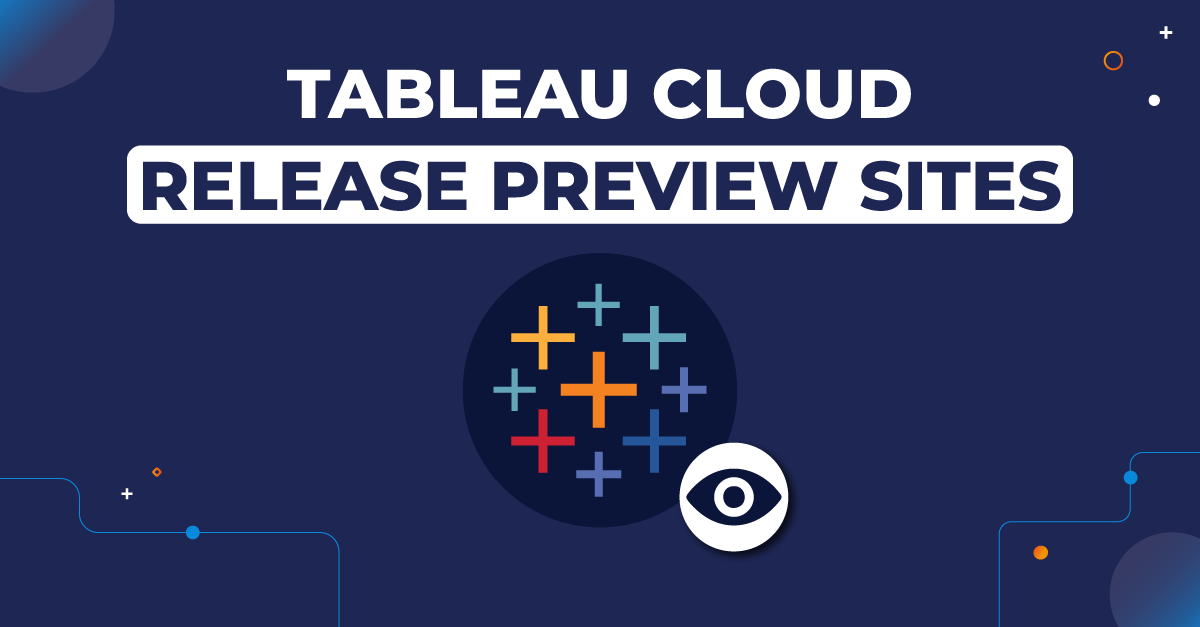
Learn how Tableau and Wiiisdom are partnering together for the new Tableau Cloud Release Preview sites in Tableau+.| Wiiisdom | Analytics Governance Solutions
The structure of the data as released and the interactive tool to visualise it are a mess of bad choices that get in the way of helping other analysts derive useful understanding from the data. They could do much better. | policyskeptic
The following is a collaborative blog post from Sebastine Amede, Darragh Murray, and me.| The Flerlage Twins: Analytics, Data Visualization, and Tableau
Les violents incendies de Los Angeles ont fait disparaître une quantité phénoménale de tableaux de grands artistes. De quoi nous faire réfléchir sur l'importance de l'art dans nos vies.| L’actualité
We are thrilled to once again be speaking at Tableau Conference April 15-17, 2025 in San Diego!! And this year, we're going to be presenting on the MAIN KEYNOTE STAGE!!!!| The Flerlage Twins: Analytics, Data Visualization, and Tableau
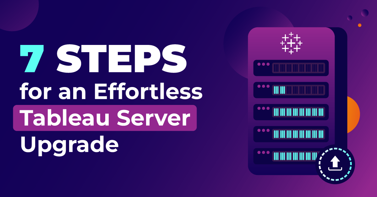
Follow this seven-step methodology the next time you carry out a Tableau Server upgrade to ensure it runs successfully.| Wiiisdom | Analytics Governance Solutions
If we build (or buy) the best data platform we can afford, the users will be clamoring to use it, right? …and when they don’t, we’ll blame the software, switch platforms, and repeat the cycle…| Do Mo(o)re with Data
In late 2021, Ken and I chose our favorite Tableau Public vizzes ever . Then in 2022, we started an annual tradition of choosing our favo...| The Flerlage Twins: Analytics, Data Visualization, and Tableau
Discover the challenges companies face with GxP compliance in Tableau Cloud and how Wiiisdom solutions can help ensure full compliance.| Wiiisdom | Analytics Governance Solutions
As a reminder, our Tiny Tableau Tips blog posts are comprised of tips shared by others on social media that we are just providing a more per...| The Flerlage Twins: Analytics, Data Visualization, and Tableau
I’m so excited!!! With the release of Tableau 2024.3, Tableau now fully supports seven new fonts!!!| The Flerlage Twins: Analytics, Data Visualization, and Tableau
Today, I’m honored to be collaborating on a post with the inimitable Lisa Trescott. If you don’t know Lisa, then where have you been? She’s ...| The Flerlage Twins: Analytics, Data Visualization, and Tableau
Reading Time: 3minutes Tableau has Python packages for working with its Hyper API, both for native operations (tableauhyperapi) or through pandas (pantab). With the recently announced public preview of Microsoft Fabric, you can also easily work with data sourced from Tableau Hyper files... The post How to Convert Tableau Hyper for Use in a Microsoft Fabric Lakehouse appeared first on DataVeld.| DataVeld
I really don't like stacked bar charts - they have so many inherent problems. But sometimes, they are, in fact, the best chart for the job. But when I design a stacked bar chart, I take numerous steps to make the chart the most insightful and easy to understand as possible. I've spoken about many of these techniques in past blog post and presentations and I will refer to those today, plus I'll add in one technique that I think takes it to the next level - allowing a user to toggle between con...| The Flerlage Twins: Analytics, Data Visualization, and Tableau
Since Tableau Public was recently upgraded to enable local saving (It’s about time), I decided to look and see what new dashboards were out there that I could learn from, and subsequently teach oth…| Smoak Signals | Data Analytics Blog
I've run across dozens of situations where I needed to provide important information to end users and force them to read it before interacting with a dashboard. For example, let's assume that the new year 2024 has begun and the business has decided to change how targets are structured. For that reason, the data in the dashboard will not be updated for the entire month of January and will continue to reflect data for the previous month (Dec 2023). If users are accustomed to seeing data for the...| The Flerlage Twins: Analytics, Data Visualization, and Tableau
If you’ve landed here, chances are you’re a BI director, Tableau Server administrator, site administrator or developer who’s interested in or planning to migrate from Tableau Server to Tableau Cloud.| InterWorks
When you’ve used Tableau for long enough, you will inevitably run into a situation where you want some text element to wrap but, whatever ...| The Flerlage Twins: Analytics, Data Visualization, and Tableau
Update June 10, 2024 : We were so blown away by the response to this training. Within a week, we had over 100 people hold their seats!! We'v...| The Flerlage Twins: Analytics, Data Visualization, and Tableau
Unlock the power of mobile dashboards in Tableau. Insights, examples, and practical tips from the Tableau Conference 2024. Start mobilizing your data today!| Canonicalized
Custom date hierarchies are one of the most underutilized features in Tableau. They allow you to define specific drill-downs not automatical...| www.vizwiz.com
Custom dates allow users to define the level of granularity and format of the date field according to their specific needs based on existing...| www.vizwiz.com
If I were starting now, these are the 3 reasons I would build a Tableau Public profile. 1. To build your skills 2. To develop your career ...| www.vizwiz.com
The general consensus in data visualization is that tables aren’t great. This is because they don’t leverage any preattentive attributes ....| The Flerlage Twins: Analytics, Data Visualization, and Tableau
In our recent Tableau Bootcamp, Ken was showing some sorting options when a client, who had a good bit of Tableau experience, asked, "when sorting, I always chose 'Nested', but you chose to sort on a 'Field' - what's the difference?" Honestly, neither of us really knew. Dangit. I really hate when I get stumped and Ken does too...and he stumped us both! We told him we would look into it and get back to him...and Ken pushed forward with the class. Of course, it was driving me crazy so I looked ...| The Flerlage Twins: Analytics, Data Visualization, and Tableau
As a reminder, our Tiny Tableau Tips blog posts are comprised of tips shared by others on social media that we are just providing a more permanent home for. For more information on how #tinytableautips came to be, check out Round 1. In Round 5, we will be featuring tips from Vince Baumel, Whitney Wood, Brittany Rosenau, Elisa Davis, and Tore Levinsen.| The Flerlage Twins: Analytics, Data Visualization, and Tableau
On 11 January 2019 I had the privilege to speak at the Michigan System Center Users Group meeting on the topic of using Power BI to report your OSD build stats. This is a companion post to that presentation. This is an update to my original post ( here ) on how to gather and present […]| The Systems Monkey
If you’re a regular reader of this blog, you know that Kevin regularly shares fantastic tips. I have only ever written one tips blog mysel...| The Flerlage Twins: Analytics, Data Visualization, and Tableau
That title is a bit of a mouthful and this may seem like a somewhat niche topic, but if you’ve ever tried to connect to a csv from the web, ...| The Flerlage Twins: Analytics, Data Visualization, and Tableau
Have you ever built a line chart that simply looks like a flat line and provides very little value? Take the following line chart for example:| The Flerlage Twins: Analytics, Data Visualization, and Tableau
I love actions in Tableau. They are such a great way of adding interactivity in an intuitive way. I use actions in almost every dashboard ...| The Flerlage Twins: Analytics, Data Visualization, and Tableau
How being curious about the unmet user needs can help dashboard designers navigate requests for spreadsheets as data sources, and requests for the ability to export dashboards to Excel| Do Mo(o)re with Data
This is a guest blog post is from Damola Ladipo. Based in Washington DC, Damola works as a Senior Data Visualization Specialist for DevTech Systems at USAID Data Services. Damola is a Tableau Public Ambassador, a 7x Viz of the Day winner, and one of the most amazing Tableau Public authors out there. And if you thought his work in Tableau was amazing, wait until you read his writings - wow! We are super excited and honored to welcome Damola as a guest blogger on our site...and he has an open ...| The Flerlage Twins: Analytics, Data Visualization, and Tableau
In November, Jennifer Dawes issued a challenge on Twitter (Yeah, I know the name changed, but I’m gonna keep calling it Twitter…). She wa...| The Flerlage Twins: Analytics, Data Visualization, and Tableau
Newcomp Analytics is here to help with Case Study: Transforming Beauty Analytics with Alteryx and Tableau Enablement A prominent player in the beauty and skincare industry engaged with Newcomp Analytics to elevate its end-to-end analytics capabilities, spanning data integration, preparation, visualization, and advanced analytics. This case study delves into the partnership between the beauty and skincare company and Newcomp, outlining the challenges faced, the strategic solutions implemented,...| Newcomp Analytics
Thanksgiving is next week. One thing that I am incredibly thankful for is our wonderfully amazing Tableau Community. Without them, there is simply no way that I'd be where I am today. So as a thank you, this blog post will feature tips from the community. This will be our 4th round of Tiny Tableau Tips.| The Flerlage Twins: Analytics, Data Visualization, and Tableau
A common Tableau request I’ve encountered—on the Tableau Community Forums and elsewhere—is a need to provide a filterable list of measure...| The Flerlage Twins: Analytics, Data Visualization, and Tableau
I’ve always wanted the ability to customize Tableau filters a little more than what’s possible out of the box. For example, it would be ni...| The Flerlage Twins: Analytics, Data Visualization, and Tableau
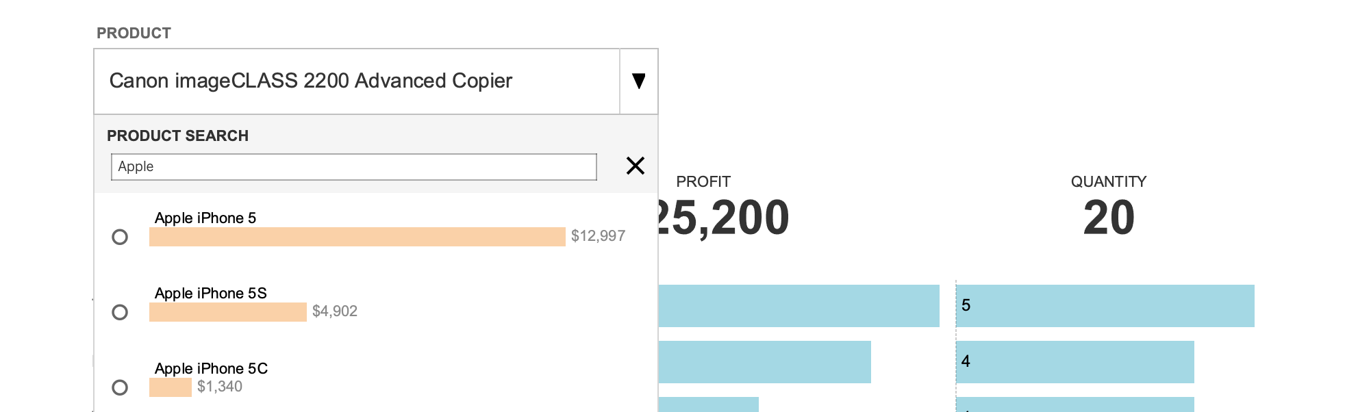
Recently, a client asked me to build them a visual to show their top 20 most profitable accounts. I created a simple bar chart showing profit and filtered that down to the top 20. However, as I looked at the chart, I wondered to myself...why are they the most profitable? The numbers were all pretty similar (say for example, #1 was $100,000 and #20 was $80,000), but how did they get to be the most profitable. So as a good analyst does, I started exploring that. I ended up adding in additiona...| The Flerlage Twins: Analytics, Data Visualization, and Tableau
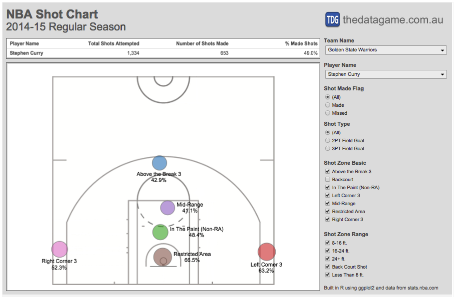
In my last post I produced some NBA shot charts in R using data scraped from stats.nba.com and ggplot2. This time I extracted all shot location data available for 490 players and linked it to a Tab…| The Data Game
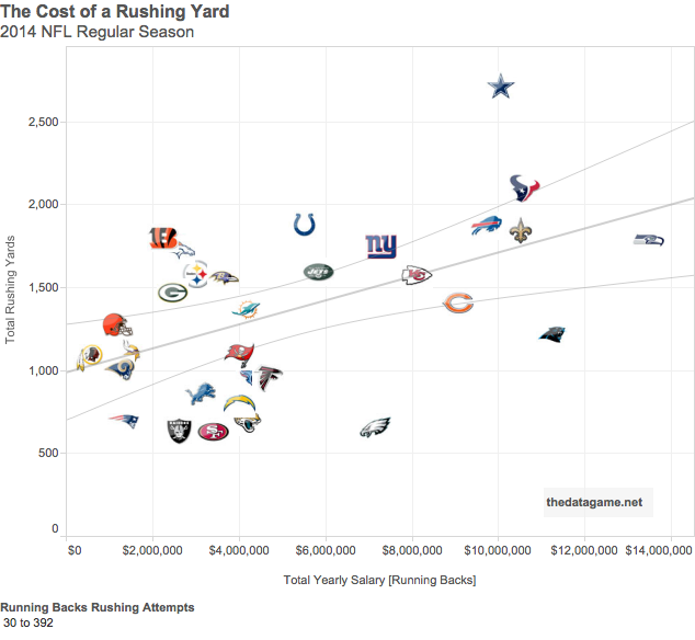
NFL teams spend a lot of money on their key players, specially running backs. But how to measure the return on investment in running backs? Are teams getting the return expected? How much does a ru…| The Data Game
What do optical illusions have to do with data visualization? Aside from being kind of fun, optical illusions tell us a lot about how human visual perception changes how we interpret what we see. T…| Do Mo(o)re with Data
If I were to give an acceptance speech, à la Tony’s, for winning the second Iron Viz feeder of 2019, it would go something like this: I was not expecting to win, the creativity and quality of the other entries was astounding. IronViz showcases the best work the data visualization community has to offer and […]| Lindsey Poulter
In a previous post, I wrote about how to create a custom dropdown using parameter actions and show/hide container buttons, as seen in my IronViz. However, I got to thinking, the list of values that appears is LONG. Having them sorted greatest to least by number of locations certainly helps, but what if there is […]| Lindsey Poulter
Better Tables A number of years ago (2020), Tableau Iron Viz finalist, Ludovic Tavernier, created a dashboard that showcased two tables: one was a standard default-looking table and the second was …| Viz Zen Data
Learn how to add a custom dashboard button in Tableau for refreshing real-time data on demand, increasing accuracy, efficiency, and user experience.| Canonicalized
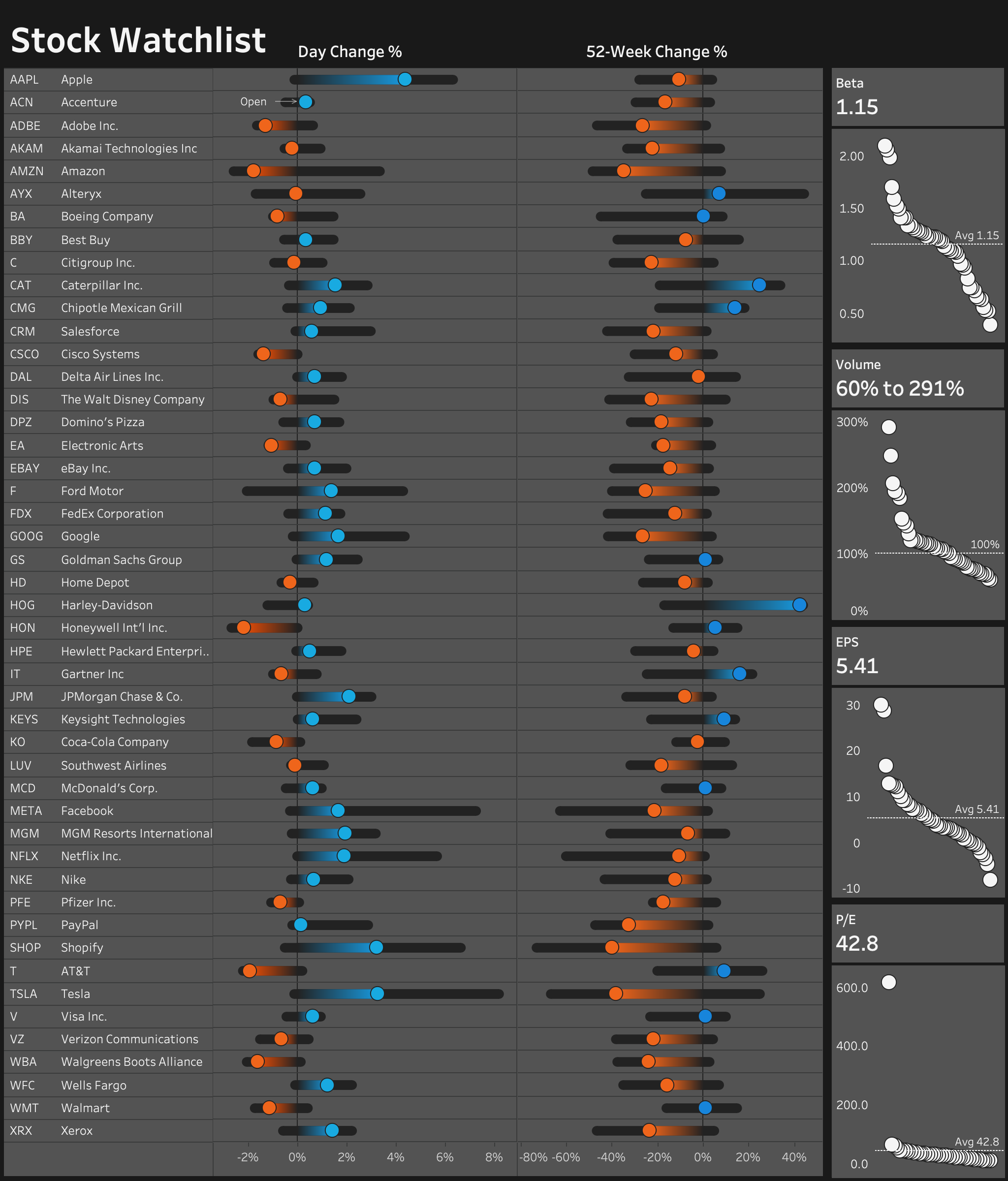
Discover how to create your own stock watchlist dashboard using Tableau & Google Sheets. Build a near real-time dashboard for free using Tableau Public!| Canonicalized
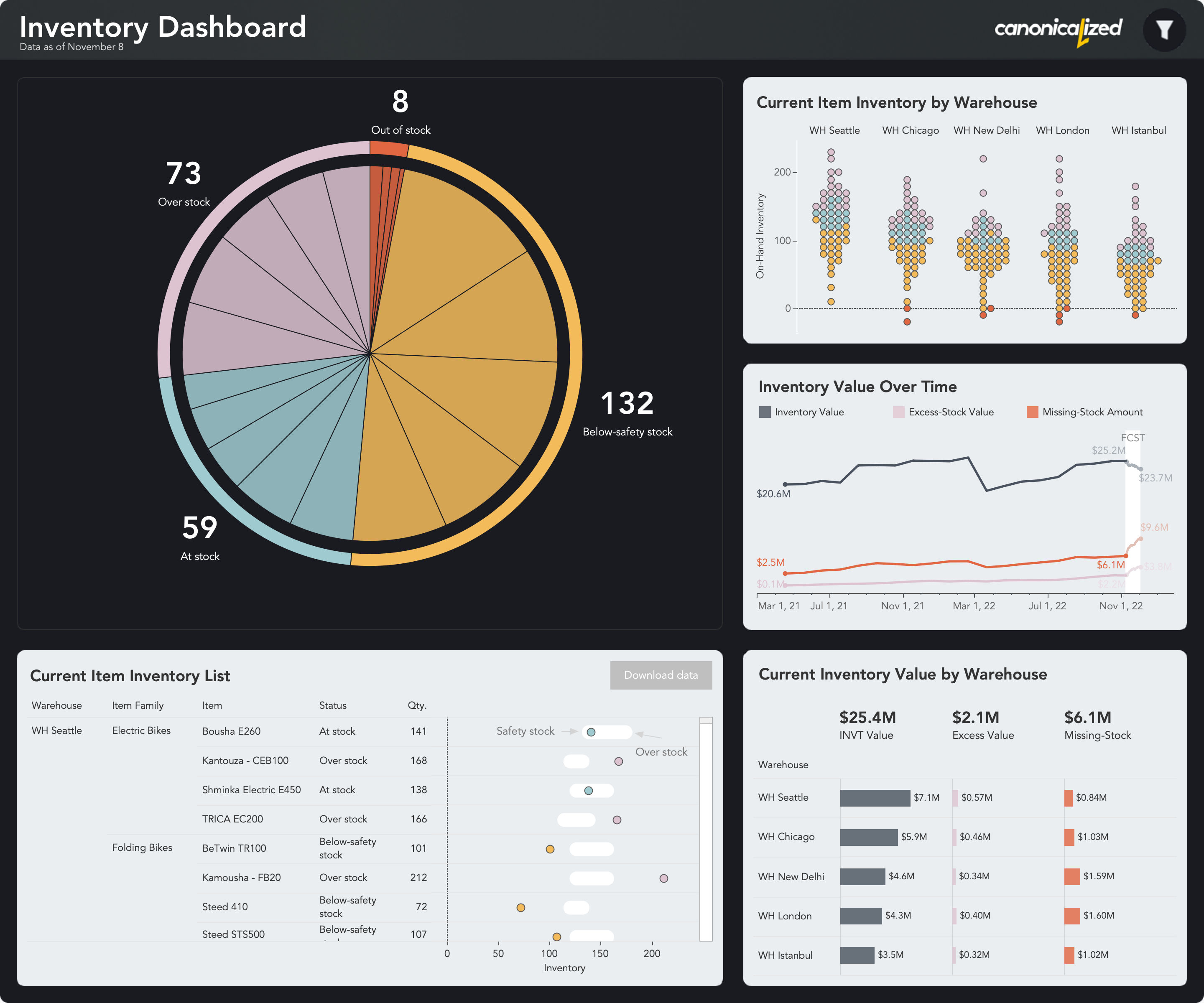
Get inspiration on using Tableau to create inventory dashboards that answer key business questions. A visually appealing supply chain business dashboard using AI, Figma, and Tableau.| Canonicalized