You hear a lot of people claiming that Nigel Farage gets an undue amount of coverage given the number of MPs in his Reform UK party. I wondered if that was true, so I ran a query against GDELT (Global Database of Events, Language and Tone). GDELT monitors mentions of specific people across broadcast, print, and web news. And…. it is! You often hear this criticism levelled specifically at the BBC, so I did a cut just for that. And it’s true there too. Technical Appendix I used BigQuery and...| Arthur Turrell
Imagining exercise can actually make you stronger – AND it doesn’t matter how old you are. I say this because most previous studies have focused on younger people. But the youngest person in this study was 68.| David R Hamilton PHD
image: iStock The Pain-Relief Technique You Can Do With Your Eyes Closed This week’s Better You, Backed by Science is about reducing pain -| David R Hamilton PHD
What level of instruction do you provide to your staff if they must undertake periodic maintenance as part of their job? Are […] The post How Exact and Safe are Your Maintenance Regimes? appeared first on Analytical Models.| Analytical Models
The European Commission JRC recently released a new 2023 update of the Global Human Settlement Layer (GHSL) data. This update has greatly improved the GHSL data, with a 10 metre scale built-up area…| CityGeographics
Each year CASA master’s students demonstrate their spatial data visualisation skills with a group project. The theme this year was ‘Urban Futures’, and students have produced some very impres…| CityGeographics
This visualisation in R displays the origins and destinations of players participating in the 2015 NBA Draft using Sankey diagrams. A Sankey diagram is a visualisation used to depict a flow from on…| The Data Game
I found a fantastic dataset on Australian Rules Football (or Australian Football League – AFL). The AFL Machine Learning Competition, promoted by Sportsbet, provided statistics on every match…| The Data Game
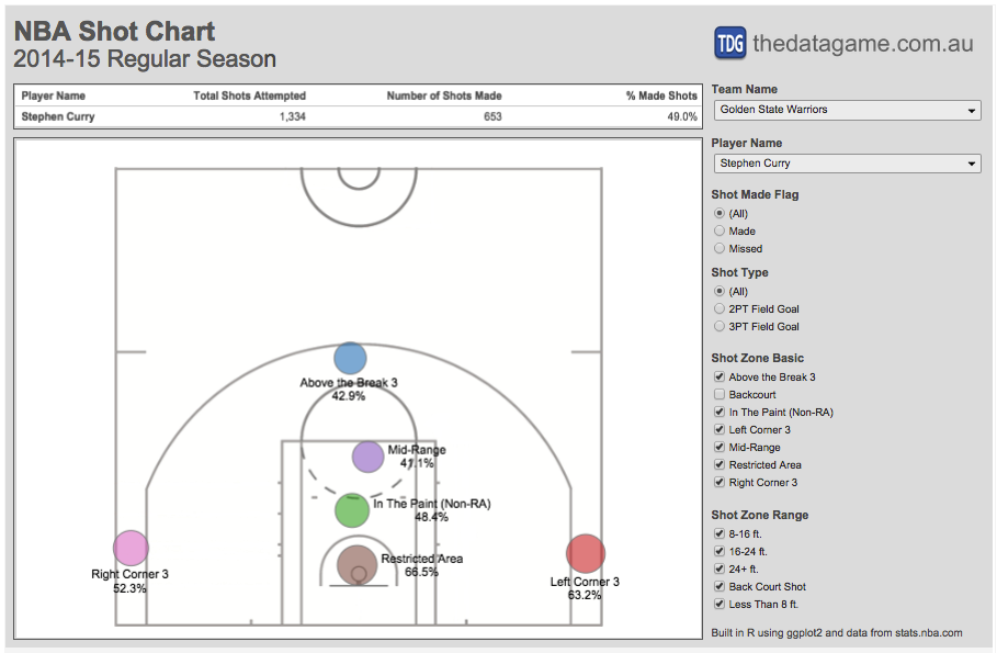
In my last post I produced some NBA shot charts in R using data scraped from stats.nba.com and ggplot2. This time I extracted all shot location data available for 490 players and linked it to a Tab…| The Data Game
Functions of the form $latex G \to \mathbb{R}$ or $latex G \to \mathbb{C}$, where $LATEX G$ is a group, arise in lots of contexts. One very natural way this can happen is to have a probability dist…| Christopher Olah's Blog
The recent IPCC AR6 WGI report summarises the state of knowledge of physical climate science, but the final version of the Summary for Policymakers (SPM) did not include a figure showing a range of indicators of our warming planet.| Climate Lab Book
The figures in the IPCC AR6 WGI SPM are a huge improvement over previous reports. However, one minor quibble is with the lack of observations shown. This brief post makes a figure available which is based on IPCC AR6 WGI SPM Figure 8, but with some observations added to show how global surface temperature and Arctic sea ice area have varied, compared to the model simulations. In my view this is a scientific improvement over the original version.| Climate Lab Book
The Working Group I (WGI) component of the IPCC 6th Assessment Report (AR6) has been released. One key development since AR5 was the involvement of professional graphic designers in creating the figures for the Summary for Policymakers (SPM). As a result, the graphics are clear and usable, having been user-tested through several design iterations. The data underlying the figures are also openly available.| Climate Lab Book