Miller’s Law | Laws of UX
The average person can only keep 7 (plus or minus 2) items in their working memory.| Laws of UX
The UX Designer’s secret weapon The UX Designer’s secret weapon, brought to you by Laws of UX & Pip Decks. Each deck includes 54 psychological principles and UX methods that help you design and justify your user interfaces, get buy-in from stakeholders and empower your design team. Order Deck Related Laws of UX Review: First Impressions Britni Pepper | Medium| Laws of UX
As humans, we have an underlying “blueprint” for how we perceive and process the world around us, and the study of psychology helps us decipher this blueprint. Designers can use this knowledge to build more intuitive, human-centered products and experiences. Instead of forcing users to adapt to the design of a product or experience, we can use some key principles from psychology as a guide for designing in a way that is adapted to people.| Laws of UX
A look into when it’s acceptable and perhaps even advantageous to design for novelty.| Laws of UX
For any system there is a certain amount of complexity that cannot be reduced.| Laws of UX
A closer look at the ubiquitous search utility.| Laws of UX
Why designers should pay close attention to the key peak moments during an experience.| Laws of UX
A look at how designers can leverage psychology to build more intuitive, human-centered products and experiences.| Laws of UX
How a classic problem-solving principle can help improve our designs.| Laws of UX
A look at both the causes and ways to reduce extraneous mental processing for the user.| Laws of UX
Users often perceive aesthetically pleasing design as design that’s more usable. Takeaways An aesthetically pleasing design creates a positive response in people’s brains and leads them to believe the design actually works better. People are more tolerant of minor usability issues when the design of a product or service is aesthetically pleasing. Visually pleasing design can mask usability problems and prevent issues from being discovered during usability testing.| Laws of UX
The tendency for people to get overwhelmed when they are presented with a large number of options, often used interchangeably with the term paradox of choice. Choice Overload is a psychology concept closely related to Hick’s Law. Takeaways Too many options hurts users’ decision-making ability. How they feel about the experience as a whole can be significantly impacted as a result. When comparison is necessary, we can avoid choice overload by enabling side-by-side comparison of related ite...| Laws of UX
A process by which individual pieces of an information set are broken down and then grouped together in a meaningful whole. Chunking is a psychology concept closely related to Miller’s Law. Takeaways Chunking enables users to easily scan content. It allows them to easily identify the information that aligns with their goals and process that information to achieve their goals more quickly. Structuring content into visually distinct groups with a clear hierarchy enables designers to align inf...| Laws of UX
A systematic error of thinking or rationality in judgment that influence our perception of the world and our decision-making ability. Takeaways Rather than thinking through every situation, we conserve mental energy by developing rules of thumb to make decisions which are based on past experiences. These mental shortcuts increase our efficiency by enabling us to make quick decisions without the need to thoroughly analyze a situation but can also influence our decision-making processes and jud...| Laws of UX
The amount of mental resources needed to understand and interact with an interface. Cognitive Load is a psychology concept closely related to Miller’s Law. Takeaways When the amount of information coming in exceeds the space we have available, we struggle mentally to keep up — tasks become more difficult, details are missed, and we begin to feel overwhelmed. Intrinsic cognitive load refers to the effort required by users to carry around information relevant to their goal, absorb new infor...| Laws of UX
Productivity soars when a computer and its users interact at a pace (<400ms) that ensures that neither has to wait on the other. Takeaways Provide system feedback within 400 ms in order to keep users’ attention and increase productivity. Use perceived performance to improve response time and reduce the perception of waiting. Animation is one way to visually engage people while loading or processing is happening in the background.| Laws of UX
The time to acquire a target is a function of the distance to and size of the target. Takeaways Touch targets should be large enough for users to accurately select them. Touch targets should have ample spacing between them. Touch targets should be placed in areas of an interface that allow them to be easily acquired. Origins In 1954, psychologist Paul Fitts, examining the human motor system, showed that the time required to move to a target depends on the distance to it, yet relates inversely...| Laws of UX
The mental state in which a person performing some activity is fully immersed in a feeling of energized focus, full involvement, and enjoyment in the process of the activity. Takeaways Flow occurs when there is a balance between the difficulty of a task with the level of skill at the given task. It’s characterized by intense and focused concentration on the present, combined with a sense of total control.| Laws of UX
The tendency to approach a goal increases with proximity to the goal. Takeaways The closer users are to completing a task, the faster they work towards reaching it. Providing artificial progress towards a goal will help to ensure users are more likely to have the motivation to complete that task. Provide a clear indication of progress in order to motivate users to complete tasks. Origins The goal-gradient hypothesis, originally proposed by the behaviorist Clark Hull in 1932, states that the t...| Laws of UX
Users spend most of their time on other sites. This means that users prefer your site to work the same way as all the other sites they already know. Takeaways Users will transfer expectations they have built around one familiar product to another that appears similar. By leveraging existing mental models, we can create superior user experiences in which the users can focus on their tasks rather than on learning new models.| Laws of UX
Elements tend to be perceived into groups if they are sharing an area with a clearly defined boundary. Takeaways Common region creates a clear structure and helps users quickly and effectively understand the relationship between elements and sections. Adding a border around an element or group of elements is an easy way to create common region. Common region can also be created by defining a background behind an element or group of elements.| Laws of UX
Objects that are near, or proximate to each other, tend to be grouped together. Takeaways Proximity helps to establish a relationship with nearby objects. Elements in close proximity are perceived to share similar functionality or traits. Proximity helps users understand and organize information faster and more efficiently. Examples Google Search Results The spacing between each result on Google’s search results page contributes to the overall scannability of the page but also helps to effe...| Laws of UX
People will perceive and interpret ambiguous or complex images as the simplest form possible, because it is the interpretation that requires the least cognitive effort of us. Takeaways The human eye likes to find simplicity and order in complex shapes because it prevents us from becoming overwhelmed with information. Research confirms that people are better able to visually process and remember simple figures than complex figures. The human eye simplifies complex shapes by transforming them i...| Laws of UX
The human eye tends to perceive similar elements as a complete picture, shape, or group, even if those elements are separated. Takeaways Elements that are visually similar will be perceived as related. Color, shape, and size, orientation and movement can signal that elements belong to the same group and likely share a common meaning or functionality. Ensure that links and navigation systems are visually differentiated from normal text elements.| Laws of UX
Elements that are visually connected are perceived as more related than elements with no connection. Takeaways Group functions of a similar nature so they are visually connected via colors, lines, frames, or other shapes. Alternately, you can use a tangible connecting reference (line, arrow, etc) from one element to the next to also create a visual connection. Use uniform connectedness to show context or to emphasize the relationship between similar items.| Laws of UX
A compressed model based on what we think we know about a system and how it works. Mental models are a psychology concept closely related to Jakob’s Law. Takeaways We form a working model in our minds around what we think we know about a system, especially about how it works, and then we apply that model to new situations where the system is similar. Match designs to the users’ mental models to improve their experience.| Laws of UX
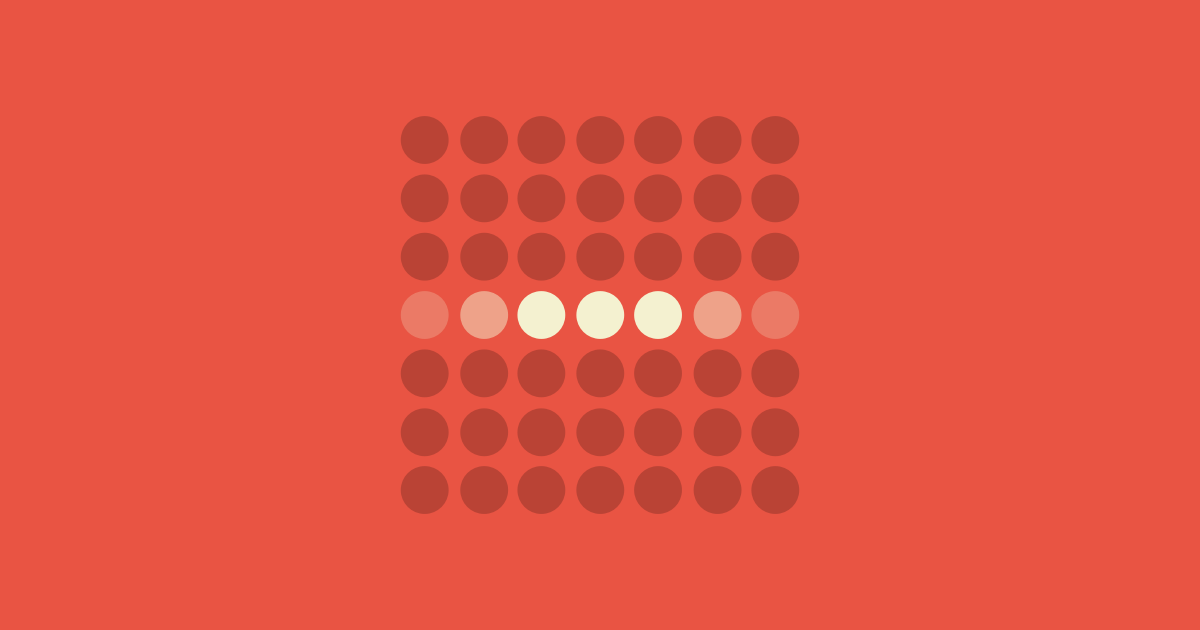
The average person can only keep 7 (plus or minus 2) items in their working memory.| Laws of UX
Among competing hypotheses that predict equally well, the one with the fewest assumptions should be selected. Takeaways The best method for reducing complexity is to avoid it in the first place. Analyze each element and remove as many as possible, without compromising the overall function. Consider completion only when no additional items can be removed. Origins Occam’s razor (also Ockham’s razor; Latin: lex parsimoniae "law of parsimony") is a problem-solving principle that, when present...| Laws of UX
Users never read manuals but start using the software immediately. Takeaways Users are often motivated to complete their immediate tasks and therefore they don't want to spend time up front reading documentation. This paradox exist because users will save time in the long term if they take the time to optimize the system and learn more about it. Make guidance accessible throughout the product experience and design it to fit within the context of use so that it can help these active new users ...| Laws of UX
The Pareto principle states that, for many events, roughly 80% of the effects come from 20% of the causes. Takeaways Inputs and outputs are often not evenly distributed. A large group may contain only a few meaningful contributors to the desired outcome. Focus the majority of effort on the areas that will bring the largest benefits to the most users. Origins Its origins stem back to Vilfredo Pareto, an economist who noticed 80% of Italy’s land was owned by 20% of the population.| Laws of UX
Any task will inflate until all of the available time is spent. Takeaways Limit the time it takes to complete a task to what users expect it’ll take. Reducing the actual duration to complete a task from the expected duration will improve the overall user experience. Leverage features such as autofill to save the user time when providing critical information within forms. This allows for quick completion of purchases, bookings and other such functions while preventing task inflation.| Laws of UX
Be liberal in what you accept, and conservative in what you send. Takeaways Be empathetic to, flexible about, and tolerant of any of the various actions the user could take or any input they might provide. Anticipate virtually anything in terms of input, access, and capability while providing a reliable and accessible interface. The more we can anticipate and plan for in design, the more resilient the design will be.| Laws of UX
The process of focusing our attention only to a subset of the stimuli in the environment — usually those related to our goals. Selective attention is a psychology concept closely related to the Von Restorff Effect. Takeaways People often filter out information that isn’t relevant. This happens in order to maintain focus on information that is important or relevant to the task at hand. Designers must guide users’ attention, prevent them from being overwhelmed or distracted, and help them...| Laws of UX
Users have a propensity to best remember the first and last items in a series. Takeaways Placing the least important items in the middle of lists can be helpful because these items tend to be stored less frequently in long-term and working memory. Positioning key actions on the far left and right within elements such as navigation can increase memorization. Origins The serial position effect, a term coined by Herman Ebbinghaus, describes how the position of an item in a sequence affects recal...| Laws of UX
Tesler’s Law, also known as The Law of Conservation of Complexity, states that for any system there is a certain amount of complexity which cannot be reduced. Takeaways All processes have a core of complexity that cannot be designed away and therefore must be assumed by either the system or the user. Ensure as much as possible of the burden is lifted from users by dealing with inherent complexity during design and development.| Laws of UX
A cognitive system that temporarily holds and manipulates information needed to complete tasks. Working memory is a psychology concept closely related to cognitive load. Takeaways Working memory is limited to 4-7 chunks of information at any given moment with each chunk fades after 20-30 seconds. We use it to keep track of information in order to achieve tasks but we often have trouble remembering what information we’ve already seen.| Laws of UX

People remember uncompleted or interrupted tasks better than completed tasks.| Laws of UX

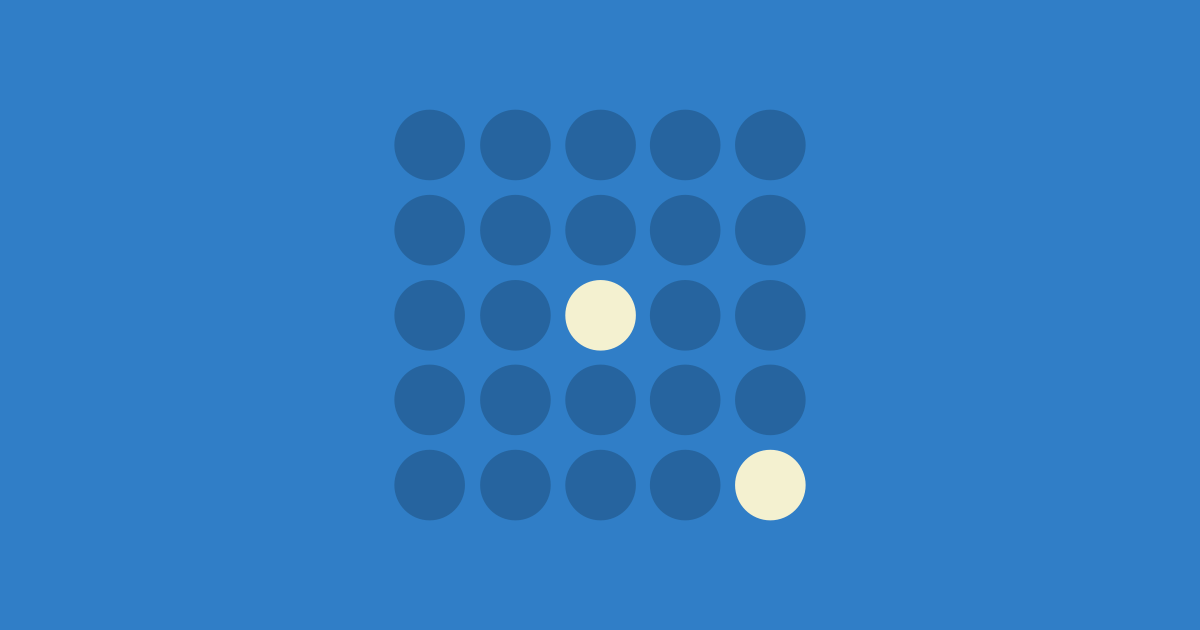
The Von Restorff effect, also known as The Isolation Effect, predicts that when multiple similar objects are present, the one that differs from the rest is most likely to be remembered.| Laws of UX

Laws of UX is a collection of best practices that designers can consider when building user interfaces.| Laws of UX

Laws of UX is a collection of best practices that designers can consider when building user interfaces.| Laws of UX
People judge an experience largely based on how they felt at its peak and at its end, rather than the total sum or average of every moment of the experience.| Laws of UX

The time it takes to make a decision increases with the number and complexity of choices.| Laws of UX
