Marking Required Fields in Forms - NN/G
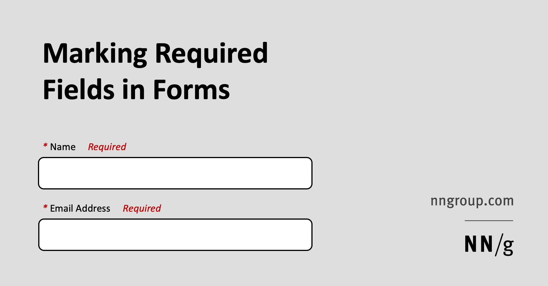
Using an asterisk to mark required fields is an easy way to improve the usability of your forms. Only marking optional fields makes it difficult for people to fill out the form.| Nielsen Norman Group
Using an asterisk to mark required fields is an easy way to improve the usability of your forms. Only marking optional fields makes it difficult for people to fill out the form.| Nielsen Norman Group
User experience training courses offered worldwide. Over 40 in-depth, full-day courses teaching practical skills, proven methods and best practices.| Nielsen Norman Group

Users’ field of vision, arm motion, affordance, and privacy are a few of the design considerations for very large touchscreens (kiosks and other nonmobile use).| Nielsen Norman Group

The mouse (desktop computer) and the finger (touchscreen) each has unique strengths and weaknesses. Thus different UI designs are best for desktop vs mobile.| Nielsen Norman Group

When deciding which links to click on the web, users choose those with the highest information scent — which is a mix of cues that they get from the link label, the context in which the link is shown, and their prior experiences.| Nielsen Norman Group
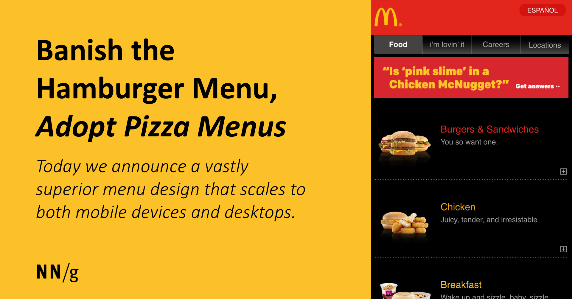
"Hamburger" menus have some usability problems in mobile designs and many problems on desktop. A bold new design solves these flaws.| Nielsen Norman Group
188 tips for attracting business customers and turning leads into sales. Includes discussions and 301 screenshots to supplement the research findings.| Nielsen Norman Group
Jakob Nielsen's classic book discusses the most important of the guidelines for Web usability. It also revisits guidelines from the 1990s in light of newer research.| Nielsen Norman Group
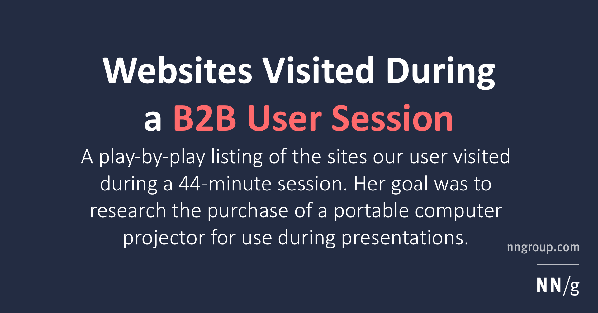
While researching a purchase, a user conducted 25 visits to 15 different sites. Discussion of why and how the user visited each site and shy she left it.| Nielsen Norman Group

Every year brings new mistakes. In 2002, several of the worst mistakes in Web design related to poor email integration. The number one mistake, however, was lack of pricing information, followed by overly literal search engines.| Nielsen Norman Group

Prospective customers want to know the price as their #1 info need on any website — including B2B sites, but these sites often hide or obscure pricing information.| Nielsen Norman Group
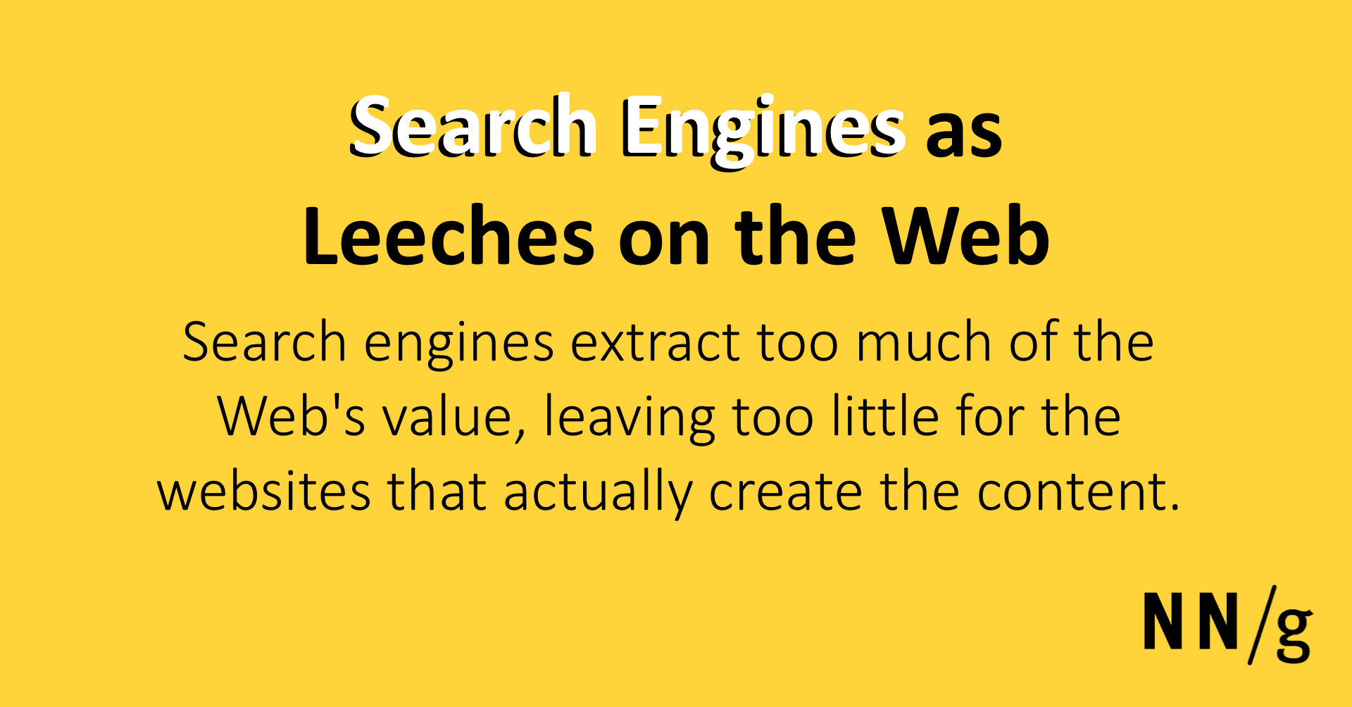
Search engines extract too much of the Web's value, leaving too little for the websites that actually create the content. Liberation from search dependency is a strategic imperative for both websites and software vendors.| Nielsen Norman Group
A leader in the user experience field, NN/g conducts groundbreaking research, trains and certifies UX practitioners, and provides UX consulting to clients.| Nielsen Norman Group

Architecting a Journey Management Practice:| Nielsen Norman Group

Qualitative usability studies have few users and variable protocol; numbers obtained from such studies are likely to poorly reflect the true behavior of your population due to large measurement errors.| Nielsen Norman Group
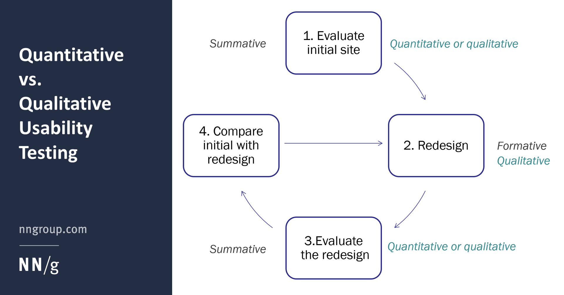
Qualitative research informs the design process; quantitative research provides a basis for benchmarking programs and ROI calculations.| Nielsen Norman Group

Don’t report descriptive statistics like success rates and averages unless you ran a quantitative study. Reported numbers must be qualified with statistical information such as confidence intervals or statistical significance.| Nielsen Norman Group
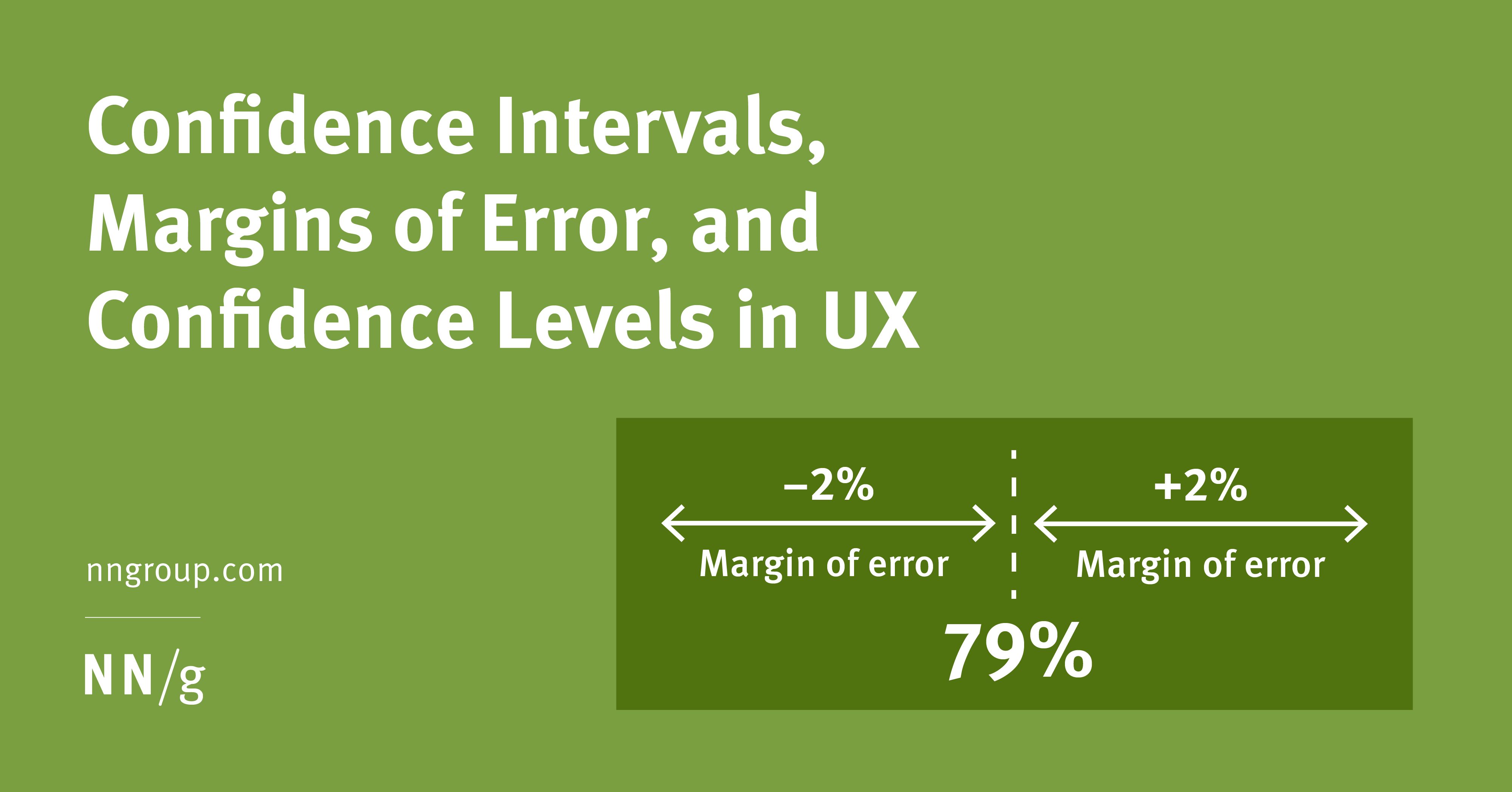
A confidence-interval calculation gives a probabilistic estimate of how well a metric obtained from a study explains the behavior of your whole user population.| Nielsen Norman Group

Quantitatively evaluate a product or service’s user experience by using metrics to gauge its relative performance against a meaningful standard.| Nielsen Norman Group
Anything done by more than 90% of big sites becomes a de-facto design standard that must be followed unless an alternative design achieves 100% increased usability.| Nielsen Norman Group
New user testing of site maps shows that they are still useful as a secondary navigation aide, and that they're much easier to use than they were during our research 7 years ago.| Nielsen Norman Group
The website is becoming a less prominent locus of experience as people use search engines to bring up answers to their current questions. How can sites cope with masses of freeloaders?| Nielsen Norman Group
Simple, unobtrusive designs that support users are successful because they abide by the Web's nature -- and they make people feel good.| Nielsen Norman Group

People get lost and move in circles when websites use the same link color for visited and new destinations. To reduce navigational confusion, select different colors for the two types of links.| Nielsen Norman Group
One line of text shows a page's location in the site hierarchy. User testing shows many benefits and no downsides to breadcrumbs for secondary navigation.| Nielsen Norman Group
International usability testing addresses methods and logistical concerns to consider when evaluating the usability of products intended for an international audience.| Nielsen Norman Group
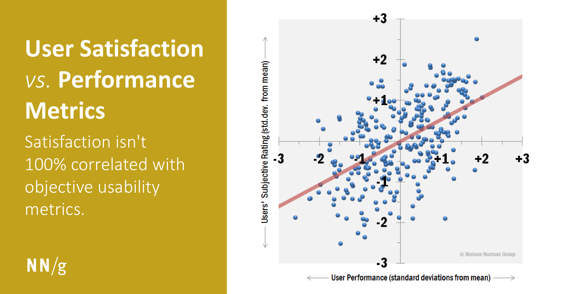
Users generally prefer designs that are fast and easy to use, but satisfaction isn't 100% correlated with objective usability metrics.| Nielsen Norman Group

Study your users’ real-life behaviors and make data-informed design decisions.| Nielsen Norman Group
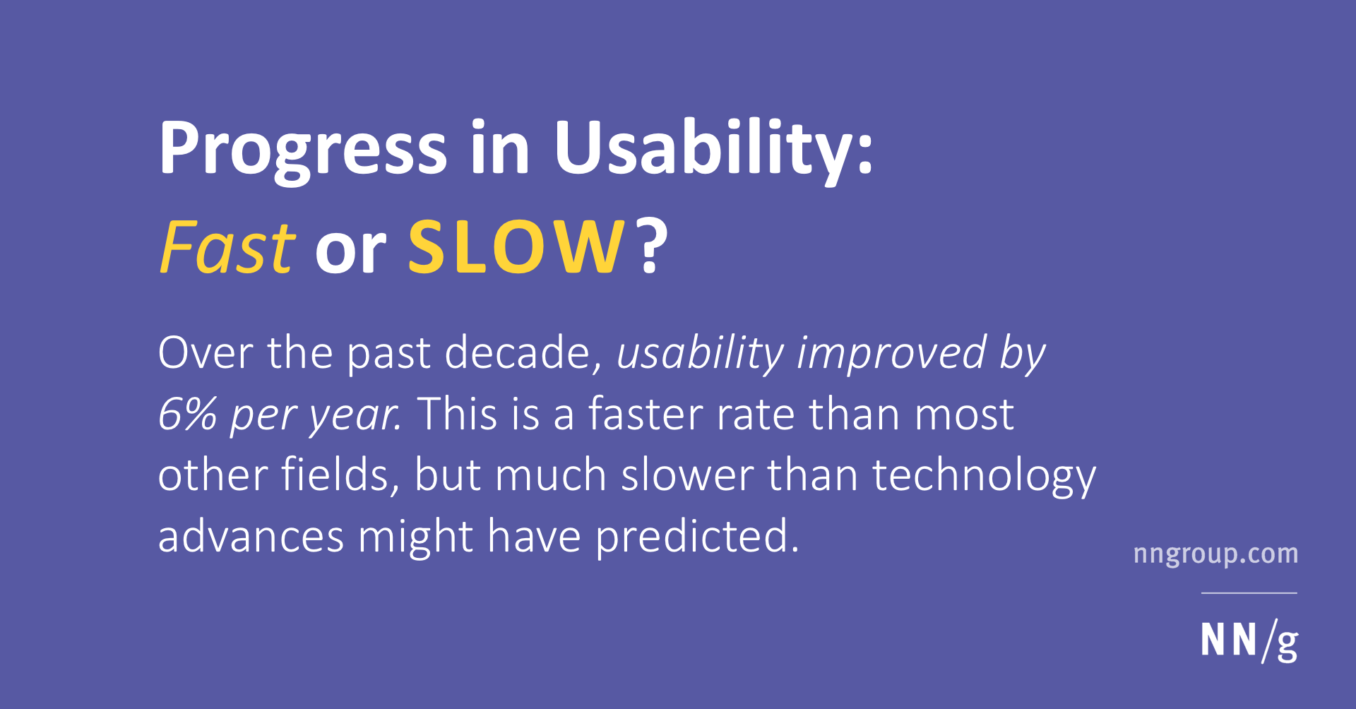
Over the past decade, usability improved by 6% per year. This is a faster rate than most other fields, but much slower than technology advances might have predicted.| Nielsen Norman Group

What appears at the top of the page vs. what’s hidden will always influence the user experience — regardless of screen size.| Nielsen Norman Group

Feline users require special considerations, including larger tap target zones for paws, continual animation, and audible vocalization.| Nielsen Norman Group

Macro conversions are desired user actions that directly contribute to your business's primary goals. In contrast, micro conversions are user actions that precede macro conversions and occur more frequently.| Nielsen Norman Group

Despite being an artificial situation, user testing generates realistic findings because people engage strongly with the tasks and suspend their disbelief.| Nielsen Norman Group
The tone of any piece of digital content can be analyzed along 4 dimensions: humor, formality, respectfulness, and enthusiasm.| Nielsen Norman Group
Users don't see stuff that's right on the screen. Selective attention makes people overlook things outside their focus of interest.| Nielsen Norman Group
If you place text over a background image, make sure it’s readable by providing adequate contrast.| Nielsen Norman Group

Improve the layout of your online forms by placing form labels near the associated text field and by grouping similar fields.| Nielsen Norman Group
In visual design, elements within the same boundary are perceived as related.| Nielsen Norman Group
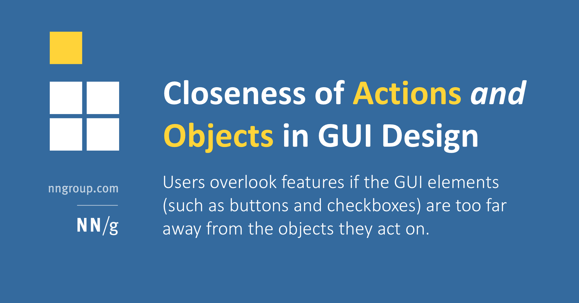
Users overlook features if the GUI elements (such as buttons and checkboxes) are too far away from the objects they act on.| Nielsen Norman Group
Help gift givers easily find and send the perfect gift. Get 87 tips for designing the ideal wishlist and gift-giving experience on your ecommerce site.| Nielsen Norman Group
53 UX guidelines for improving your website's credibility. How to help customers feel confident enough in your organization to take desirable actions.| Nielsen Norman Group
Design a helpful shopping cart and a smooth checkout process by following these 137 design guidelines.| Nielsen Norman Group
Users expect ecommerce retailers to anticipate and meet their needs throughout the entire shopping journey. Get 102 guidelines for improving your ecommerce marketing, merchandising, and selling techniques.| Nielsen Norman Group
International shoppers can differ from your domestic customers. Follow these 117 design guidelines to satisfy their needs and expand to global markets.| Nielsen Norman Group
Nielsen Norman Group ecommerce usability research report featuring 75 tips for designing websites that support customers when they need it.| Nielsen Norman Group
Get inspiration for conducting your own studies. Learn how we collected the data so you can apply the suggestions appropriately.| Nielsen Norman Group
Nielsen Norman Group report summarizing the key usability findings of our Ecommerce user experience research series.| Nielsen Norman Group
Relevant and informative automated messages help users quickly identify their transaction status. Get 143 design guidelines to convey emails and notifications efficiently.| Nielsen Norman Group
Get people to your physical stores by making yourself easy to find. Get 50 tips for designing locators.| Nielsen Norman Group
Nielsen Norman Group report detailing best practices of 2016's 10 best intranets. Take a look at innovative ideas and solutions you can use as inspiration.| Nielsen Norman Group
Nielsen Norman Group report detailing best practices of 2014's 10 best intranets. Take a look at innovative ideas and solutions you can use as inspiration.| Nielsen Norman Group

I was a proud Nest early adopter: It saved energy, and showed me the savings. In an emotional-design fail, it let me down: behaviorally, reflectively, and finally viscerally.| Nielsen Norman Group

Computer systems shouldn't make us feel bad. But they often do. Contextual usability methods can help discover social defects in user experience.| Nielsen Norman Group

To eliminate outdated information and make online shopping efficient, let ecommerce users easily update existing payment information within the checkout flow.| Nielsen Norman Group

Customization tools must be simple-to-use, easy-to-find, and easily edited, with both a clear intent and a clear benefit to users.| Nielsen Norman Group

Over the last several years, entry-level UX salaries have dropped, while pay for experienced user experience staff has been more stable. (Updated to 2019.)| Nielsen Norman Group

Need numerical data about your product’s UX, but not sure where to start? Check out this list of the most popular quantitative methods to help you pick a tool.| Nielsen Norman Group
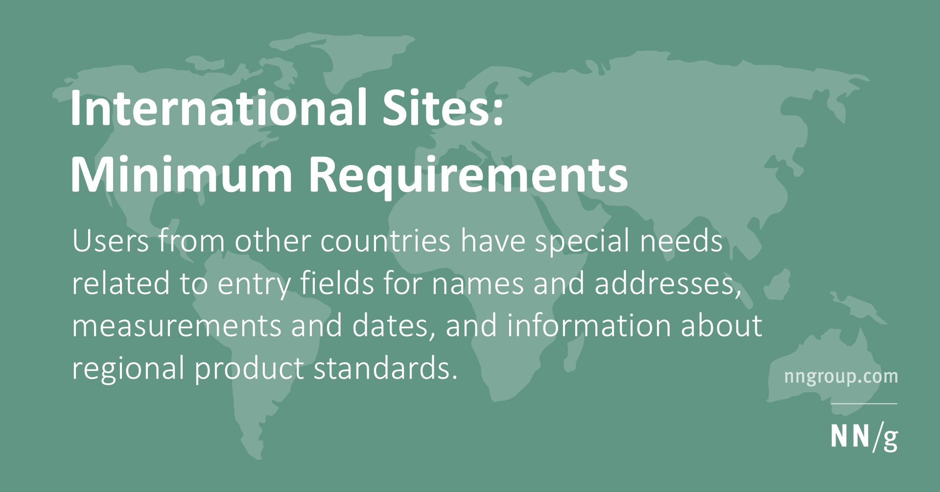
Users from other countries have special needs related to entry fields for names and addresses, measurements and dates, and information about regional product standards.| Nielsen Norman Group

Data on what works well or poorly on other sites saves you from implementing useless features and guides UX investments to features that your users need.| Nielsen Norman Group
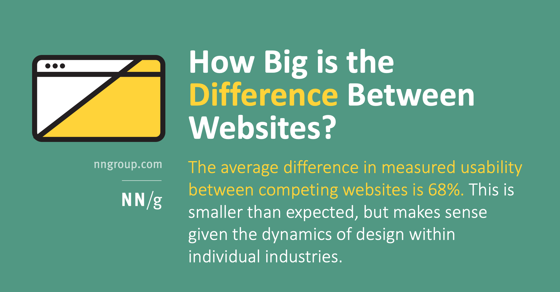
The average difference in measured usability between competing websites is 68%. This is smaller than expected, but makes sense given the dynamics of design within individual industries.| Nielsen Norman Group

The more engaged users are, the more features an application can sustain. But most users have low commitment -- especially to websites, which must focus on simplicity, rather than features.| Nielsen Norman Group
Articles explaining the heuristic evaluation technique for assessing usability, from Nielsen Norman Group, a firm specializing in User Experience Research, Training, and Consulting.| Nielsen Norman Group
The book Usability Inspection Methods, edited by Jakob Nielsen and Robert L. Mack, is the first comprehensive, book-length work in the field of usability evaluation and includes a full complement of UI strategies, tools, and techniques.| Nielsen Norman Group
This article summarizes statistics for 13 usability laboratories. It also gives an introduction to the main uses of usability laboratories in usability engineering and surveys some of the issues related to practical use of user testing and computer-aided usability engineering.| Nielsen Norman Group

Number fetishism leads usability studies astray by focusing on statistical analyses that are often false, biased, misleading, or overly narrow. Better to emphasize insights and qualitative research.| Nielsen Norman Group

Intranets are improving findability and discoverability by organizing content by task, using mega-menus, offering wayfinding cues, and providing shortcuts.| Nielsen Norman Group

Labels in a card sorting study must be neutral to prevent keyword matching and encourage careful, conceptual groupings from users.| Nielsen Norman Group
When people select alternatives, they avoid loss and optimize for sure wins because the pain of losing is greater than the satisfaction of an equivalent gain. UX designs should frame decisions accordingly.| Nielsen Norman Group
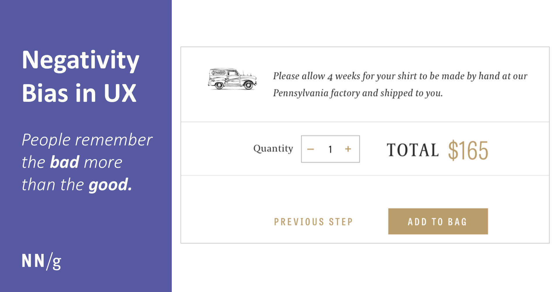
People remember the bad more than the good. Users’ tendency to identify flaws in designs raises the bar for what they consider acceptable.| Nielsen Norman Group
Overreliance on narrative details and assumptions about cause-and-effect explanations can lead to errors in judgment by UX practitioners.| Nielsen Norman Group
Recruiting internal staff to test a user interface should be a last resort. Consider potential biases before drawing any conclusions.| Nielsen Norman Group
Designers are vulnerable to the same cognitive biases as users. The context in which you present a problem can bias your design choices.| Nielsen Norman Group

Hidden features, reduced discoverability, cognitive overhead from dual environments, and reduced power from a single-window UI and low information density. Too bad.| Nielsen Norman Group

Paper prototyping, card sorting, and traditional usability testing were all employed to guide the design of the 1995 Sun Microsystems' Web site.| Nielsen Norman Group

Flat design hides calls to action, and swiping around the edges can interfere with carousels and scrolling.| Nielsen Norman Group
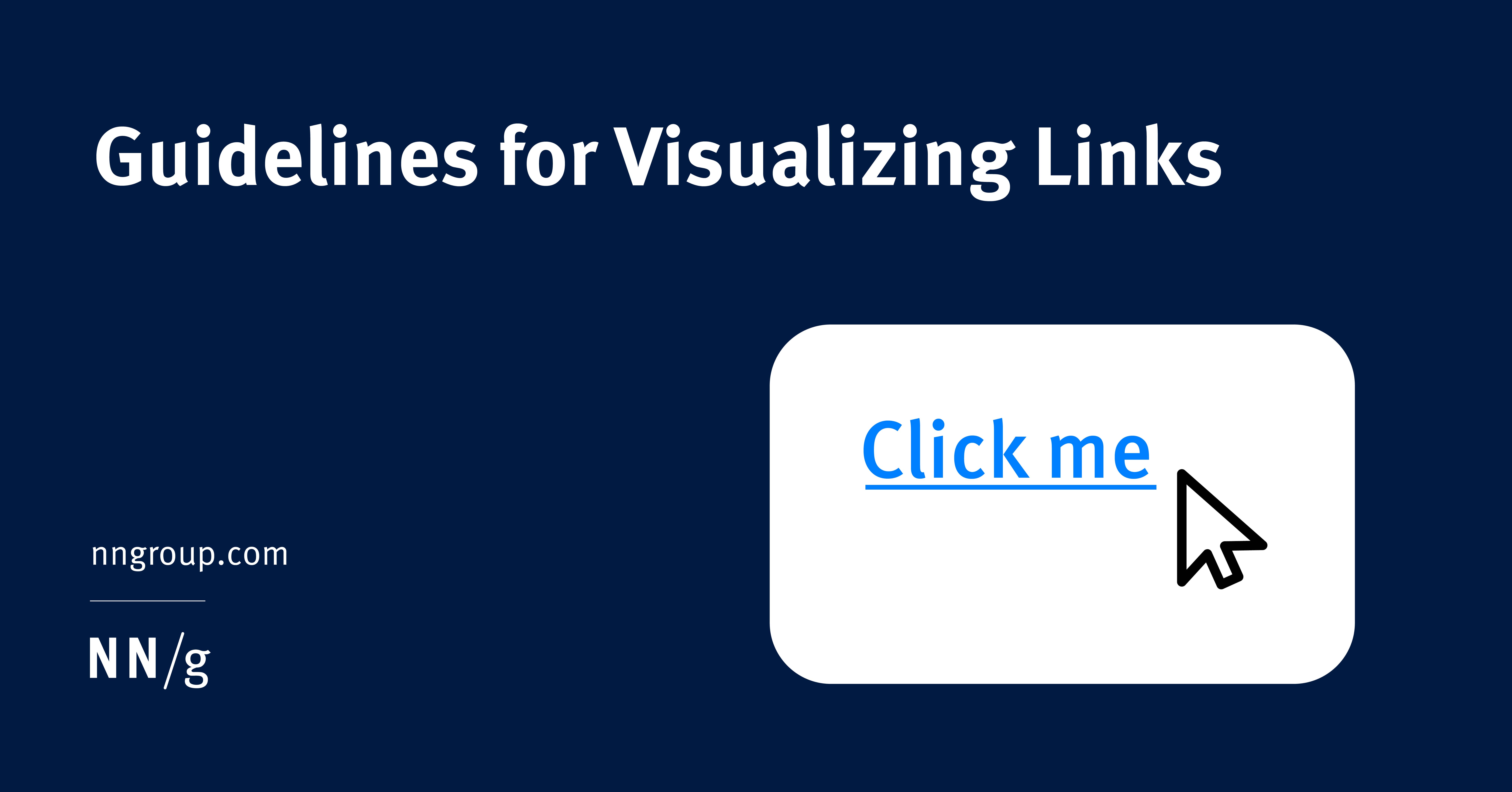
Textual links should be colored and underlined to achieve the best perceived affordance of clickability, though there are a few exceptions to these guidelines.| Nielsen Norman Group
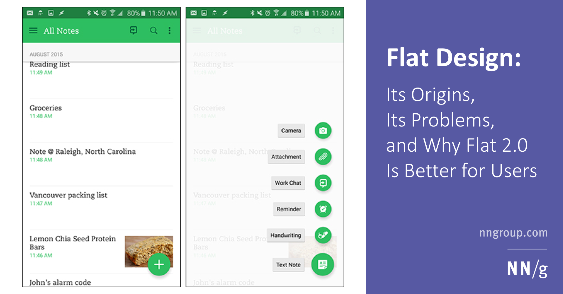
Flat design is a web-design style that became popular around 2012. It is still widely used today, and its misuse can cause serious usability problems.| Nielsen Norman Group

Clickable interface elements with absent or weak visual signifiers condition users to click and hover uncertainly across pages — reducing efficiency.| Nielsen Norman Group
The tighter the mapping between icons and the thing they represent, the easier they are to understand, but standardization can also make an icon easy.| Nielsen Norman Group
A website's tagline must explain what the company does and what makes it unique among competitors. Two questions can help you assess your own tagline: Would it work just as well for competitors? Would any company ever claim the opposite?| Nielsen Norman Group

Active voice is best for most Web content, but using passive voice can let you front-load important keywords in headings, blurbs, and lead sentences. This enhances scannability and thus SEO effectiveness.| Nielsen Norman Group
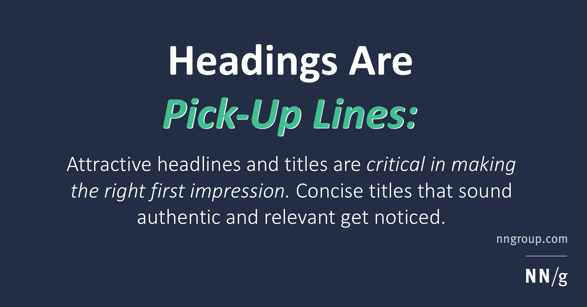
Attractive headlines and titles are critical in getting you noticed and making the right first impression.| Nielsen Norman Group
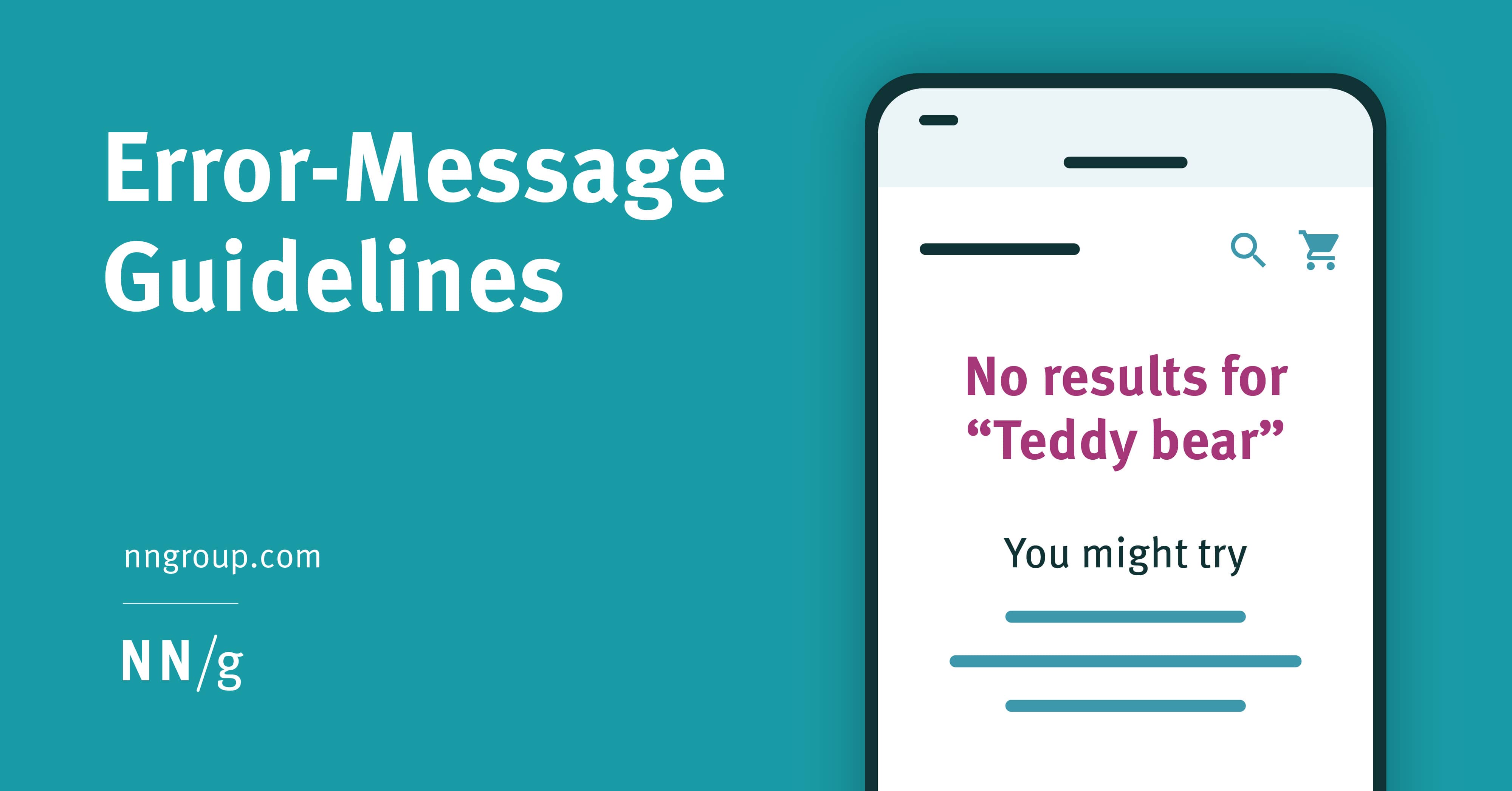
Design effective error messages by ensuring they are highly visible, provide constructive communication, and respect user effort.| Nielsen Norman Group

Focus on the first 40 characters. Descriptive and well-written subject lines allow recipients to make an informed decision to get more details or move on.| Nielsen Norman Group

Category and link labels should tell users what will happen when they click on them.| Nielsen Norman Group

A “card” is a UI design pattern that groups related information in a flexible-size container visually resembling a playing card.| Nielsen Norman Group

Avoid awkward and difficult page layouts by fitting flexible templates to content whenever possible. Test often during design, and plan to scale up.| Nielsen Norman Group

Ease users’ purchase decisions by designing interfaces that support both compensatory and noncompensatory decision-making strategies.| Nielsen Norman Group
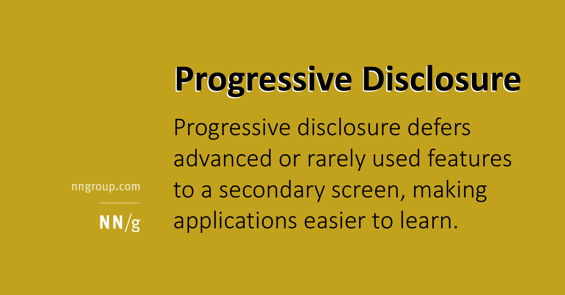
Progressive disclosure defers advanced or rarely used features to a secondary screen, making applications easier to learn and less error-prone.| Nielsen Norman Group
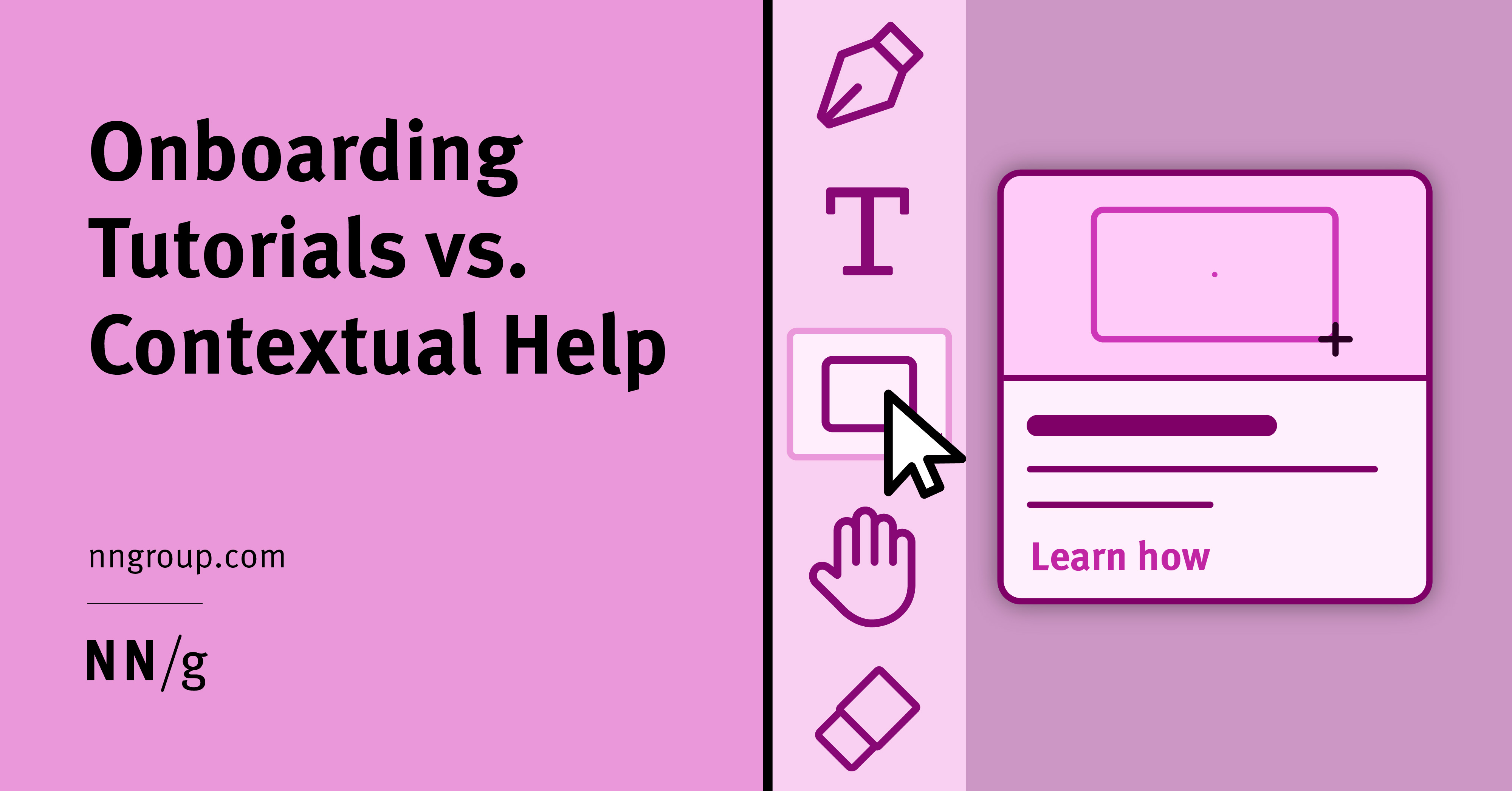
Tutorials interrupt users, don’t necessarily improve task performance, and are quickly forgotten. Contextual help signals can avoid these pitfalls but require unintrusive ways to activate.| Nielsen Norman Group

Our research shows that tutorials don’t make users faster or more successful at completing tasks; on the contrary, they make them perceive the tasks as more difficult.| Nielsen Norman Group

People rely on menus to find content and use features. Use this checklist to make sure your menus do their job.| Nielsen Norman Group

Branding elements and interaction design guidelines can bridge the gap between how a company constructs its identity and how its customers experience it.| Nielsen Norman Group

Users won’t read web content unless the text is clear, the words and sentences are simple, and the information is easy to understand. You can test all of this.| Nielsen Norman Group

Drop-downs, megamenus, and radial or marking menus arrange items in different patterns to optimize the reach time to individual menu options.| Nielsen Norman Group
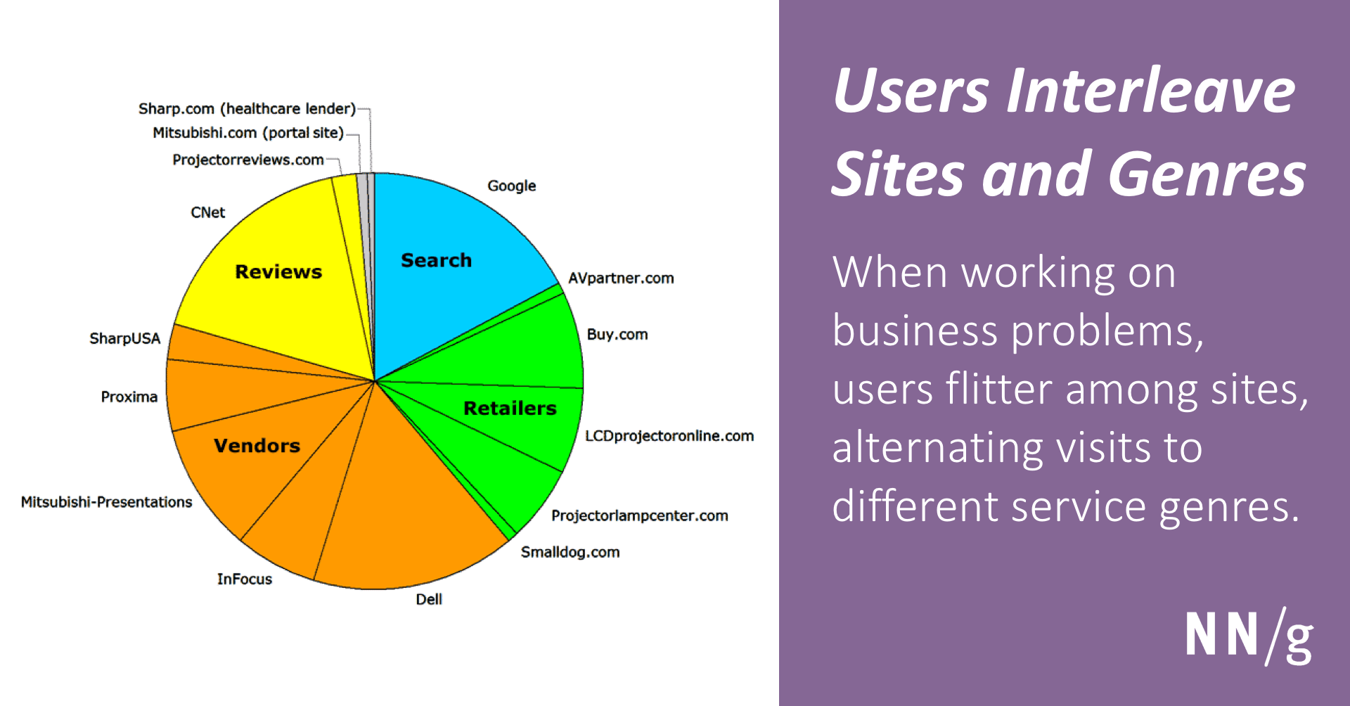
When working on business problems, users flitter among sites, alternating visits to different service genres. No single website defines the user experience on its own.| Nielsen Norman Group

The average business metrics improvement after a usability redesign is now 83%. This is substantially less than 6 years ago, but ROI remains high because usability is still cheap relative to gains.| Nielsen Norman Group
Give ecommerce customers the product information they want, at the right time, and at the appropriate level of detail. Get 108 guidelines for producing engaging product pages.| Nielsen Norman Group

In addition to being expensive, collecting usability metrics interferes with the goal of gathering qualitative insights to drive design decisions. As a compromise, you can measure users' ability to complete tasks. Success rates are easy to understand and represent the UX bottom line.| Nielsen Norman Group
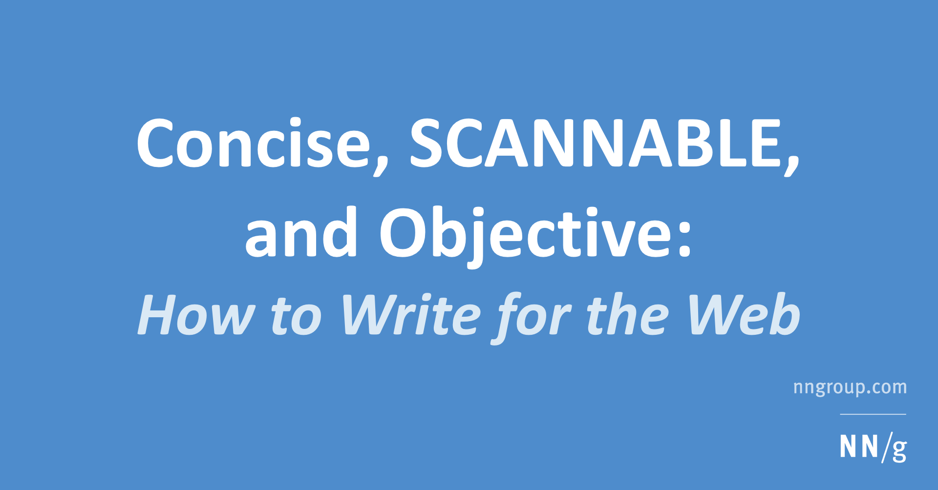
Users don't read Web pages; they scan. Concise text improved usability by 58%, SCANNABLE layout added 47%, and objective language added 27% to measured usability; combining all three improvements gave 124%.| Nielsen Norman Group
